Print page: Simplify #13
Description
There is a lot of text and ui on the print page:
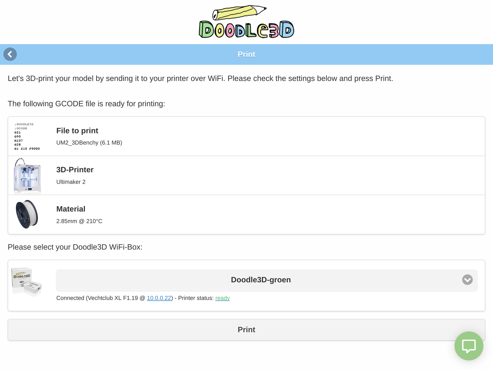
Couldn't we simplify it to something like:
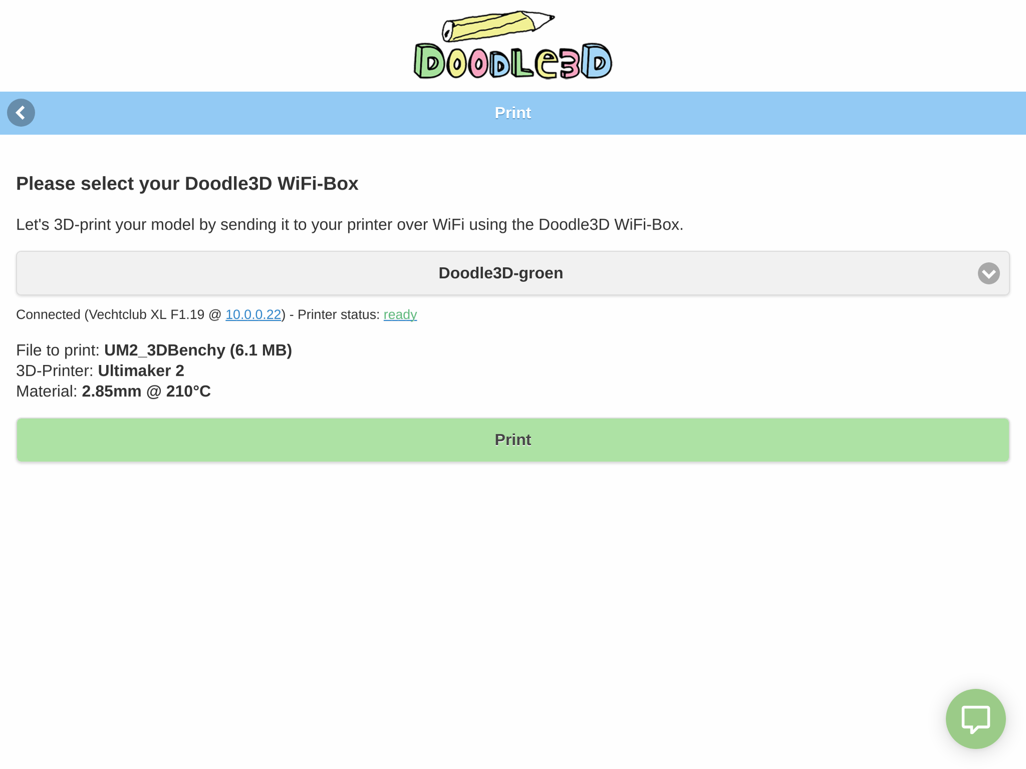
- The actual action that the user needs to perform on this page is a header
- The information that the user might want to check (which I think is more focused towards power users) is given much less space. And is shown below the WiFi-Box selection. (Also see Print page: Visually prioritize WiFi-Box selection #12)
- I've also highlighted the print button in green.
- Less borders / boxes.
- Removed images, because they added a lot of visual noise.
(I think the actual copy could still be improved)
Screenshots in iPhone form factor:
