Skip to content

Mobile Interface #15

@F1nnM

Description

@F1nnM

Currently, the interface breaks on small screens:
image

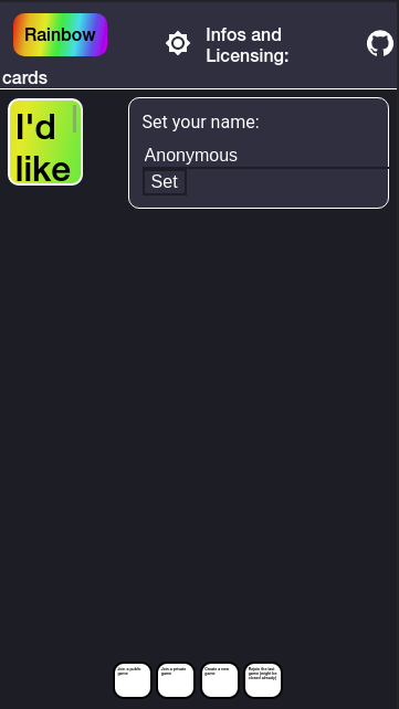
Following issues need to be fixed (any one of them can be a seperate PR):

  • Header-area: Don't wrap "Rainbow cards", instead only wrap "Infos and licensing" and adjust the spacing.
  • Don't shrink the white cards that small. Once too many cards are on the screen to fit (in a game), make the list of cards scroll horizontally, instead of shrinking them.
  • The rainbow card currently sticks to the left, and shrinks with the screen. Once this would make it too small for the text, place the card at it's minimal size in the center of the screen.

My vision for the main menu is the following:
image

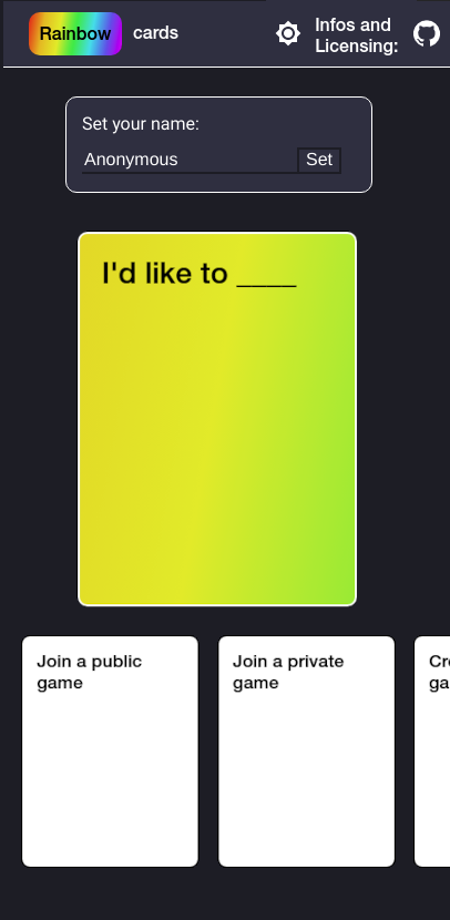
Suggestions for how the game screen should look on small screens are very welcome!

Metadata

Metadata

Assignees

No one assigned

    Labels

    No labels
    No labels

    Projects

    No projects

    Milestone

    No milestone

    Relationships

    None yet

    Development

    No branches or pull requests

    Issue actions