Styling of the Left hand Nav + Nav item interaction states #2426
Description
Here is a proposal for updating the left hand nav.
https://www.figma.com/file/VvabDMuRKIdb3sSczCjUVR/Marquez?node-id=112%3A364&t=O97rZZ6JlTEhrpmu-1
The Problem
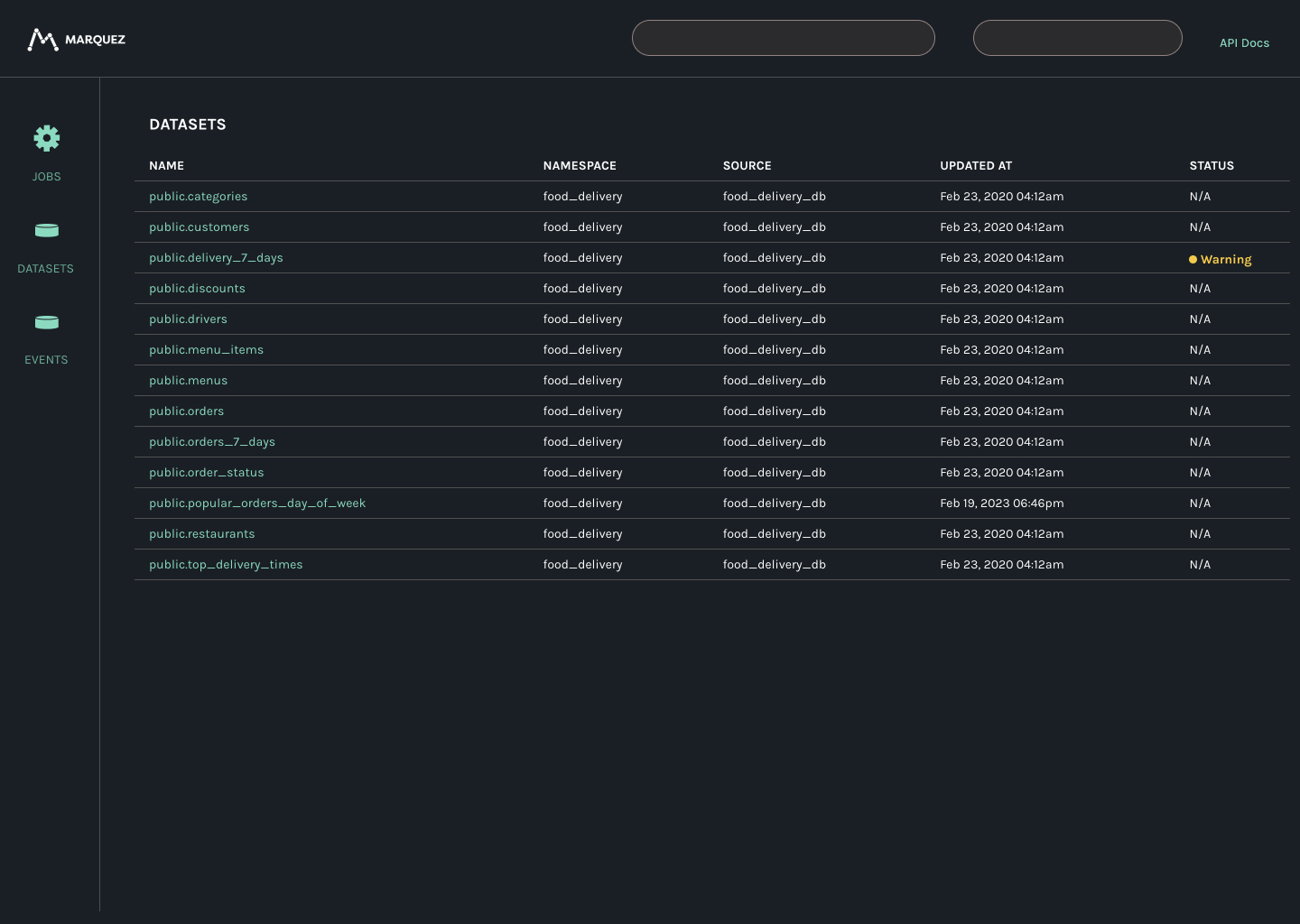
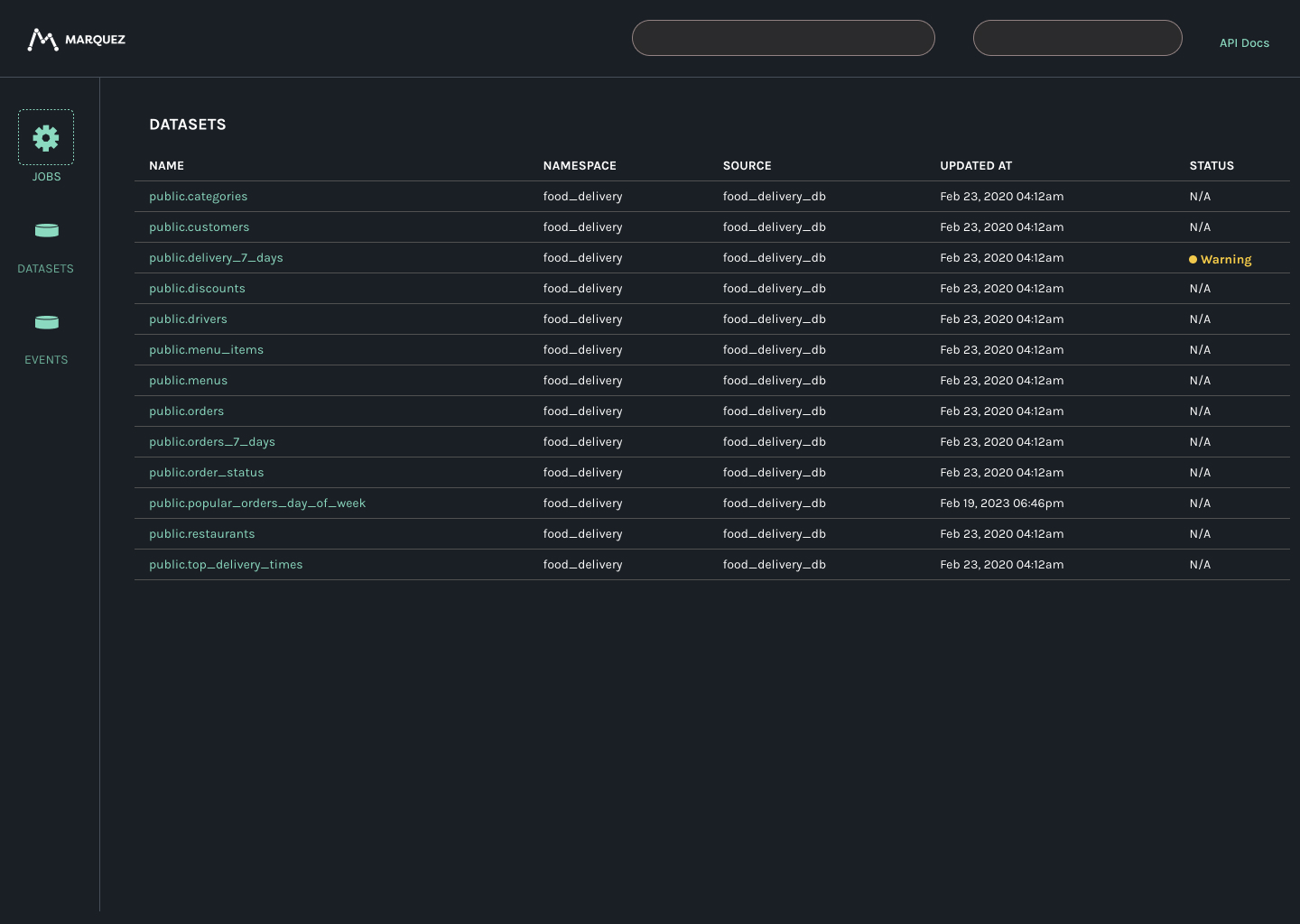
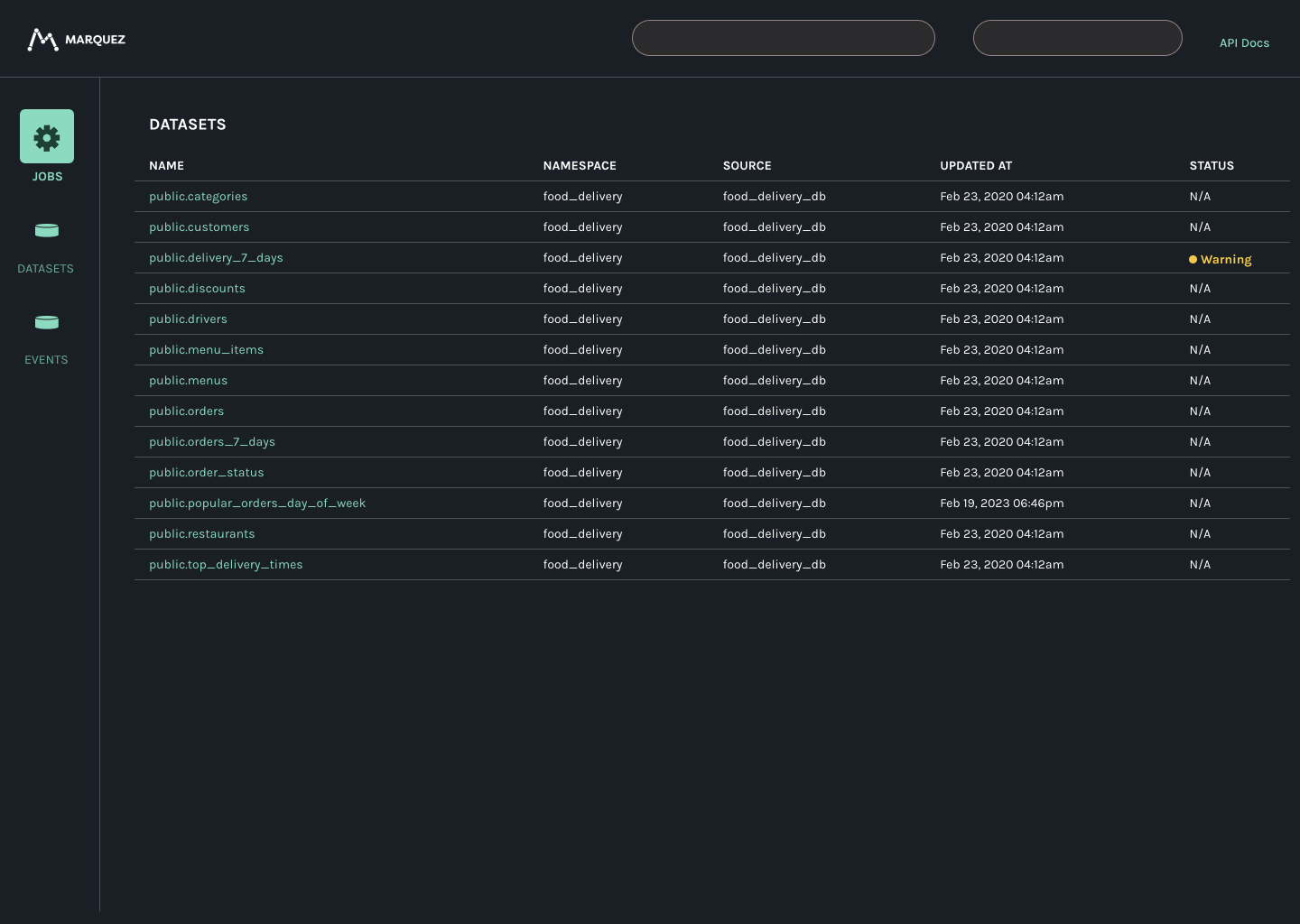
Labels of the navigation menu items only appear when the menu item is hovered over. This increases interaction cost, and for new users, decreases the ability to quickly recognise these items, based on the icons alone. Having the labels always displayed encourages recognition over recall. Useful for new users to quickly understand the UI.
Solution
The teal color is used as a visual indicator of a click target, with labels always shown below the icons.
Notes
- Icons used are indicative.
- I've also taken a crack at updating the UI but please treat that as a proposal.