[Design] Website overhaul for skywalking.apache.org #7722
Replies: 10 comments 43 replies
-
|
User page seems a little small, I think we should use vertical space more. |
Beta Was this translation helpful? Give feedback.
-
|
Awesome. The website is more attractive than before. All changes look brilliant to me except for the feature gallery Could we place some diagrams or artworks instead of raw YAMLs here? The visitor has to zoom into every piece to find out the details of each one. |

Beta Was this translation helpful? Give feedback.
-
|
That is almost the reasoning behind this design, users can zoom into the technical details a bit more. I assumed that most of the users are comfortable reading the snippets. |
Beta Was this translation helpful? Give feedback.
-
|
The new design looks fantastic! One thing to note, as per the Apache policy, we should not display the users in our home page, we have fixed this days ago and it seems to be on your new design still, you might need to adjust the home page of your new design accordingly. |
Beta Was this translation helpful? Give feedback.
-
|
Thanks, and I appreciate Apache for providing the guideline and rational behind it. Removing the logo wall. I wonder if it's ok to show usage data (etc. X tracing/day at Y, proud to empower Z companies)? These demonstrate the scale SkyWalking is used and capable of. The guideline didn't seem to have a clear cut here and this usage seems to comply the guideline. Correct me if wrong @kezhenxu94 @wu-sheng |
Beta Was this translation helpful? Give feedback.
-
|
Showing the usage data is feasible to me, as long as we don't show bias to any vendor or company, "x traces/day" is an objective statement and IMO it is ok to be on the website but "proud to empower y company" seems to be kind of subjective and might imply bias in some linguistic context. |
Beta Was this translation helpful? Give feedback.
-
|
edited, what do you think? |

Beta Was this translation helpful? Give feedback.
-
Hi @rickyzhangca, sorry I didn't make it clear enough, "powered by" companies' names and/or logos are all not allowed in home page, the stats without company names are allowed. As per this policy, I think we have to put these in a secondary page and only keep a hyperlink in the homepage |
Beta Was this translation helpful? Give feedback.
-
|
removed, I liked this section |
Beta Was this translation helpful? Give feedback.
-
|
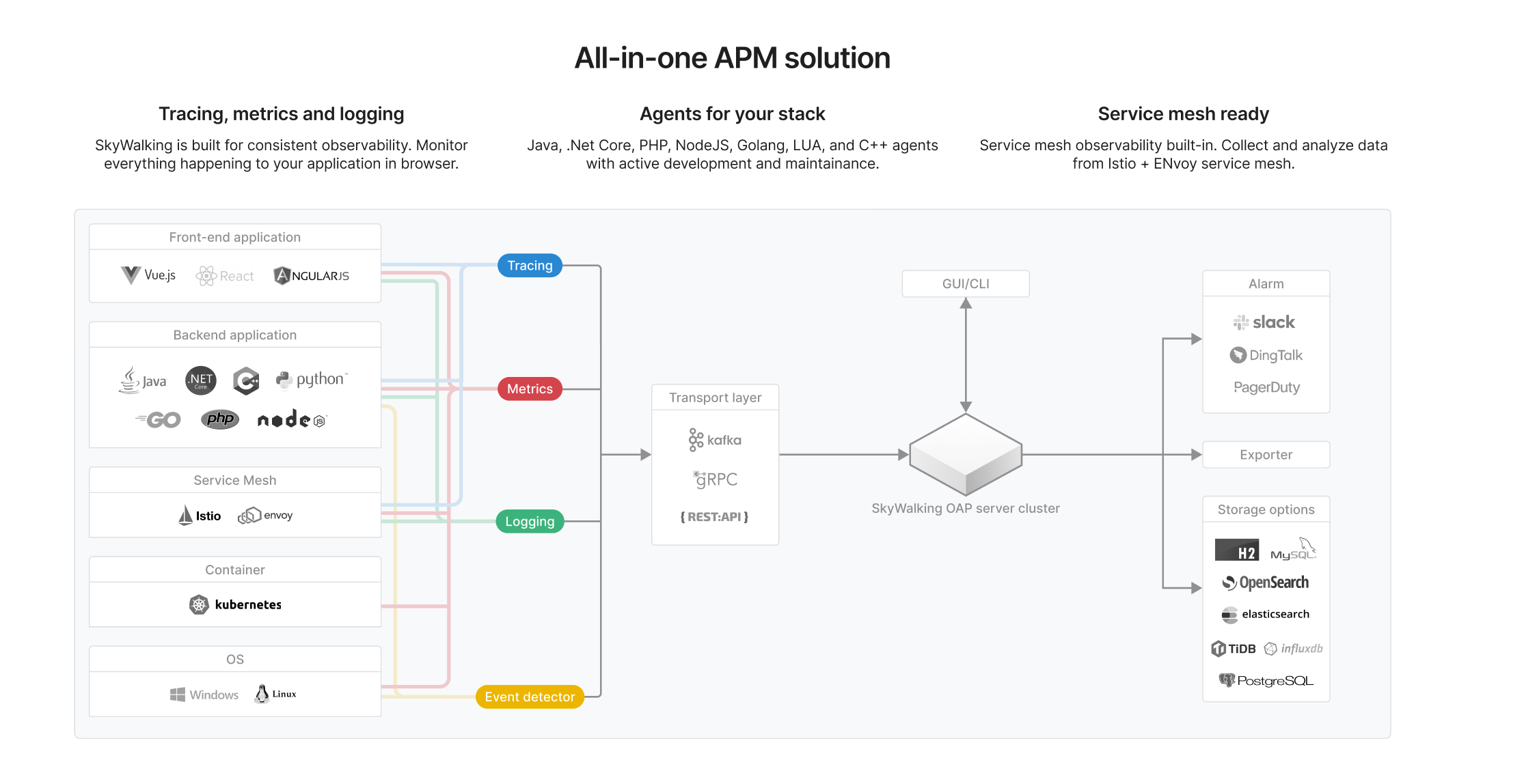
Stunning design!🥳 But I can't visually see the meaning of the colored buttons on the right. |

Beta Was this translation helpful? Give feedback.
-
If the arrow means the dataflow (seems to be true for other places), I think it's right. Also please note there is data from CLI to OAP and vice versa, CLI can report event data to OAP and retrieve data from OAP |
Beta Was this translation helpful? Give feedback.
-
|

Beta Was this translation helpful? Give feedback.
-
This is super better. Just feel SkyWalking cluster is a little thin, just feeling. |
Beta Was this translation helpful? Give feedback.
-
|
Thank you! Just made it taller. Probably at a good spot now before it becomes chunky. Feature locking this design to wrap it up for final hand-off.
|
Beta Was this translation helpful? Give feedback.
-
|
I love it, looks so cool. |
Beta Was this translation helpful? Give feedback.
-
|
Nice design! |

Beta Was this translation helpful? Give feedback.
-
|
Once there is no specific project names or vendors, we are good. |
Beta Was this translation helpful? Give feedback.
-
|
Thanks! I hope it's a step up from the current site and will last long. Design wise, this section aims to provide detailed highlights to best sell SkyWalking, so user doesn't have to leave the site to google or spend time searching through our blogs by themselves. The comparison with competing/similar products are almost always one thing user will look for. |
Beta Was this translation helpful? Give feedback.
-
|
Policy wise, thank you wu-sheng for double checking! |
Beta Was this translation helpful? Give feedback.
-
|
It looks fantastic!
|


Beta Was this translation helpful? Give feedback.
-
|
Screenshots section: 3 approaches (currently). The buttons won't be tiny. We can just switch to another set of graphics made for phones.
What do you think?
|

Beta Was this translation helpful? Give feedback.
-
|
Round corners: good point! I started with some Apple-ish round corners there but I realized it's too much for us so I removed them. Glad to hear that we love some gentle round corners. Good balance between the sharp ones and Apple ones. We unintentionally did an AB testing here. Updated the screens. |
Beta Was this translation helpful? Give feedback.
-
|
I prefer the design of the third one. |
Beta Was this translation helpful? Give feedback.
-
|
As far as I know, the width of the main display area on a general page is around 1200px. In this case, it's 1440px. Will it look too full? @rickyzhangca |
Beta Was this translation helpful? Give feedback.
-
|
@wu-sheng would we need to include the TM in our logo, if that's our "official logo"? I don't think ours in the Apache Project logos has one https://www.apache.org/foundation/marks/pmcs#graphics |
Beta Was this translation helpful? Give feedback.
-
|
Most logos are submitted by some end users, which should be but missed from time to time. |
Beta Was this translation helpful? Give feedback.
-
|
ok I'll stick to the ones submitted to Apache for now |
Beta Was this translation helpful? Give feedback.
-
|
Hey Ricky, great work! 😍 |
Beta Was this translation helpful? Give feedback.
-
|
Noticed 2 things.
|
Beta Was this translation helpful? Give feedback.
-
|
My bad! forgot to double check them after copy & paste. Fixed. |
Beta Was this translation helpful? Give feedback.
-
|
|

Beta Was this translation helpful? Give feedback.
-
|
Homepage is implemented through apache/skywalking-website#352. @Jtrust leads. |
Beta Was this translation helpful? Give feedback.
-
I'm a summer student working on an improved design for skywalking.apache.org. After 2.5 months of designing, I'm showcasing some of the ideas here and sharing an interactive prototype to hear feedbacks and thoughts from everyone. Any input would be appreciated. I'm happy to explain the design decisions behind any change.
Credits to @wu-sheng for being my mentor.
Improved readability
Several changes are introduced aiming to improve the readability. They include decluttering, restyling and reorganizing contents.
More intuitive interactions
Some of the interactions are reworked to better involve user at where we should. For example, users can peek SkyWalking UI right at the landing scene, and find the
try live demobutton soon after. The logo wall simply self-scroll.Refined visual design
All designers love over-spend time on pixel-perfecting. Other than aesthetics, there are other good reasons behind. For example, a set of clean icons here lets you locate repos easier.
Check out the prototype!
"A prototype is worth a thousand pictures": start
try.it.mov
Beta Was this translation helpful? Give feedback.
All reactions