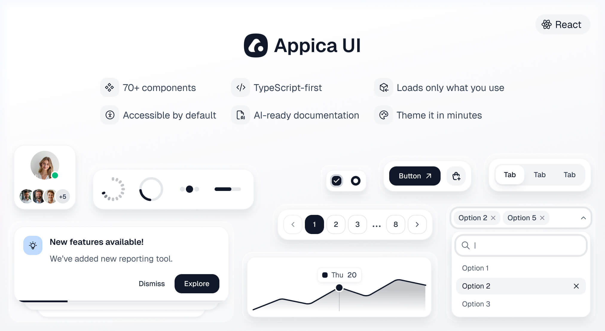




A modern React component library - 70+ accessible, themeable components built on Base UI primitives, animated with Motion, and styled with Tailwind CSS v4 design tokens.
Documentation · Installation guide · Components
| Dependency | Version |
|---|---|
| React | >= 19 |
| React DOM | >= 19 |
| Tailwind CSS | >= 4.0 |
React 19 is a hard requirement - components use the modern ref-as-prop API with no forwardRef shims. Tailwind v4 must be set up and compiling in your project first; Appica UI relies on your project's Tailwind to compile the component styles.
npm install @appica/ui-react
# or
yarn add @appica/ui-react
# or
pnpm add @appica/ui-react
# or
bun add @appica/ui-reactImport the design tokens after Tailwind in your global stylesheet, and add a @source directive so Tailwind scans the compiled library for class names:
@import 'tailwindcss';
@import '@appica/ui-react/styles.css';

@source '../node_modules/@appica/ui-react/dist';
Don't skip
@source- and give it a real path.Tailwind ignores
node_modulesby default. Without the@sourcedirective it won't generate the utility classes used inside the compiled components, and they'll render unstyled.
@sourcetakes a path or glob relative to the stylesheet that contains it, not a bare package name -@source '@appica/ui-react'does not resolve and silently scans nothing. Count the../needed to reachnode_modulesfrom your CSS file: a stylesheet one level deep (app/globals.css,src/index.css) needs a single../; a deeper one (src/styles/app.css) needs../../. This matches Tailwind's own@sourcedocumentation, whose example is@source '../node_modules/@my-company/ui-lib';.
Appica UI is built on Tailwind, and the source-scanning setup above is the recommended path. If your project doesn't use Tailwind, skip that step and import the prebuilt stylesheet instead - a single self-contained file with every component's styles and the full token system compiled in:
@import '@appica/ui-react/css';No bundler? Link it straight from a CDN (pin a version for cache stability):
<link rel="stylesheet" href="https://unpkg.com/@appica/ui-react@latest/appica.css" />Tailwind stays an optional peer dependency, so nothing installs it on your behalf when you take this path. Design tokens remain CSS variables, so theming still works the same way - redefine the variable after the import:
:root {
  --primary: oklch(60% 0.25 150);
}
Don't load both.
The prebuilt file bundles Tailwind's Preflight reset, and only the token variables (colors, fonts, radii, shadows) stay overridable - structural utilities are frozen at publish time. If you already run Tailwind, use Configure Tailwind instead, or you'll ship the reset and utilities twice.
Wrap your app in ThemeProvider to enable theming and dark mode with no flash of the wrong theme:
import { ThemeProvider } from '@appica/ui-react/providers/theme-provider'

export default function RootLayout({ children }: { children: React.ReactNode }) {
  return (
    <html lang="en" suppressHydrationWarning>
      <body>
        <ThemeProvider>{children}</ThemeProvider>
      </body>
    </html>
  )
}Import components from their subpath for the smallest bundle:
import { Button } from '@appica/ui-react/button'

export default function App() {
  return <Button>Get started</Button>
}
See the installation guide for framework-specific notes (Next.js, Vite, TanStack Start, Remix, Astro), and Theming to customize colors, radii, and tokens.
If you are a coding agent reading this from node_modules, the rules for writing Appica UI code correctly are in agent-rules.md, next to this file. Read it before writing any component or CSS. The two mistakes it prevents are the expensive ones: a missing @source directive renders every component unstyled, and hue-based utilities (bg-gray-100) bypass the token system entirely.
Every documentation page is served as clean markdown at <url>.md - fetch https://appica.dev/ui/components/react/button.md, not the HTML page. The full index, with an instruction block, is at https://appica.dev/llms.txt.
If you are a human setting up a project: paste those rules into your own AGENTS.md so your agent loads them every session. See Set up your coding agent for a copy-paste block.
What changed in each release is in CHANGELOG.md, next to this file, and on appica.dev/ui/changelog alongside the documentation and Figma updates that shipped with it.
Every component is also available as a free Figma design file - variants, sizes, and states mirrored one-to-one with the code, built on the same design tokens. Design and develop from a single source of truth.
Follow @Appica_dev on X for release announcements and updates.
MIT © Appica
Free to use in personal and commercial projects.