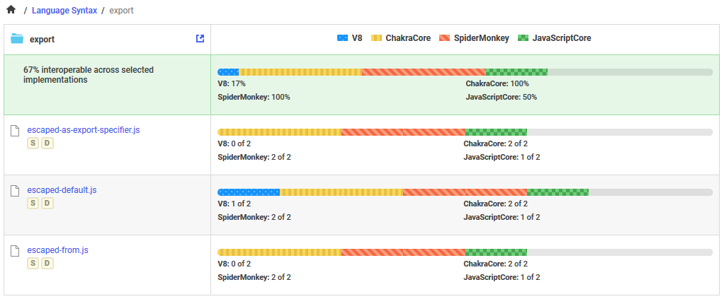
Test reporting "bar graph" feels a little hard to read #6
Description
I was looking at some of the test results, eg. https://test262.report/browse/language/export and found it a little difficult the read the stacked bar charts. With some very basic changes in the web inspector, I was able to change this:
To this:
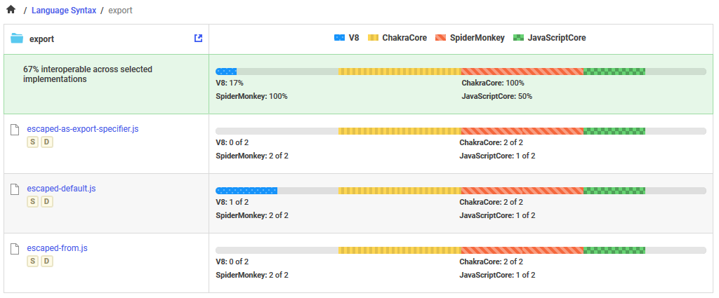
I feel this change makes it easier to quickly see which browsers are failing a set of tests.