Given a backtest run that yields negative returns over time.
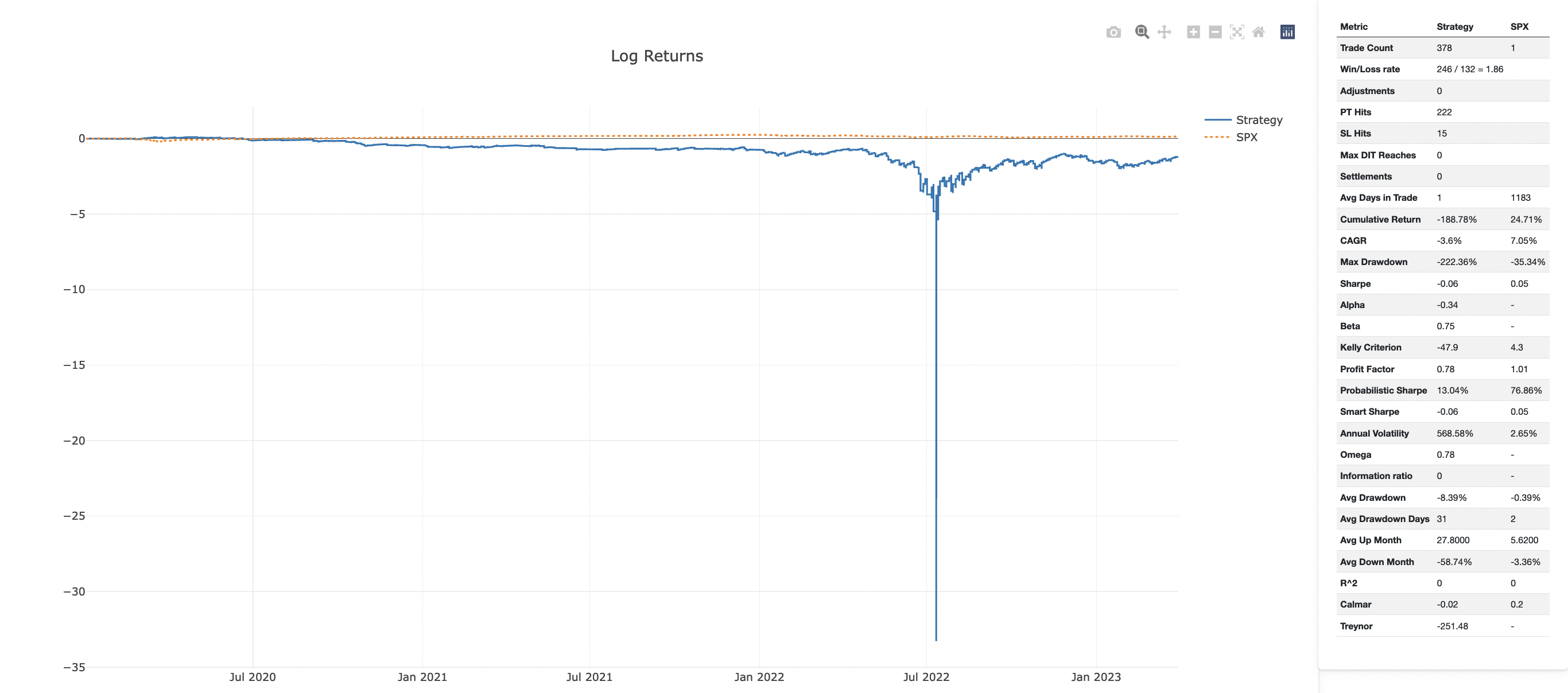
When we represent the Log Returns graph, there will be a big spike down at the most negative NAV level.
Contrary, the Full Tearsheet Log Graph looks normal -- see the attached screenshots.
The key issue here is how we calculate the Log Return graph:
As the negative values log is undefined, we normalize the return data as the most negative number becomes 0.
QuantStats doing this differently - yet to be figured out how.
Solution: stick to QuantStat's representation in our Log Return graph.

Given a backtest run that yields negative returns over time.
When we represent the Log Returns graph, there will be a big spike down at the most negative NAV level.
Contrary, the Full Tearsheet Log Graph looks normal -- see the attached screenshots.
The key issue here is how we calculate the Log Return graph:
As the negative values log is undefined, we normalize the return data as the most negative number becomes 0.
QuantStats doing this differently - yet to be figured out how.
Solution: stick to QuantStat's representation in our Log Return graph.