A standalone React component for rendering crosswords.
- Renders crossword grid and clues
- Displays separators in grid for hyphenated and multiple-word answers
- Layout is responsive (and can be customised)
- Attempted clues are greyed out in the clue list
- Clicking on a clue highlights the associated row or column
- Groups clues together when they span multiple columns or rows
- Progress is saved to local storage
- Answers can be checked and revealed
- Smart clearing when checking answers that strikes through incorrect letters
- Anagram helper
- Accessible: elements in the crossword are clearly labelled to communicate context and state to assistive technology
- Keyboard navigable: you can tab between the grid, clues and controls, and these can be navigated with the arrow key
- Includes print styles
- Includes support for theming and custom colour schemes
| Prop | Details |
|---|---|
data |
(Required) Data to render the crossword, including clues, answers and metadata (See Crossword data format) |
progress |
(Optional) Current state of the grid (See Progress format) |
Layout |
(Optional) Allows default layout to be customised (See Layout) |
Any of the keys from the default theme can also be passed as a prop to customise the appearance of the crossword. These are detailed in the Theming section.
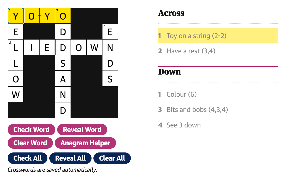
This is an example set of data used to create the crossword shown above:
{
	id: 'crosswords/example/1',
	number: 1,
	name: 'Example crossword No 1',
	creator: {
		name: 'James',
		webUrl: 'https://www.theguardian.com/profile/maskarade',
	},
	date: 1740149419743,
	webPublicationDate: 1740149419743,
  entries: [
    {
      id: '1-across',
      number: 1,
      humanNumber: '1',
      clue: 'Toy on a string (2-2)',
      direction: 'across',
      length: 4,
      group: ['1-across'],
      position: { x: 0, y: 0 },
      separatorLocations: {
        '-': [2],
      },
      solution: 'YOYO',
    },
    {
      id: '2-across',
      number: 2,
      humanNumber: '2',
      clue: 'Have a rest (3,4)',
      direction: 'across',
      length: 7,
      group: ['2-across'],
      position: { x: 0, y: 2 },
      separatorLocations: {
        ',': [3],
      },
      solution: 'LIEDOWN',
    },
    {
      id: '1-down',
      number: 1,
      humanNumber: '1',
      clue: 'Colour (6)',
      direction: 'down',
      length: 6,
      group: ['1-down'],
      position: { x: 0, y: 0 },
      separatorLocations: {},
      solution: 'YELLOW',
    },
    {
      id: '3-down',
      number: 3,
      humanNumber: '3',
      clue: 'Bits and bobs (4,3,4)',
      direction: 'down',
      length: 7,
      group: ['3-down', '4-down'],
      position: { x: 3, y: 0 },
      separatorLocations: {
        ',': [4],
      },
      solution: 'ODDSAND',
    },
    {
      id: '4-down',
      number: 4,
      humanNumber: '4',
      clue: 'See 3 down',
      direction: 'down',
      length: 4,
      group: ['3-down', '4-down'],
      position: {
        x: 6,
        y: 1,
      },
      separatorLocations: {},
      solution: 'ENDS',
    },
  ],
  solutionAvailable: true,
  dateSolutionAvailable: 1542326400000,
  dimensions: {
    cols: 13,
    rows: 13,
  },
  crosswordType: 'quick',
	pdf: 'https://crosswords-static.guim.co.uk/gdn.quick.20250221.pdf',
}Grid progress is stored as a simple 2 dimensional array and is persisted in local storage. Each element in the array contains the value of the corresponding grid cell. Cells that are empty or not part of an answer are represented as an empty string.
The example crossword above is represented as:
[
	['Y', 'E', 'L', 'L', 'O', 'W', ''],
	['O', '', 'I', '', '', '', ''],
	['Y', '', 'E', '', '', '', ''],
	['O', 'D', 'D', 'S', 'A', 'N', 'D'],
	['', '', 'O', '', '', '', ''],
	['', '', 'W', '', '', '', ''],
	['', 'E', 'N', 'D', 'S', '', ''],
];
The data is indexed by column (x) and then row (y) so the data in the array when printed is transposed when compared to the visual layout of the grid.
For example, the last letter of 2 across is in the 7th column and 3rd row of the grid so would be accessed as progress[6][2] giving us 'N'.
The following keys from the crossword theme can be passed to the Crossword component to customise its appearance:
| Key | Description |
|---|---|
gridBackgroundColor |
background colour of 'black' squares/dividers etc on the grid |
gridForegroundColor |
background colour of 'white' squares on the grid |
gridTextColor |
colour of text in the grid (clue numbers and entered letters) |
gridPrintBackgroundColor |
background colour of 'black' squares on grid when printed |
gridGutterSize |
size of the gap between grid cells |
gridCellSize |
length of one side of a cell on on the grid |
gridCellStrikeThrough |
colour of the strike through on an incorrect cell |
textColor |
main text colour (grid text, clues etc.) |
focusColor |
colour of the currently selected cell border |
selectedTextColor |
colour of currently selected clue |
selectedBackgroundColor |
colour of cells / clues that are currently selected |
connectedBackgroundColor |
colour of cells / clues that are connected to the currently selected clue |
buttonBackgroundColor |
background colour of clue-helper buttons |
buttonBackgroundHoverColor |
hover colour of clue-helper buttons |
borderColor |
border colour used to visually separate parts of the UI |
clueListBorderColor |
border colour applied to the top of the clue lists |
clueMinWidth |
minimum width of a clue |
clueMaxWidth |
maximum width of a clue |
anagramHelperBackgroundColor |
background colour of the anagram helper |
anagramHelperCandidateTextColor |
text colour of shuffled letter that are not yet on the grid |
focusedClueBackgroundColor |
background colour for the focused clue |
A custom layout component can passed to the Crossword component via the Layout prop. The individual components that the crossword is composed of are passed to the layout as props so that additional elements or styles can be applied as required. (This is used in DCR to customise the layout and allow the insertion of ad slots.)
This is a simplified example of a layout:
const Layout: CrosswordProps['Layout'] = ({
	Grid,
	Clues,
	Controls,
	SavedMessage,
	AnagramHelper,
	FocusedClue,
}) => {
	return (
		<div>
			<AnagramHelper />
			<div>
				<FocusedClue />
				<Grid />
				<FocusedClue />
				<Controls />
				<SavedMessage />
			</div>

			<div>
				<Clues direction="across" />
				<Clues direction="down" />
			</div>
		</div>
	);
};$ pnpm add @guardian/react-crosswordor
$ npm i @guardian/react-crossword