⚠️ AI-generated draft — needs human validation
This issue was written by an AI agent from materials produced during the
hasadna Open Bus hackathon (July 2026). The underlying analysis was built fast,
under hackathon conditions, and has not been peer-reviewed. Figures,
endpoint behaviour and conclusions all need independent verification before
anyone acts on them or quotes them publicly.
Please validate before implementing. Corrections very welcome.
What it answers
The same ghost / early / late / on-time breakdown, split by day, so a spike on one bad day is not hidden inside a window average.
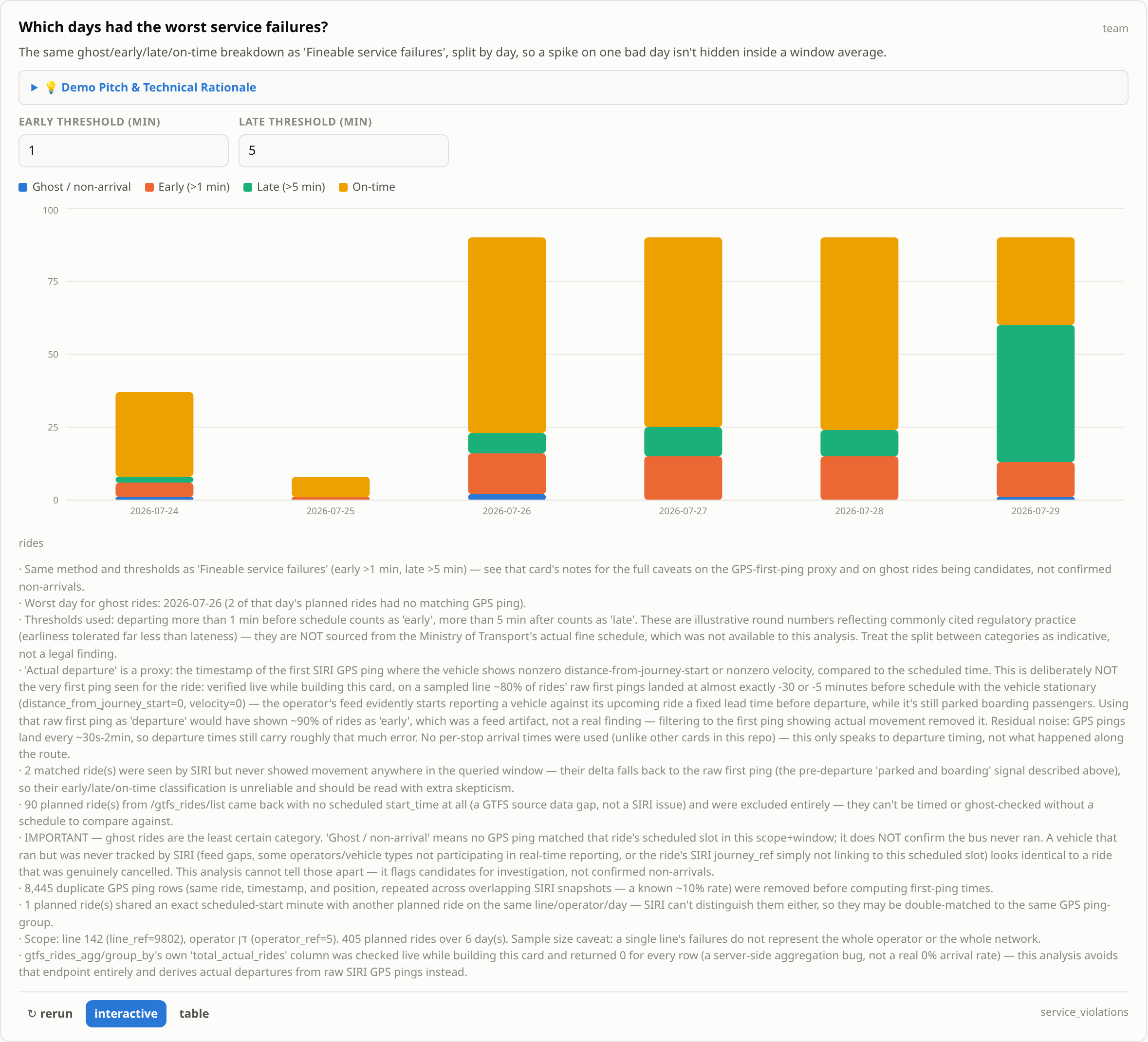
Which days had the worst service failures — screenshot of the hackathon dashboard card.
How it works
Identical method and thresholds to the per-line card, grouped by service date and
drawn as a stacked bar per day, with every date in the window present even when a
category is empty.
Where it could go in דאטאבוס
/gaps, directly beside the per-line breakdown.
A suggestion, not a decision — page ownership is the maintainers'.
Known limitations
Inherits every caveat of the per-line card — the same invented thresholds and the same ghost-vs-untracked ambiguity. A day where SIRI ingestion was degraded looks identical to a day of mass cancellations, which matters more here than in the aggregate view because a single day has no averaging to soften it.
Suggested next steps
Add a feed-health floor: cross-check each day against network-wide SIRI volume and grey out days where ingestion was clearly degraded, rather than reporting them as service failures.
Status
The research is done and the numbers exist — a working implementation runs in the
hackathon repo against the live Stride API. What is missing is a production-shaped
version in this app.
Credit & provenance
Found during the hasadna Open Bus hackathon, July 2026 — analysis by the hackathon team.
· Method, evidence and caveats: algorithms/service-violations.md
· Original work: https://github.com/hasadna/open-bus-hackathon-26
· Issue drafts and the full defect list: algorithms/upstream-issues.md
What it answers
The same ghost / early / late / on-time breakdown, split by day, so a spike on one bad day is not hidden inside a window average.
Which days had the worst service failures — screenshot of the hackathon dashboard card.
How it works
Identical method and thresholds to the per-line card, grouped by service date and
drawn as a stacked bar per day, with every date in the window present even when a
category is empty.
Where it could go in דאטאבוס
/gaps, directly beside the per-line breakdown.A suggestion, not a decision — page ownership is the maintainers'.
Known limitations
Inherits every caveat of the per-line card — the same invented thresholds and the same ghost-vs-untracked ambiguity. A day where SIRI ingestion was degraded looks identical to a day of mass cancellations, which matters more here than in the aggregate view because a single day has no averaging to soften it.
Suggested next steps
Add a feed-health floor: cross-check each day against network-wide SIRI volume and grey out days where ingestion was clearly degraded, rather than reporting them as service failures.
Status
The research is done and the numbers exist — a working implementation runs in the
hackathon repo against the live Stride API. What is missing is a production-shaped
version in this app.
Credit & provenance
Found during the hasadna Open Bus hackathon, July 2026 — analysis by the hackathon team.
· Method, evidence and caveats:
algorithms/service-violations.md· Original work: https://github.com/hasadna/open-bus-hackathon-26
· Issue drafts and the full defect list:
algorithms/upstream-issues.md