-
Notifications
You must be signed in to change notification settings - Fork 3.5k
Closed
Labels
Feature RequestShould be a discussionShould be a discussionUXUser experience related bugUser experience related bug
Description
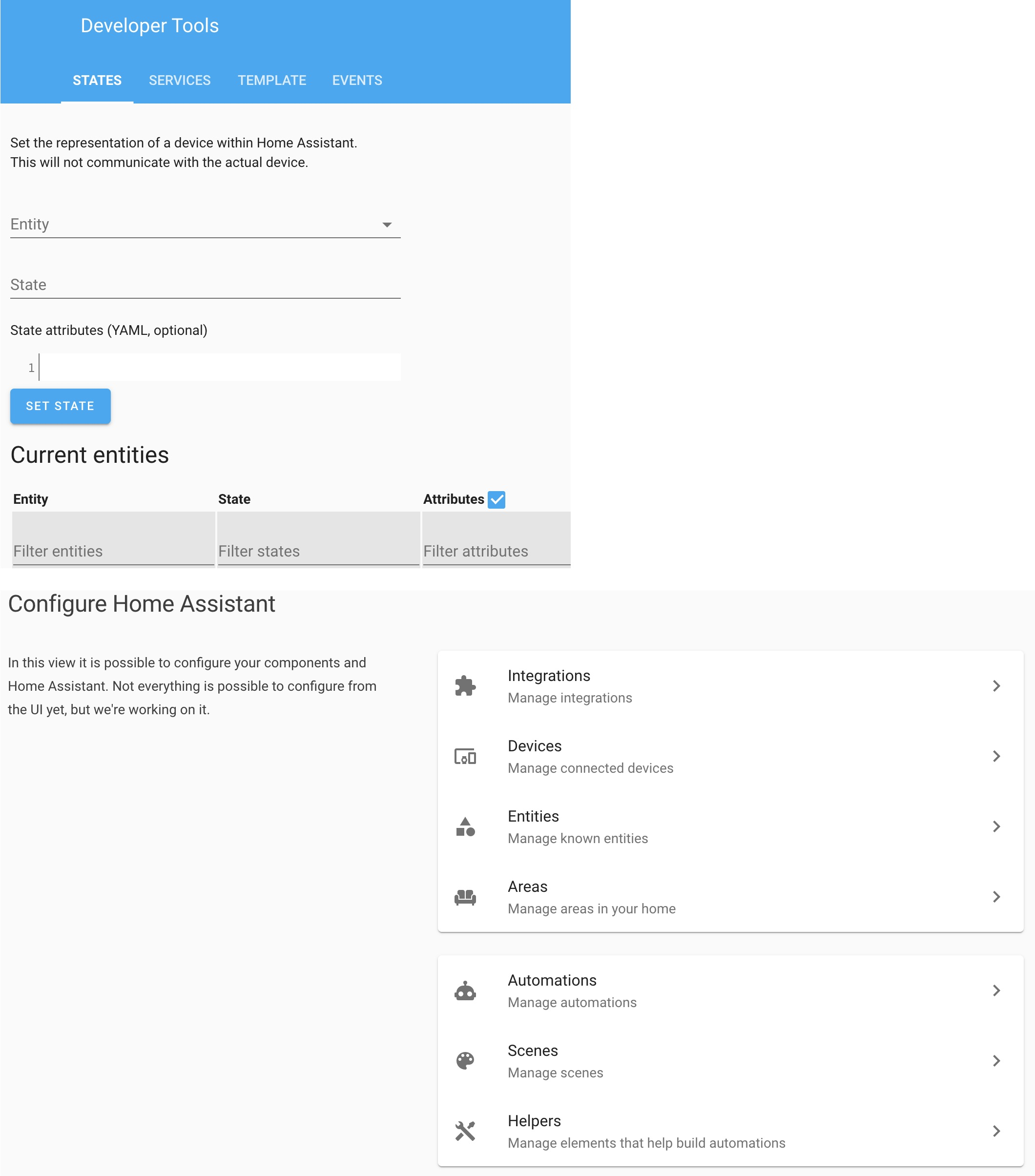
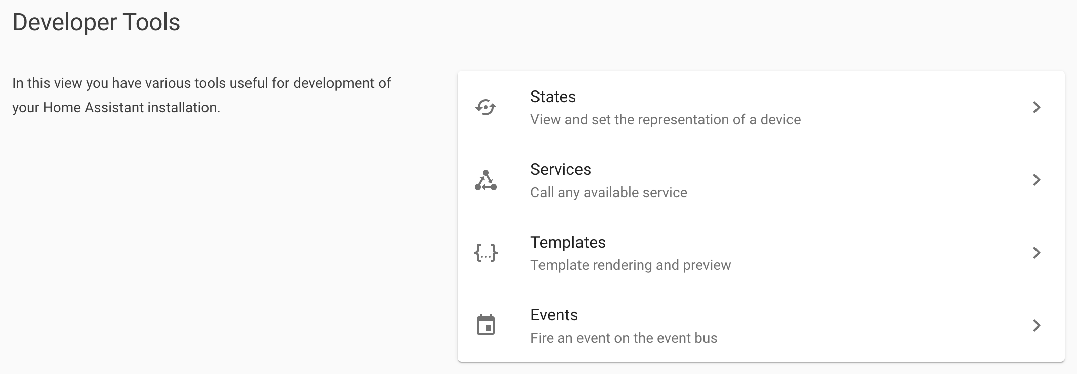
Bring visual alignment between developer and configuration menus
It would be great to have a similar look and feel between the Developer and the Configuration Menus. It currently looks like these two were designed by completely different teams (which could be entirely possible).
While being cognizant that the overall design should not make too many clicks to get to the services tab, but this would only add one click to get to the services screen
The alternatives
Additional information
I have the Chrome Inspect window open but can’t copy the HTML code because of what I think are these shadow-root errors. If anyone knows how to fix this, LMK.
Misiu and SNoof85
Metadata
Metadata
Assignees
Labels
Feature RequestShould be a discussionShould be a discussionUXUser experience related bugUser experience related bug

