If we see the picture below, seems like there is something weird about the symbology
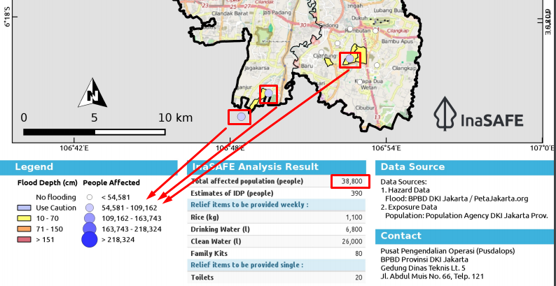
As we know, the circle on the map representing the number of people affected in every village.
In the picture above, we can see 3 blue circles on the map.
Refers to the map legend, that circle represents 54K - 109K people affected.
But, as the information from InaSAFE Analysis result, apparently just 38K people affected.
@lucernae maybe you can explain it? or there is a mistake in the realtime system?
Thank you.

If we see the picture below, seems like there is something weird about the symbology

As we know, the circle on the map representing the number of people affected in every village.
In the picture above, we can see 3 blue circles on the map.
Refers to the map legend, that circle represents 54K - 109K people affected.
But, as the information from InaSAFE Analysis result, apparently just 38K people affected.
@lucernae maybe you can explain it? or there is a mistake in the realtime system?
Thank you.