Replies: 3 comments 3 replies
-
|
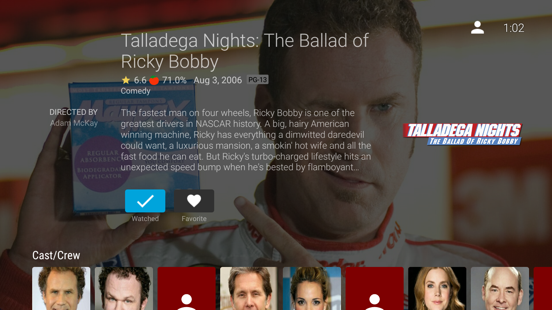
70% opacity is the first one that is readable for me |
Beta Was this translation helpful? Give feedback.
-
|
I think maintaining consistency with web would be desirable (go with 86%). |
Beta Was this translation helpful? Give feedback.
-
|
Iirc the original ATV design had the text itself have another background behind just it so that is probably why we have a lighter overall opacity |
Beta Was this translation helpful? Give feedback.
-
|
Yes the first "row" (pretty much fills the complete screen) had a separate background but it looked really weird and the animation started to bug out at some point so I removed it. |
Beta Was this translation helpful? Give feedback.
-
|
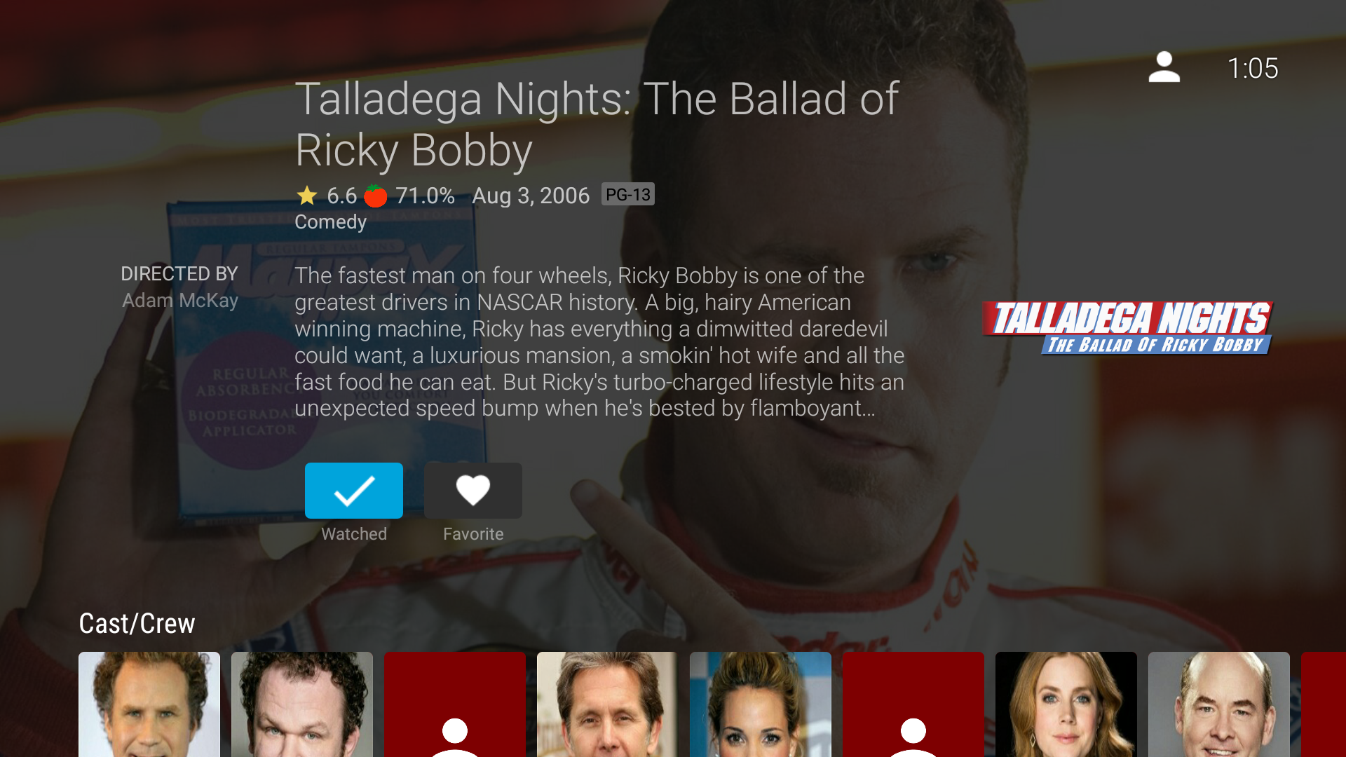
I opened a PR (#983) changing it to 80% as a middle ground. We can adjust it further if needed. |
Beta Was this translation helpful? Give feedback.
-
|
Looks good, I'll merge this one and we can always change it again in another PR if necessary. |
Beta Was this translation helpful? Give feedback.
Uh oh!
There was an error while loading. Please reload this page.
-
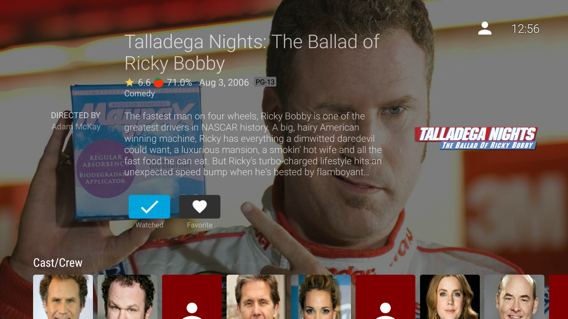
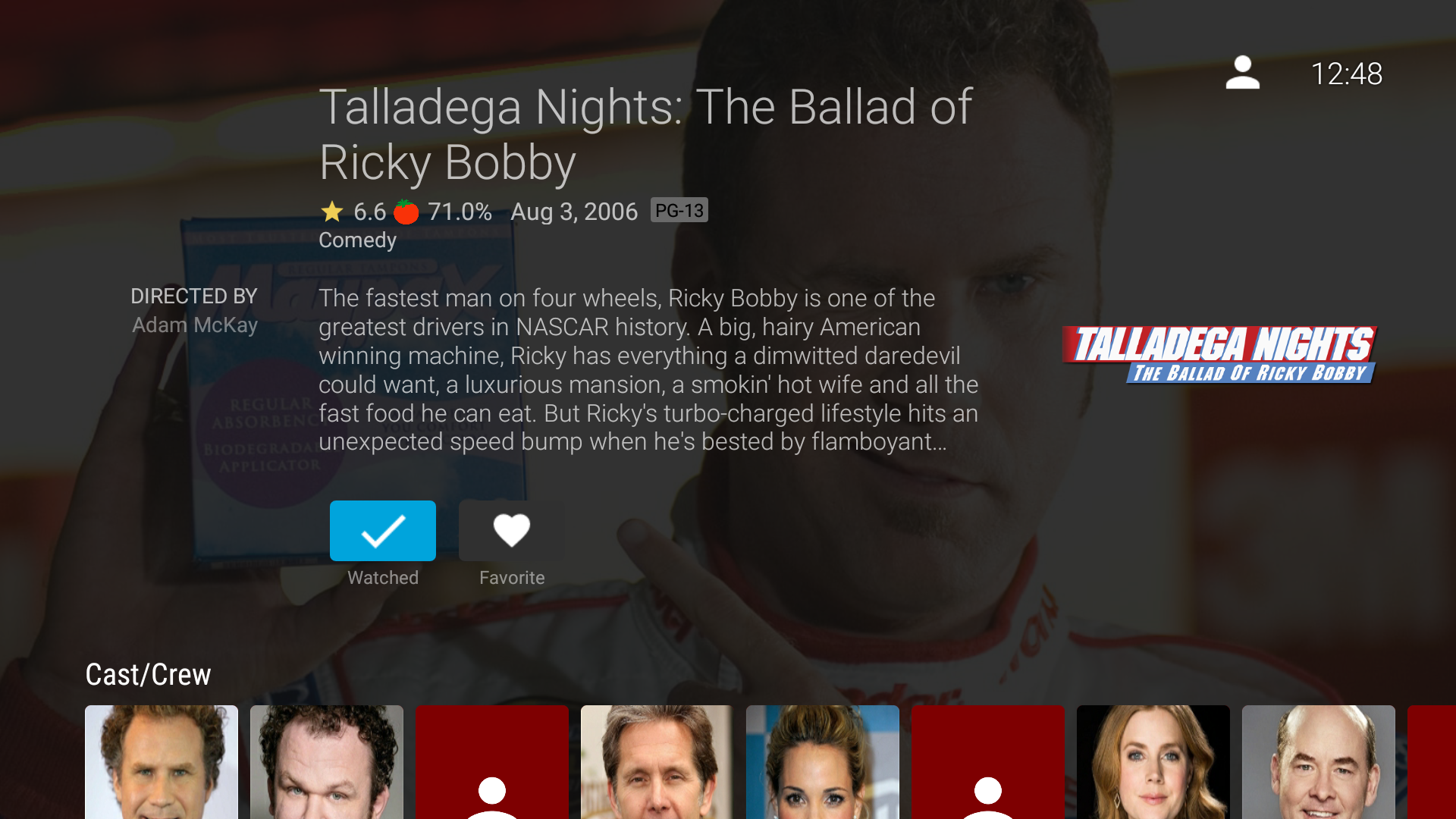
I find the current overlay color used for backdrop images makes text very hard to read. We currently only use 55% opacity pure black for the overlay. In comparison web uses 86% opacity and the normal (almost but not quite black) background color.
I believe it would be best from a design stand point for us to use the same background color that we use normally instead of pure black. Although I am not a designer so I could be wrong on that. 😂
I do think we should be at least at 80% opacity though to improve readability based on the comparisons I did below.
55% Opacity Black (current)

55% Opacity
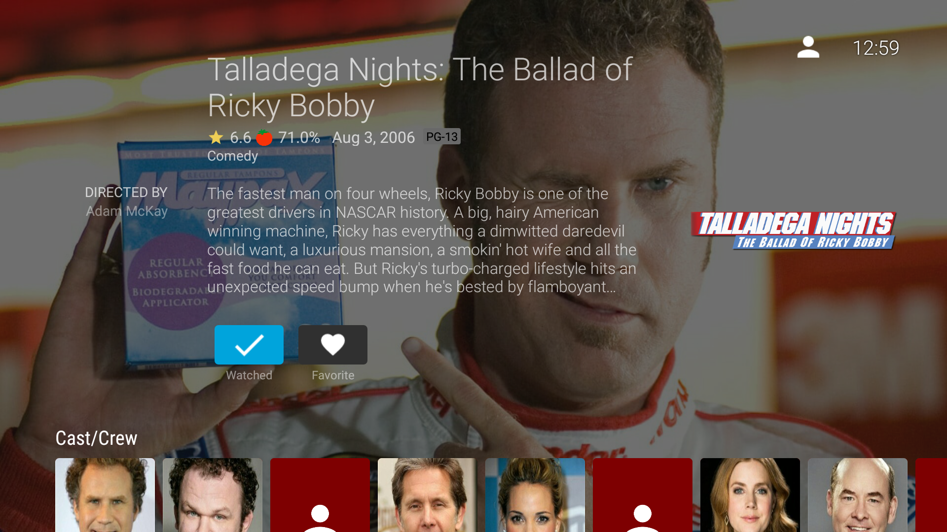
60% Opacity
70% Opacity
80% Opacity
86% Opacity (used in web)
Beta Was this translation helpful? Give feedback.
All reactions