Description
Is your feature request related to a problem? Please describe.
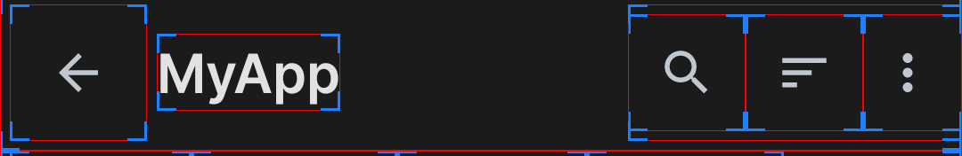
According to the Material Design 3 docs, this is how a Top App Bar should be laid out:

There should be 16dp of spacing from the edge of the screen to the icon, and each icon should be spaced 24dp apart.
MaterialToolbar (which is based on AppCompat Toolbar) is inconsistent with this design for three reasons:
- The overflow icon has a
minWidthof 36dp. It should be 48dp. - The navigation icon is also sized strangely, with it taking up 56dp instead of 48dp.
- The toolbar does not pad correctly. While the navigation icon seems to be padded right, the action buttons have no padding whatsoever. The Toolbar does apply padding on tablet layouts, but not only is it 8dp, it is also applied to the already-padded navigation icon.
Describe the solution you'd like
I want the library to override the Toolbar styles to remove these inconsistencies. I would bring this over to the core AppCompat libraries, but I imagine that these quirks exist due to compat reasons, so I feel like it would be better if such was overridden in the material design library.
Describe alternatives you've considered
I've figured out how to implement this myself using some ugly hacks.
To resize the overflow icon, I redefined actionOverflowButtonStyle to this:
<style name="Widget.MyApp.Button.Overflow" parent="@style/Widget.AppCompat.ActionButton.Overflow">
    <!-- 48dp + no padding hacks -->
    <item name="android:minWidth">48dp</item>
    <item name="android:minHeight">48dp</item>
    <item name="android:paddingStart">0dp</item>
    <item name="android:paddingEnd">0dp</item>
</style>
To resize the navigation icon, I redefined toolbarNavigationButtonStyle to this:
<style name="Widget.MyApp.Button.Navigation" parent="@style/Widget.AppCompat.Toolbar.Button.Navigation">
    <!-- Can't change the height, but we can change the width -->
    <item name="android:minWidth">48dp</item>
</style>
To resolve the padding issue, I defined a custom toolbar style to this in a plain values folder:
<style name="Widget.MyApp.Toolbar" parent="">
    <!-- Navigation icon already pads correctly, do not pad it -->
    <item name="android:layout_marginEnd">4dp</item>
</style>
And then defined the same style as this in values-sw600dp:
<style name="Widget.MyApp.Toolbar" parent="">
    <!-- Remove the 8dp navigation padding (navigation icon already pads correctly) -->
    <item name="android:layout_marginStart">-8dp</item>
    <!-- Remove half of the 8dp navigation padding (keep 4dp) -->
    <item name="android:layout_marginEnd">-4dp</item>
</style>
This causes the toolbar to go from this:
To this:

Which I feel is much more consistent with the Material Design guidelines.
Additional context
I don't know what the reasoning is behind this. I hope it is simply some legacy cruft that this library can clear out. If this isn't possible, I'm fine with my hacks to fix this.