Hard to read UI guide #4669
Description
Note from the teaching team: This bug was reported during the Part II (Evaluating Documents) stage of the PE. You may reject this bug if it is not related to the quality of documentation.
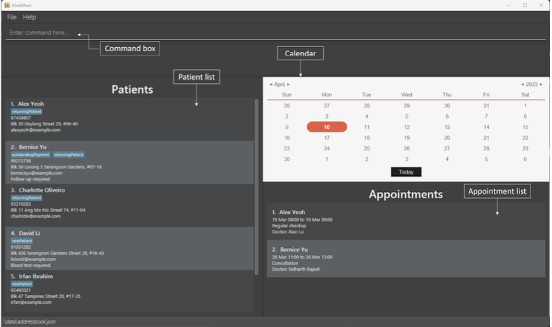
It is quite hard to identify where the arrows are pointing to in the image depicting sections of the UG. Would it be better to box up the sections to make it clearer?
[original: nus-cs2103-AY2223S2/pe-interim#4668] [original labels: severity.VeryLow type.DocumentationBug]