Popover contrast in darkmode #2174
Description
Just something for you to consider.
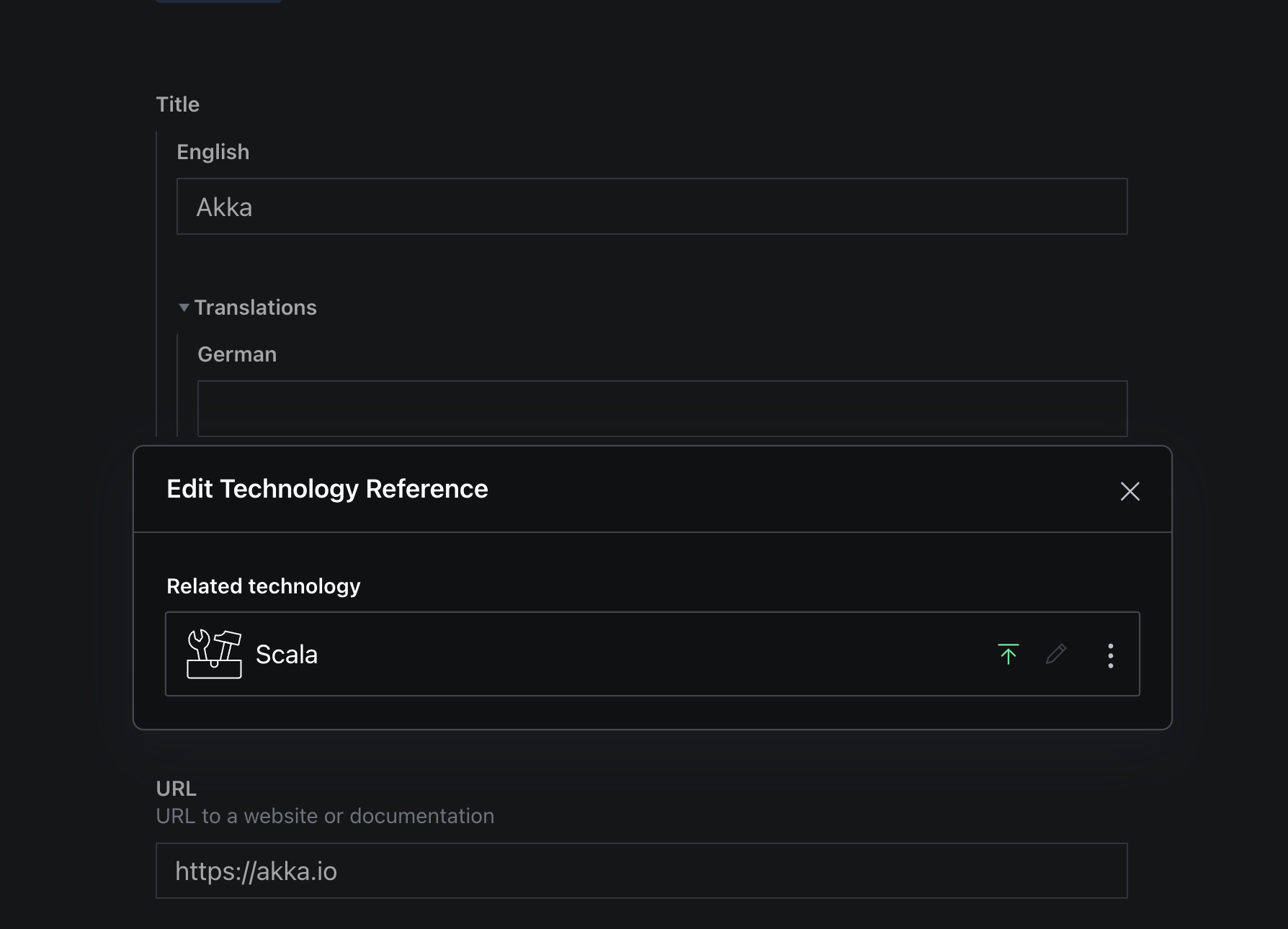
I have been entering massive amounts of content in sanity studio over the last few weeks. It happened to me multiple times that I simply didn't realise that there is a popover open and clicked on the background, getting confused for a second why nothing happens.
I think the contrast between popover and background is a bit too low in dark mode, it is sometimes hard to make a distinction between the background and the popover itself. Depending on the environment (physical env, little bit of sun here and there..) it's almost impossible to see the borders of the popovers. The grey almost entirely fades into black.
Some ideas:
- brighten the popover's borders
- dim the background even further
- add some accent color to pull focus
- indicate some sort of depth (which is hard with shadows on black, I realise that :P )
- make the popover bg dark grey to suggest depth
- make the left border 4px or some other kind of accent that clearly sets it apart from the rest of the form
Granted, I am 41 and my eyesight is probably lacking by looking at screens for 25 years ;-) but I think this is something not just "old" people like me would appreciate.
Not sure if this is the case for everybody but on the first glance, at least for me, there is no real obvious distinction between background and popover. The contrast declines very quickly with just a little bit of stray light from a window. It's only really obvious in perfect lighting conditions.
Cheers!