Stronger distinction between selected and unselected tabs #100
Description
Hey,
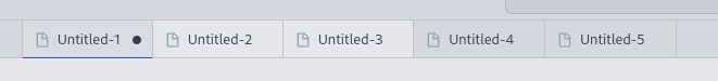
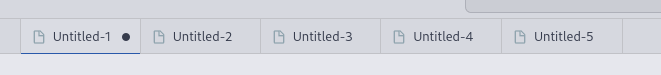
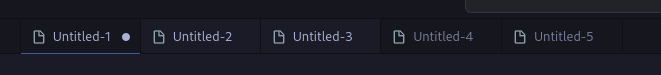
currently, the difference between selected and unselected tabs is only a small increase of brightness of the foreground color, see images. In there, the first tab is always currently opened, the second and third were previously selected via ctrl + click and the last two are unselected.
Tokyo Night:

Tokyo Night Storm:

Tokyo Night Light:
This is pretty hard to distinguish with different qualities of monitors (and sometimes even with better ones), especially with many open tabs in different rows. Could we maybe have some stronger distinction here, e.g. by introducing some background highlighting for selected tabs?
One can already change this individually with some combination of "tab.activeBackground", "tab.selectedBackground", and "tab.selectedForeground", but maybe we can find some better defaults if I'm not the only one having this issue, that is. Tokyo Night Light already has "tab.selectedBackground", but the difference is too minor.
Here are some examples for improvement. All these settings below use the editor background as selected tab background to be consistent with the theme.
"workbench.colorCustomizations": {
    "[Tokyo Night]": {
        "tab.selectedBackground": "#1a1b26",
    },
}
Tokyo Night Storm:
"workbench.colorCustomizations": {
    "[Tokyo Night Storm]": {
        "tab.selectedBackground": "#24283b",
    }
}
Tokyo Night Light:
"workbench.colorCustomizations": {
    "[Tokyo Night Light]": {
        "tab.selectedBackground": "#e6e7ed",
    }
}