Implement PickerAvoidingView and PickerStateProvider #8
There are no files selected for viewing
| Original file line number | Diff line number | Diff line change |
|---|---|---|
| @@ -0,0 +1,46 @@ | ||
| import React, { Component } from 'react'; | ||
| import { StyleSheet, View } from 'react-native'; | ||
| import { PickerStateContext } from '../PickerStateProvider'; | ||
| import { IOS_MODAL_HEIGHT } from '../constants'; | ||
| import PropTypes from 'prop-types'; | ||
|
|
||
| /** | ||
| * PickerAvoidingView is a React component that adjusts the view layout to avoid | ||
| * being covered by an open iOS picker modal. It's meant to be similar to | ||
| * the built-in KeyboardAvoidingView component, but specifically tailored for | ||
| * iOS picker modals. | ||
| * | ||
| * In order for this component to work correctly, all the pickers and the | ||
| * PickerAvoidingView should have a PickerStateProvider ancestor. | ||
| * | ||
| * @param {React.ReactNode} props.children - The child components that should be | ||
| * protected from obstruction by the picker modal | ||
| */ | ||
| export class PickerAvoidingView extends Component { | ||
| static propTypes = { | ||
| enabled: PropTypes.bool, | ||
| }; | ||
|
|
||
| static defaultProps = { | ||
| enabled: true, | ||
| }; | ||
|
|
||
| render() { | ||
| const { enabled, style, ...viewProps } = this.props; | ||
|
|
||
| return ( | ||
| <PickerStateContext.Consumer> | ||
jakub-trzebiatowski marked this conversation as resolved.
Show resolved
Hide resolved
|
||
| {(context) => { | ||
| const isModalShown = context && context.isModalShown; | ||
| const effectiveStyle = enabled | ||
| ? StyleSheet.compose(style, { | ||
| paddingBottom: isModalShown ? IOS_MODAL_HEIGHT : 0, | ||
| }) | ||
| : style; | ||
|
|
||
| return <View style={effectiveStyle} {...viewProps} />; | ||
| }} | ||
| </PickerStateContext.Consumer> | ||
| ); | ||
| } | ||
| } | ||
| Original file line number | Diff line number | Diff line change |
|---|---|---|
| @@ -0,0 +1,15 @@ | ||
| import React from 'react'; | ||
| import { View } from 'react-native'; | ||
|
|
||
| /** | ||
| * As, currently, only on iOS the picker's modal resembles the software keyboard | ||
| * in any way, the default implementation doesn't have any avoiding logic. | ||
| * | ||
| * @param {React.ReactNode} props.children - The child components to render | ||
| * within the PickerAvoidingView. | ||
| */ | ||
| export function PickerAvoidingView(props) { | ||
| // eslint-disable-next-line no-unused-vars | ||
| const { enabled, ...viewProps } = props; | ||
| return <View {...viewProps} />; | ||
| } |
| Original file line number | Diff line number | Diff line change |
|---|---|---|
| @@ -0,0 +1,43 @@ | ||
| import React from 'react'; | ||
|
|
||
| /** | ||
| * @typedef {Object} PickerStateData | ||
| * @property {boolean} isModalOpen - Indicates whether a picker-related modal is | ||
| * currently being shown. Note that currently modal is opened for pickers only | ||
| * on iOS. | ||
| * | ||
| * PickerStateContext is a context that gives access to PickerStateData. | ||
| */ | ||
| export const PickerStateContext = React.createContext(); | ||
|
|
||
| /** | ||
| * PickerStateProvider provides PickerStateContext and manages the necessary | ||
| * state. | ||
| * | ||
| * This component should be used as a single top-level provider for all picker | ||
| * instances in your application. | ||
| */ | ||
| export class PickerStateProvider extends React.Component { | ||
| constructor(props) { | ||
| super(props); | ||
|
|
||
| this.state = { | ||
| isModalShown: false, | ||
| }; | ||
| } | ||
|
|
||
| render() { | ||
| const context = { | ||
| isModalShown: this.state.isModalShown, | ||
| setIsModalShown: (isModalShown) => { | ||
| this.setState({ isModalShown }); | ||
| }, | ||
| }; | ||
|
|
||
| return ( | ||
| <PickerStateContext.Provider value={context}> | ||
| {this.props.children} | ||
| </PickerStateContext.Provider> | ||
| ); | ||
| } | ||
| } |
| Original file line number | Diff line number | Diff line change |
|---|---|---|
| @@ -0,0 +1,3 @@ | ||
| // Measuring the modal before rendering is not working reliably, so we need to hardcode the height | ||
| // This height was tested thoroughly on several iPhone models (iPhone SE, from iPhone 8 to 14 Pro, and 14 Pro Max) | ||
| export const IOS_MODAL_HEIGHT = 262; | ||
jakub-trzebiatowski marked this conversation as resolved.
Show resolved
Hide resolved
|
||
| Original file line number | Diff line number | Diff line change |
|---|---|---|
|
|
@@ -5,16 +5,17 @@ import isEqual from 'lodash.isequal'; | |
| import { Picker } from '@react-native-picker/picker'; | ||
| import { defaultStyles } from './styles'; | ||
| import { Dimensions } from 'react-native'; | ||
| import { PickerAvoidingView } from './PickerAvoidingView'; | ||
| import { PickerStateContext, PickerStateProvider } from './PickerStateProvider'; | ||
| import { IOS_MODAL_HEIGHT } from './constants'; | ||
|
|
||
| const preserveSpaces = (label) => { | ||
| return label.replace(/ /g, '\u00a0'); | ||
| }; | ||
|
|
||
| export default class RNPickerSelect extends PureComponent { | ||
| static contextType = PickerStateContext; | ||
|
|
||
| static propTypes = { | ||
| onValueChange: PropTypes.func.isRequired, | ||
| items: PropTypes.arrayOf( | ||
|
|
@@ -245,23 +246,34 @@ export default class RNPickerSelect extends PureComponent { | |
| // If TextInput is below picker modal, scroll up | ||
| if (textInputBottomY > modalY) { | ||
| this.props.scrollViewRef.current.scrollTo({ | ||
| // Add 10 pixels for a more visually pleasant effect | ||
| y: textInputBottomY + 10 - modalY + this.props.scrollViewContentOffsetY, | ||
|
There was a problem hiding this comment. can you share 2 videos to clarify difference?
Author
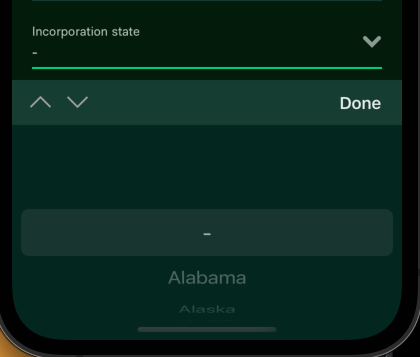
There was a problem hiding this comment. It's just a small padding, which is "accidentally" the same as we use in Expensify. It just looks a bit better. After the scroll happens, this is how it looks now:
How it looked before:
Author
There was a problem hiding this comment. Relevant line in Expensify: https://github.com/Expensify/App/blob/main/src/components/Form.js#L357 |
||
| }); | ||
| } | ||
| }); | ||
| } | ||
|
|
||
| triggerCallbacks() { | ||
| const { onOpen, onClose } = this.props; | ||
| const { showPicker } = this.state; | ||
|
|
||
| if (!showPicker && onOpen) { | ||
| onOpen(); | ||
| } | ||
|
|
||
| if (showPicker) { | ||
| if (onClose) { | ||
| onClose(); | ||
| } | ||
|
|
||
| // If the picker is currently shown, toggling it will start closing | ||
| // the modal on iOS. Let's handle this here, instead on relying on | ||
| // Modal's onDismiss, because onDismiss is fired _after_ the modal | ||
| // closing animation ends. PickerAvoidingView behaves better | ||
| // (visually) when it adjusts right after the modal closing starts. | ||
| if (this.context) { | ||
| this.context.setIsModalShown(false); | ||
| } | ||
| } | ||
| } | ||
|
|
||
|
|
@@ -291,7 +303,7 @@ export default class RNPickerSelect extends PureComponent { | |
| return; | ||
| } | ||
|
|
||
| this.triggerCallbacks(); | ||
|
|
||
| if (Keyboard.isVisible()) { | ||
| const keyboardListener = Keyboard.addListener('keyboardDidHide', () => { | ||
|
|
@@ -481,6 +493,13 @@ export default class RNPickerSelect extends PureComponent { | |
| supportedOrientations={['portrait', 'landscape']} | ||
| onOrientationChange={this.onOrientationChange} | ||
| {...modalProps} | ||
| onShow={() => { | ||
| if (this.context) { | ||
| this.context.setIsModalShown(true); | ||
| } | ||
|
Comment on lines
+497
to
+499
Member
There was a problem hiding this comment. If we show the Modal, |
||
|
|
||
| this.scrollToInput(); | ||
| }} | ||
| > | ||
| <TouchableOpacity | ||
| style={[defaultStyles.modalViewTop, style.modalViewTop]} | ||
|
|
@@ -635,4 +654,4 @@ export default class RNPickerSelect extends PureComponent { | |
| } | ||
| } | ||
|
|
||
| export { defaultStyles, PickerStateProvider, PickerAvoidingView }; | ||

Uh oh!
There was an error while loading. Please reload this page.