
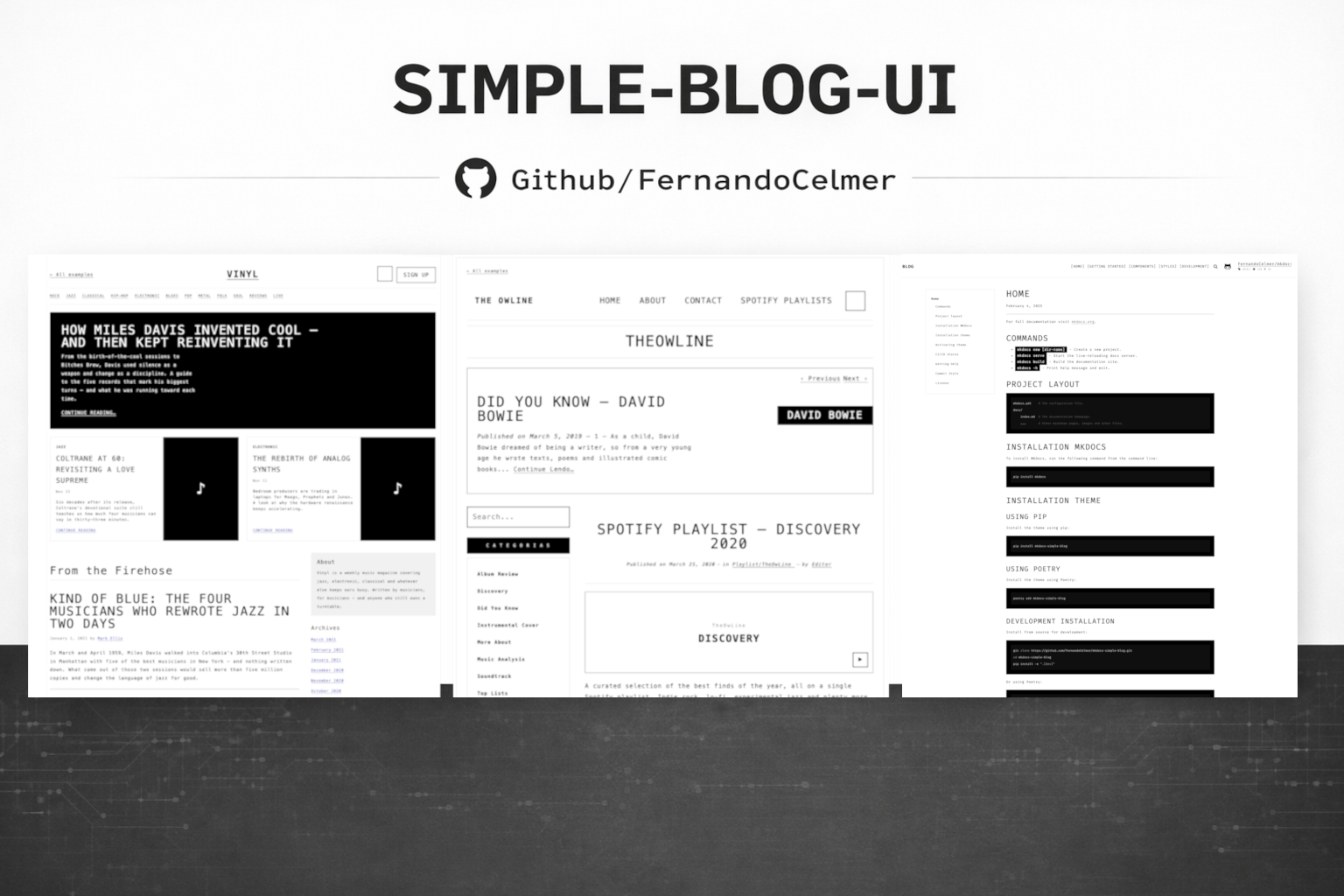
The UI kit for your terminal-style blog.
A framework-agnostic component library built with Lit — drop it into plain HTML, React, or Vue and get 45 Web Components styled after mkdocs-simple-blog: Fira Mono, uppercase, 2px borders, zero rounded corners. The kind of UI that looks like it was typeset on a Selectric.


📖 Live Storybook: fernandocelmer.github.io/simple-blog-ui
- One lib, three stacks. Web Components are native — write them once, use them everywhere.
- Opinionated design, zero configuration. The whole kit follows a single aesthetic: monospace terminal chic. No theme configuration required to look good.
- Dark mode baked in. Flip
data-theme="dark"on<html>and every component inverts correctly. - Syntax highlighting included.
<sb-code>auto-highlights JavaScript, Python, Bash, JSON, HTML and 30+ more languages via highlight.js. - Tiny. ~5KB Lit runtime + per-component shadow DOM. No global CSS-in-JS bloat.
- React-first DX. Official PascalCase wrappers via
simple-blog-ui/reactturn custom events (sb-click,sb-change) into native React handlers (onClick,onChange). - Blog-ready. Includes a dedicated Blog category with layout, sidebar, footer and prev/next primitives — drop-in building blocks for a documentation site.
npm install simple-blog-ui<script type="module">
import 'simple-blog-ui';
</script>
<link rel="stylesheet" href="node_modules/simple-blog-ui/src/styles/main.css" />
<sb-button variant="primary">Click me</sb-button>import { Button, Input, Alert } from 'simple-blog-ui/react';
import 'simple-blog-ui/style.css';
export default function App() {
return (
<>
<Button variant="primary" onClick={() => alert('hi')}>Click me</Button>
<Input label="Email" onInput={(e) => console.log(e.detail.value)} />
<Alert variant="success" title="Saved">Done.</Alert>
</>
);
}<script setup>
import 'simple-blog-ui';
import 'simple-blog-ui/style.css';
</script>
<template>
<sb-button variant="primary" @sb-click="onClick">Click me</sb-button>
</template>Tell Vue that sb-* is a custom element — add to your vite.config:
vue({ template: { compilerOptions: { isCustomElement: (t) => t.startsWith('sb-') } } })45 components · 9 categories · all in the same minimalist style.
| Category | Count | Components |
|---|---|---|
| actions | 4 | sb-button · sb-icon-button · sb-button-group · sb-close-button |
| typography | 3 | sb-heading · sb-text · sb-code |
| layout | 3 | sb-container · sb-stack · sb-divider |
| display | 9 | sb-card · sb-avatar · sb-badge · sb-tag · sb-accordion · sb-collapse · sb-list-group · sb-carousel · sb-table |
| forms | 4 | sb-input · sb-textarea · sb-checkbox · sb-switch |
| feedback | 4 | sb-alert · sb-spinner · sb-progress · sb-toast |
| navigation | 6 | sb-link · sb-tabs · sb-nav · sb-navbar · sb-breadcrumb · sb-pagination |
| overlays | 5 | sb-modal · sb-tooltip · sb-dropdown · sb-offcanvas · sb-popover |
| blog 🆕 | 7 | sb-page-layout · sb-sidebar · sb-footer · sb-prev-next · sb-post-list · sb-profile · sb-error-page |
Play with every single one in the Storybook.
The blog category provides the building blocks for a documentation-style site (used in production by mkdocs-simple-blog):
| Component | What it does |
|---|---|
<sb-page-layout> |
Max-width container + 25/75 sidebar/content grid. Collapses to one column on mobile. |
<sb-sidebar> |
Nested TOC — pass items as JSON (supports unlimited depth). |
<sb-footer> |
Centered footer section with top border and stacked items. |
<sb-prev-next> |
3-column prev/next post navigation. |
<sb-post-list> |
Post index with date + title columns. |
<sb-profile> |
Centered about page — name, role, bio slot, social links. |
<sb-error-page> |
404/500 with oversized code + message and action slot. |
Custom events map to standard React props. The CustomEvent payload lives at event.detail.
| React prop | Components |
|---|---|
onClick |
Button · IconButton |
onChange |
Input · Checkbox · Switch · Accordion |
onInput |
Input · Textarea |
onClose |
Modal · Offcanvas · Toast · CloseButton |
onSelect |
Dropdown · ListGroup |
onPageChange |
Pagination |
onTabChange |
Tabs |
onDismiss |
Alert |
onRemove |
Tag |
onToggle |
Collapse |
onSlide |
Carousel |
Two themes out of the box. Toggle with a single attribute:
<html data-theme="dark">Every component reads its colors and spacing from CSS custom properties defined in root.css. Override any of them to re-theme globally:
:root {
  --primary: #1e40af;        /* change primary accent */
  --color-red: #b91c1c;      /* change error color */
  --background: #fef3c7;     /* change page background */
}
Core tokens (inherited verbatim from mkdocs-simple-blog):
--text: #000        --color-blue:   #4051b5
--title: #000       --color-green:  #4cae4f
--primary: #000     --color-yellow: #f1dc15
--background: #fff  --color-orange: #ffa724
--color-gray: #808080
                    --color-purple: #ab47bd
--color-red: #ff2c06Every component has a live Storybook page with HTML / React / Vue code tabs, interactive controls, and the full set of variants.
npm install
npm run storybook   # opens http://localhost:6006
Three usage guides inside Storybook: Usage / HTML, Usage / React, Usage / Vue — plus Design / Colors and Design / Typography for the full token map.
npm run storybook        # dev server at :6006
npm run build            # library build (ESM + CJS)
npm run build-storybook  # static Storybook site
npm pack # produce a local tarball for testingThe lib is built with Lit, which compiles to standard Web Components — native browser APIs. That means:
- No framework lock-in. A
<sb-button>is just an HTML element with Shadow DOM. It works in React, Vue, Svelte, Solid, Angular, plain HTML, or any future framework. - Scoped styles. Shadow DOM isolates each component's CSS — no class name collisions, no global leaks.
- Tiny runtime. Lit is ~5KB gzip, loaded once for the whole library. No per-component bundle bloat.
- Future-proof. Web Components are a W3C standard. Your investment survives framework churn.
| Library | Distribution | Design system | Dark mode | Frameworks | Blog primitives |
|---|---|---|---|---|---|
| simple-blog-ui | npm (ESM + CJS) | Monospace, B&W, 2px borders | ✅ built-in | HTML · React · Vue | ✅ Page layout · TOC · Prev/Next |
| Shoelace | npm | Modern, rounded | ✅ | all via WC | ❌ |
| MUI | npm | Material Design | ✅ | React only | ❌ |
| Chakra UI | npm | Clean, rounded | ✅ | React only | ❌ |
| shadcn/ui | copy-paste | Opinionated | ✅ | React only | ❌ |
When to pick simple-blog-ui — you want a clean, opinionated monospace/terminal aesthetic, your app or blog is documentation-centric, or you want one lib that works across React and Vue without rewrites.
Does it work with Next.js / Nuxt? Yes. Register the components client-side (Next: in a client component; Nuxt: via a .client.ts plugin). Both frameworks support Web Components.
What about SSR? Components render in the browser (Shadow DOM is client-side). The server sends the <sb-*> tags, the client hydrates. For pre-rendered HTML you can use Lit SSR separately — not included here.
Is it tree-shakeable? Individual components can be imported per-file in the React wrapper layer (import { Button } from 'simple-blog-ui/react'). The Web Component registrations in the main entry are side-effect imports — the full set is ~96KB gzipped.
Can I theme it? Yes. All colors, fonts, spacing come from CSS custom properties. Override on :root to re-theme globally or on any parent for scoped overrides.
Is there a Figma kit? Not yet.
How do I contribute? Open an issue or PR at github.com/FernandoCelmer/simple-blog-ui.
Born as a React/Vue companion to mkdocs-simple-blog. Built with Lit and highlight.js. React wrappers generated via @lit/react. Documented with Storybook.
MIT — Fernando Celmer