


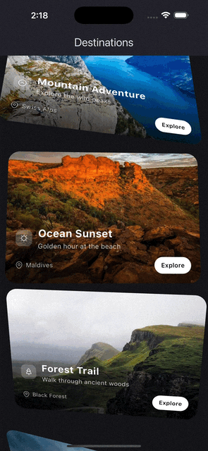
Physics-first Flutter animations with a composable, timeline-driven API for building polished transitions, expressive UI motion, and reusable animation systems without wiring imperative controllers through your widget tree.
source |
source |
source |
source |
source |
source |
source |

source |
source |

source |
source |
source |
source |
Cue separates animation into a few small pieces:
Cuedecides when an animation should run.Actordecides which widget is animated.Actdescribes the effect that is applied.CueMotiondescribes how it moves, whether that is spring-based or timed with a curve.Keyframesdescribe multi-step motion.
That separation keeps animation code readable, reusable, and easy to scale across a subtree.
Cue.onMount(
  motion: .smooth(),
  child: Actor(
    acts: [
      .fadeIn(),
      .slideY(from: 0.2),
      .scale(from: 0.96),
    ],
    child: const Text('Hello Cue'),
  ),
)
For a single animated child, you can skip the explicit Actor and pass acts directly to Cue:
Cue.onMount(
  motion: .smooth(),
  acts: [
    .fadeIn(),
    .slideY(from: 0.2),
  ],
  child: const Text('Hello Cue'),
)
If you are exploring animations during development, enable CueDebugTools right after you get the basic setup working. It gives you a scrubber for completed Cue animations and is best wrapped in a kDebugMode check:
MaterialApp(
  builder: (context, child) {
    if (kDebugMode) {
      return CueDebugTools(child: child!);
    }
    return child!;
  },
)Cue publishes a CueController to its subtree through CueScope. Any Actor below it can use it to build animations.
Use the factory that matches the trigger you want:
Direction matters here:
Cue.onMountplays forward when the widget is inserted into the tree. It is a one-way entrance trigger unless you opt into repeat behavior.Cue.onToggleplays forward whentoggledbecomestrue, and plays in reverse whentoggledbecomesfalse.Cue.onChangerestarts from0and plays forward each time the trackedvaluechanges. It does not reverse based on the old and new values.Cue.onHoverplays forward on pointer enter, and reverses on pointer exit.Cue.onFocusplays forward when the widget gains focus, and reverses when it loses focus.Cue.onScrollis scrubbed by scroll position. It does not simply fire forward or reverse once; progress is continuously mapped to where the widget is in the viewport.Cue.onScrollVisiblemaps visibility to animation progress. It moves forward as the widget enters the viewport and reverses as the widget exits it.Cue.onProgressis scrubbed by an external progress source. The listenable drives the current value directly, so direction depends on whether the external progress is increasing or decreasing.Cue.indexedis driven by an indexed controller. Items ahead of the active offset move forward, while items behind it move in reverse as the controller moves between indices.Cue(...)gives you full imperative control. You decide the direction by calling methods such asforward,reverse,animateTo, or by setting progress directly on your controller.
Example:
Cue.onToggle(
  toggled: isExpanded,
  motion: .smooth(),
  reverseMotion: .snappy(),
  child: Column(
    children: [
      Actor(
        acts: [.rotate(to: 180)],
        child: const Icon(Icons.expand_more),
      ),
      Actor(
        delay: 50.ms,
        acts: [.fadeIn(), .slideY(from: 0.15)],
        child: const Text('Details'),
      ),
    ],
  ),
)Actor is the visual building block. It takes a child plus one or more acts and applies them using the nearest Cue.
Important rules:
Actoris passive. Without an ancestorCue, it will throw.- One
Actorcan apply multiple acts at once. - Acts eventually resolve into nested widget wrappers around the child, so ordering matters. For example, clipping before transforming is not always the same as transforming before clipping.
- Only one act per act key is allowed in the same
Actor. For example, two slide variants in oneActorare not allowed because they share the same key. motionon an act overridesActor.motion, which overrides the parentCuemotion.
You can also attach acts inline with the widget extension:
ElevatedButton(
  onPressed: onPressed,
  child: const Text('Save'),
).act([
  .fadeIn(),
  .slideUp(),
])An Act is an immutable description of one animated property. Prefer the shorthand factories in normal app code.
Actor(
  acts: [
    .fadeIn(),
    .scale(from: 0.9),
    .slideY(from: 0.2),
  ],
  child: child,
)
The direct class constructors still exist, but the shorthand reads better and keeps call sites clean. Prefer:
.smooth()overSpring.smooth()when the type is inferred..fadeIn()overAct.fadeIn()..key(...)overKeyframe(...)..fractional([...])where shorthand is available.
This is the style Cue is designed around.
CueMotion controls timing and feel. In most UI, spring motion is the default choice because it handles interruption naturally.
Common presets:
.smooth()fast, clean, no overshoot. Best default..snappy()near-instant micro-interactions..bouncy()visible overshoot for emphasis..gentle()slower, softer motion..wobbly()exaggerated playful motion..interactive()responsive drag and hover feel..spatial()tuned for layout movement..effect()tuned for decorative changes..linear(250.ms),.easeIn(250.ms),.easeOut(250.ms)for fixed-duration timing.
Cue.onHover(
  motion: .interactive(),
  child: Actor(
    acts: [.scale(to: 1.03)],
    child: const Chip(label: Text('Hover me')),
  ),
)Use keyframes when a transition needs more than one target value.
Motion-based keyframes:
Actor(
  acts: [
    ScaleAct.keyframed(
      frames: Keyframes([
        .key(0.92),
        .key(1.06, motion: .bouncy()),
        .key(1.0),
      ], motion: .smooth()),
    ),
  ],
  child: child,
)
Fractional keyframes:
Actor(
  acts: [
    TranslateAct.keyframed(
      frames: .fractional([
        .key(const Offset(0, 24), at: 0.0),
        .key(const Offset(0, -8), at: 0.7),
        .key(Offset.zero, at: 1.0),
      ], duration: 450.ms),
    ),
  ],
  child: child,
)Cue.onMount(
motion: .smooth(),
acts: [
.fadeIn(),
.slideY(from: 0.15),
],
child: const Card(child: Padding(
padding: EdgeInsets.all(16),
child: Text('Mounted content'),
)),
)Cue.onToggle(
toggled: selected,
motion: .smooth(),
child: Actor(
acts: [
.scale(to: 1.04),
.decorate(
color: .tween(Colors.white, Colors.blue.shade50),
borderRadius: .fixed(.circular(16)),
),
],
child: child,
),
)Cue.onChange is useful when the target value changes but the trigger is not a simple boolean.
Cue.onChange(
  value: currentTab,
  motion: .smooth(),
  fromCurrentValue: true,
  acts: [
    .fadeIn(),
    .slideY(from: 0.08),
  ],
  child: Text(labels[currentTab]),
)Cue.onHover(
motion: .interactive(),
acts: [.scale(to: 1.02)],
child: Cue.onFocus(
motion: .smooth(),
acts: [.decorate(borderRadius: .fixed(.circular(14)))],
child: child,
),
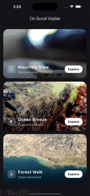
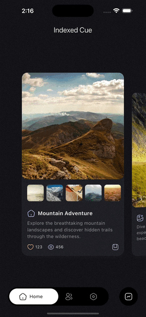
)Cue.indexed is commonly used with CuePageController, where each page gets its own indexed cue and can animate multiple children as the page moves in and out.
final controller = CuePageController(viewportFraction: 0.8);

PageView.builder(
  controller: controller,
  itemCount: pages.length,
  itemBuilder: (context, index) {
    final page = pages[index];
    return Cue.indexed(
      controller: controller,
      index: index,
      child: Column(
        mainAxisAlignment: MainAxisAlignment.center,
        children: [
          Actor(
            acts: [
              .fadeIn(),
              .slideY(from: 0.12),
            ],
            child: Text(page.title),
          ),
          Actor(
            delay: 60.ms,
            acts: [
              .scale(from: 0.96),
              .fadeIn(),
            ],
            child: Card(
              child: SizedBox(
                height: 220,
                child: Center(child: Text(page.subtitle)),
              ),
            ),
          ),
        ],
      ),
    );
  },
)Cue ships a large set of acts. Most apps can think about them in a few groups.
.scale(),.zoomIn(),.zoomOut().rotate(),.rotate3D(),.flipX(),.flipY().translate(),.translateX(),.translateY().slide(),.slideX(),.slideY(),.slideUp(),.slideDown().stretch(),.skew(),.transform().parallax()
.opacity(),.fadeIn(),.fadeOut().blur(),.focus(),.unfocus().backdropBlur().colorTint()
.sizedBox().sizedClip().fractionalSize().padding().align().clipHeight(),.clipWidth(),.clip(),.circularClip()
.decorate().textStyle().iconTheme()
.position()for stack-based layout animationCardActandCardActorPaintActandPaintActorPathMotionAct
Acts, Actors, and Cues can all contribute timing.
- Use
motionto control forward timing. - Use
reverseMotiononCueorActorwhen reverse should feel different. - Use
delayandreverseDelayto offset animation starts. - Use
ReverseBehavioron an act when reverse should target a different value or be disabled.
Actor(
  motion: .smooth(),
  reverseMotion: .linear(160.ms),
  delay: 80.ms,
  acts: [
    .fadeIn(
      reverse: .mirror(delay: 40.ms),
    ),
    .scale(
      to: 1.06,
      reverse: .to(0.98),
    ),
  ],
  child: child,
)Use the trigger factories first. Reach for controllers when you need explicit orchestration.
CueController is an AnimationController backed by a CueTimeline. It keeps Cue's motion and track system available even when you are driving animation manually.
Important differences from a normal AnimationController:
- Duration is derived from the timeline motion. You do not set
durationorreverseDurationdirectly. - The timeline manages tracks, and each track can have its own motion.
- To remove a track from the timeline, every obtainer of that track must release it.
- If you rebuild the timeline with a new default motion, previously obtained tracks become stale and must be obtained again.
Available controller types include:
CueControllerfor direct control.CuePageControllerandCueTabControllerfor navigation-driven progress.CueIndexControllerandIndexedCueControllerfor sequences and staggered lists.SelfAnimatedCuefor self-contained animation ownership.
When working manually with CueController, there are two levels of API:
- High-level: pass the controller into
Cue(controller: ...)and letActors consume it throughCueScope. - Low-level: obtain tracks with
obtainTrack,tweenTrack, orkeyframedTrackwhen you need typed imperative animations outside the normal widget helpers.
late final CueController controller;

@override
void initState() {
  super.initState();
  controller = CueController(vsync: this, motion: .smooth());
}


@override
Widget build(BuildContext context) {
  return Cue(
    controller: controller,
    acts: [.fadeIn(), .slideY(from: 0.2)],
    child: child,
  );
}
If you obtain typed animations directly, remember that they hold timeline tracks underneath:
late final CueController controller;
late final CueAnimation<double> opacity;
late final CueAnimation<double> scale;

@override
void initState() {
  super.initState();
  controller = CueController(vsync: this, motion: .smooth());
  opacity = controller.tweenTrack<double>(
    from: 0,
    to: 1,
  );
  scale = controller.keyframedTrack<double>(
    frames: Keyframes([
      .key(0.92),
      .key(1.06),
      .key(1.0),
    ], motion: .smooth()),
  );
}

@override
void dispose() {
  controller.dispose();
  super.dispose();
}
If the controller itself is being disposed, you do not need to release those tracks manually. Disposing the controller disposes the timeline and everything attached to it.
If the controller stays alive but a specific imperative animation is no longer needed, release that animation so its underlying track can be removed when no other obtainers still hold it.
Track lifecycle matters here:
obtainTrackreturns a track plus aReleaseToken.tweenTrackandkeyframedTrackwrap that same mechanism and exposeCueAnimation.release().- A track is only removed after every token for it has been released.
If you call rebuildTimeline(...) because the default motion changed, all previously obtained tracks become stale, including tracks that had their own motion override. Re-obtain them after rebuilding.
Cue widgets handle all of this automatically. These details only matter when you use the controller as a low-level imperative API.
Cue also includes higher-level widgets for common transition patterns.
Use Cue-powered route transitions for dialogs and overlays. Actors inside the route automatically pick up the route controller through CueScope.
showCueDialog(
  context: context,
  motion: .smooth(),
  reverseMotion: .snappy(),
  builder: (context) => Actor(
    acts: [
      .fadeIn(),
      .slideY(from: 0.12),
    ],
    child: const AlertDialog(title: Text('Hello')),
  ),
)Use this when a trigger should expand into contextual modal content. The builder receives the trigger rectangle, so it is easy to animate size and position from the original source.
CueModalTransition(
  motion: .smooth(),
  reverseMotion: .snappy(),
  hideTriggerOnTransition: true,
  triggerBuilder: (context, open) {
    return IconButton(
      onPressed: open,
      icon: const Icon(Icons.more_horiz),
    );
  },
  builder: (context, rect) {
    return Actor(
      acts: [
        .translateFromGlobalRect(rect),
        .sizedClip(from: .size(rect.size), to: .width(240)),
      ],
      child: const Card(child: SizedBox(height: 180)),
    );
  },
)Use route integration when modal transitions should be driven by Cue instead of a one-off animation builder.
Attach drag-based scrubbing to any subtree driven by a Cue controller.
Cue(
  controller: _controller,
  child: CueDragScrubber(
    axisDirection: AxisDirection.down,
    distance: 200,
    child: DecoratedBoxActor(...),
  ),
)axisDirection(required) controls which drag axis and direction map to progress. UseAxisDirection.up,.down,.left, or.right.distancemust be positive. To reverse the drag direction, use the oppositeAxisDirectioninstead of a negative distance.
A drop-in replacement for Flutter's FlexibleSpaceBar that provides cue animations driver through context, the animations are driven by the collapse progress of the flexible space bar.
CueFlexibleSpaceBar(
  background: Center(child:
    Actor(
    acts: [.fadeIn(), .zomeIn()],
    child: Image.asset('header.jpg'),
    ),
  ),
  title: const Text('Title'), // can animate anyting here as well
)
Does not react to SliverAppBar.expandedHeight changes at runtime. Use a ValueKey if you have dynamic heights.
When the built-in acts are not enough, there are two main paths:
- Build your own
Actwhen you want a reusable effect that fits naturally into normalActor(acts: [...])composition. - Use
TweenActor<T>when you want to animate a custom value and render it directly with a builder.
TweenActor is the simplest custom entry point. You provide from, to, and a builder, and Cue gives you an animation you can use to drive any widget tree:
TweenActor<double>(
  from: 0,
  to: 1,
  motion: .smooth(),
  builder: (context, animation) {
    return FadeTranstion(
      opacity: animation,
      child: const Text('Custom animation'),
    );
  },
)
Cue also ships composed actor helpers for common cases where the act and widget shape already belong together:
PositionedActorfor animatingPositioninside aStackDecoratedBoxActorfor animated box decorationCardActorfor animated card propertiesPaintActorfor painting with animation progress
Use those when they match the job, and build your own Act or TweenActor when they do not.
Cue works best when call sites stay terse.
- Prefer
Cue.onToggle(motion: .smooth(), ...)over verbose class-qualified constructors when type inference is clear. - Prefer
.fadeIn(),.slideY(),.scale()and other shorthand act factories in act lists. - Prefer
Cue.actsorwidget.act([...])for single-child cases. - Use an explicit
Actorwhen you need multiple animated descendants with different delays or motions. - Put one
Cuehigh enough in the tree to coordinate related actors.
In short: use the shorthand named constructors whenever possible. That is the cleanest API Cue offers.
Cue ships a GitHub Copilot agent skill that gives Copilot deep knowledge of the Cue API. Load it in your VS Code Copilot agent to get accurate code generation, act suggestions, and motion guidance without leaving your editor.