-
Notifications
You must be signed in to change notification settings - Fork 251
feat: improves onDelete, dropzoneText and docs #324
New issue
Have a question about this project? Sign up for a free GitHub account to open an issue and contact its maintainers and the community.
By clicking “Sign up for GitHub”, you agree to our terms of service and privacy statement. We’ll occasionally send you account related emails.
Already on GitHub? Sign in to your account
base: master
Are you sure you want to change the base?
Changes from all commits
File filter
Filter by extension
Conversations
Jump to
Diff view
Diff view
There are no files selected for viewing
Some generated files are not rendered by default. Learn more about how customized files appear on GitHub.
Large diffs are not rendered by default.
Some generated files are not rendered by default. Learn more about how customized files appear on GitHub.
Large diffs are not rendered by default.
| Original file line number | Diff line number | Diff line change |
|---|---|---|
| @@ -1,7 +1,8 @@ | ||
| # material-ui-dropzone | ||
|
There was a problem hiding this comment. Choose a reason for hiding this commentThe reason will be displayed to describe this comment to others. Learn more. Revert changes to |
||
|
|
||
| > Material-UI-dropzone is a set of [React](https://github.com/facebook/react) components using [Material-UI](https://github.com/mui-org/material-ui) and is based on the excellent [react-dropzone](https://github.com/react-dropzone/react-dropzone) library. | ||
| **Material-UI-Dropzone** is a set of [React](https://github.com/facebook/react) components using [Material-UI](https://github.com/mui-org/material-ui) and is based on the excellent [react-dropzone](https://github.com/react-dropzone/react-dropzone) library. These components provide: | ||
|
|
||
| This components provide either a file-upload dropzone or a file-upload dropzone inside of a dialog. | ||
| - File Upload Dropzone | ||
| - File Upload Dropzone inside of a Dialog | ||
|
|
||
| The file-upload dropzone features some snazzy "File Allowed/Not Allowed" effects, previews and alerts. | ||
| Additionally, the File Upload Dropzone features some snazzy "File Allowed/Not Allowed" effects, previews and alerts. | ||
| Original file line number | Diff line number | Diff line change |
|---|---|---|
| @@ -1,14 +1,9 @@ | ||
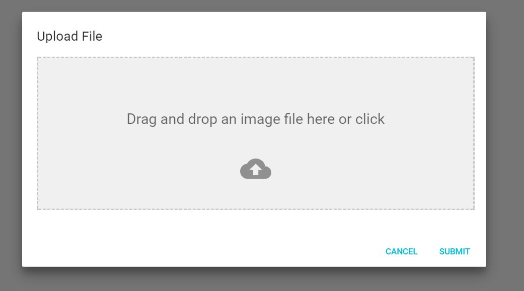
| This is the Dialog component: | ||
|
There was a problem hiding this comment. Choose a reason for hiding this commentThe reason will be displayed to describe this comment to others. Learn more. Revert changes to |
||
| Full documentation and samples are available here [https://yuvaleros.github.io/material-ui-dropzone](https://yuvaleros.github.io/material-ui-dropzone). | ||
|
|
||
|  | ||
|  | ||
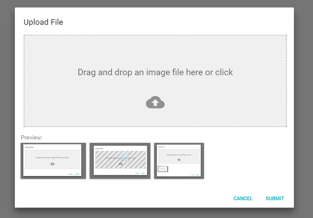
| **Preview: Dialog Component** with drag'n'drop effects for accepted and rejected files. | ||
|
|
||
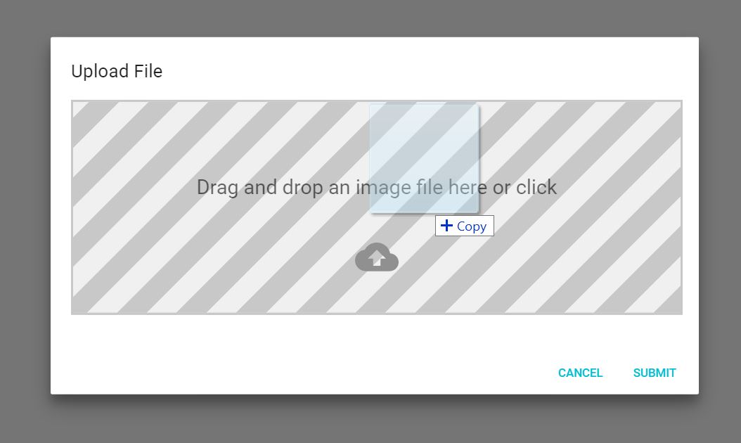
| When you drag a file onto the dropzone, you get a neat effect: | ||
| <img src="pics/dropzone.gif" alt="drawing" width="100%"/> | ||
| <br> | ||
| <br> | ||
|
|
||
|  | ||
|
|
||
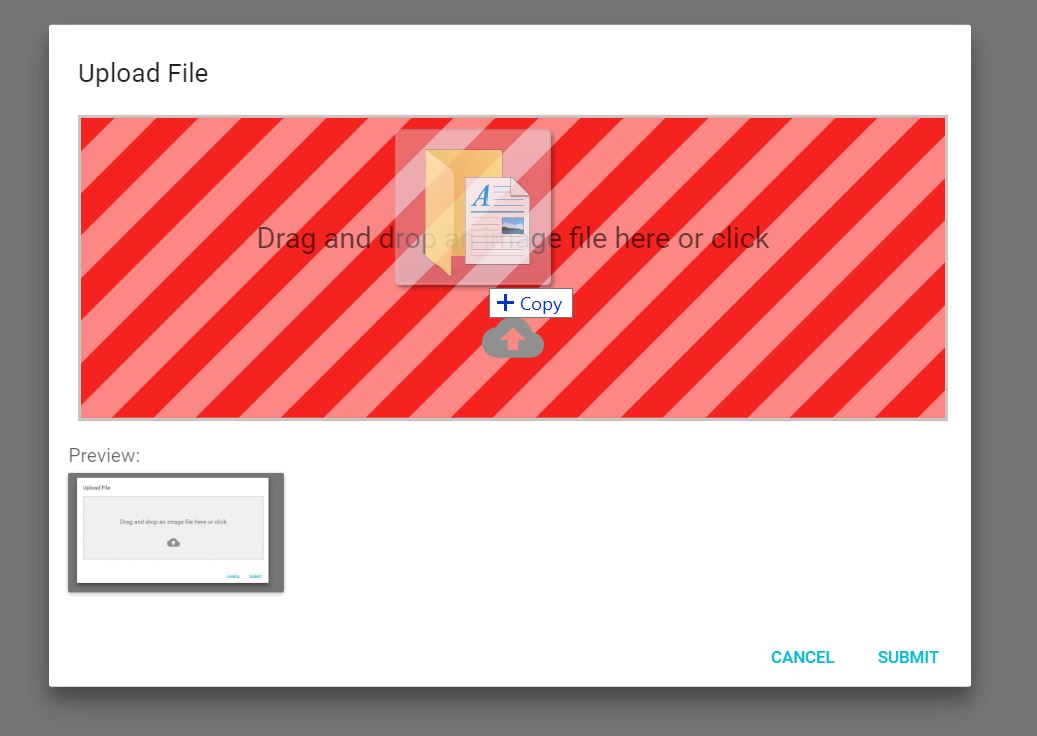
| And if you drag in a wrong type of file, you'll get yelled at: | ||
|
|
||
|  | ||
|
|
||
| **N.B. This has some limitations (see [here](https://github.com/react-dropzone/react-dropzone/tree/master/examples/accept#browser-limitations) for more details).** | ||
| **Disclaimer:** Drag'n'drop handling has some known limitations, see [here](https://github.com/react-dropzone/react-dropzone/tree/master/examples/accept#browser-limitations) for more details. | ||
| Original file line number | Diff line number | Diff line change |
|---|---|---|
|
|
@@ -15,7 +15,7 @@ module.exports = { | |
| content: './docs/support.md', | ||
| }, | ||
| { | ||
| name: 'Screenshots', | ||
| name: 'Demo', | ||
|
There was a problem hiding this comment. Choose a reason for hiding this commentThe reason will be displayed to describe this comment to others. Learn more. Revert this change |
||
| content: './docs/screenshots.md', | ||
| }, | ||
| { | ||
|
|
||
There was a problem hiding this comment.
Choose a reason for hiding this comment
The reason will be displayed to describe this comment to others. Learn more.
Revert changes to
README.mdor exclude them from this PR.