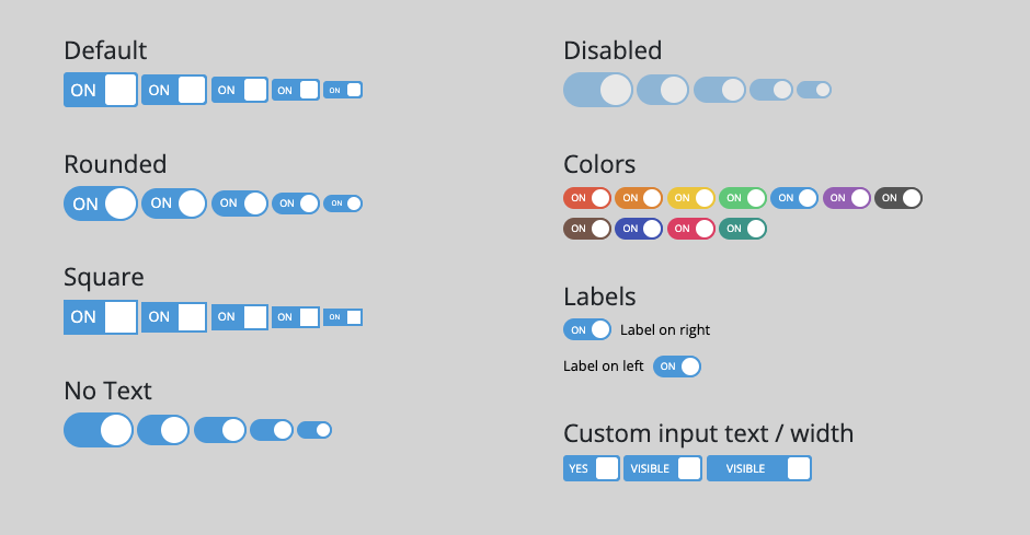
A toggle switch build with pure CSS, that can be used in forms as input checkboxes.
<link rel="stylesheet" href="build/toggle-switch.css">
<label class="a8z-toggle-switch">
	<input checked type="checkbox" id="ID_HERE">
	<span class="toggle">
		<span class="switch"></span>
	</span>
</label>
| Option | Data Attribute |
|---|---|
| Rounded | data-style="rounded" |
| Square | data-style="square" |
| No Text | data-text="false" |
| Disabled | add the disabled attribute to the input tag |
| Checked | add the checked attribute to the input tag |
| Sizes | data-size="xl"data-size="lg"medium (default) data-size="sm"data-size="xs" |
| Colors | data-color="red"data-color="orange"data-color="yellow"data-color="green"data-color="blue"data-color="purple"data-color="gray"data-color="brown"data-color="pink"data-color="indego"data-color="teal" |
| Labels | data-label="left"label on right (default) |
| content text / width | use the style attribute to modify the css variablesstyle="--a8z-ts-input-checked-content:'VISIBLE'; --a8z-ts-input-unchecked-content: 'HIDDEN'; --a8z-ts-width: 90px;" |
- CSS only - no JavaScript!
- No dependencies
- Fully reponsive
- Fully customizable (change input content text / widht)
- Fully self contained
- 11 color schemes
- Labels on the left and the right
- Keyboard Accessible - accessibility (a11y)
- Focus Styles - accessibility (a11y)
- Supports all modern browsers
- Search engine friendly
- Screen reader friendly
- Doesn't dump a bunch of global styles that'll screw with your other CSS
- Everything is customizable with scss variables if using the scss source file
- Everything is customizable if overwriting the css variables in the
a8z-toggle-switchclass