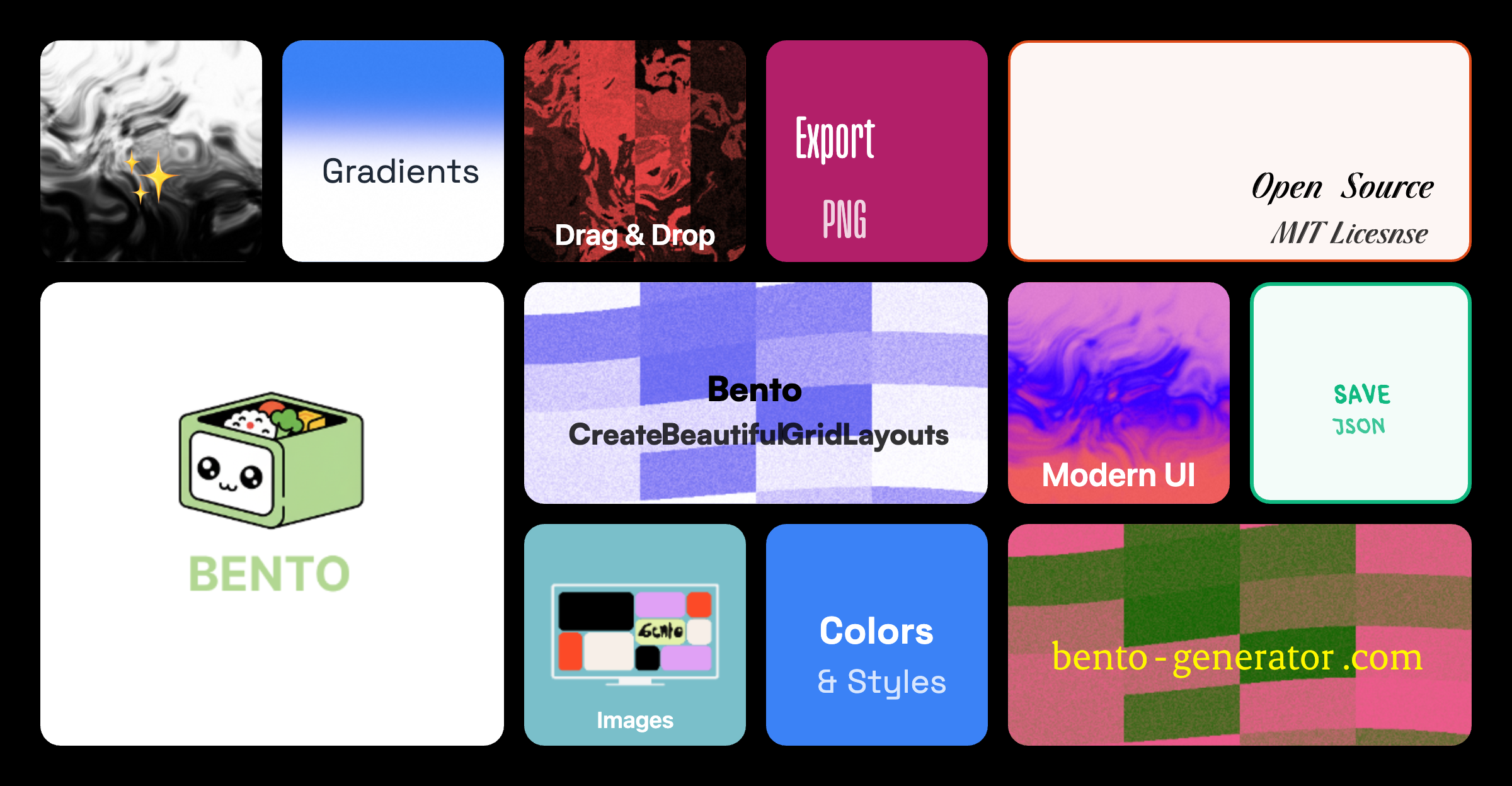
A powerful, intuitive web-based tool for creating beautiful Bento-style grid layouts. Design, customize, and export stunning grid compositions with an easy drag-and-drop interface.
- Drag & Drop Interface - Intuitive card placement and rearrangement
- Smart Grid System - 12×6 grid with intelligent collision detection
- Multiple Card Sizes - Square (1×1), Wide (2×1), Portrait (1×2), Large (2×2)
- Intelligent Card Swapping - Automatically rearranges cards when dragging to occupied spaces
- Real-time Preview - See changes instantly as you design
- Background Styles
- Solid color fills
- Background images with URL support
- Border-only style with transparent fills
- Custom border colors and widths
- Text Customization
- Custom text content and colors
- Font size control
- Horizontal alignment (left, center, right)
- Vertical alignment (top, center, bottom)
- Text orientation (horizontal, vertical)
- Live Edit Panel - Preview all changes before applying
- Save & Load Layouts - Store multiple layouts locally
- Export as PNG - Download your design as high-quality images
- Export as JSON - Share layouts as portable JSON files
- Import JSON - Load layouts from files
- Mobile Optimized - Fully responsive with touch support
- 16:9 Aspect Ratio - Maintains canvas proportions across devices
- Adaptive UI - Toolbar collapses to dropdown on mobile
- Portfolio Pro
- Social Links
- Photography
- Design Studio
- Product Showcase
- Node.js (v16 or higher)
- npm or yarn package manager
-
Clone the repository
git clone https://github.com/aruntemme/bento-generator.git cd bento-gen -
Install dependencies
npm install # or yarn install -
Start the development server
npm run dev # or yarn dev -
Open your browser
Navigate to
http://localhost:5173
Analytics is disabled by default. To enable, set an environment flag and provide your PostHog key.
-
Create an
.env.localfile at the project root with:VITE_ENABLE_ANALYTICS=true VITE_PUBLIC_POSTHOG_KEY=phc_your_key_here # Optional (defaults to https://us.i.posthog.com) VITE_PUBLIC_POSTHOG_HOST=https://us.i.posthog.com # Optional: enable verbose logging in dev VITE_ANALYTICS_DEBUG=false # Optional: respect Do Not Track (default true). Set to false to ignore DNT (testing only) VITE_ANALYTICS_RESPECT_DNT=true
-
Restart the dev server.
-
(Optional) Run the PostHog setup wizard to help configure your project:
npm run analytics:wizard
# which runs: npx -y @posthog/wizard@latest
If VITE_ENABLE_ANALYTICS is not set to true, analytics code is not loaded.
This project can use PostHog Cloud to collect anonymous usage analytics when enabled. This helps improve the software experience, but means some usage data may be sent to PostHog’s servers. See PRIVACY.md for full details, including what data is collected and how to opt out.
npm run build
# or
yarn build
The optimized files will be in the dist folder.
npm run preview
# or
yarn previewReady to deploy? Check out the Deployment Guide for detailed instructions on deploying to:
- Netlify (Recommended) ⭐
- Vercel
- GitHub Pages
-
Add Cards
- Click the "Add Card" button in the toolbar
- Select a card size (Square, Wide, Portrait, or Large)
- Cards are automatically placed in the first available spot
-
Customize Cards
- Click the "Edit" button (pencil icon) on any card
- Customize:
- Background color or image
- Text content and styling
- Border styles
- Alignment options
- Preview changes in real-time
- Click "Save" to apply changes
-
Rearrange Cards
- Drag cards to new positions
- Cards automatically swap or shift to make room
- Invalid positions are highlighted in red
- Valid positions show a green outline
-
Resize Cards
- Click the resize button (maximize icon) on any card
- Cycles through available sizes
- Only shows sizes that fit in the current position
-
Delete Cards
- Click the delete button (trash icon) on any card
- Card is immediately removed from the canvas
- Save Layout: Click "Save" → Enter a name → Click "Save"
- Load Layout: Click "Load" → Select from saved layouts
- Export Image: Click "Export" → Download as PNG
- Export JSON: Click "More" → "Export JSON"
- Import JSON: Click "More" → "Import" → Select JSON file
- Click "Templates" in the toolbar
- Select a pre-built template
- Template cards are instantly loaded onto canvas
- Customize as needed
bento-gen/
├── src/
│   ├── components/
│   │   ├── BentoCard.tsx       # Individual card component
│   │   ├── EditPanel.tsx        # Card customization panel
│   │   ├── GridCanvas.tsx       # Main canvas with drag-drop
│   │   ├── Toolbar.tsx          # Top toolbar with actions
│   │   ├── Modal.tsx            # Message modal component
│   │   └── InputModal.tsx       # Input modal for names
│   ├── utils/
│   │   ├── gridUtils.ts         # Grid calculations & collision detection
│   │   └── storage.ts           # LocalStorage management
│   ├── types.ts                 # TypeScript interfaces
│   ├── App.tsx                  # Main app component
│   ├── main.tsx                 # App entry point
│   └── index.css                # Global styles & animations
├── public/                      # Static assets
├── index.html                   # HTML template
├── package.json                 # Dependencies & scripts
├── tsconfig.json                # TypeScript configuration
├── tailwind.config.js           # Tailwind CSS configuration
└── vite.config.ts               # Vite configuration
| Technology | Purpose |
|---|---|
| React 18 | UI framework with hooks |
| TypeScript | Type safety and better DX |
| Vite | Fast build tool and dev server |
| Tailwind CSS | Utility-first styling |
| Lucide React | Beautiful icon library |
| html2canvas | Canvas to image export |
The canvas uses a 12×6 grid with:
- Cell size: 80px
- Gap between cells: 16px
- Padding: 32px
- Total canvas size: ~1024×576px (16:9 ratio)
| Size | Grid Units | Pixels (approx) |
|---|---|---|
| Square | 1×1 | 80×80 |
| Wide | 2×1 | 176×80 |
| Portrait | 1×2 | 80×176 |
| Large | 2×2 | 176×176 |
- Simple Swap: When dragging to a single card of the same size, they swap positions
- Smart Shift: Cards shift along a row/column to make room
- Space-based Rearrangement: Complex multi-card reorganization when needed
- Overlap Prevention: All moves are validated to prevent card overlaps
React.memoon card components with custom comparisonuseCallbackfor event handlersrequestAnimationFramefor drag throttling- Early exit conditions in collision detection
We love contributions! Here's how you can help:
- Check if the bug is already reported in Issues
- If not, create a new issue with:
- Clear description
- Steps to reproduce
- Expected vs actual behavior
- Screenshots if applicable
- Open an issue with the
enhancementlabel - Describe the feature and its benefits
- Include mockups or examples if possible
-
Fork the repository
git clone https://github.com/aruntemme/bento-generator.git cd bento-gen git checkout -b feature/your-feature-name -
Make your changes
- Follow the existing code style
- Add comments for complex logic
- Update types if needed
-
Test your changes
npm run dev      # Test in development
npm run build    # Ensure it builds
npm run lint     # Check for linting errors
-
Commit with clear messages
git commit -m "feat: add new card animation"
git commit -m "fix: resolve drag issue on mobile"
-
Push and create PR
git push origin feature/your-feature-name
Then create a Pull Request on GitHub
- Use TypeScript for all new code
- Follow functional components with hooks
- Use Tailwind CSS for styling
- Add proper types for props and state
- Write meaningful variable names
- Keep components small and focused
- Add comments for complex logic
# Type checking
npm run typecheck

# Linting
npm run lint

# Development server with hot reload
npm run dev- Undo/Redo functionality
- Keyboard shortcuts
- Custom grid sizes
- Gradient backgrounds
- Icon library integration
- Animation presets
- Collaborative editing
- Cloud storage integration
- Export to React/HTML code
- Dark mode
This project is licensed under the MIT License - see the LICENSE file for details.
- Inspired by Bento grid design trend
- Built with modern React best practices
- Icons by Lucide
Have questions? Reach out!
- GitHub Issues: Create an issue
- Discussions: Join the discussion
If you find this project useful, please consider giving it a ⭐ on GitHub!
Made with ❤️ by the open-source community