RFC for Issueish List View #1503
There are no files selected for viewing
| Original file line number | Diff line number | Diff line change |
|---|---|---|
| @@ -0,0 +1,112 @@ | ||
| # Issueish List | ||
|
|
||
| ## Status | ||
|
|
||
| Proposed | ||
|
|
||
| ## Summary | ||
|
|
||
| Display a list of all open pull requests in the current repository in the GitHub tab. | ||
|
|
||
| ## Motivation | ||
|
|
||
| To provide a navigational element that makes sense even if you aren't on an active feature branch. | ||
|
|
||
| To give users a way to see an overview of what's going on in the repository. | ||
|
|
||
| As an initial building block toward a pull request review workflow. | ||
|
|
||
| ## Explanation | ||
|
|
||
| ### Accordion Lists | ||
|
|
||
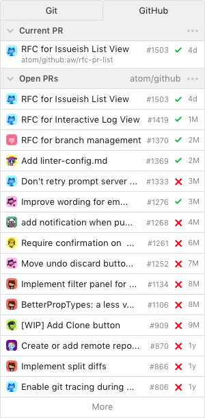
| Within the GitHub panel, render a vertical stack of two collapsible lists of _issueish_ (pull request or issue) items: | ||
|
|
||
| _First list: current pull request_. If the active branch is associated with one or more open pull requests on the GitHub repository, render an item for each. | ||
|
There was a problem hiding this comment. In what case would it show more than one open PR? Is if someone forks use the same branch name and make a PR to your
Couldn't this be reduced to just one if we would limit it to the current remote repo? Then there can only be one branch with the same name. There was a problem hiding this comment.
Yeah, that's the case where we show multiple now, like all of the "master" PRs it offers to let you pin.
Which remote is the "current" one? Right now we just ask you for the "upstream" one. This gets tricky when you have a network of multiple forks involved. I think you can send multiple pull requests from the same head ref to different base repositories in the same fork network. You might even be able to open multiple pull requests from the same head ref to different base refs within the same repository... ? I haven't tried it yet. In any case, the by-far most common case is to have zero or one pull requests for a given head ref and head repository, but we've got a long tail of wacky edge cases where you could have several. I figured that because we're already building a view based on stacked lists, we could handle them and make it more consistent just by making the "current" section a list, too. There was a problem hiding this comment.
The one that it would use to pull/push. I think it's called "remote tracking branch". But I didn't consider that a local branch could have no remote tracking branch. Hmm.. maybe the title could say
There was a problem hiding this comment. Oh, right - I can get that remote from your branch information. Well then 😄 |
||
|
|
||
| _Second list: all open pull requests_. List all open pull requests on the GitHub repository. | ||
|
|
||
| Each list has a "collapse arrow" in its header. Clicking the collapse arrow toggles the visibility of that list's items, accordion-style. | ||
|
|
||
| If either list exceeds 20 items, truncate the list and render a "More" link after its final item. Clicking "more" opens the corresponding search on GitHub. | ||
|
|
||
|  | ||
|
|
||
| Each list item renders a tile containing a compact set of information about that pull request: | ||
|
|
||
| * Mini author avatar | ||
| * Title, truncated if necessary | ||
| * PR number (`#1503`) | ||
|
There was a problem hiding this comment. Apparently in some teams, they use the PR number/ID to refer to a PR. Therefore it should be helpful seeing it in the list so you can search by number/ID and not just title. |
||
| * Status check summary | ||
|
There was a problem hiding this comment. ☝️ For this I was thinking a "mini donut view" might be cool. It'd be pretty small and it'd still let you tell the difference between "everything failed," "some stuff was green," and "all good to go". There was a problem hiding this comment. A donut could also only be used for mixed states (fail and success). For "everything failed/succeeded" we could still use the x and checkmark. Then you don't have to look too closely if the donut contains any red/green parts.
Or maybe a donut with a x or checkmark. |
||
| * Terse relative timestamp (1d, 2h, 30m) | ||
|
|
||
|  | ||
|
|
||
| Clicking on a list item opens an issueish pane item for the chosen issueish in the same pane container as the parent component (by default, the right dock). If the issuish pane item is already open, it is activated instead. | ||
|
There was a problem hiding this comment. Like @simurai and I were talking about earlier, there are a few directions we could go here. To list a few:
There was a problem hiding this comment. This is super tough to decide.
Any favorite? Hmm.... 🤔 I don't yet. Maybe best to first mock them up to compare or even do a static prototype. |
||
|
|
||
| ### Issueish Pane Item: Pull Request | ||
|
|
||
| For a pull request, the issueish pane shows: | ||
|
|
||
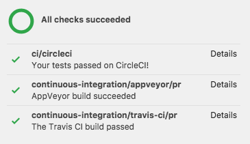
| * PR status badge. -> `Open`. | ||
| * Link to .com. -> [atom/github#1503](https://github.com/atom/github/pull/1503) | ||
| * Author avatar | ||
| * Title | ||
| * Branches -> `master` < `aw/rfc-pr-list` | ||
| * "Checkout" button to fetch (if necessary) and check out the pull request. Only enabled if the current pull request is not the current one. | ||
| * `Commits` with count, links to .com (for now), optional with avatars | ||
| * `Checks` with count, links to .com (for now) | ||
| * CI status, each item links to the detail page | ||
| * `Files changed` with count, links to .com (for now), optional with "+-" bar | ||
| * Mergability status -> `Able to merge`, links to the [Merging controls at the bottom](https://github.com/atom/github/pull/1503#partial-pull-merging) | ||
| * "Merge PR" to merge the pull request on GitHub if it is open. | ||
|
There was a problem hiding this comment. In our design review, it was suggested to not show the close and merge button. Just because there isn't enough information and context to make a good decision. It might still be handy for people that mostly merge their own PRs, but it could also lead to "accidents". |
||
| * "Close" to close the pull request, unmerged, if it is open. | ||
| * "Re-open PR" to re-open a pull request if it is closed. | ||
| * `Conversation` with comment count, opens the current PR timeline in a center pane. | ||
| * Reaction emoji and counts. | ||
| * Description (PR body) as rendered markdown. | ||
|
|
||
|  | ||
|
|
||
| ## New PR | ||
|
|
||
| If no current PR can be found, an "open new pull request" button is shown. If needed it also offers to "Publish" or "Push". | ||
|
|
||
|  | ||
|
|
||
| When the current branch is the default branch, e.g. `master`, a message is shown that suggests to "Create a new branch". | ||
|
|
||
| ## Drawbacks | ||
|
|
||
| None! | ||
|
|
||
| ## Rationale and alternatives | ||
|
|
||
| Our current GitHub panel focuses on showing you stuff about _the pull request that's associated with your current branch._ The problem is, it's difficult to unambiguously determine that in the general case. | ||
|
|
||
| The first thing you see today when you open the GitHub panel on the `master` branch of an active repository is not very helpful: | ||
|
|
||
|  | ||
|
|
||
| This is a list of _all pull requests on GitHub that have a head ref called "master", from any head repository_. You can then "pin" any of them to see that pull request's details. This isn't useful on master and it's unclear to users what this is supposed to accomplish. Pinning was intended to be an infrequent edge case when we couldn't find the right PR for a given ref, not the first interaction you have with the package. | ||
|
|
||
| Showing a PR list instead provides a uniform, more easily understood entry point to the package's GitHub functionality, and paves the way to other pull-request-focused activities in the future. "All open PRs" seems like a reasonable starting point, and "current PRs" preserves the ability to take advantage of your local editor context. | ||
|
|
||
| With that said, the choices for the specific lists we show are a bit arbitrary. We'll need to research and iterate on them quite a bit to find what's most useful for the most people, but for now we need to start with something. | ||
|
|
||
| ## Unresolved questions | ||
|
|
||
| ### Before RFC merge: | ||
|
|
||
| - [ ] What else from the existing issueish pane should we keep? Comments, timeline events? | ||
|
There was a problem hiding this comment. The main reason I'd consider taking these out is because they don't really add anything to just... looking at the PR on .com. There was a problem hiding this comment. I updated the RFC to keep the existing center pane when clicking on "Conversation". I'm not sure how valuable it is, but since it's already built, we can keep it for now? Other things from the current GitHub panel:
There was a problem hiding this comment.
👍 I like it for:
One of my most-used features, personally 😁 It's a great way to keep an eye on builds while continuing to work, and to jump right to the problem when there is one. Maybe we could come up with a more compact representation (eventually, if not here)? |
||
| - [ ] Are there other pull request actions it would be useful to support? | ||
|
|
||
| ### Out of scope: | ||
|
|
||
| - [ ] How can we allow a user to customize the lists? | ||
| - [ ] How can we notify a user about updated activity on a visible PR? | ||
|
|
||
| ## Implementation phases | ||
|
|
||
| 1. Accordion list infrastructure: search model, collapsible list component. | ||
|
There was a problem hiding this comment. are you going to make a generic "list" component that could be re-used elsewhere in the UI? It seems like we have a lot of "one off" components, and it might make sense to think about what could be made generic. (Ideally, I'd love a React UI components library for Atom that provides generic modals and lists and forms and other stuff, but one thing at a time.) There was a problem hiding this comment.
Yah, I was mentally planning on having an
This is true, we don't as of yet have many reusable building block-style components. Does anything come to mind for abstractions we could introduce to consolidate existing ones? That would be a cool way to improve the codebase 🤔
I've had Secret Plans ™️ to extract our Atom API integration components to their own npm package for a while. We could build on that 😄 There was a problem hiding this comment. 👍 I would also love if Atom would provide UI components beyond the basic ones from the styleguide. Then not every package author has to create their own from scratch.
A while (very long time) ago, I made an accordion component: atom/atom-ui#14
It uses the There was a problem hiding this comment. yeah, if we care about Atom's "hackability" providing a generic UI toolkit that package authors could leverage seems like a REALLY high value thing. (And then we can also bake in accessibility / i18n). But one thing at a time, since creating a UI toolkit is a large undertaking. |
||
| 2. Revisit the issueish pane item and add action controls. | ||


There was a problem hiding this comment.
Choose a reason for hiding this comment
The reason will be displayed to describe this comment to others. Learn more.
reading this, it wasn't immediately clear to me that the number was "time." I saw "3M" and thought "3 million"? So can we clarify that label somehow? Also is this the date that the pull request was opened, or the date of the first commit in that pull request?
There was a problem hiding this comment.
Choose a reason for hiding this comment
The reason will be displayed to describe this comment to others. Learn more.
I thought the same thing, and was going to comment on it before realizing it is using
Mto signify months sincemwould be taken by minutes.There was a problem hiding this comment.
Choose a reason for hiding this comment
The reason will be displayed to describe this comment to others. Learn more.
yeah, ideally we could use "minutes", "weeks", "etc" instead of abbreviations. Moment.js has a "humanize time since" function that provides this in an i18n-friendly manner. https://momentjs.com/docs/#/durations/humanize/
There was a problem hiding this comment.
Choose a reason for hiding this comment
The reason will be displayed to describe this comment to others. Learn more.
For the recent commits we changed the longer
10 minutes agoto the shorter10mso that there is more space for the commit message. It's similar Twitter's short version.To avoid confusion, an option might be to never show minutes and only start with hours, like
Nowor<1h1h1d1m1yThat might still be fine not knowing the exact minutes.