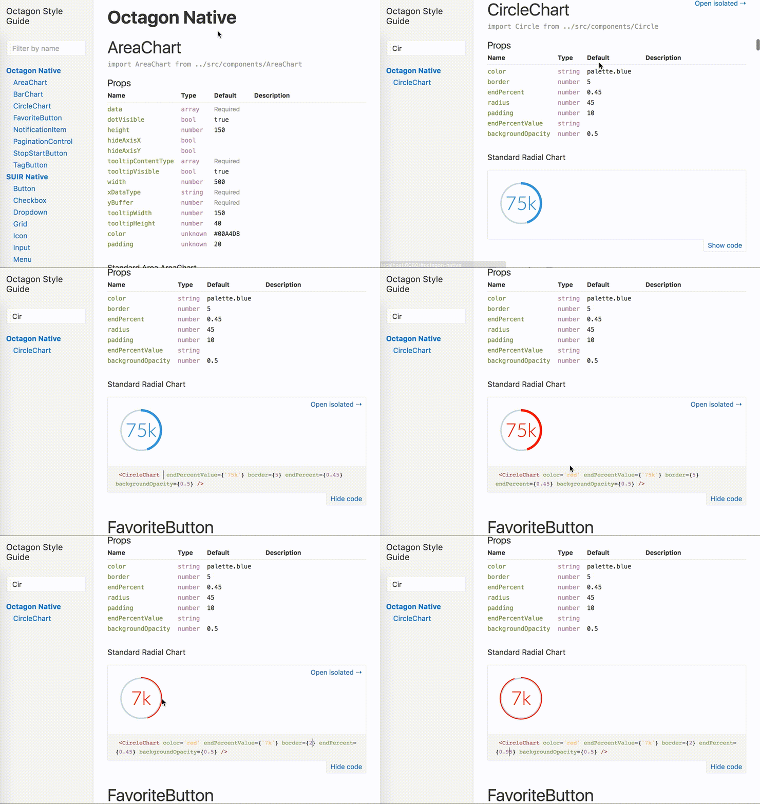
octagon is a react component library. see the latest interactive library documentation here.
this package provides:
- a custom semantic-ui theme,
- a subset of semantic-ui-react (SUIR) components,
- a set of additional react components to facilitate Tripwire UI.
If you are looking for a ground up framework, please instead jump directly to semantic-ui-react, as this project is generally just an opionionated implementation of the SUI ecosystem.
npm install --save react-octagon or yarn add --dev react-octagon
octagon imports, occasionally wraps, and re-exports piece-wise components from semantic-ui-react. you may generally refer to those docs for API usage.
To use it:
- add octagon's CSS into your app using whatever css bundling you prefer
- your build system must be able to bundle static assets. that is, this code exports components that have code like
require('./widget.css')
- your build system must be able to bundle static assets. that is, this code exports components that have code like
- import components from the lib
import 'react-octagon/lib/styles/semantic.css'
import Segment from 'react-octagon/lib/components/suir/Segment'
import FavoriteButton from 'react-octagon/lib/components/FavoriteButton'

class MyWigdet () {
  render () {
    return (
      <Segment>
        <FavoriteButton isFavorited />
      </Segment>
    )
  }
}- clone this repository
- run
yarn - run
yarn start - open the URL to play w/ components as you develop them
now you're off to the races 🏇! theme changes, components, & examples will update automatically. Make sure that your examples source components from within the src/ dir!
for information on how to adjust the theme styles, see THEMING.md.
useful if you've yarn linked your front-end project with octagon and want to iterate on components without suffering the build/publish lifecycle for octagon. You must run yarn run build to get a fresh set of react components!
want to contribute? please see THEMEING.md & CONTRIBUTING.md.


