AI-enhanced input components for shadcn/ui — textbox, textarea, and combobox, where you want to allow a user to AI generate or enhance a value, and would like a visual indicator while AI related content is loading to fill in the fields. Presents a subtle Apple-style AI glow around inputs, with an option to allow the value to be reverted.
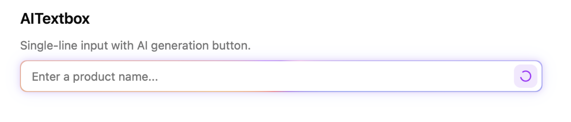
Active inputs kinda look like this:
Video: https://raw.githubusercontent.com/chrisboulton/shadcn-components-ai-inputs/main/demo.mp4
Check out the demo/example: https://shadcn-ai-input-components.pages.dev
Install all three components:
npx shadcn@latest add https://raw.githubusercontent.com/chrisboulton/shadcn-components-ai-inputs/main/public/r/ai-inputs.jsonOr install individually:
npx shadcn@latest add https://raw.githubusercontent.com/chrisboulton/shadcn-components-ai-inputs/main/public/r/ai-textbox.json
npx shadcn@latest add https://raw.githubusercontent.com/chrisboulton/shadcn-components-ai-inputs/main/public/r/ai-textarea.json
npx shadcn@latest add https://raw.githubusercontent.com/chrisboulton/shadcn-components-ai-inputs/main/public/r/ai-combobox.jsonSingle-line input with an AI generation button. Extends React.InputHTMLAttributes<HTMLInputElement>.
import { AITextbox } from "@/components/ui/ai-textbox";

<AITextbox
  placeholder="Enter a product name..."
  value={value}
  onChange={(e) => setValue(e.target.value)}
  onAIClick={async () => {
    const result = await generateText(prompt);
    return result; // returned string is set as the input value
  }}
/>;
Pass aiOptions to show a dropdown with multiple AI actions:
<AITextbox
  value={value}
  onChange={(e) => setValue(e.target.value)}
  aiOptions={[
    { label: "Generate title", value: "generate" },
    { label: "Improve title", value: "improve" },
    { label: "Make shorter", value: "shorten" },
  ]}
  onAIClick={async (option) => {
    const result = await generateText(option);
    return result;
  }}
/>| Prop | Type | Description |
|---|---|---|
onAIClick |
(option?: string) => void | Promise<void> | Promise<string> |
Called when the AI button is clicked. Return a string to set the input value. |
aiOptions |
{ label: string; value: string }[] |
Options for the AI dropdown. When provided, shows a dropdown instead of a single button. The selected option's value is passed to onAIClick. |
All standard <input> props (value, onChange, placeholder, disabled, etc.) are also supported.
Multi-line textarea with an AI generation button. Extends React.TextareaHTMLAttributes<HTMLTextAreaElement>.
import { AITextarea } from "@/components/ui/ai-textarea";

<AITextarea
  placeholder="Write a description..."
  value={value}
  onChange={(e) => setValue(e.target.value)}
  onAIClick={async () => {
    const result = await generateText(prompt);
    return result;
  }}
/>;| Prop | Type | Description |
|---|---|---|
onAIClick |
() => void | Promise<void> | Promise<string> |
Called when the AI button is clicked. Return a string to set the textarea value. |
All standard <textarea> props (value, onChange, placeholder, disabled, rows, etc.) are also supported.
Searchable dropdown with AI-powered selection.
import { AICombobox } from "@/components/ui/ai-combobox";

<AICombobox
  options={[
    { value: "react", label: "React" },
    { value: "vue", label: "Vue" },
    { value: "svelte", label: "Svelte" },
  ]}
  value={value}
  onChange={setValue}
  placeholder="Pick a framework..."
  onAIClick={async () => {
    const best = await pickBestOption();
    return best; // must match an option's `value`
  }}
/>;| Prop | Type | Description |
|---|---|---|
options |
{ value: string; label: string }[] |
The list of selectable options. |
value |
string |
The currently selected option value. |
onChange |
(value: string) => void |
Called when the selection changes. |
onAIClick |
() => void | Promise<void> | Promise<string> |
Called when the AI button is clicked. Return a string matching an option's value to select it. |
placeholder |
string |
Placeholder text when no option is selected. |
disabled |
boolean |
Disables the combobox. |
className |
string |
Additional classes for the input element. |
All components share the same behavior when onAIClick is called:
- An animated gradient border and loading spinner appear while the promise is pending
- If the returned promise resolves to a string, it is set as the component's value
- An undo button appears allowing the user to revert to the previous value
React 19+, Tailwind CSS v4, shadcn/ui
npm install
npm run dev             # Example app at localhost:5173
npm run typecheck       # Type checking
npm run lint            # ESLint
npm run registry:build # Build registry JSON filesMIT