![]()

Our goal is to visualize and motivate CO2-compensation for users. Greenhouse gas effect has been a rising topic the last decade and remains important. Examples for activities that result in CO2 emission include but are not restricted to commuting, machine learning, streaming, shopping, etc. By visualizing the user's contribution to CO2-compensation, we wish to help them understand and grasp their impact and possibilities they have.
Summarizing our desktop research there are a lot of online services that calculate the user's CO2 emission and/or enable the user to compensate for their carbon footprint through the service. Often, CO2 compensation is offered by planting trees or investing into climate sustainable projects on the behalf of the user. An example for real-time CO2 emission visualization is given on QUARTZ. It shows how many trees’ CO2 neutralizing capabilities the user has „used up“ since he or she has opened the Google webpage. On the other hand, the visualization of CO2 compensation is frequently shown as charts, certificates or checkmarks at the check-out process (e.g. Zalando or Flixbus). The current state of CO2 compensation visualization with numbers, charts and certificates does not satisfy us, because it is still hard for the user to grasp their impact through emission and compensation.
Key points of our project are to visualize pollution and compensation. For example, an 8-bit tree or forest as a web-extension could represent the user’s current net CO2 emission or it could simply just flourish as you contribute to CO2 compensation projects and wither as you forget or have not contributed to such projects for a longer time. An easier way of visualizing CO2 compensation could be rendering a graph with the user’s CO2 emission and compensations over time or use a scale with an emission and a compensation side.
Moreover, through our visualizations, we hope to motivate the user to compensate for the CO2 emissions they cause. This could be given in the form of social recognition through social media sharing posts or NFT plant tokens that you can collect and lose. More motivation could be triggered through rankings, either single or team based. Also, we think that it is important to show or visualize the concrete results of the CO2 compensated.
- How might we get users to engage in CO2-compensation?
- How might we continually motivate users to compensate CO2?
- How might we have an aesthetically pleasing visual for CO2-emissions?
- How might we make a catchy and interactive display of compensation?
- How might we visualize CO2-compensation a in way that makes users feel better about their purchases and understand their impact?
- How might we create a feeling of reward?
- How might we give the user an idea of what is compensated for? (e.g. I plant one tree but how much online shopping will this compensate?)
 Affinity Diagramm
We focused on a turn based brainstorming approach, meaning that we split up to ideate and then tried to group and share our ideas in rounds. The main take-aways from the brainstorming sessions where ways to visualize the pollution and compensation (mainly forest/tree-based approaches), ways to motivate and reward users (coin based or just visually pleasing), and ideas about if it makes sense to plan a kind of user competition.
(The evaluation session was skipped in this years curse.)
Creating the low-fidelity prototypes helped us document ideas. It was interesting to see how a vague idea can be worked out to a "visible" and clearly defined idea using simple paper prototypes.
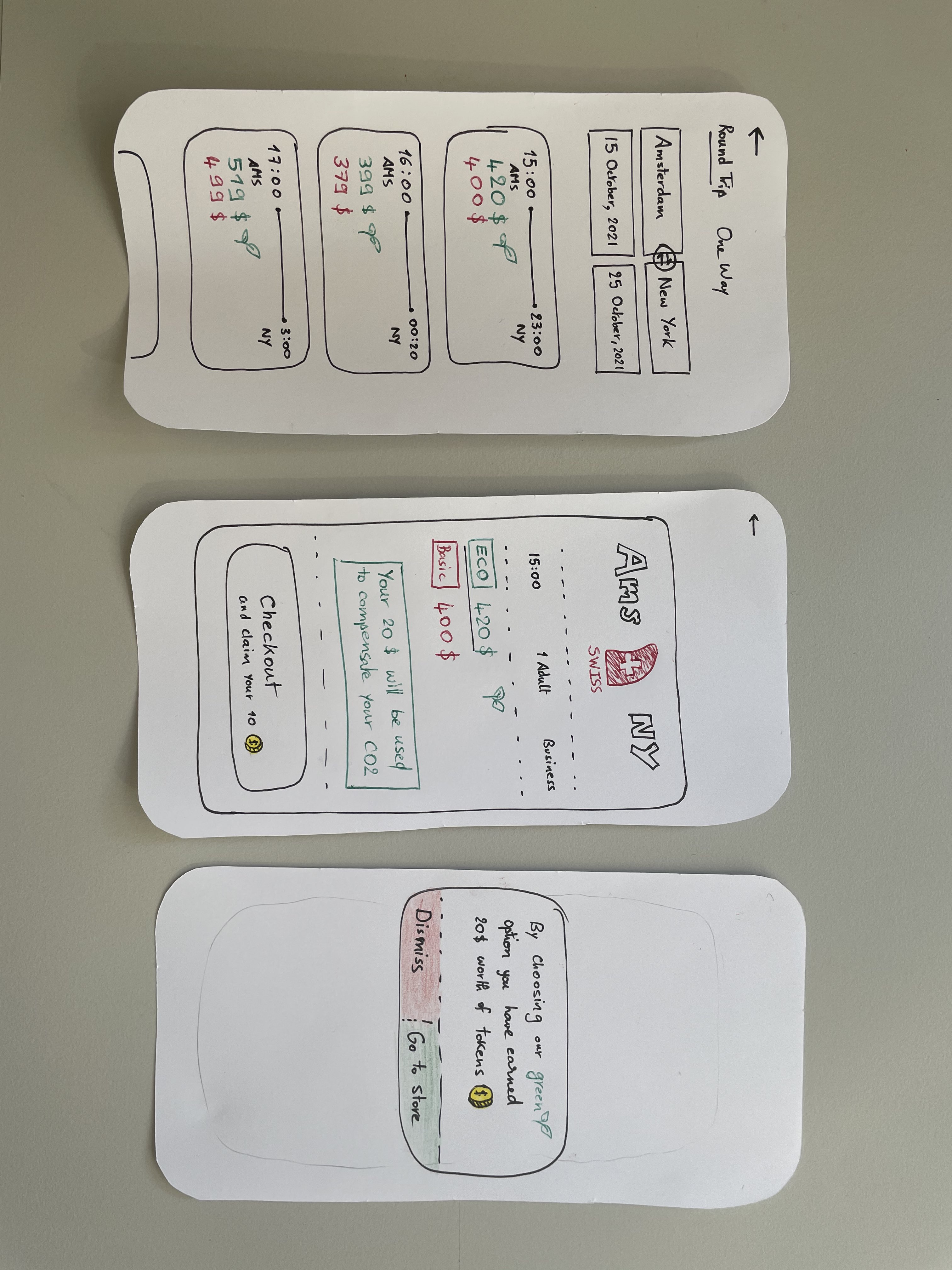
A: Reward System
The idea is here is a universal reward system, where all the user’s CO2 compensation is exchanged to tokens. Users have to make an account, where they will store their tokens.
Our service offers many ways to redeem those tokens, as we have a store and many partnerships that offer our users discounts on products, the possibility to do more CO2 compensation(use the tokens to plant more trees) as well as a social media sharing possibility. Paper prototyping made us reflect on the amount of info we want to add when offering a green buying choice, it also made us reflect how to present the options in terms of colors and extra steps that the user has to make before checking out.
B: Forest Browser Extension
Web-extension forest grows as CO2 is compensated and shrinks/dies if the user emits too much CO2 or does not contribute to CO2 emission compensation. If the user does not compensate for CO2 emission for a month, a push notification will be sent.
We tried to keep the prototype as simple as possible whilst keeping key features. The web-extension shall be a calm guard of the user‘s CO2 compensations, keep him/her happy as long as the forest is taken care of, and alert the user when CO2 emissions are too high in relation to the compensations. We opted to use simplistic 8-bit caricatures and visualized them as a 2D-prototype.
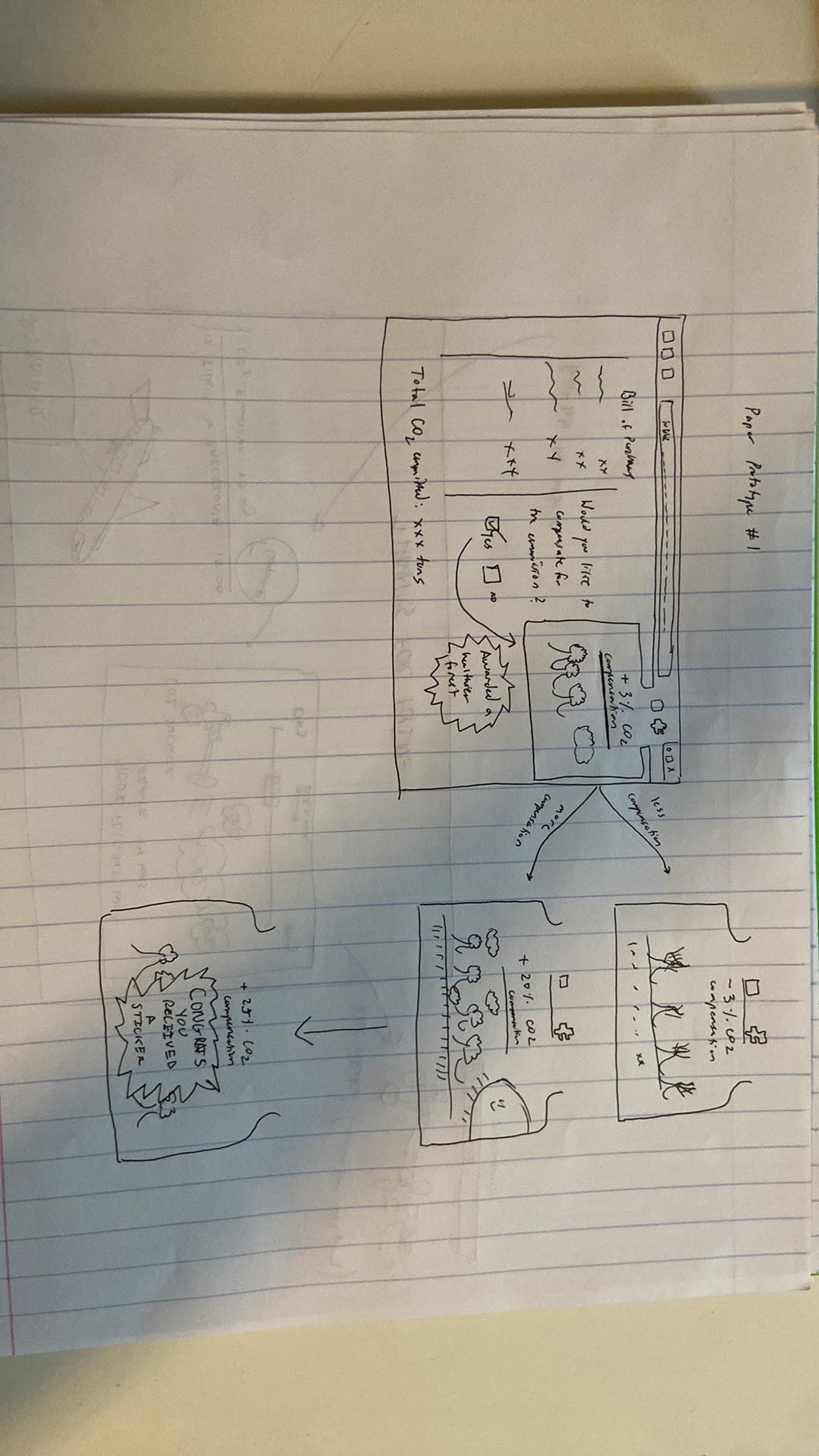
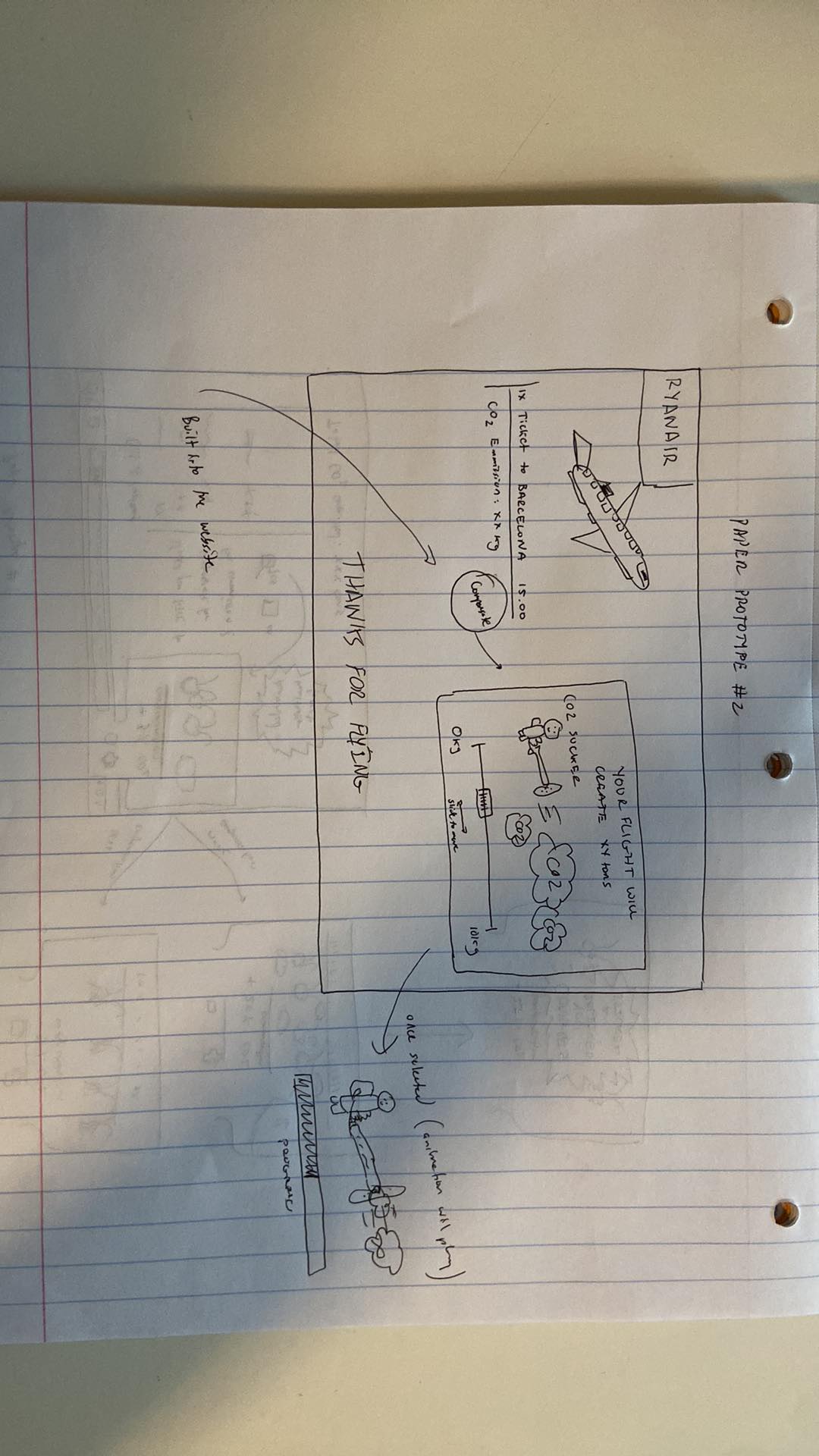
C: CO2-Buster
This tool should be used by webshops or online booking websites to offer an interactive way of CO2-compensation, instead of the usual check mark we see on most websites today.
The CO2-Buster let’s you choose your desired amount of CO2 to compensate by a slider, ranging from 0% to over 100% of your emissions caused by your purchase. This offers you the option to help other buyers, who can not afford the compensation or didn’t bother to.
The design is focussed on a positive and encouraging user experience, animating the Emissions as a cloud and then sucking up the part of the cloud you compensated for in a satisfying animation and finally congratulating you, for your effort against climate change, but never judging you for choosing less than 100%.
The costs will then just be added on top of your bill, based on percentage chosen and thus the respective amount of CO2 to compensate, simple and easy.
The focus of this prototype is really on simplicity of use and positive user experience. All one has to do is slide a slider to the desired position, representing the amount to compensate.
A: Forest Web Extension
Our motivation for this idea was to create something simple and omnipresent in your browser so that you are always aware of CO2 emission levels when purchasing new products. This idea we decided on was to create a virtual forest that would be present in the browser and could reprsent the user's total CO2 consumption and emission in a playful way.
Firstly, the store shopping page would display the CO2 emission levels and have a choice of wheter you want to compensate or not. This will be a simple choice and you can also choose what percentage you would like to compensate. When this happens, the web extension will pop up your forest giving you a reminder of the current state of your forest and to remind you to compensate if you can as well as the impact if you don't.


This forest would grow and change as your habits with CO2 emissions change as well. When you stop compensating your CO2 emission levels, the forest starts to die and you will see that the trees start to lose their leaves. When you start compensating you will recieve a popup where your forest is now blooming and swinging happily. This will continue until you unlock various rewards such as a virtual background or stickers to thank you for your compensation levels. Likewise, it is possible to have in-store rewards so that you actually end up saving more money shopping by compensating to reduce the CO2 emission levels.

Walktrough video (password: hci16): https://polybox.ethz.ch/index.php/s/wC0mm3tFBobonHu
B: Carbon Busters
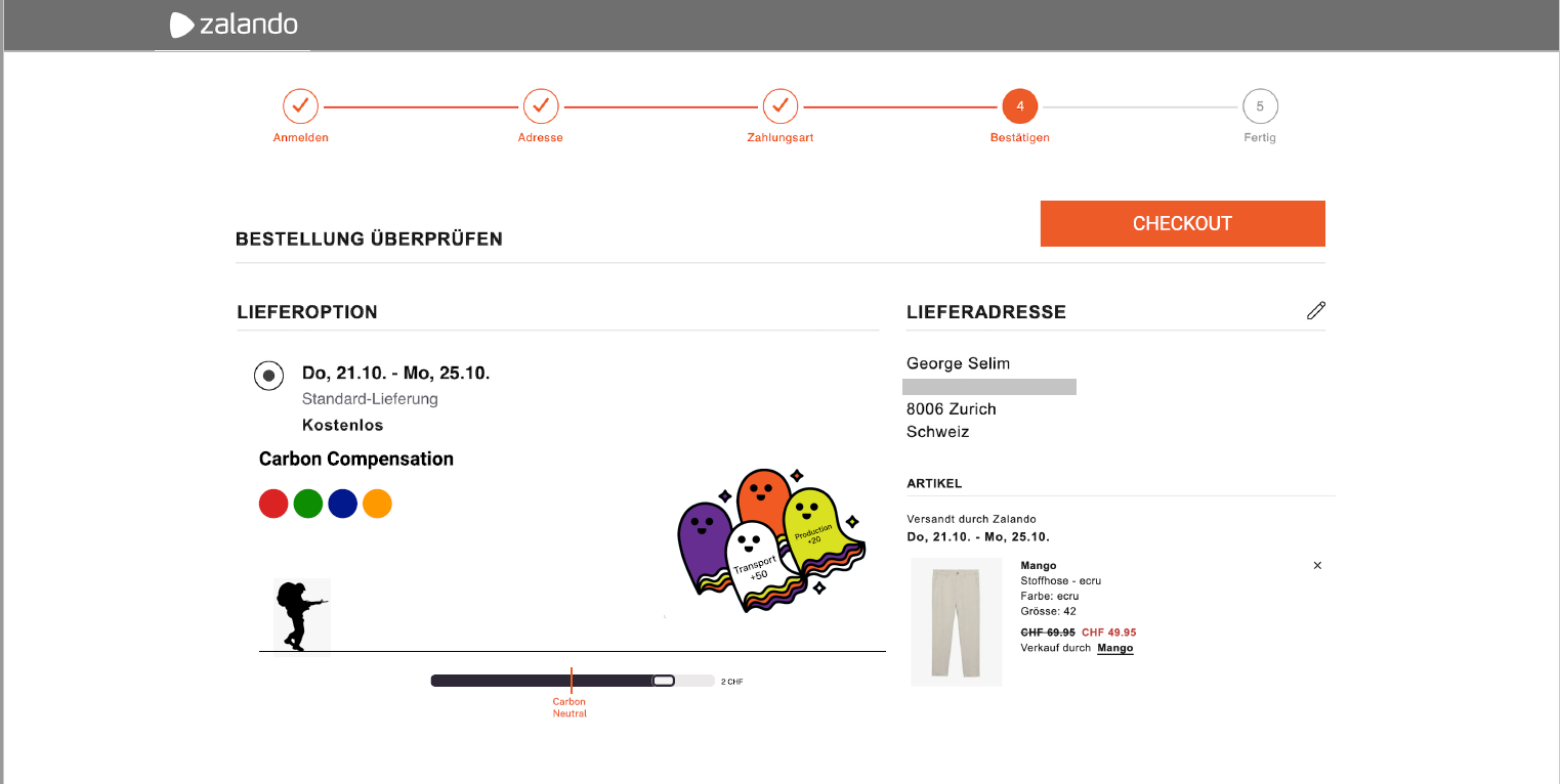
So the idea is like a parody of the famous cartoon GhostBusters, called Carbon Busters. On online shopping websites, right before checking out, you have a page with your order info, on that page we are adding a small game. The first thing you can do is choose your character (the 4 small circles), then move the slider(which is originally at the lowest value, 0).
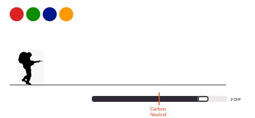
The slider determines how much money you want to pay for CO2 compensation, with a line determining the point where you are carbon neutral. We had the choice of letting the slider either control the amount of money payed or the amount of CO2 compensated, we preferred it showed the amount of money as it is more important to most users. As you can see, the slider allows users to become" Carbon Positiv"e. The Carbon is visualized by the ghosts, we have a ghost for each source of carbon (Transport, production, etc) To visualize how much of their emissions the users are compensating, we chose to keep it abstract. Most websites try their best to give users the easiest and more comfortable experience, if we start making users feel guilty about their purchases, our idea will not be adopted by the websites. So on each Ghost, you have a number, which represents how much(percentage) of that field of emission you have compensated. For example if the slider is on 10% compensation, the ghosts will show -90 on them, if the slider is on 150%, they will show +50. Another aspect is that the ghosts’ size grows with the slider growing, we also thought that a way to incite overcompensation would be to make the ghosts “like a puzzle”, meaning that only at 150% compensation they sit tucked together nicely in a visually satisfying way.
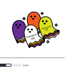
After making those 2 simple choices, the user goes to the checkout page, this page presents the confirmation of the order, and an animation of your character sucking in the ghosts play.
Under this animation the website tells you how much CO2 you compensated, and presents a comparison with something concrete(liters of fuel, kms in a car, trees planted, etc.)
We chose to add this comparaison here, as it only shows a concrete example of how much the user compensated and not how much they emitted with their purchase. Which results in a better user experience, as they would feel better about themselves. Also for the more curious, they can click on the learn more button to find out how exactly the website compensates and what projects are implemented.
Walkthrough video: https://drive.google.com/file/d/1M78UubB3j6UKLAwfGtzXocIIokS6COxE/view?usp=sharing
Group 07: The character choosing buttons were not clear, she didn’t know what they did(but that is mainly because the mid-fi prototype is not accurate enough). She said the numbers on the ghosts were confusing. The fact that the counter starts at 0 is good Maybe adding next to the money on the slider the amount of CO2. She liked the layout in the page. She liked the fact that the characters are humans. She liked the comparison of CO2 to ghosts The small animation is a nice plus. She would have liked to have a learn more button on the first page.
Group 10: She liked it because it is playful and interactive The numbers on the ghosts were confusing She would have liked a learn more button on the first page It’s not intuitive what you have to do at first, maybe change the UI? She said it’s special and she hadn’t seen this approach anywhere else.
Group 13: They hadn’t watched ghostbusters before so they weren’t very familiar with the topic. Therefore, he wasn’t as interested in the design. Also the different colors didn’t make sense to him but that had to take some explaining to clear up. In addition, he thought that the design was simple but liked the idea of having a slider to determine what amount of CO2 you can compensate for. He wanted more information on why there were ghosts as well.
TA: His concern was that of the A/B testing, the main core of this idea is visual, yet the course is about interaction, so we have to think about what will we test and how much interaction the user will have with the plugin.
Group 07: She really liked the simplicity of the design and how it was visually. She felt that having your personal forest you would get attached to it, so it would be a nice incentive to keep it alive. The user said that maybe more info about the widget (a learn more button) would be useful. She also liked the fact that it’s a pop up, so you can access it anytime.
Group 10: Didn’t understand what happened when the trees completely died and wasn’t sure if you could revive it. Also really liked the simplicity of the design. Wanted more control over what you could do with the plans and trees in the forest. Also had some suggestions on what should be in the rewards store such as discounts on purchases and collectable points/trophies. She said that this was easier to use and implement than carbon busters.
Group 13: Really liked the simplicity of the design and the idea that the forest was always there. He didn’t like how one of the rewards was a sticker because wouldn’t that create more CO2. Which is true and made me realize there needs to be mainly virtual rewards only. They also liked how there was a breakdown of where the CO2 came from.
TA: Thought it was cool to have a simple design but felt like there needed to be more interactivity. Thought both designs were nice but felt that there needed to be much more buttons and things to do and shouldn’t just be something that you watch the entire time. Liked the simplicity of the tree and forest design and how it tracks overall consumption and has a life-long history.
In light of the feedback we received from Groups 7, 10 and 13 and from the TA, we decided to discuss possible paths of development for our two Mid-Fidelity Prototypes, the Carbon Busters and Browser Extension Forest.
The focal point for most of the positive feedbacks was the simplicity of design for our both prototypes, and the main negative feedback centered around the lack of interaction on both our prototypes. For that reason, we tried to come up with different ways to improve the level of interaction of our prototypes while keeping the interface simple. Upon further discussion, we decided that Carbon Busters would enable a path for development with a higher level of interactivity. One example that we came up with was adding drop down lists on the cloud of carbon dioxide, detailing the origin of the emissions with various charts for more interested users. Otherwise, the graph would not be visible, keeping the interface clean and simple.
Another reason for choosing Carbon Busters over the Browser Extension Forest is the nature of the two prototypes. We had planned for Carbon Busters to be a plugin that would be included in the final phase of a purchase on websites such as Galaxus and Amazon. As a result, it would be visible to more user, regardless of their existing environmental concern, which will hopefully inspire people who are not normally environmentally conscious to compensate for their actions. The Browser Extension Forest, being an extension that has to be installed manually by users, would probably pique the interest of people who are already environmentally conscious, which would potentially limit the userbase.

Based on the Feedback, we decided to pursue the Carbon Buster Idea for our HiFi Prototype and drop the forest browser extension.
We want to keep the simplicity of the design as much as possible, as this was a main positive conclusion from the feedback and should therefore remain. On the other hand, we need to add an option to show more information about the CO2-causes. Also more Information should be displayed by default on the page, like total emission in kg and maybe a comparison to familiar emissions like car miles or flight distances. We are however still unsure on how to implement this while still keeping it as simple as possible. We’ll have to discuss this with the TA in the next exercise session.
As one of the testers wasn’t familiar with the Ghostbusters and thus couldn’t make sense of the ghost figures we will try to replace these with more cloud like versions to represent emissions better. We also want to change the “Buster”-Figurine to a “tree man” to better represent the action of taking up CO2 but still keeping it playful with the CO2-Sucker in the hands. Also the color selection for the CO2-Buster was often misunderstood or confusing, so we’re probably gonna drop this option.
We plan on keeping the UI from the MidFi Prototype in its basic looks but will add additional functionality like clickable Ghosts/Clouds to display more info, as well as better functionality for the slider bar. We plan on adding a tank to the CO2-Sucker to act as a display for compensation projects or total compensated CO2.
All in all, the compensation task should also involve a bit more user interaction than in the MidFi, with the goal to get the user better informed about the roots of his CO2 emissions as possible and create engagement to compensate.
We want to keep the option open of adding virtual rewards for overcompensating, coming from the second MidFi Prototype. But we are still not sure, if this would lead to a better experience or just useless over complication of the process.
For the programming environment we settled on using Javascript with Vue, as it was advertised as the beginner friendliest tool. Some of us are still beginners in front end development and have no previous experience in javascript, so this makes sense.
We plan on evaluating three sets of A/B tests. As a first variation, we would like to test two different input methods for the amount of CO2 to be compensated. One option is to offer a slidebar with continuous input. The other option is to use checkboxes, where the user can only choose discrete values. Secondly, we would like to encourage the user to find more information about their CO2 compensation by clicking on the ghosts/clouds. In particular, we want to try one version with growing and shrinking ghosts and another version with a fake cursor or finger/water drop animation. Finally, we want to test the influence of the slider’s starting position. Shall the default slider position be at “no contribution to compensation”, i.e. negative compensation, or at “CO2 neutral”, i.e. net compensation equals to zero? In the case of checkboxes, we would test a version with a pre-checked box at “no contribution to compensation” and one at “CO2 neutral”.
After consulting with the TAs, we decided to slightly modify the structure of our A-B tests in such a way that it make more sense. We decided to compare different slider formats instead of sliders versus checkboxes. Our initial idea was having a continuous slider where the position of the knob directly represents the amount to be compensated. On the other side of the test, we compare this with a discrete slider, where the value to be compensated increases in steps depending on where the knob is situated on the slider. For our second A-B testing, we decided to compare this whole concept of Carbon Busters with sliders with the existing sysem where the user simply ticks a checkbox to compensate for the whole carbon emission linked to that purchase. #Goal of the Study The goal of this study is to find the best input method in terms of effectiveness, error rate, user preference and SUS. Also, the input method shall enable the user to perceive the amount of CO2 compensated as accurately as possible. Secondly, this study aims to find out whether the system (carbon buster compensator with slidebar) surpasses the “existing” checkbox at checkout by means of motivation to compensate, perceived information, SUS, user satisfaction and task completion time. The above mentioned goals are relevant, because we want to build a system that motivates the user to compensate more for CO2 emissions. For this, we think that it is important that the user gets a good idea of the amount of CO2 compensated and keep him/her motivated. In addition, lower error rates, higher effectiveness and lower task completion time may prevent the user from “giving up” and not compensating. For this investigation, we have planned the following A/B tests:
- Vary input method: A. slidebar with continuous input; B. discrete slider
- Compare existing system and Carbon Busters: A. slidebar; B. existing system with checkbox at checkout
This then leads us to the following null hypotheses:
- There will be no effect of changing the input methods between a slider, checkboxes or direct value input on the effectiveness (time) of the user in choosing the CO2 to compensate.
- There will be no effect of changing the input methods between a slider, checkboxes or direct value input on the error rate (amount of clicks) of the user in choosing the CO2 to compensate.
- There will be no effect of changing the input methods between a slider, checkboxes or direct value input on the SUS of the user.
- There will be no effect of changing the input methods between a slider, checkboxes or direct value input on the user’s perception of the amount of CO2 compensated.
- There will be no effect of changing the input methods between a slider, checkboxes or direct value input on the total CO2 compensated.
- There will be no effect of changing the input methods between a slider, checkboxes or direct value input on user preference. (Which method they like the most)
(Plugin with slider is used:)
- There will be no effect of using our carbon busters plugin in comparison to using the “existing” checkbox system on the amount of CO2 compensated by the user.
- There will be no effect of using our carbon busters plugin in comparison to using the “existing” checkbox system on the CO2-compensation-information taken up by the user. (questionnaire)
- There will be no effect of using our carbon busters plugin in comparison to using the “existing” checkbox system on the SUS of the user.
- There will be no effect of using our carbon busters plugin in comparison to using the “existing” checkbox system on the user satisfaction. (questionnaire: to be defined)
- There will be no effect of using our carbon busters plugin in comparison to using the “existing” checkbox system on the time spent by the user to compensate. (task completion time)
First, the participants are asked to fill in a preliminary survey to better approximate their profiles. Then, the participants are asked to do two tasks which correspond to our two AB tests.
In the first task, participants are given a randomly generated cart, complete with the CO2 emission information. The participants are then asked to proceed with the checkout, with a given budget that varies between 25% and 125% of the total CO2 of the cart. This task is repeated 5 times for the standard checkbox-to-compensate checkout page and 5 times for the modified checkout page with our plugin. In the end, we compare how much CO2 was compensated on average in both cases.
In the second task, participants are once more given a randomly generated cart, again with the CO2 emission information. Once again, they have a budget ranging between 25% and 125% of the total CO2 emissions. There, they go through three of our designs for the checkout page, that are: continuous slider, discrete slider, and finally an input box where the user types in the percentage of CO2 they would like to compensate for. Since the order in which participants are presented with these three designs can potentially have an influence in the participants’ interaction with the test, we ask each participant to do this sequence three times, with a random order of input methods in every iteration. In this task, we measure how much CO2 is measured with each input method on average, and also, how fast the checkout process is completed on average with each input method.
Tasks: AB-1: (Checkbox or our Plugin, 5 repetitions) Generate random cart (total CO2 emitted, Transport CO2, …) Budget random in defined range 25%-125% of total CO2 Compensate as much as possible
AB-2: (Input method) (Random order of three designs, 3 repetitions) generate a random cart (total CO2 emitted, Transport CO2, ...) Budget random in defined range 25%-125% of total CO2 Compensate as much as possible Do it as fast as possible
We will be using a paired Wilcoxon signed rank test to compare the input methods. This is because we are using the same participant group for all tests, which means that they are not independent and that the distributions for the data for the input methods are not normal based upon the Shapiro-Wilk normality test (p-value < 0.05 for distributions tested) Test 1: Plugin vs traditional checkbox
To find out if our plugin motivates users to compensate more, we compared the percentage of the budget used to compensate using the checkbox and plugin interfaces. We conducted a Wilcoxon signed rank test. With the traditional checkbox input method, the average budget percentage was 28.4% (SD =39.3%) and for the plugin, the average was 41.3% (SD =34.2%). The mean difference between the plugin and the checkboxes was statistically significant: V = 1823, p-value = 7.227e-05. This indicates that using our plugin, the users ended up compensating more than using the traditional checkbox.
To find out if our plugin motivates users to find out more about their emissions, we looked at two metrics of our test results: the first being the error between the actual compensated emissions and the reported compensated emissions by the user in the questionnaire. We conducted a Wilcoxon signed rank test. With the traditional checkbox input method, the average error was 9.4% (SD =27.2%) and for the plugin, the average was 18.5% (SD =27.3%). The mean difference between the plugin and the checkboxes was statistically significant: V = 50, p-value = 0.1424. Those results indicate that the difference between the error percentage of the two interfaces was not statistically significant. The second metric was a question about the biggest emitter category, these results are presented in Fig.4 in the Appendix.
After the completion of the first test, the users were asked to choose a preferred interface between the two. Eight users chose the Carbon Busters plugin while six preferred the traditional checkbox. We also offered the option to give a reason for the preferred compensation method at the end of the questionnaire. The most common answer for the plugin preferring testers was along the lines of “allows to choose the amount,“ for the one preferring the checkbox it was usually the higher simplicity compared to the plugin.
To compare the effect of the input method on the completion time, we conducted a Wilcoxon signed rank test. With the traditional checkbox input method, the average time was 15001 ms (SD = 14303) and for the plugin, the average was 33199 ms (SD = 27932.07). The mean difference between the plugin and the checkboxes was statistically significant: V = 197, p-value = 8.933e-12. These results indicate that the input method plugin was slower than the traditional checkboxes. The H0 is rejected. This was probably because the checkboxes are much simpler to use and have less options so it took less time to pick a compensation there, that would maximize the budget. This also made the checkboxes simpler to use and therefore the task was completed faster. Test 2: Different inputs to Carbon Buster plugin
To compare the effect of the input method on the completion time, we conducted a Wilcoxon signed rank test. With the input method checkbox, the average time was 14476 ms (SD = 11052), for slider, the average was 14476 ms (SD = 11019), and for value input, the average was 25984 ms (SD=17069). The mean difference between the slider and the checkboxes were statistically significant: V = 1149 and p-value = 0.02403. Also, the mean difference between the checkboxes and the value was statistically significant: V = 426, p-value = 1.038e-08. Lastly, we also checked the difference between the slider and the value input and found that this was also statistically significant: V = 444, p-value = 1.72e-08. These results indicate that the input method checkboxes was the fastest, next was the slider, and last was the value input. Thus, H0 is rejected. This difference is most likely because it was difficult to choose a value that gave the participants a high compensation while getting close to the total budget with the value input, whereas with the slider, it was easier to change values, and the checkboxes were even simpler as there were only six options.
To compare the effect of the input method on the mouse clicks, we conducted a Wilcoxon signed rank test. With the input method checkbox, the average time was 3.05 ms (SD = 1.99), for slider, the average was 5.15 ms (SD = 2.83), and for value input, the average was 6.788 ms (SD=6.08). The mean difference between the slider and the checkboxes was statistically significant: V = 400.5, p-value = 1.575e-07. Also, the mean difference between the checkboxes and the value input was not statistically significant: V = 1106, p-value = 0.1785. Lastly, we also checked the difference between the slider and the value input and found it was also statistically significant: V = 297.5, p-value = 6.491e-07. These results indicate that the inout method slider was slower than the checkboxes but faster than the value input. Therefore, H0 is rejected. This was probably because the checkboxes are much simpler to use and have less options so there is less error when choosing the appropriate compensation to maximize the budget.
All graphs in Fig.1-3 in the appendix were measured on a scale of 1 to 5. Where 1 was the least intuitive and 5 was the most intuitive. To compare the effect of the input method on the intuitiveness score, we conducted a Wilcoxon signed rank test. With the input method checkboxes, the average score was 4.29 (SD = 1.213), slider had an average of 4.588 (SD = 0.62), and value input had an average of 2.47 (SD = 1.07). The test between value input and slider was statistically significant at V = 136, p-value = 0.0003913 and so was the best between value input at checkbox at V = 131, p-value = 0.001085, as both p-values were less than 0.05. These results indicate that the value input method had a worse intuitive score than the checkboxes and the slider. However, no comparison can be made between the checkboxes and the slider, as the p-value was greater than 0.05 (V = 20, p-value = 0.3429). Thus, H0 is partially rejected. This makes sense because the value input entry forced the user to think about how much they wanted to compensate and have to type it in as well. It was more annoying to deal with than the other two input methods, which were easier to simply slide the slider or just check a box.
To compare the effect of the input method on the percentage compensated, we conducted a Wilcoxon signed rank test. With the input method checkbox, the average percentage compensated was 41.875% (SD = 36.19), for slider, the average was 50.388%(SD = 37.244), and for the value input, the average was 54.11% (SD=37.85). The Wilcoxon test between the slider and checkbox (V = 2690, p-value = 0.0806), slider and value input (V = 3063, p-value = 0.6412), and checkbox and value input (V = 2578.5, p-value = 0.03311) led to p-values greater than 0.05. These results indicate that there was not enough evidence to conclude that there was a difference between the percentage compensated. The H0 is not rejected. This was possible because of there being a large error which led us to not being able to make a better conclusion. More testing would be appropriate.
The final report can be found here: https://github.com/eth-ait/hci-project-hci2021-group-16/blob/2021/Deliverables/Study/Group16_StudyReport.pdf
The Walkthrough Video can be found here https://github.com/eth-ait/hci-project-hci2021-group-16/blob/12cace7715f9926bac70a4e1293e79274cbc2e9d/Deliverables/WalkthroughVideo.mov