


A modern Entity progress card for Home Assistant's Lovelace UI.
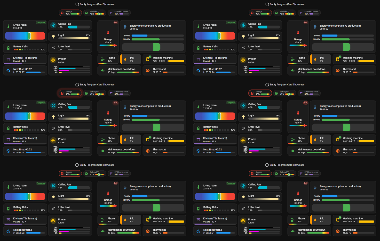
Thousands of Home Assistant dashboards run this card, every day. On a wall-mounted tablet. A phone. A screen that never turns off.
A glance is all it takes. A battery. A washing machine. A boiler. Read at a distance, in half a second — not deciphered.
Want simple? One click, and it's done. The right unit. The right icon. The right math. Resolved automatically, the moment you add an entity. No YAML required.
Want more? Every value can be a Jinja template. As deep as you want to go.
Not another progress bar. The progress bar that disappears — because it simply does what it's supposed to.
- 7 variants, one consistent card: a full dashboard card, a compact badge, a native Tile feature, several bars stacked into one — plain YAML or Jinja-powered, your call. Pick the shape that fits. Keep the same options.
- Native visual editor: point, click, done — most variants ship a full editor styled straight from Home Assistant's own design tokens, not a generic form bolted on top. No YAML required to get started (Tile Feature and Multi-Card/Multi-Feature are still YAML-only).
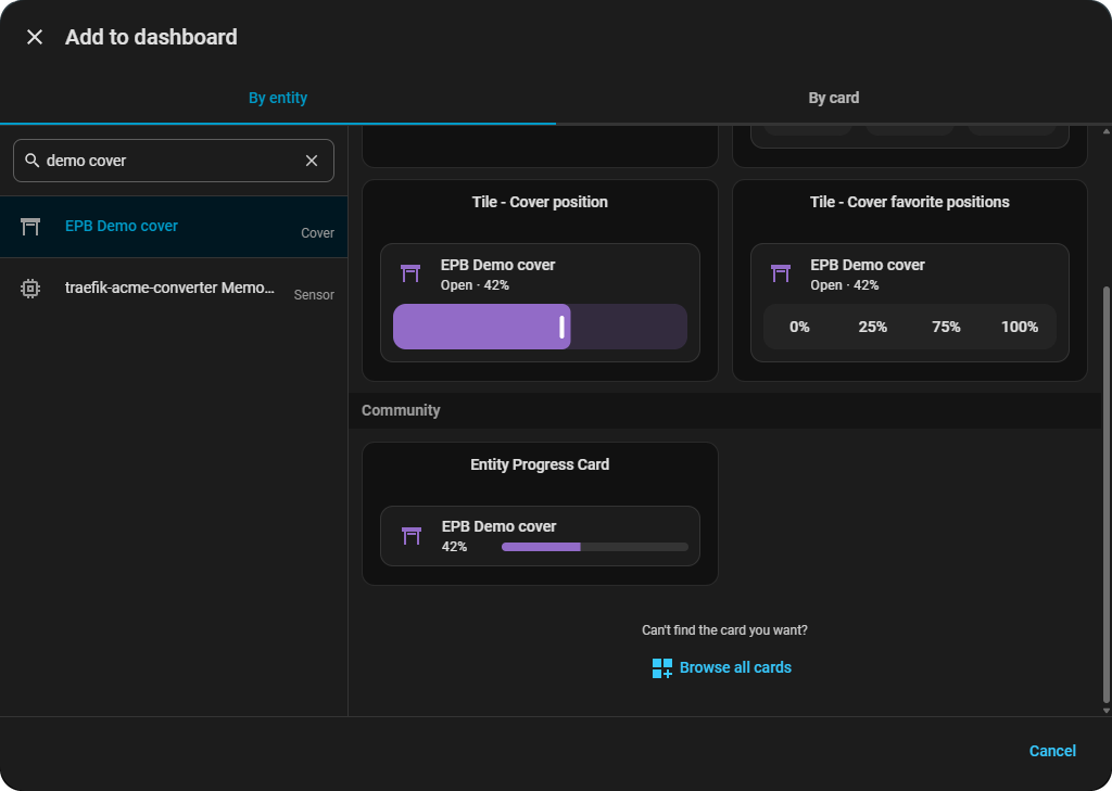
- It finds you first: pick a compatible entity — sensor, cover, fan, light, humidifier, climate, counter, timer — in Home Assistant's own entity-first card picker (2026.6+), and this card raises its hand. Pre-filled. Ready to use. No blank YAML stub to figure out.
- Set it and forget it: the right unit, icon and percentage math are resolved automatically from the entity's own domain — a sensible result out of the box, YAML or editor either way, before you override anything.
- Visual effects, built in: the bar sweeps, glows and shifts through
full-theme gradients on its own — shimmer, glass, rainbow, segmented, or your
own
custom_themecolor zones — and icons spin, pulse, or react to what the entity is actually doing. All combinable. Nocard_modneeded. - Alerts that find you: cross an
alert_whenthreshold and the card reacts on its own — a glowing border, a tinted background, a status pill, static or Jinja-driven. Pair it withcenter_zerofor bidirectional flows like charge/discharge in a single bar. - Reference lines that read as intent:
watermarkmarks a low/high threshold — blended, striped, triangle, round, or a hard line — sourced from a fixed value, another entity, or a Jinja template. Each side can override its own color/opacity/style, or just hide with a singlefalse. - Knows where it's been:
trend_indicatorreads a real history window to show ↑/↓/flat instead of reacting to a single noisy sample;peak_markermarks the min/max/average observed over that same window directly on the bar. Both seed themselves from Home Assistant's own history on load — no separate helper entity needed. - Jinja everywhere: skip the helper sensors — the Template variants compute the percentage, color, icon and text directly in YAML, non-linear math and multi-sensor logic included.
- Style without reverse-engineering the DOM: every color, spacing, border
and animation is exposed as a documented CSS variable (58
--epb-*hooks, see the Theme Guide) — apply them from a theme, or pointcard_modat exactly the ones that matter instead of guessing at internal class names. Zero runtime dependencies, so nothing extra to break. - Accessibility first: screen readers announce the right value, not a pile of divs. Motion backs off automatically for anyone with "Reduce Motion" set system-wide. Tap, hold, double-tap — all native Home Assistant actions, nothing reinvented.
- 39-language i18n: editor and error messages localized, not just the README. 🇸🇦 🇧🇩 🇨🇿 🇩🇰 🇩🇪 🇬🇷 🇬🇧 🇪🇸 🇫🇮 🇫🇷 🇮🇳 🇭🇷 🇮🇩 🇮🇹 🇯🇵 🇰🇷 🇲🇰 🇳🇴 (bokmål) 🇳🇱 🇵🇱 🇵🇹 🇷🇴 🇸🇪 🇹🇭 🇹🇷 🇺🇦 🇻🇳 🇨🇳.
Prerequisites / Browser compatibility (click to expand)
| Platform | Browsers | ||||
|---|---|---|---|---|---|
 |
 |
 |
 |
 |
 |
| Home Assistant | Chrome | Edge | Firefox | Safari | Opera |
2024.0+ |
98+ |
98+ |
94+ |
15.4+ |
84+ |
| Full visual effects | 111+ |
111+ |
113+ |
16.2+ |
97+ |
[!IMPORTANT]
Ensure your Home Assistant instance is up to date to support this custom card.
The first row is the functional minimum — the card loads and works. A handful of purely decorative touches (a soft tint behind icons, the pulsing alert/ping animations, the bar's gradient sheen) need the newer "Full visual effects" versions and gracefully degrade below that: same information, just a little less vivid. See the live degraded-mode comparison for exactly what's affected.
I'm aware upgrading an embedded/kiosk device (a wall-mounted control panel in particular, e.g. an older Chromium like Chrome 92 — see issue #128) isn't always simple, so this is a deliberate, pragmatic trade-off rather than an oversight: full functionality first, full polish where the browser allows it.
entity-progress-card is available in HACS (Home Assistant
Community Store).
Use this link to directly go to the repository in HACS

Tip
If you are unable to use the button above, follow the steps below:
✅ Add this repository to HACS: Go to HACS ➡️ Integrations ➡️ ⋮
➡️ Custom repositories.
✅ Paste the URL of this repository and select Dashboard as the category.
✅ Install the Entity Progress Card from HACS.
Manual Installation (click to expand)
- Download the file
entity-progress-card.js(from the last version) to the/config/www/directory in your Home Assistant setup. - Add
/local/entity-progress-card.jsto your Lovelace resources:- Go to Settings ➡️ Dashboards ➡️ Resources ➡️
⋮➡️ Add Resource - Set:
- URL:
/local/www/entity-progress-card.js - Type:
JavaScript Module
- URL:
- Save
- reload the browser cache (
CTRL+F5or clear cache).
- Go to Settings ➡️ Dashboards ➡️ Resources ➡️
-
Open Home Assistant's native "Add Card" picker and search for your entity.
-
Click Entity Progress Card — it's already there, pre-filled.
-
Enjoy.
Then tweak it — the visual editor (click to expand)
No YAML here either — every option gets its own field, styled straight from Home Assistant's own design tokens.
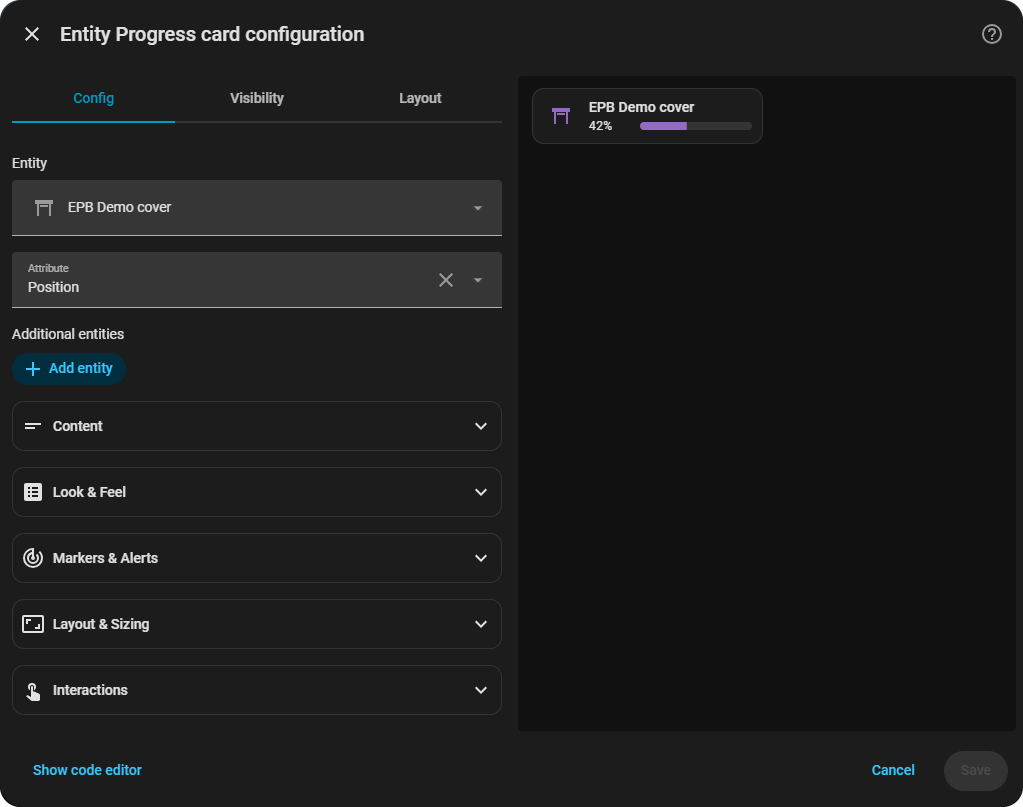
Point it at an entity, and it works:
type: custom:entity-progress-card
entity: sensor.washing_machine_progress
name: Washing Machine
icon: mdi:washing-machine
Want a specific color, a different bar style, an alert when it crosses a threshold? Same options work the same way across all 7 variants — Card, Template Card, Badge, Badge Template, Tile Feature, Multi-Card, Multi-Feature.
That's enough to get started. Past that, here's where the rest of the depth lives — pick whichever guide matches what you're trying to do:
| Guide | What's in it |
|---|---|
| 🍳 Cookbook | Every variant's option summary, every visual effect with a screenshot, and real-world recipes (washing machine brands, an SSL countdown, a sun-tracking bar) |
| 🎨 Theme Guide | All 12 built-in themes with their exact value ranges, the full --epb-* CSS API, and the DOM reference for card_mod/UI-X styling |
| 📖 Full Configuration Reference | Every option, every variant — type, default, and a working example |
The card is designed to work well for everyone, out of the box.
Details (click to expand)
- Screen readers: the progress bar exposes proper ARIA semantics
(
role="progressbar"with livearia-valuenow, including negative ranges incenter_zeromode). Purely decorative elements (fill layers, watermarks, icon shape) are hidden from assistive technologies, so the card is announced once, with the right value — not as a pile of divs. - Reduce Motion: the card respects the system-level "Reduce Motion" setting (iOS/macOS, Android, Windows). When enabled, bar transitions and shimmer animations are disabled automatically to prevent dizziness, migraines or distraction.
- Manual control: animations can also be tuned or disabled per card or per
theme through the CSS API — e.g.
--epb-progress-transition: none(see the Theme Guide). - Interactions: tap, hold and double-tap are handled by Home Assistant's native action system, so they behave consistently with official cards.
🌟 Our goal is to make this card a seamless and intuitive tool for users worldwide, eliminating language barriers and ensuring proper data formatting for every region. The card defaults to the language set in the user's profile, and is translated into 39 languages.
Full language list & number formatting (click to expand)
We strive to make this card as inclusive as possible, with support for:
| Flag | Code | Language (English / Native) |
|---|---|---|
| 🇸🇦 | ar | Arabic / العربية |
| 🇧🇩 | bn | Bengali / বাংলা |
 |
ca | Catalan / Català |
| 🇨🇿 | cs | Czech / Čeština |
| 🇩🇰 | da | Danish / Dansk |
| 🇩🇪 | de | German / Deutsch |
| 🇬🇷 | el | Greek / Ελληνικά |
| 🇬🇧 | en | English / English |
| 🇪🇸 | es | Spanish / Español |
| 🌎 | es-419 | Spanish (Latin America) / Español (Latinoamérica) |
| 🇪🇪 | et | Estonian / Eesti |
| 🇫🇮 | fi | Finnish / Suomi |
| 🇫🇷 | fr | French / Français |
| 🇮🇳 | hi | Hindi / हिन्दी |
| 🇭🇷 | hr | Croatian / Hrvatski |
| 🇭🇺 | hu | Hungarian / Magyar |
| 🇮🇩 | id | Indonesian / Bahasa Indonesia |
| 🇮🇹 | it | Italian / Italiano |
| 🇯🇵 | ja | Japanese / 日本語 |
| 🇰🇷 | ko | Korean / 한국어 |
| 🇱🇹 | lt | Lithuanian / Lietuvių |
| 🇱🇻 | lv | Latvian / Latviešu |
| 🇲🇰 | mk | Macedonian / Македонски |
| 🇳🇴 | nb | Norwegian Bokmål / Norsk Bokmål |
| 🇳🇱 | nl | Dutch / Nederlands |
| 🇵🇱 | pl | Polish / Polski |
| 🇵🇹 | pt | Portuguese / Português (Portugal) |
| 🇧🇷 | pt-BR | Portuguese / Português (Brazil) |
| 🇷🇴 | ro | Romanian / Română |
| 🇷🇺 | ru | Russian / Русский |
| 🇸🇰 | sk | Slovak / Slovenský |
| 🇸🇮 | sl | Slovene / Slovenščina |
| 🇸🇪 | sv | Swedish / Svenska |
| 🇹🇭 | th | Thai / ไทย |
| 🇹🇷 | tr | Turkish / Türkçe |
| 🇺🇦 | uk | Ukrainian / Українська |
| 🇻🇳 | vi | Vietnamese / Tiếng Việt |
| 🇨🇳 | zh-Hans | Chinese (Simplified) / 中文(简体) |
| 🇹🇼 | zh-Hant | Chinese (Traditional) / 中文(繁體) |
[!IMPORTANT]
I use translation tools to help bridge language gaps, as I'm not fluent in every language.
If you notice any mistakes, please understand they are purely unintentional — feel free to reach out on GitHub or Discord to fix it.
More languages may be added in the future to enhance accessibility!
Numbers are displayed based on your regional preferences, using:
- Your selected language settings (auto)
- Your specific format (manual selection)
- Or the system-defined format from your Home Assistant user profile
By default, the card uses standard Arabic numerals (0-9) for maximum compatibility.
Need help? Find solutions and important updates in the Errors, Deprecations & Troubleshooting Guide.
Want more features? Want to improve this card? Contributions are welcome! 🚀
Check out the Contributing Guide to get started.
-
Resources from Home Assistant
➡️ Custom Card Documentation -
Resources from @thomasloven – thank you!
➡️ PreLoading Lovelace Elements
➡️ Custom Element Loader Gist -
Inspired by Mushroom (Apache-2.0 license) — Copyright © Paul Bottein (@piitaya)
➡️ For the look & feel -
Inspired by bar-card (MIT License) — Copyright © Lucas Bramlage (@Gluwc)
➡️ No code was copied; this project is an original implementation. -
Inspired by superstruct (MIT License) — Copyright © Ian Storm Taylor (@ianstormtaylor)
➡️ Structural validation ideas to manage inputs (v1.5+). This implementation is original and does not reuse code from the library. -
Inspired by hass-progress-bar-feature (MIT License) — Copyright © Yury Tilis (@ytilis)
➡️ override HA's default feature row sizing behavior, preventing card height increase when using overlay features. -
Special thanks to @harmonie-durrant
➡️ PRs, HACS testing, debugging,Lighttheme and illustrations:docs/images/example.pngdocs/images/thumbnail.png
-
Special thanks to @jam3sward & @Duncan1106
➡️ README proofreading and improvements -
Special thanks to @mooseBringer & @RKT62 from Discord
➡️ Discord activity
➡️ Regular tests & feedbacks -
Special thanks to all contributors – including those who submitted pull requests, opened issues, and shared feedback (GitHub Issues / Discord)!
This project is licensed under the GPL-3.0 license.