fix(landing): derive readable text from author-chosen block colours (#569) - #576
Conversation


…569)

A landing-page block that sets its own colour paired it with a hardcoded
foreground, in both directions: the preview widget painted the accent and
assumed white on top, and used the accent as text on a card whose surface it
never checked — so the published fixture's Stats block (#0f172a) rendered
dark-on-dark and its numbers vanished.

The same gap is live in the app, and worse. `accentVars()` emitted
`--block-accent` with no paired foreground, so every block painting that
surface hardcoded `text-primary-foreground`/`text-white`; `Section` went
further and dropped `themeMap[theme]` — the class carrying the text colour —
whenever an author set a background, leaving a dark section rendering the
page's dark inherited `--foreground` on the public `/` and `/p/[slug]` routes.
Tenant theming overrode `--primary` but never recomputed
`--primary-foreground`, so a pale brand colour was white-on-pale everywhere.

One helper now derives one colour from the other: `readableOn()` picks the ink
by comparing real WCAG contrast ratios against both candidates (a luminance
cut sends green-600 to white at 3.3:1 when near-black scores 5.8:1), escalating
to pure black/white for mid-tones where neither branded ink clears AA;
`accentTextOn()` handles the inverse case, keeping the author's colour when it
already passes and otherwise mixing it toward white/black until it does.

- `accentVars()` emits `--block-accent-foreground`; the six blocks that paint
  an accent surface consume it instead of a hardcoded near-white
- `Section` rebinds the `--foreground` token, not just `color` — the Heading
  and Text blocks carry an explicit `text-foreground` that beats inheritance
- tenant CSS vars derive `--primary-foreground` from the tenant's brand colour
- the widget's stats value computes both inks and lets the same `dark:` variant
  that paints the card choose, since `resources/styles.css` is not part of the
  widget build and `dark:` resolves to `prefers-color-scheme`, not the `.dark`
  class the widget sets

The app copy under `lib/color/` and the widget copy under `mcp-server/` are
deliberate mirrors: mcp-server is not an npm workspace of the root package and
cannot import from `lib/`.

Co-Authored-By: Claude Opus 5 (1M context) <noreply@anthropic.com>
Claude-Session: https://claude.ai/code/session_01Ax5eoJNqvCPk8zqsmv9V3x
 guillermoscript
added
bug
guillermoscript
added
bug
Screenshots referenced from the pull request: the landing-page-preview widget
in light and dark for both demo fixtures, and a real Code Academy landing page
carrying a dark section, a pale section, a pale-accent hero and CTA.

Co-Authored-By: Claude Opus 5 (1M context) <noreply@anthropic.com>
Claude-Session: https://claude.ai/code/session_01Ax5eoJNqvCPk8zqsmv9V3x
Visual evidenceThe live app — a real Code Academy landing pageOne page carrying four author-set colours: a
In the "before" shot, "Dark section heading" is near-black on the near-black section — the section-background bug on a public route — while the hero title, the CTA title and both secondary buttons are white on pale yellow. In the "after" shot, each one takes its ink from the colour behind it. The preview widget —
|
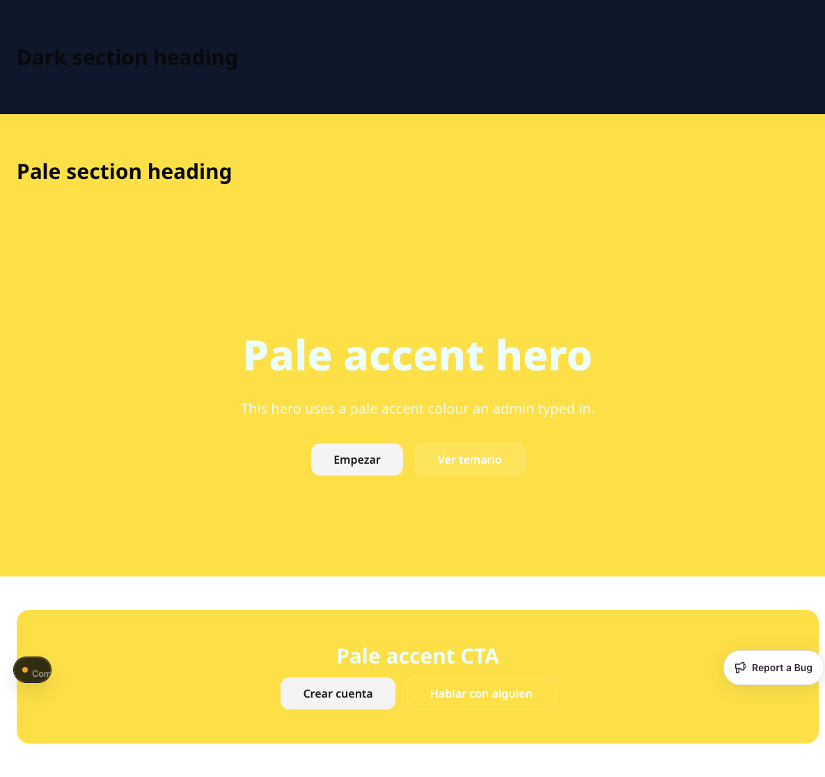
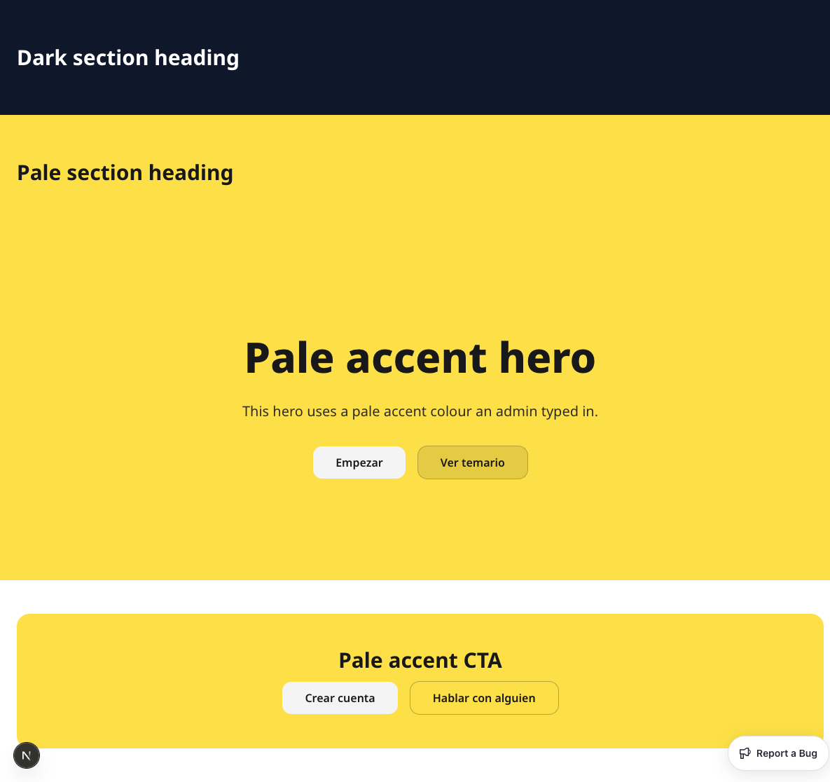
| Before | After | |
|---|---|---|
| dark | 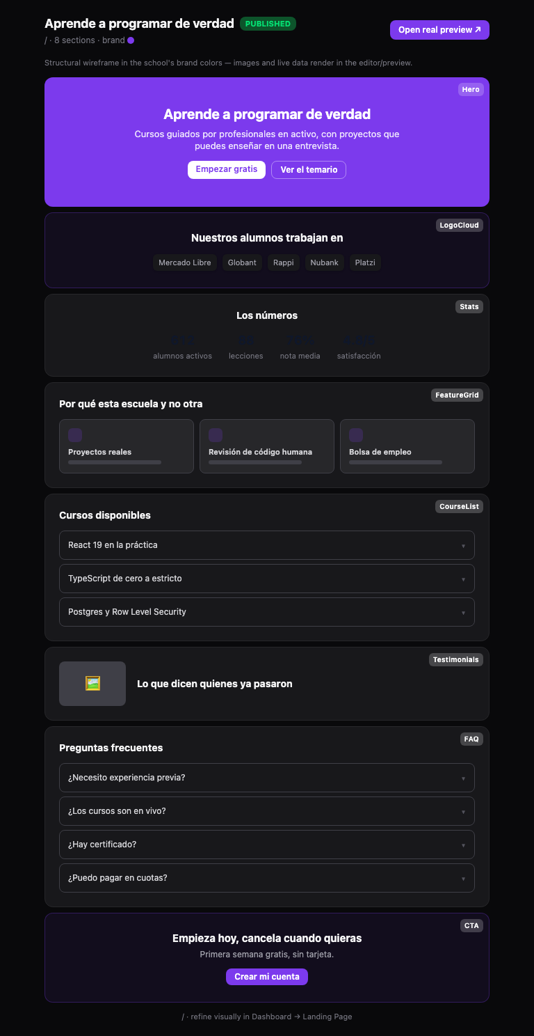 |
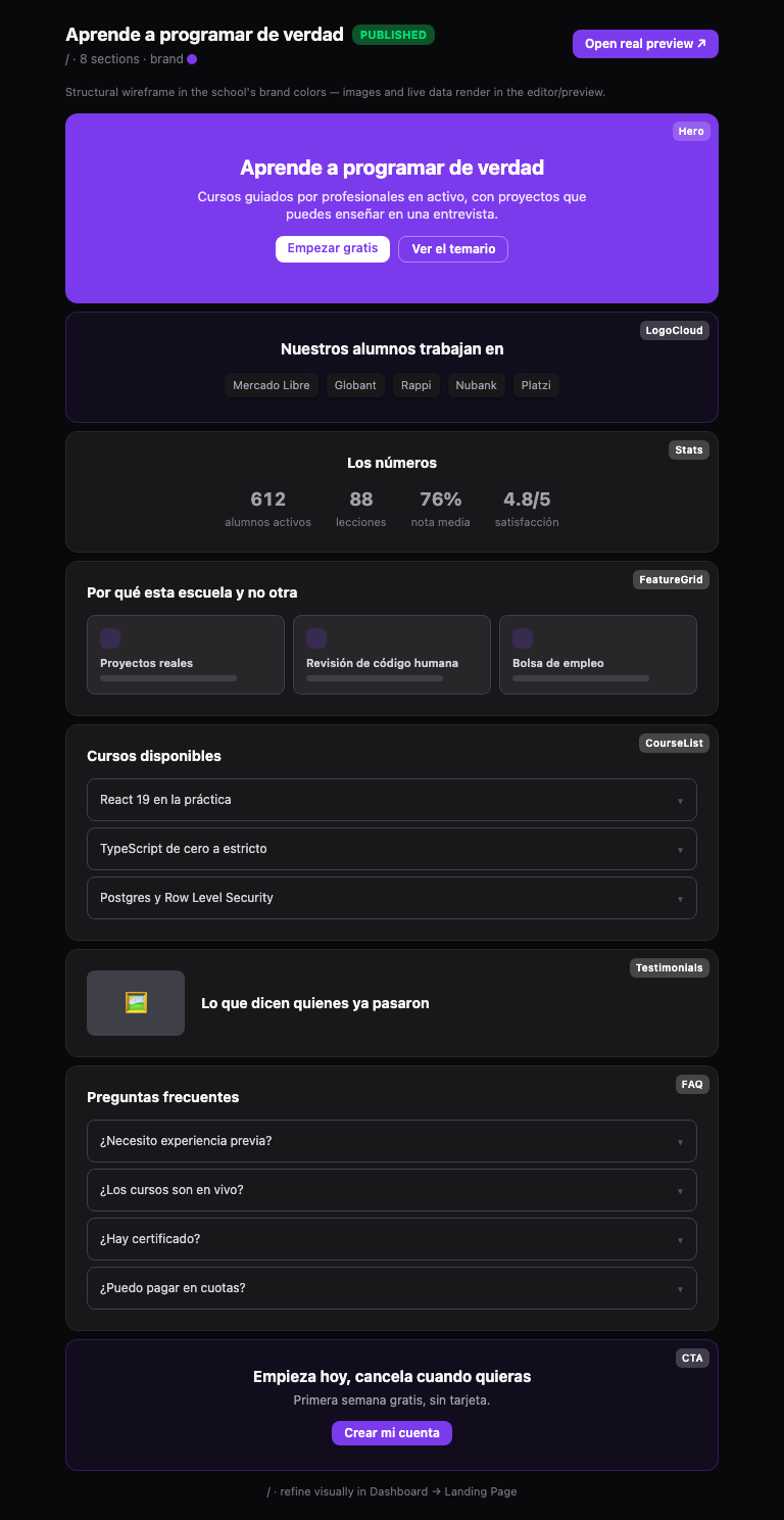 |
| light | 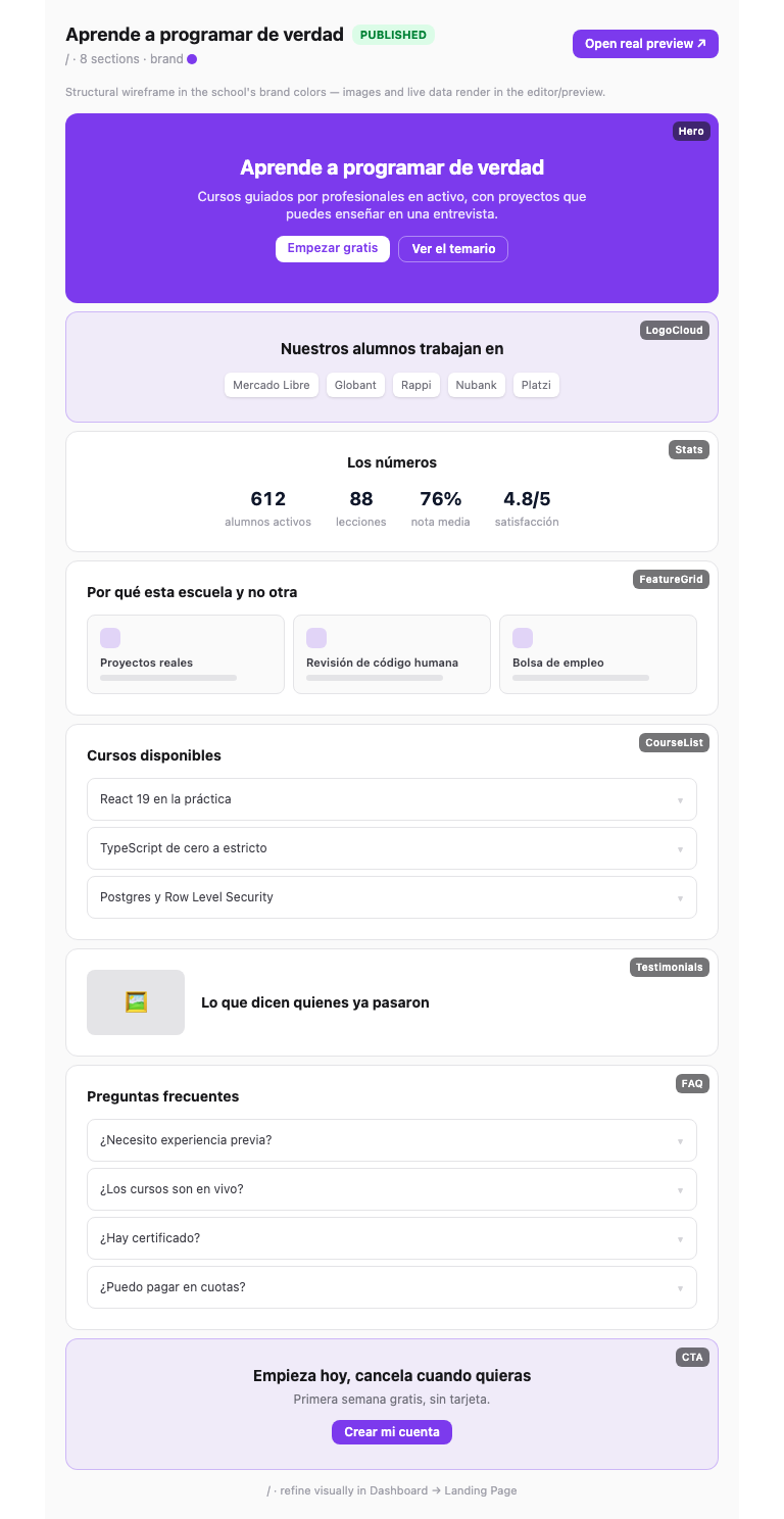 |
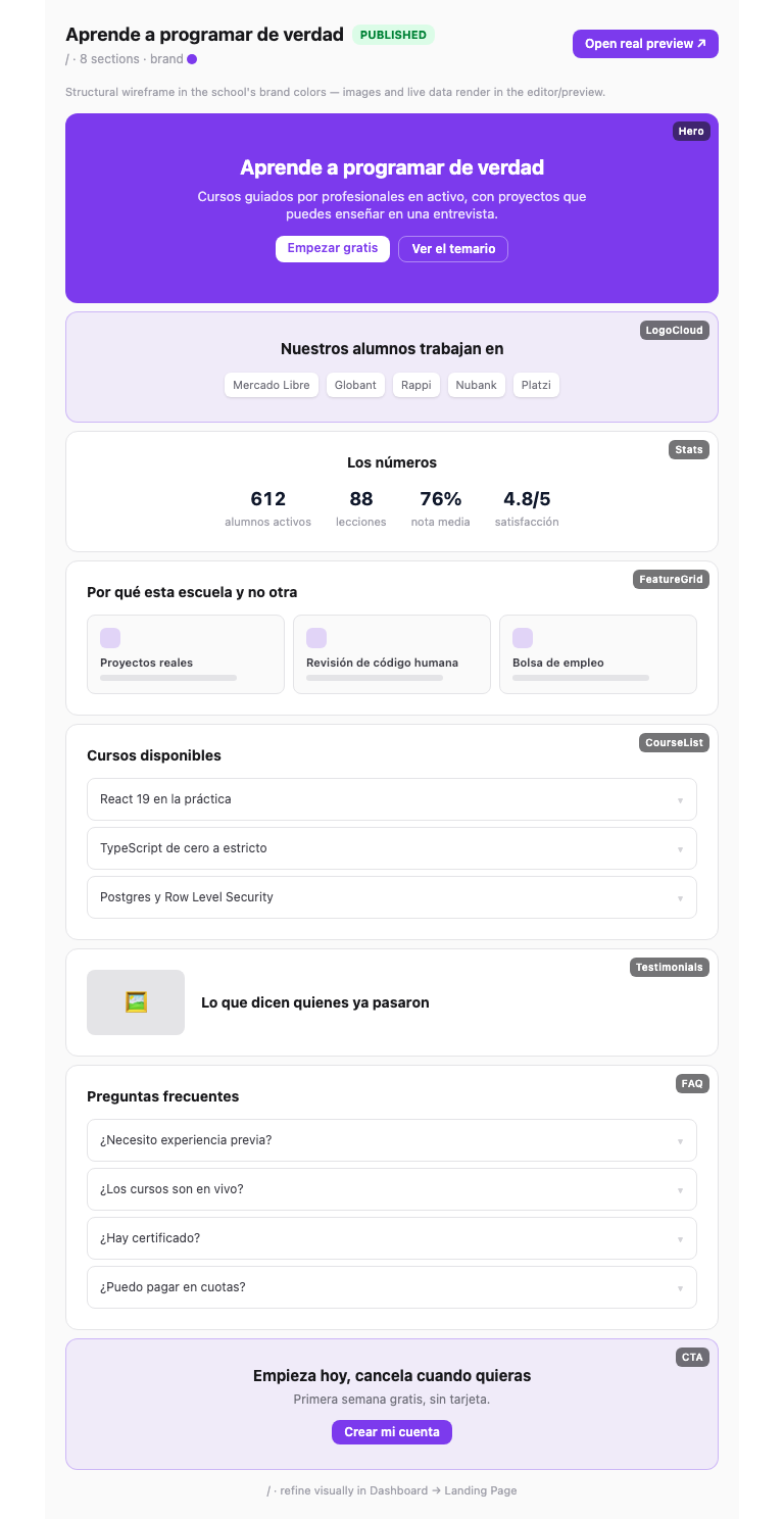 |
Light mode is included to show what did not change: the numbers were already legible there, and they stay that way.
landing_page_preview:draft-warnings
The second fixture from the issue's "Done when", unchanged in both themes — it sets no explicit block colour, so every section keeps the tenant brand.
| Before | After | |
|---|---|---|
| dark | 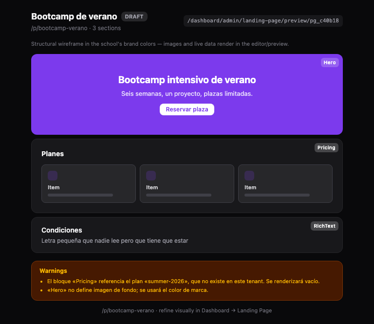 |
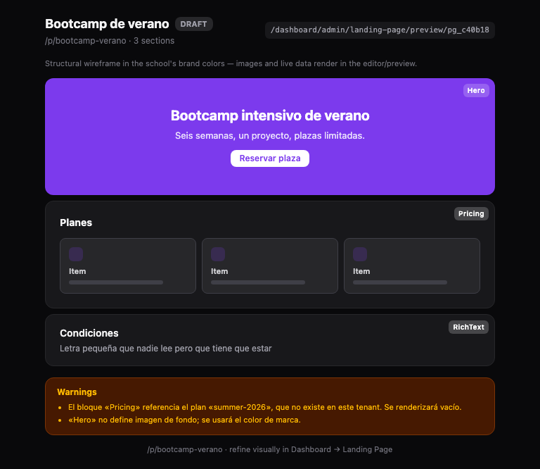 |
| light | 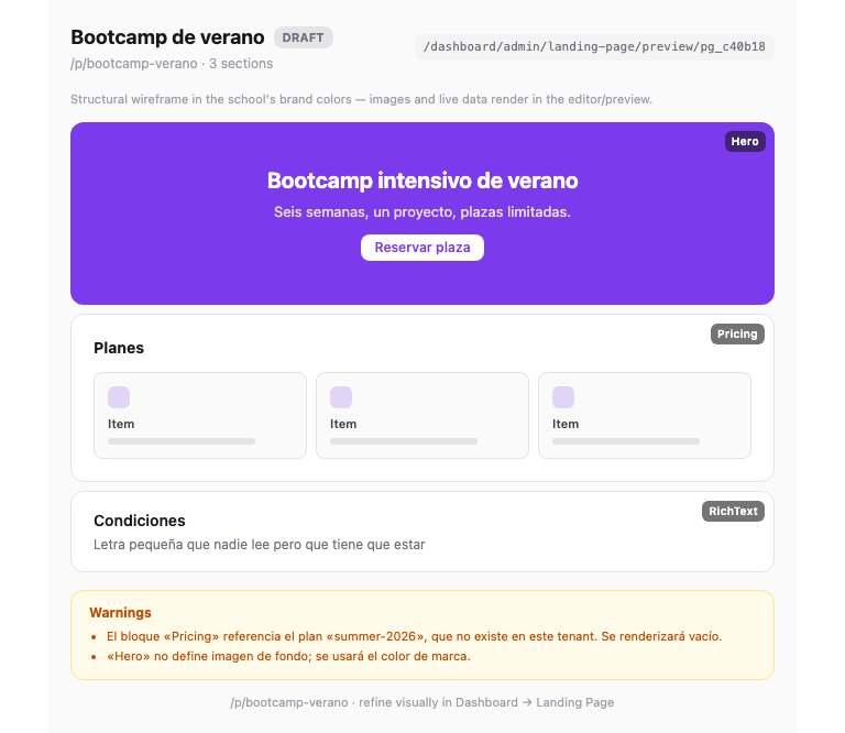 |
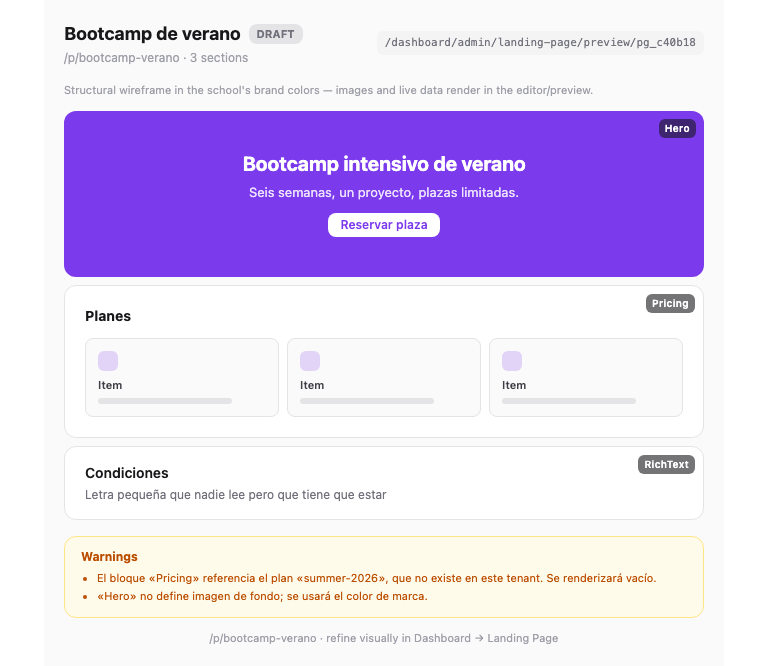 |
The app shots were taken by seeding a throwaway landing_pages row, screenshotting with the branch applied and again with the app files reverted to HEAD, then deleting the row — the local database is back to the zero rows it started with.
|
Merged into Shipped: one shared helper derives the foreground for any author-chosen block colour, replacing the hardcoded near-white that made a pale accent illegible and the raw accent that vanished on a dark card.
Verified before merge: tsc clean, 611 + 8 app tests, 56 mcp-server tests (17 new), both builds, and the new arbitrary Tailwind classes confirmed present in the compiled CSS. Before/after screenshots are in the comment above; the raw URLs are SHA-pinned, so they survive the branch being deleted. Two things left for a follow-up rather than smuggled in here: the pre-existing |
1 participant

What
A landing-page block that sets its own colour now derives the text colour that reads on top of it, through one shared helper, instead of pairing an author's colour with a hardcoded foreground.
Closes #569
Why
The reported case: the preview widget's
Statsblock uses the accent as its numbers, on a card that is white in light mode andzinc-900in dark. The published fixture setscolor: "#0f172a"— a legitimate value an admin can pick — so in dark mode the four numbers were dark-on-dark and effectively invisible, while the grey captions survived.Checking the app's real Puck blocks, as the issue suggested, found the same gap live — and broader:
accentVars()emitted--block-accentwith no paired foreground, so every block painting that surface hardcodedtext-primary-foregroundortext-white. That is the inverse failure: a pale accent renders white-on-pale.Sectiondeliberately droppedthemeMap[theme]— the class carrying the text colour — the moment an author set any background (section.tsx:104-110). The content then inherited the page's--foreground, which is dark in light mode, so a dark custom background was dark-on-dark on the public/and/p/[slug]routes.--primarybut never recomputed--primary-foreground, which stays a near-white. Any school with a pale brand colour got white-on-pale wherever a block fell back to the brand.No luminance or contrast helper existed anywhere in the repo.
How
readableOn(bg)picks the ink;accentTextOn(accent, surface)handles the inverse case, keeping the author's colour when it already clears AA and otherwise mixing it toward white/black in steps until it does, so the result still reads as their colour.Two things worth a reviewer's attention, because both were wrong in my first attempt and the tests/browser caught them:
readableOncompares real contrast ratios, not a luminance threshold. A single cut sends green-600 (#16a34a) to white at 3.30:1 when near-black scores 5.80:1 on the same surface. Two fixed inks also cannot always reach AA — a surface near the crossover (luminance ≈ 0.2) tops out around 4.3:1 against either — so mid-tones escalate to pure black/white, the only pair that clears 4.5:1 for every possible background.Sectionrebinds the--foregroundtoken, not justcolor. The blocks that land in its zone (Heading,Text) carry an explicittext-foreground, which beats an inherited colour — settingcoloralone looked correct and did nothing.@theme inlinemaps--color-foreground: var(--foreground)and that re-resolves per element, so rebinding on the section reaches every descendant using the token.In the widget, the stats value computes both inks and lets CSS choose via
text-[var(--stat-ink-light)] dark:text-[var(--stat-ink-dark)]. That is deliberate:mcp-server/resources/styles.cssis not part of the widget build (documented in its own header), so its@variant dark (&:where(.dark, .dark *))never compiles anddark:resolves to Tailwind's defaultprefers-color-schemequery — not the.darkclass the widget sets fromuseWidgetTheme(). I confirmed this in the built bundle: the rule sits inside@media (prefers-color-scheme:dark)and there are zero.darkdescendant selectors. Choosing the surface in JS from the theme hook would have drifted from the card the text sits on.lib/color/contrast.tsandmcp-server/resources/shared/contrast.tsare deliberate mirrors —mcp-serveris not an npm workspace of the root package and its widgets bundle separately, so it cannot import fromlib/; the widget already hand-mirrorsaccentVars()for the same reason.How to QA
The widget (no DB needed):
cd mcp-server && MCP_DEMO_WIDGETS=1 npm run devnpx mcp-use client screenshot --mcp http://localhost:3000/mcp --tool lms_demo_landing_page_preview variant=published --theme dark --output after.png--theme lightand withvariant=draft-warnings.The live app (
code-academy.lvh.me:3000, an enterprise-plan tenant — the Puck home page only renders for a non-default tenant on a paid plan):creator@codeacademy.com/password123and open Dashboard → Landing Page.#0f172aand drop a Heading inside → the heading is white and legible. Change the background to#fde047→ it flips to near-black.#fde047→ title, subtitle and both buttons are dark and legible (they were white-on-yellow before).gradient, and a solid Badge/Button primitive with a pale colour.Screenshots / GIF
Posted as a PR comment: before/after of the preview widget in light and dark, and before/after of a real landing page carrying a dark section, a pale section, a pale-accent hero and a pale-accent CTA.
Checklist
npm run typecheckandnpm run test:unitpass — tsc clean, 611 app tests + 8 new;mcp-server56 tests incl. 17 newnpm run buildpasses — app andmcp-server(18 widgets); verified the new arbitrary classes actually compile into the CSS rather than being silently droppedtenant_id— no queries addedmessages/en.jsonandmessages/es.json— none addedNotes for the reviewer
--no-verify).lint-stagedlints whole files, andenroll-cta.tsx:56has a pre-existingreact-hooks/rules-of-hooksviolation (useTranslationsinsiderender) that predates this branch —git show HEAD:...confirms it, and my diff does not touch that line. Fixing it would mean restructuring a component unrelated to this issue.--primary-foregroundchanges primary-surface text for any school whose brand colour is pale enough to cross the threshold — which is the fix, but it reaches beyond the landing blocks (buttons, sidebar). It is additive and only emitted when the colour parses; mid and dark brand colours such as the default#7c3aedkeep white text exactly as today.oklch/oklab/lab/lchare approximated by their lightness channel. We only ask "is this light or dark", and a grey of equal perceptual lightness answers it without a full colour-space conversion.