Conversation
| */ | ||
|
|
||
| export const FeedbackModal = (props: FeedBackModalProps) => { | ||
| const { onFeedbackSubmit, displayStrings: passedInDisplayString } = props; |
There was a problem hiding this comment.
This API is not consistent with the advanced usage that all components are supposed to support.
https://github.com/iTwin/itwin-synchronization-report-ui#4-advanced-usage
And the missing props (className and delegated props) would be difficult to add with the current setup: does it go on the button or the modal? Maybe it would help to split into separate components.
There was a problem hiding this comment.
I see your point. If we split this into separate components, how would that look in the .tsx? Something like
<FeedbackModalButton>
    <FeedBackModal onFeedbackSubmit={() => void} />
</FeedbackModalButton>
or
<FeedbackModalButton modal={<FeedBackModal onFeedbackSubmit={() => void} />} />
Or maybe we change the name of this component to just <FeedbackModalButton /> and just expose the button and have the classnames apply to the button only. Another options would be to make the modal property on the second example above be optional, and if the user wants they can include a custom modal, but by default (nothing passed in) we display our modal.
There was a problem hiding this comment.
I think this makes sense:
<FeedbackModalButton modal={<FeedBackModal onFeedbackSubmit={() => void} />} /> We can't make the modal optional because our modal doesn't do anything by default (the feedback goes nowhere).
There was a problem hiding this comment.
Duh, definitely can't be optional. I'll rename this component and split these apart. That will make it easier to test this in the future anyway.
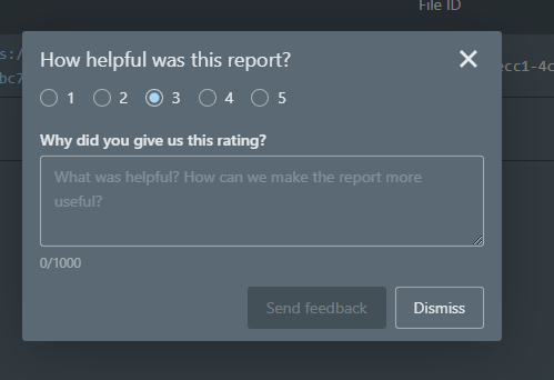
| <InputGroup label='' message={displayStrings.inputGroupMessage} className='isr-feedback-inputgroup'> | ||
| <Radio name='choice' label='1' onChange={() => setRating(1)} /> | ||
| <Radio name='choice' label='2' onChange={() => setRating(2)} /> | ||
| <Radio name='choice' label='3' onChange={() => setRating(3)} /> | ||
| <Radio name='choice' label='4' onChange={() => setRating(4)} /> | ||
| <Radio name='choice' label='5' onChange={() => setRating(5)} /> | ||
| </InputGroup> |
There was a problem hiding this comment.
Hard to recommend this kind of layout.

Have you tried placing them inline?
There was a problem hiding this comment.
I tried inline and didn't know what was worse tbh. I'm not a huge fan of either, but I guess we can take the one you like the best.
There was a problem hiding this comment.
Would a slider work? You can cap the slider at 5 and force the values to whole numbers.
3 participants
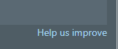
Added the Feedback Modal component. I pretty much just copied the Feedback Modal from the current Badgers Report. Feel free to suggest changes. This is not included in the basic usage of the
<Report />component.Button to display modal, rendered at the bottom left of the report.