StoryLite is a lightweight, Vite-powered alternative to Storybook for building and showcasing component stories in HTML, React, Svelte, Vue, and Solid. It gives projects a focused story workflow with a managed app shell, isolated preview iframe, story controls, static output, and optional framework renderer adapters.
Use it when you want story-driven component previews without the full Storybook addon platform or configuration surface. Start with HTML or web components, then add framework adapters only where your project needs them.
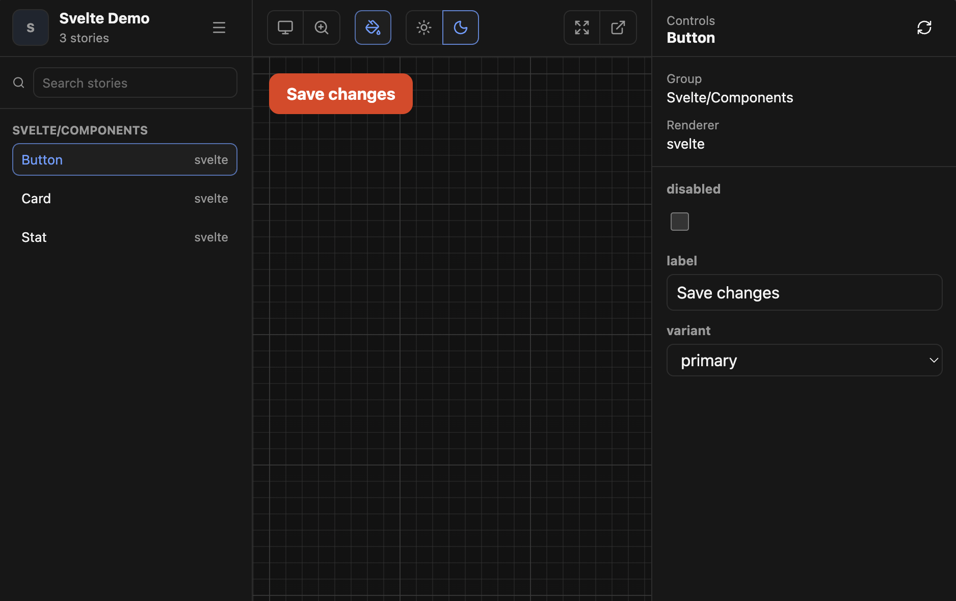
- Managed CLI app: run
storylite dev,storylite build, andstorylite preview. - Portable previews: configured project CSS is injected into the isolated preview iframe and static story pages.
- Built-in renderers for
htmlandweb-components. - Optional adapters for React, Svelte, Vue, and Solid.
- CSF-like story files with
args,argTypes, controls, and per-story parameters. - Static build with a prerendered manager shell and one static page per story.
- Project customization for branding, backgrounds, viewports, toolbar tools, menu links, HTML hooks, home content, and Vite plugins.
Install StoryLite in the package that owns your stories:
pnpm add -D @storylite/storyliteAdd a framework adapter only when you need one:
pnpm add -D @storylite/renderer-react
pnpm add -D @storylite/renderer-svelte
pnpm add -D @storylite/renderer-vue
pnpm add -D @storylite/renderer-solid
Add scripts:
{
  "scripts": {
    "storylite": "storylite dev",
    "storylite:build": "storylite build",
    "storylite:preview": "storylite preview"
  }
}StoryLite exposes three commands:
storylite
storylite dev
storylite build
storylite preview
Running storylite without a command prints help. --help and -h are supported globally and
after each command.
| Option | Description |
|---|---|
-h, --help |
Print CLI usage help. |
Starts the managed Vite development server.
storylite dev --port 4103 --host 127.0.0.1| Option | Description |
|---|---|
--port <port> |
Dev server port. Defaults to 3993, or PORT when it is set. |
--host [host] |
Host to listen on. Pass without a value to expose on all hosts. |
EXPOSE_HOST=1 and EXPOSE_HOST=true also expose the dev server on all hosts.
Builds the static StoryLite output into dist-storylite.
storylite build --base /docs/| Option | Description |
|---|---|
--base <path> |
Public base path for generated asset and story URLs. Defaults to ./. |
STORYLITE_BASE can also set the build base path.
Serves dist-storylite with Vite preview.
storylite preview --port 4103 --host 127.0.0.1 --base /docs/| Option | Description |
|---|---|
--port <port> |
Preview server port. Defaults to 3993, or PORT when it is set. |
--host [host] |
Host to listen on. Defaults to exposing on all hosts for preview. |
--base <path> |
Public base path used while serving the built output. Defaults to ./. |
Create .storylite/config.ts:
import { defineConfig } from '@storylite/storylite'

export default defineConfig({
  stories: ['./src/**/*.stories.ts'],
  css: ['./src/styles.css'],
})
Create a story:
import type { StoryLiteMeta, StoryLiteStoryDefinition } from '@storylite/storylite'
import buttonHtml from './button.html?raw'

export default {
  title: 'Components/Button',
} satisfies StoryLiteMeta

export const Primary = {
  args: {
    label: 'Save changes',
  },
  argTypes: {
    label: { control: 'text' },
  },
  render: (args) => buttonHtml.replace('{{ label }}', String(args.label)),
} satisfies StoryLiteStoryDefinition<{ label: string }>
Run StoryLite:
pnpm storyliteBuild static output:
pnpm storylite:buildstorylite build writes dist-storylite/index.html plus one default-args static page per story at
dist-storylite/stories/<story-id>/index.html. Static asset URLs are relative by default so the
output can be hosted from a subpath.
StoryLite reads .storylite/config.ts first, then .storylite/config.js. Export with
defineConfig for typed authoring:
import { defineConfig } from '@storylite/storylite'

export default defineConfig({
  stories: ['./src/**/*.stories.{ts,tsx}'],
  css: ['./src/styles.css'],
  home: '# Component Library',
  setup: './.storylite/setup.ts',
  renderers: [],
  vitePlugins: [],
  storyId: (_path, suggestedId) => suggestedId,
})| Option | Description |
|---|---|
stories |
Glob patterns for story modules. Required. |
css |
Shared CSS files injected into the preview iframe and static story pages. |
home |
Inline Markdown source for the home page. Overrides .storylite/home.md when set. |
publicDir |
Static asset directory served at / in dev and copied into dist-storylite. Defaults to public. Set false to disable. |
setup |
Optional module exporting setupPreview(window) for preview setup. |
renderers |
Optional renderer adapters, such as react(), svelte(), vue(), or solid(). |
vitePlugins |
StoryLite-specific Vite plugins. Use this for Tailwind, aliases, and other project transforms. |
storyId(path, suggestedId) |
Optional story ID rewrite hook. |
Story IDs strip the leading src/ segment by default. For example,
src/components/button.stories.ts becomes components-button--primary. Duplicate IDs are shown in
the dev UI and fail storylite build.
Put static files that need stable names in public/. StoryLite serves them from / during
storylite dev and copies them to the root of dist-storylite during storylite build:
public/favicon.ico
public/robots.txt
Reference those files with root-relative URLs such as /favicon.ico. StoryLite keeps those URLs
base-safe in built output. For example, storylite build --base /docs/ rewrites matching public
asset URLs in generated pages to /docs/..., while relative builds rewrite nested static story
pages to paths such as ../../favicon.ico.
To use a different directory or disable public assets:
export default defineConfig({
  publicDir: './.storylite/public',
  // publicDir: false,
})Configured css files are processed by Vite as ?inline, so Vite plugin transforms run before the
CSS string is injected into previews:
export default defineConfig({
  css: ['./src/styles.css'],
})
Story-specific CSS can also be supplied through parameters.css:
export const Primary = {
  parameters: {
    css: '.button { border-radius: 8px; }',
  },
}
If story-specific CSS needs Vite transforms, import it as ?inline instead of ?raw:
import css from './button.css?inline'

export const Primary = {
  parameters: { css },
}StoryLite runs an isolated Vite config for its managed app instead of merging the consuming
project's full vite.config.ts. Add StoryLite-specific Vite plugins with vitePlugins:
import { defineConfig } from '@storylite/storylite'
import tailwindcss from '@tailwindcss/vite'

export default defineConfig({
  stories: ['./src/**/*.stories.tsx'],
  css: ['./src/styles.css'],
  vitePlugins: [tailwindcss()],
})
vitePlugins can also be a callback:
vitePlugins: ({ target, command, projectRoot }) => {
  if (target === 'static') return []
  return [tailwindcss()]
}
The callback receives:
| Field | Values |
|---|---|
target |
'manager', 'prerender', or 'static' |
command |
'serve' or 'build' |
projectRoot |
Absolute path to the consuming project |
Install Tailwind:
pnpm add -D tailwindcss @tailwindcss/viteConfigure StoryLite:
import { defineConfig } from '@storylite/storylite'
import tailwindcss from '@tailwindcss/vite'

export default defineConfig({
  stories: ['./src/**/*.stories.tsx'],
  css: ['./src/styles.css'],
  vitePlugins: [tailwindcss()],
})
Add Tailwind to the configured stylesheet. When your utility classes live in story/component files,
explicitly register those files with @source:
@import 'tailwindcss';
@source './components';StoryLite ships built-in support for html and web-components. Framework support is added with
renderer adapters so each project only installs the runtimes it uses.
import { defineConfig } from '@storylite/storylite'
import react from '@storylite/renderer-react'

export default defineConfig({
  stories: ['./src/**/*.stories.tsx'],
  css: ['./src/styles.css'],
  renderers: [react()],
})import svelte from '@storylite/renderer-svelte'
import vue from '@storylite/renderer-vue'
import solid from '@storylite/renderer-solid'
export default defineConfig({
renderers: [svelte(), vue(), solid()],
})Each adapter owns its client renderer, optional static renderer, and adapter-specific Vite plugins.
Changing renderer adapters in .storylite/config.ts requires restarting storylite dev.
StoryLite supports a focused CSF-like subset:
import type { StoryLiteMeta, StoryLiteStoryDefinition } from '@storylite/storylite'

type ButtonArgs = {
  label: string
  variant: 'primary' | 'secondary'
  disabled: boolean
}

export default {
  title: 'Components/Button',
  args: {
    variant: 'primary',
    disabled: false,
  },
  argTypes: {
    label: { control: 'text' },
    variant: { control: 'select', options: ['primary', 'secondary'] },
    disabled: { control: 'boolean' },
  },
  parameters: {
    renderer: 'html',
  },
} satisfies StoryLiteMeta<ButtonArgs>

export const Primary = {
  name: 'Primary',
  args: {
    label: 'Save changes',
  },
  render: (args) => `<button data-variant="${args.variant}">${args.label}</button>`,
} satisfies StoryLiteStoryDefinition<ButtonArgs>| Field | Description |
|---|---|
title |
Story group title in the sidebar. |
component |
Optional component reference or web component tag name. |
args |
Default story args. |
argTypes |
Control metadata. |
parameters |
Default story parameters. |
| Field | Description |
|---|---|
name |
Optional display name. Defaults to the export name. |
component |
Optional story-specific component. |
args |
Args merged over default export args. |
argTypes |
Arg types merged over default export arg types. |
parameters |
Parameters merged over default export parameters. |
render(args, context) |
Story render function. |
Supported control types:
booleantextnumbercolorselect
Controls can be declared as a string:
argTypes: {
  disabled: { control: 'boolean' },
}
Or as an object:
argTypes: {
  variant: {
    control: { type: 'select' },
    options: ['primary', 'secondary'],
    description: 'Visual treatment',
  },
}
If no control is provided, StoryLite infers a simple control from the current arg value.
| Parameter | Description |
|---|---|
renderer |
Renderer name: html, web-components, or an adapter renderer such as react. |
css |
Per-story CSS string or array of strings. |
background |
Initial preview background value. |
defineCustomElements(window) |
Registers custom elements in the preview window. |
render(args, context) receives:
| Field | Description |
|---|---|
id |
Normalized story ID. |
title |
Story group title. |
name |
Story display name. |
canvas |
Canvas element where the story is mounted. |
document |
Preview document. |
window |
Preview window. |
For HTML stories, return a string, Node, or DocumentFragment. Framework adapter stories usually
use component and adapter-specific rendering instead.
Use the built-in web-components renderer when your component is a custom element:
export default {
  title: 'Components/DemoButton',
  component: 'demo-button',
  parameters: {
    renderer: 'web-components',
    defineCustomElements: (window) => {
      window.customElements.define('demo-button', DemoButton)
    },
  },
}

export const Primary = {
  args: {
    label: 'Save',
  },
}
Web components should remain progressive enhancements: the light-DOM markup should be visible and styled before JavaScript upgrades behavior.
StoryLite's manager UI can be customized from ui:
export default defineConfig({
  ui: {
    brand: {
      markHtml: '<span>UI</span>',
      titleHtml: '<strong>Design System</strong>',
      subtitle: 'Component workbench',
    },
    backgrounds: (defaults) => [...defaults, { label: 'Brand', value: '#eff6ff' }],
    viewports: (defaults) =>
      defaults.map((viewport) =>
        viewport.icon === 'mobile' ? { ...viewport, width: 390 } : viewport,
      ),
    css: '.brand__mark { color: var(--sl-primary); }',
  },
})| Option | Description |
|---|---|
brand.markHtml |
Trusted project HTML for the sidebar mark. |
brand.titleHtml |
Trusted project HTML for the sidebar title. |
brand.subtitle |
Plain text for the subtitle below the title. Defaults to <count> stories. |
backgrounds |
Replace or extend preview background presets. |
viewports |
Replace or extend toolbar viewport presets. |
css |
CSS injected into the StoryLite manager chrome. |
brand.subtitle is rendered as text. Use brand.markHtml and brand.titleHtml only for trusted
project-source HTML.
Viewport widths can be numbers or strings. Numeric widths are normalized to pixels. The built-in grid background can be tuned with preview CSS variables:
--storylite-grid-size--storylite-grid-major-size--storylite-grid-offset--storylite-grid-line-width--storylite-grid-line-color--storylite-grid-line-color-2--storylite-grid-background-color
ui.toolbar adds project-defined tools to a separate toolbar group. StoryLite intentionally ships
no project-specific custom toolbar defaults.
export default defineConfig({
  ui: {
    toolbar: [
      {
        type: 'toggle',
        id: 'a11y-outlines',
        label: 'A11y outlines',
        icon: 'accessibility',
        defaultValue: false,
        target: { type: 'preview-class', name: 'show-a11y-outlines' },
      },
      {
        type: 'select',
        id: 'density',
        label: 'Density',
        icon: 'layout',
        options: [
          { label: 'Comfortable', value: 'comfortable' },
          { label: 'Compact', value: 'compact' },
        ],
        target: { type: 'preview-class', prefix: 'density-' },
      },
      {
        type: 'link',
        id: 'repo',
        label: 'Repository',
        icon: 'external-link',
        href: 'https://github.com/example/design-system',
        target: '_blank',
        rel: 'noreferrer',
      },
    ],
  },
})
Supported tools:
| Type | Description |
|---|---|
toggle |
Icon button with aria-pressed. |
select |
Icon button with a popover list of options. |
link |
Regular toolbar link. |
Supported toggle/select targets:
| Target | Description |
|---|---|
preview-class |
Applies a class to the preview body. |
preview-attribute |
Applies a data-* attribute to the preview body. |
manager-attribute |
Applies a data-* attribute to the StoryLite manager root. |
url-query |
Mirrors the value into the URL query string. |
url-hash |
Mirrors the value into the hash query string. |
Toggle/select values persist in storylite:toolbar-settings.customTools unless persist: false is
set. Stored values are validated against the current config at startup, so removed tools and invalid
select values fall back cleanly.
Supported built-in icon names:
;'accessibility' |
  'bug' |
  'external-link' |
  'eye' |
  'flag' |
  'globe' |
  'info' |
  'layout' |
  'monitor' |
  'moon' |
  'paint-bucket' |
  'settings' |
  'sun' |
'zap'ui.menuLinks customizes the app menu opened from the sidebar. The default menu contains only
About:
const defaultLinks = [
  {
    id: 'about',
    label: 'About',
    href: 'https://github.com/itsjavi/storylite',
    icon: 'info',
    target: '_blank',
    rel: 'noreferrer',
  },
]
Extend or replace it with (defaultLinks) => newLinks:
export default defineConfig({
  ui: {
    menuLinks: (defaultLinks) => [
      ...defaultLinks,
      {
        id: 'docs',
        label: 'Docs',
        icon: 'external-link',
        href: '/docs',
      },
    ],
  },
})
Menu links are regular links. They do not run project JavaScript.
StoryLite supports both config hooks and files in .storylite/.
Manager hooks customize the StoryLite chrome document:
export default defineConfig({
  managerHtmlAttrs: (defaults) => ({ ...defaults, lang: 'en', 'data-library': 'components' }),
  managerBodyAttrs: { 'data-shell': 'storylite' },
  managerHead: '<meta name="storylite-project" content="component-library">',
  managerBodyStart: '<script>window.beforeStoryLite = true</script>',
  managerBodyEnd: '<script>window.afterStoryLite = true</script>',
})
Convention files:
.storylite/manager-head.html.storylite/manager-body-start.html.storylite/manager-body-end.html.storylite/manager.css.storylite/ui.css
manager.css and ui.css are injected into the manager chrome.
Preview hooks customize the isolated iframe document:
export default defineConfig({
  previewHtmlAttrs: (defaults) => ({ ...defaults, lang: 'en', 'data-preview': 'component' }),
  previewBodyAttrs: { 'data-theme-root': true },
  previewHead: '<meta name="storylite-preview" content="component">',
  previewBodyStart: '<div data-preview-start></div>',
  previewBodyEnd: '<script>window.previewReady = true</script>',
})
Convention files:
.storylite/preview-head.html.storylite/preview-body.html.storylite/preview-body-start.html.storylite/preview-body-end.html
preview-body.html is a backwards-compatible alias for preview-body-end.html.
HTML fragments can be strings or callbacks that receive the convention-file default:
previewHead: (defaultHead) => `${defaultHead}<meta name="extra" content="true">`HTML fragments are trusted project source. Do not feed untrusted user content into these hooks.
Add .storylite/home.md to render a Markdown welcome page at #/:
---
title: Component Library
description: Component stories
---

# Component Library

Use the sidebar to browse components.
You can also pass Markdown directly in config. This is useful when you want to load another file:
import { readFileSync } from 'node:fs'
import { fileURLToPath } from 'node:url'
import { defineConfig } from '@storylite/storylite'

const home = readFileSync(fileURLToPath(new URL('../README.md', import.meta.url)), 'utf8')

export default defineConfig({
  stories: ['./src/**/*.stories.{ts,tsx}'],
  home,
})
The home page is compiled with mdsvex. When present, it replaces the default initial story canvas and is included in the static build's prerendered manager shell. When absent, StoryLite starts on the first story and hides the toolbar home button.
StoryLite uses hash routes:
| Route | Description |
|---|---|
#/ |
Home page when .storylite/home.md exists. |
#/story/:storyId |
Normal isolated iframe preview. |
#/canvas/:storyId |
Direct non-iframe rendering in the manager document. |
In built output, the toolbar's open-canvas link points to the static page at
./stories/<story-id>/.
Press / to focus story search.
storylite build performs three jobs:
- Builds the manager app into
dist-storylite. - Prerenders the manager shell and optional home page into
index.html. - Emits one static page per story at
dist-storylite/stories/<story-id>/index.html.
Static pages include configured preview HTML hooks, shared CSS, story CSS, and the renderer's static HTML when the renderer supports static rendering.
- StoryLite supports a focused CSF-like subset, not the complete Storybook API.
play, loaders, decorators, docs/autodocs, actions, and addon APIs are not part of the current story format.- Custom toolbar tools are declarative only. They can toggle classes/attributes, update URL state, or link elsewhere, but they cannot run arbitrary project callbacks.
- StoryLite does not merge the consuming project's full
vite.config.ts. Add StoryLite-specific plugins throughvitePlugins. - Tailwind CSS 4 may need explicit
@sourcedirectives when utilities live in story/component files and CSS is processed through StoryLite's configuredcsspipeline. - Static story pages render default args. They are meant for shareable previews and smoke coverage, not a full interactive replacement for the dev manager.
- Framework static rendering depends on the adapter. If an adapter or story cannot render statically, StoryLite will still build the manager and can show warnings in static pages.
- Some framework adapters still have partial HMR behavior in dev. React and Solid stories may need a
manual refresh or
storylite devrestart after certain component edits. - HTML customization hooks are trusted project-source HTML.
- Config changes and renderer adapter changes may require restarting
storylite dev.