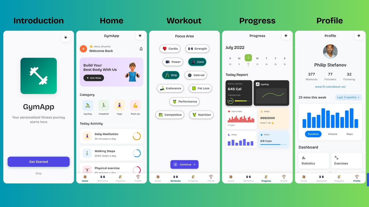
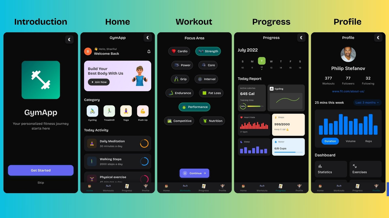
✨ Modern UI Design
- Clean and minimal interface
- Smooth animations and transitions
- Dark/Light theme support
- Custom choice chips with icons
🎯 Interactive Elements
- Multi-selection choice chips
- Real-time selection counter
- Dynamic continue button state
- Animated progress indicators
🎨 Theme System
- Toggle between dark and light modes with beautiful animations
- Persistent theme preferences using SharedPreferences
- Consistent color schemes across all app screens
- Smooth theme transitions for all UI components
- System theme integration with Provider pattern
- Flutter SDK (3.6.2 or higher)
- Dart SDK
- Android Studio / VS Code
- Android/iOS device or emulator
- Clone the repository:
git clone https://github.com/mihf05/flutter-fitness.git
cd flutter-custom-choice-chips- Install dependencies:
flutter pub get- Run the application:
flutter runlib/
├── main.dart # Application entry point
├── app_theme.dart # Theme configurations for light/dark mode
├── theme_service.dart # Theme state management with persistence
├── theme_toggle_button.dart # Animated theme toggle button
├── workout_selection.dart # Main workout selection page
├── choice_chip_widget.dart # Custom choice chip component
└── action_button.dart # Reusable action button component
assets/
├── fonts/
│ └── Lato-Regular.ttf # Custom font
└── icons/ # Workout category icons
├── heart_icon.png
├── dumbbell_icon.png
├── barbell_plates_icon.png
└── ... (more icons)
The main page component featuring:
- Animated header with theme toggle
- Progress indicator showing selection count
- Grid of workout category choice chips
- Dynamic continue button
A custom widget for selectable workout categories:
- Icon and text display
- Selection state management
- Smooth tap animations
- Theme-aware styling
Animated button for switching between light and dark themes:
- Smooth rotation animation using AnimationController
- Theme-aware icons (sun/moon)
- Seamless state transitions
- Persists theme preference
Core service for managing app theme:
- Singleton pattern for global theme state
- Uses SharedPreferences for persistence
- Notifies listeners when theme changes
- Supports system, light, and dark modes
- flutter: Core Flutter framework
- google_fonts: Custom typography (Bricolage Grotesque)
- cupertino_icons: iOS-style icons
- provider: State management and theme dependency injection
- shared_preferences: Persistence of theme preferences
- Update the
workoutSelectionmap inworkout_selection.dart:
Map<String, bool> workoutSelection = {
  "Your Category": false,
  // ... existing categories
};- Add corresponding icon to
iconsMap:
Map<String, String> iconsMap = {
  "Your Category": "your_icon.png",
  // ... existing icons
};- Add the icon asset to
assets/icons/directory
The app uses a centralized theme system defined in app_theme.dart:
// Light theme colors
static final lightColors = {
  'background': const Color(0xFFFAFAFC),
  'surface': Colors.white,
  'text': const Color(0xFF2A2A2A),
  'subtitle': const Color(0xFF666666),
  'accent': const Color(0xFF4F46E5),
  'primary': const Color(0xFF005C5C),
};

// Dark theme colors
static final darkColors = {
  'background': const Color(0xFF0A0A0B),
  'surface': const Color(0xFF1A1A1D),
  'text': const Color(0xFFE8E8E8),
  'subtitle': const Color(0xFFB0B0B0),
  'accent': const Color(0xFF6366F1),
  'primary': const Color(0xFF005C5C),
};
To use the theme in any widget:
// Get theme from provider
final themeService = Provider.of<ThemeService>(context);
final isDarkMode = themeService.isDarkMode;

// Use theme-aware colors
final backgroundColor = isDarkMode ? const Color(0xFF0A0A0B) : const Color(0xFFFAFAFC);- Fork the project
- Create your feature branch (
git checkout -b feature/AmazingFeature) - Commit your changes (
git commit -m 'Add some AmazingFeature') - Push to the branch (
git push origin feature/AmazingFeature) - Open a Pull Request
- Icons designed for fitness and workout categories
- Inspired by modern mobile app design principles
- Built with Flutter's powerful animation framework