UI polish batch: cloud sign-in, onboarding, composer menu - #6281
UI polish batch: cloud sign-in, onboarding, composer menu#6281wangchenglong0001 wants to merge 5 commits into
Conversation


Sign-in surfaces (rail callout, balance-gate dialog, onboarding) had
drifted from the visual system and lost some redundant chrome; this
batch tightens them up alongside a couple of composer/design-files
reorganizations that were sitting in the same working tree:

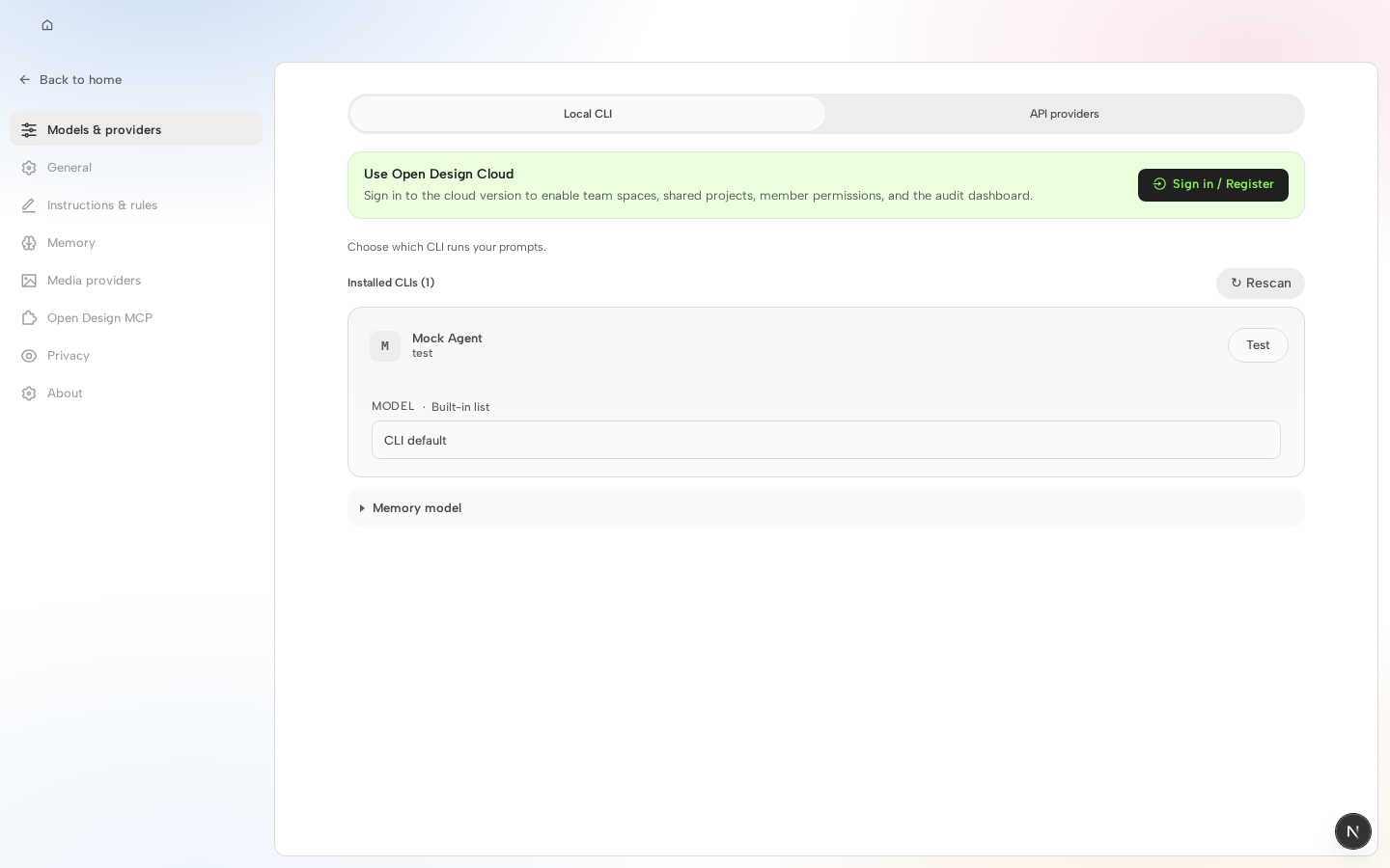
- Rail's signed-out callout: reorder copy above the login pill, give
  the pill an icon + accent-green label, restore the Escape hatch
  the pill had before it lost its close affordance.
- AmrBalanceDialog (insufficient-balance / signed-out gate): add a
  full-bleed art banner above the copy, drop the now-redundant icon
  badge, tighten spacing/shadows to match.
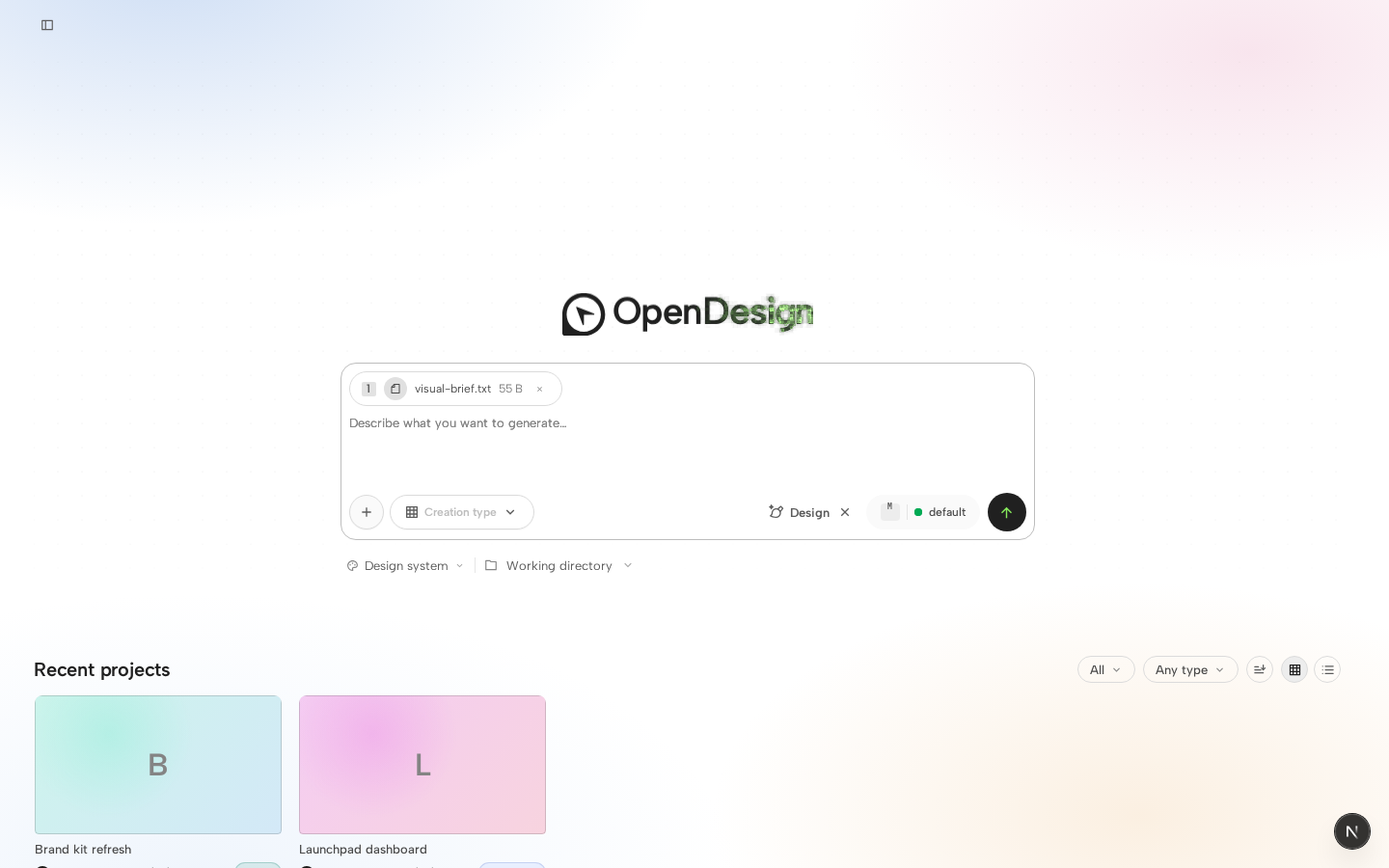
- Onboarding cloud landing: switch from a single centered column to
  a two-column layout (form pane + full-bleed art panel), move the
  language switcher into the footer, swap the local-CLI/BYOK links
  for icon Buttons, and add a dismiss control to the activation-retry
  hint.
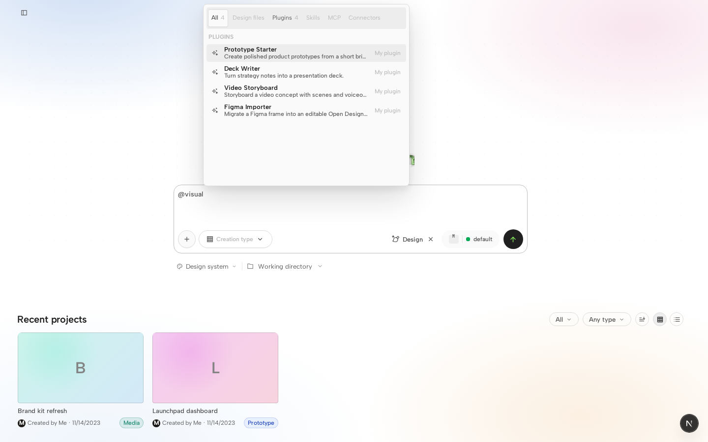
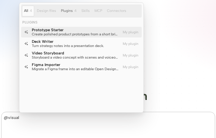
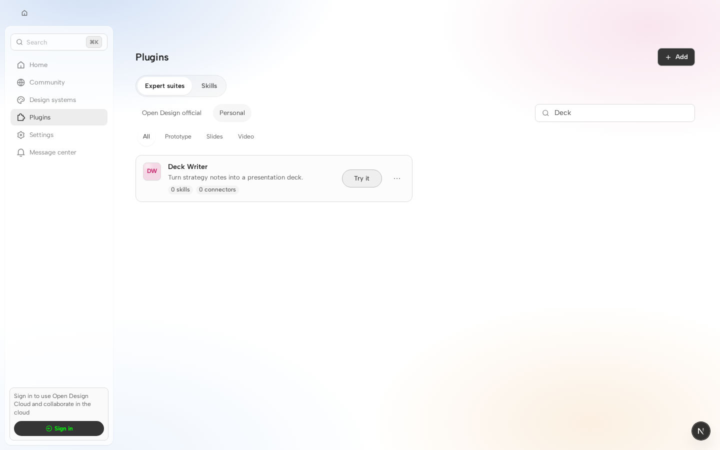
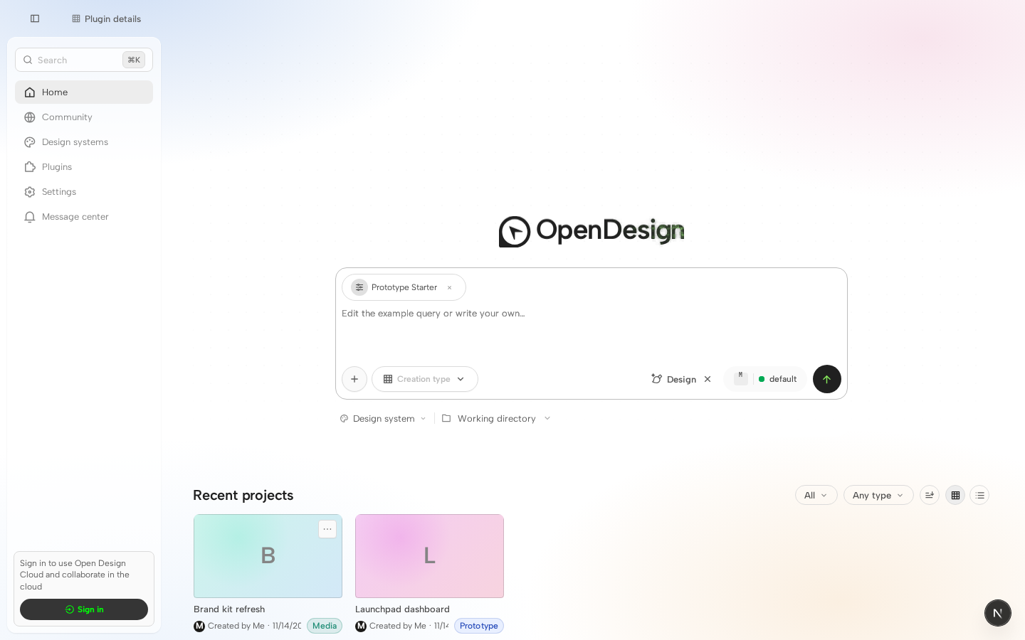
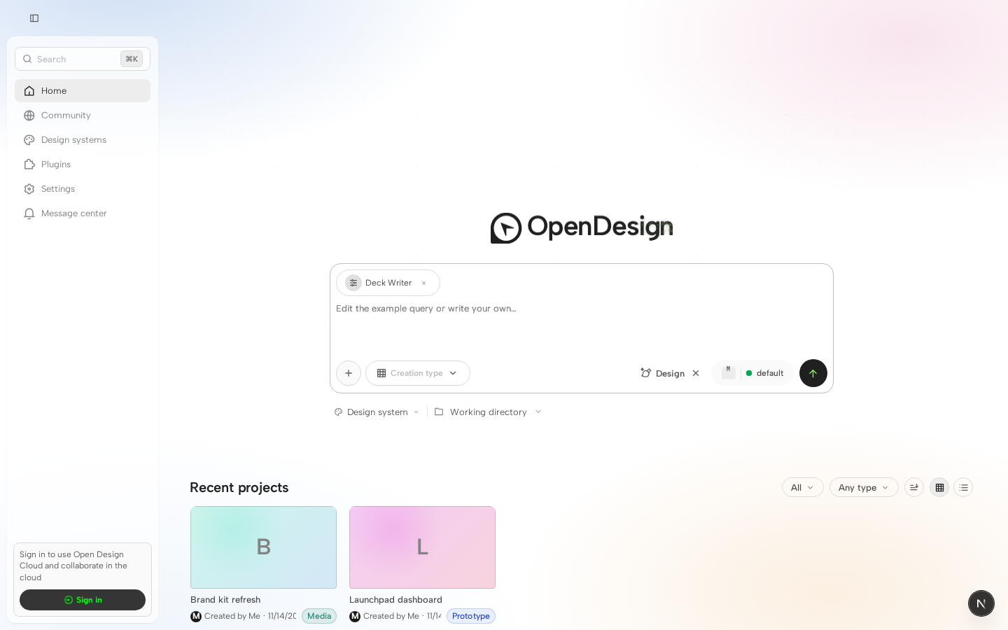
- Composer "+" menu: fold 插件/设计百宝箱 back in as hover-expand
  submenu rows instead of standalone quick pills above the input.
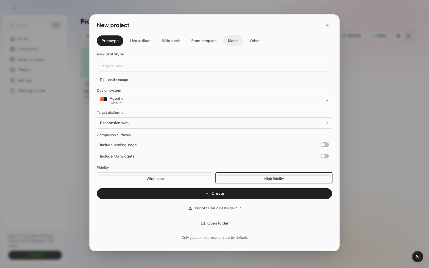
- Design files panel: move new-document/upload actions out of the
  always-visible toolbar into the empty-state actions only.
- Message center: drop the redundant header close button (backdrop
  click and Escape still dismiss it) and restyle the list from
  bordered cards to a divider-separated list.
- New `key` / `robot` / `translate` / `arrow-right` icons; language
  menu switches from the `languages` glyph to `translate`.
- Tab launcher popover reverts to the glass material; language
  dropdown gets a max-height + scroll so long lists don't blow out
  the popover.

Rebased the composer-quick-pill removal onto this branch's own
accessibility work on those pills (opener-based focus return via
`ComposerStandalonePanel`) rather than reverting it — the "next step"
card still drives the same standalone-panel API, just without a pill
to hand focus back to. Also updated/removed the tests that pinned the
now-removed surfaces (quick-pill popup contract, message-center close
button, onboarding top bar, design-files toolbar upload trigger) so
none of this lands with a newly-red suite.
 lefarcen
added
size/XL
lefarcen
added
size/XL

 nettee
left a comment
nettee
left a comment
nettee
left a comment
There was a problem hiding this comment.
I found one keyboard interaction regression in the next-step composer-panel path; the details are in the inline comment below.
🔁 Powered by Looper · runner=reviewer · agent=codex · An autonomous AI dev team for your GitHub repos.
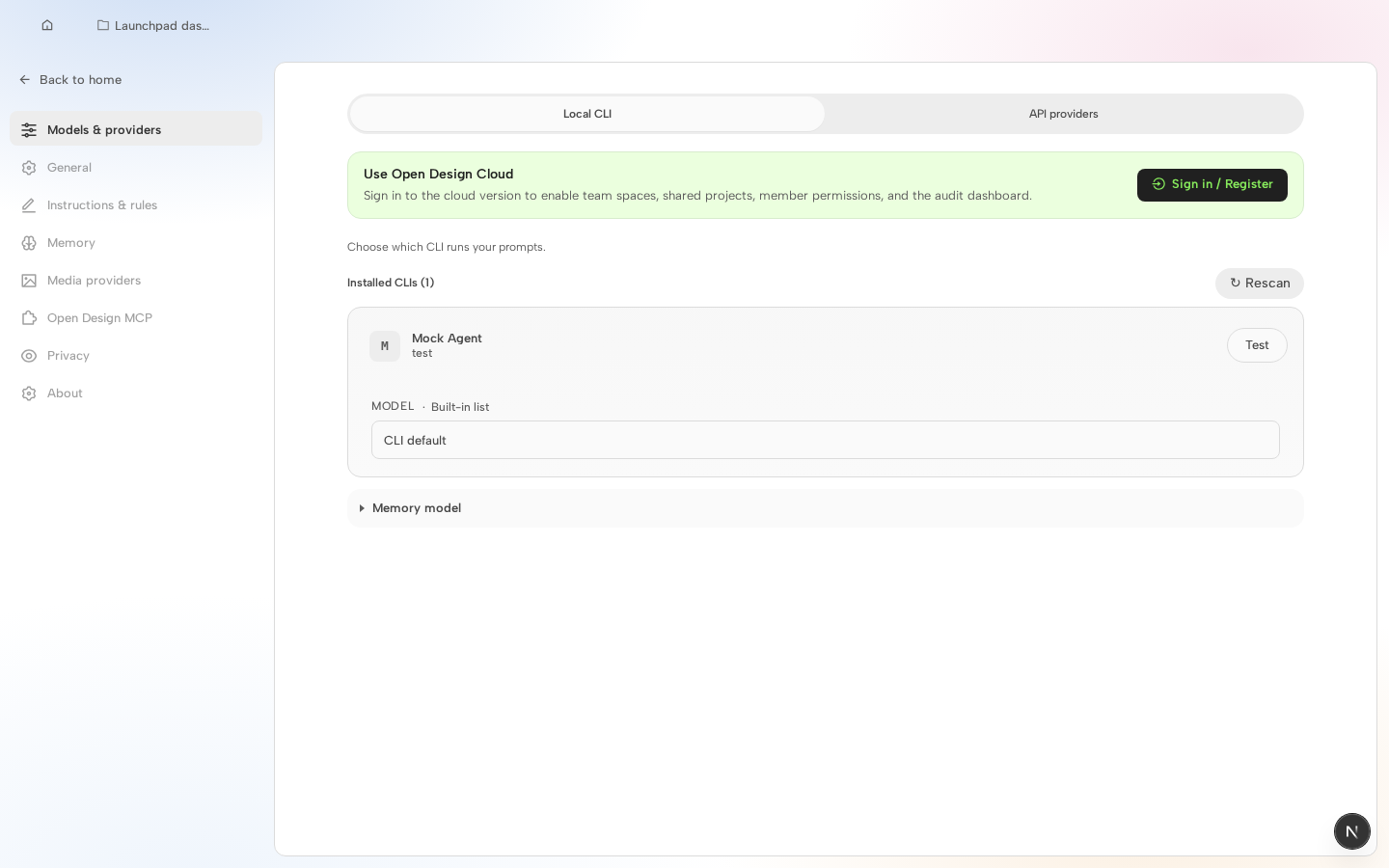
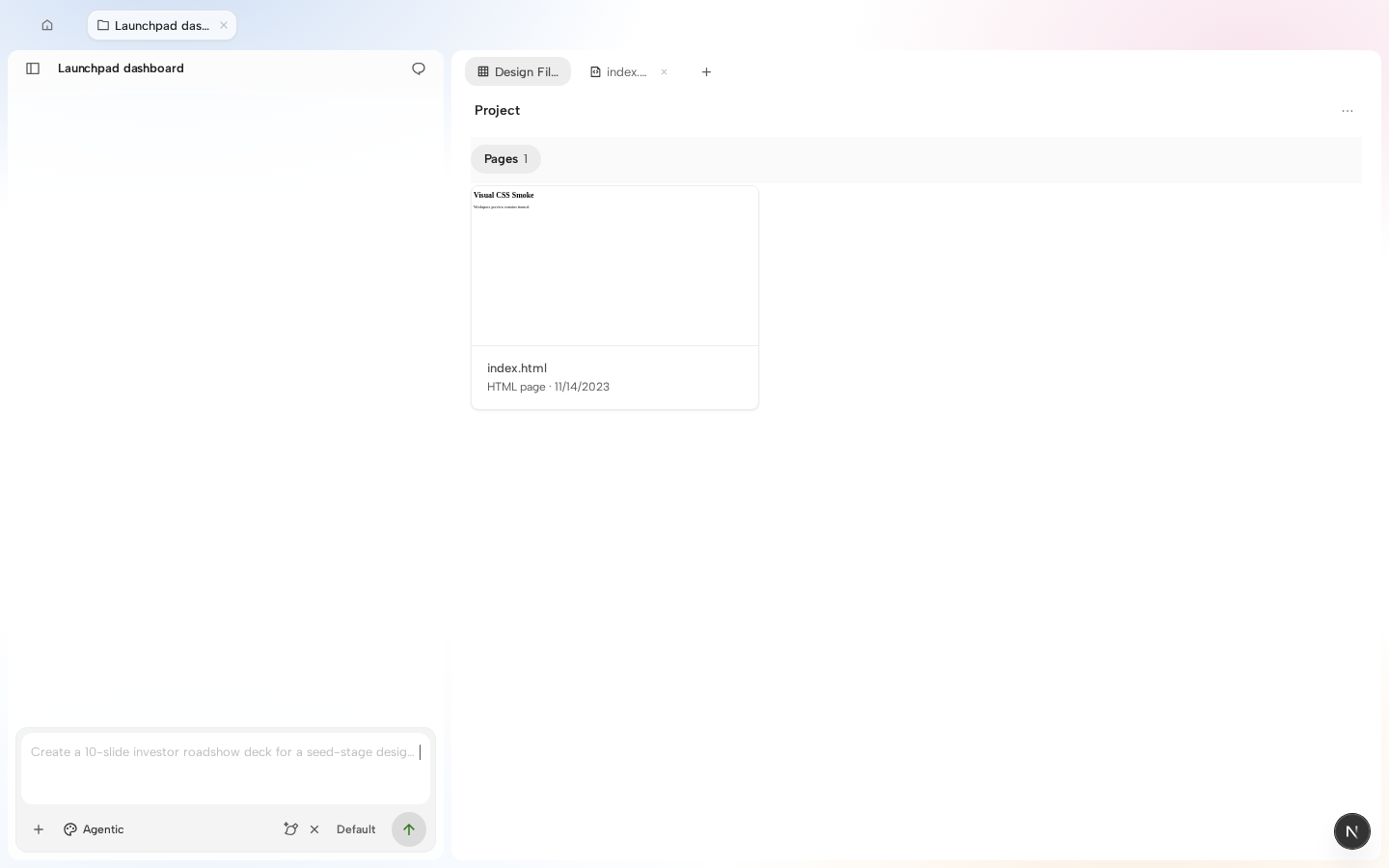
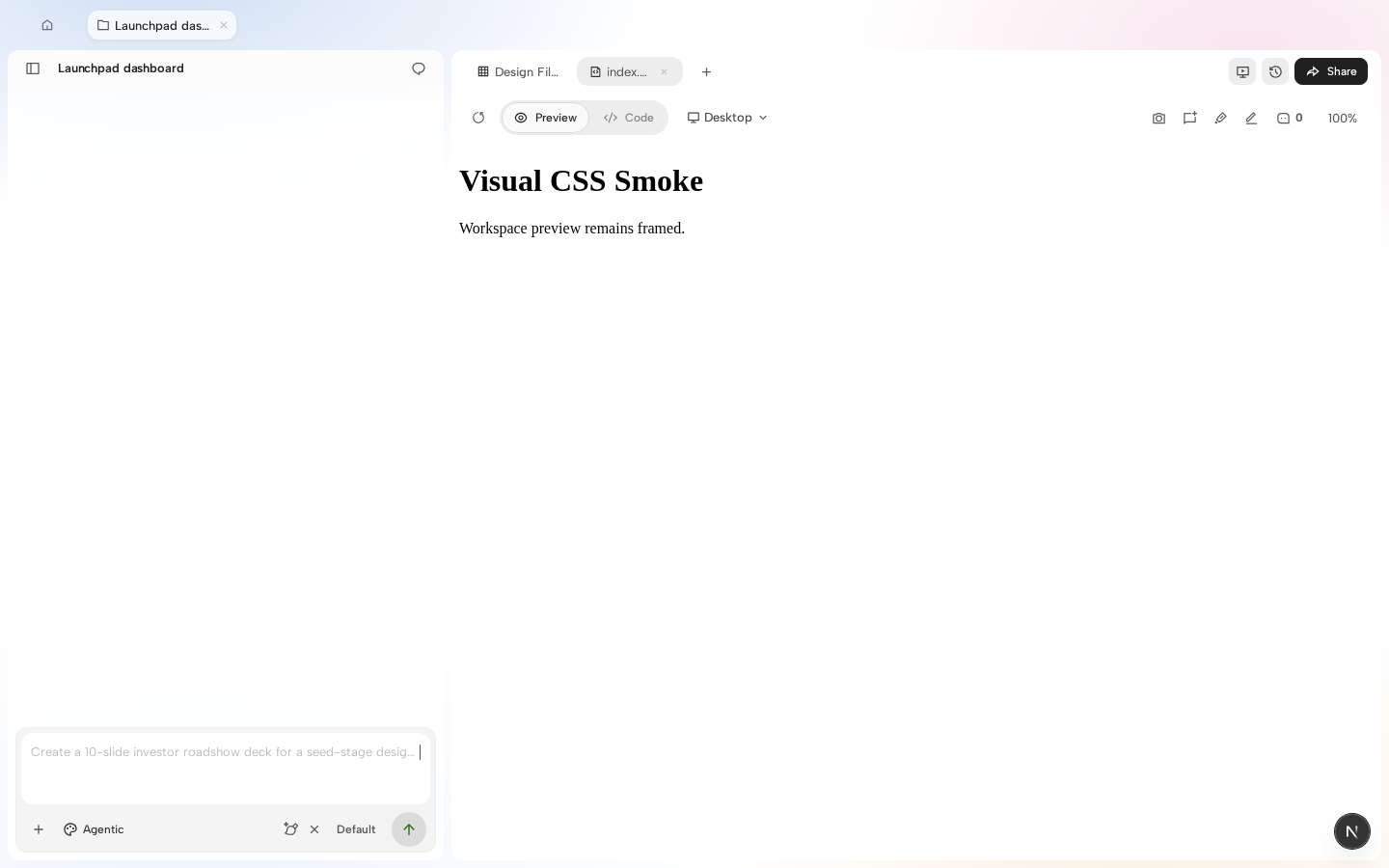
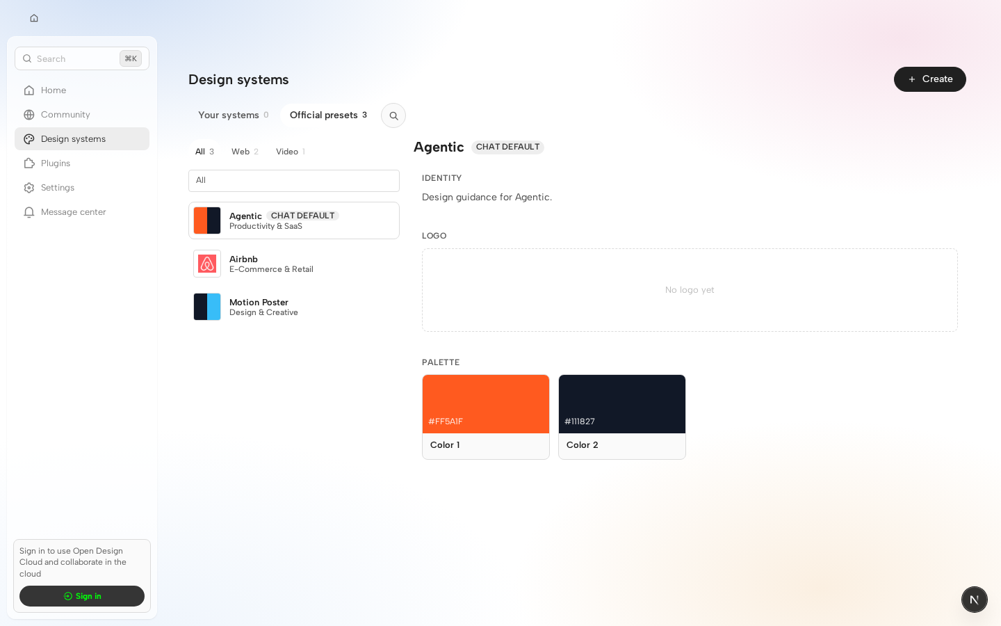
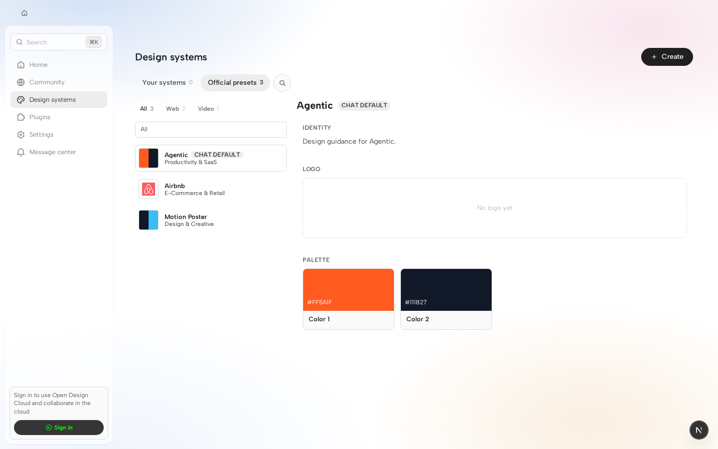
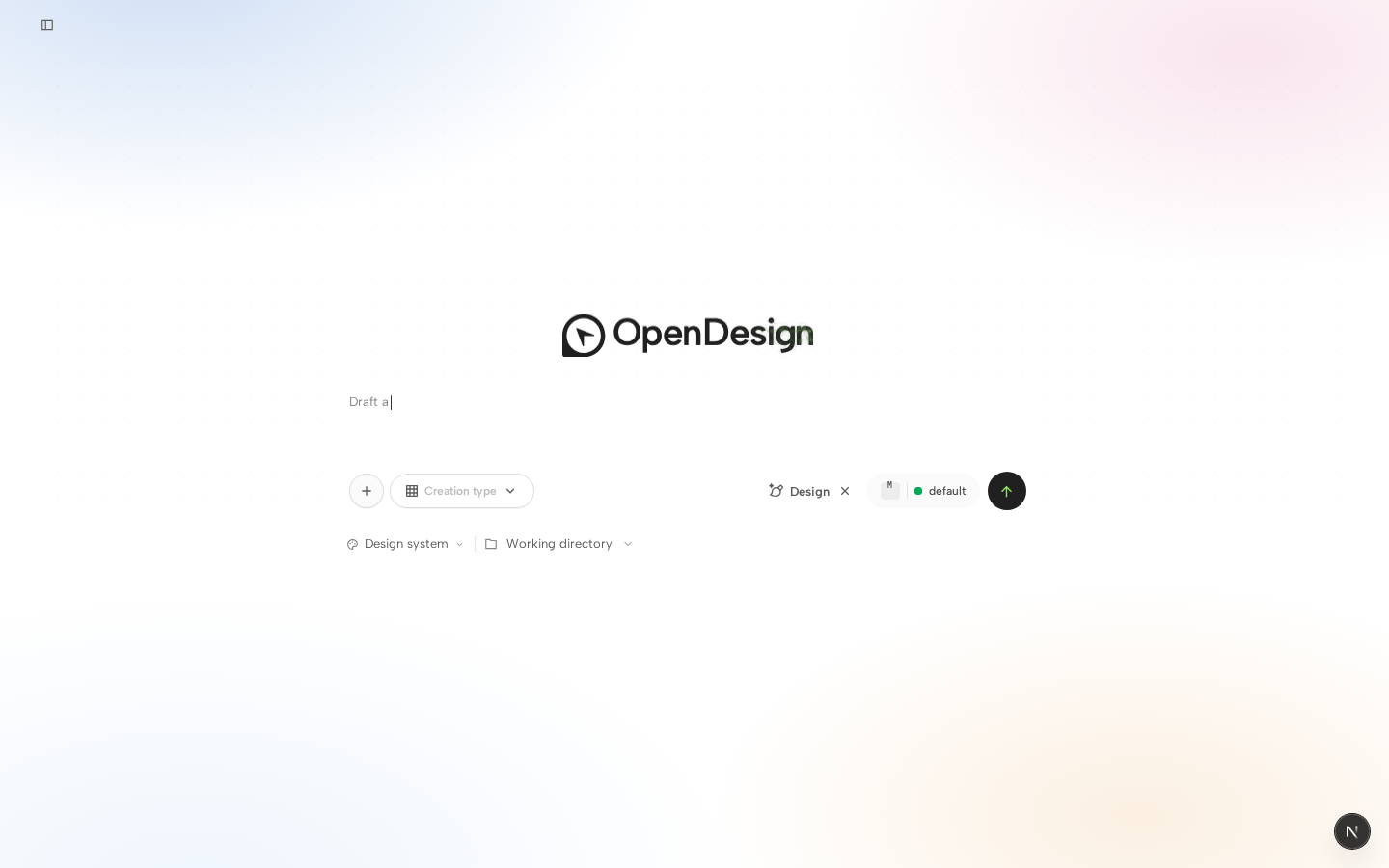
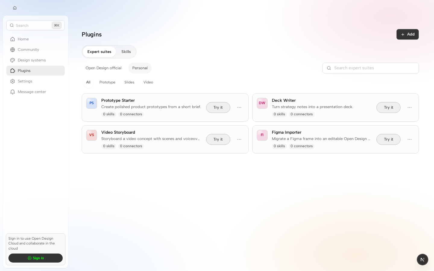
Visual regression reviewHead:
0 changed · 0 unchanged · 47 new without baseline · 0 failed New cases without baselines
27 additional new case(s) omitted from this comment. Visual diff is advisory only and does not block merging. |



nettee
left a comment
nettee
left a comment
There was a problem hiding this comment.
I found one blocking regression in the changed Design Files empty-state path; the actionable detail is in the inline comment.
🔁 Powered by Looper · runner=reviewer · agent=codex · An autonomous AI dev team for your GitHub repos.Location: apps/web/src/components/DesignFilesPanel.tsx RIGHT lines 1352-1383
This new empty-state branch re-enables mutation entry points for viewerOnly projects. The changed comment says these CTAs should render for read-only shared viewers because the writes are guarded downstream, but these buttons call the mutation props directly (onNewSketch, onPaste, onUpload, onCreateDesignSystem). In the current caller, FileWorkspace wires those props straight to startNewSketch(), createMarkdownDocument(), fileInputRef.current?.click(), and navigate({ kind: 'design-system-create' }) without a viewerOnly check, so an empty shared project becomes writable again even though the rest of this component fails closed for read-only state. Please keep the empty-state copy if product wants it, but gate the mutating buttons the same way as the rest of the panel (hide or disable them when viewerOnly is true, or add explicit guards in the callbacks) and update the new read-only test to assert the blocked behavior instead of pinning the regression.
Inline comment could not be anchored: anchor_outside_complete_diff

nettee
left a comment
nettee
left a comment
There was a problem hiding this comment.
I found one blocking correctness regression in the new project-file invalidation path; the actionable detail is in the inline comment below.
🔁 Powered by Looper · runner=reviewer · agent=codex · An autonomous AI dev team for your GitHub repos.| function invalidateProjectFiles(projectId: string): void { | ||
| evictSharedCancellableGet(projectFilesCacheKey(projectId)); |
There was a problem hiding this comment.
This eviction helper drops the cache entry for future callers, but it does not invalidate readers that already joined the old sharedCancellableGet() promise. shared-cancellable-get.ts keeps that fetch running and will still resolve it into its original awaiters even after entries.delete(key), so a /files read that started before uploadProjectFiles() / writeProjectTextFile() succeeds can still land the pre-mutation snapshot in ProjectView.refreshProjectFiles() and overwrite the freshly changed list. Please make invalidation cancel or version the in-flight read instead of doing a bare delete here, and add a regression test where the mutation finishes before the first fetchProjectFiles() response returns.

4 participants


Why
Working through the cloud sign-in surfaces (rail callout, balance-gate
dialog) surfaced a batch of related UI polish sitting in the same tree:
onboarding's cloud landing, the composer's plugins/toolbox entry point,
the design-files empty state, and the message-center panel. Bundling
them here since they're small, independent, and were already sitting
staged together — happy to split into smaller PRs on request.
Pain addressed: the signed-out rail callout and balance-gate dialog had
drifted from the current visual system (flat icon badge instead of art,
inconsistent button treatment); onboarding's single-column layout had
dead space with no visual anchor; the composer's standalone quick pills
above the input didn't match the "+" menu's existing plugins/toolbox
rows, doubling the surface for the same action.
What users will see
above the login pill (was below); the pill has a login icon and its
label is accent-green.
full-bleed illustration above the copy instead of a small icon badge.
form on the left, a full-bleed illustration on the right (viewport
<1136px collapses back to a single column, art hidden). The language
switcher moved from a top-right icon bar into the footer next to the
copyright line. "Local CLI" / "own API key" are now icon buttons.
again (below 工作目录), instead of separate pill buttons floating
above the input.
the empty state now, not in the always-visible toolbar.
clicking the backdrop still close it); the message list uses divider
lines between rows instead of individual bordered cards.
Surface area
entry.cloudCalloutBodycopy in zh-CN/zh-TW (no new keys).Screenshots
Not attached in this automated submission — happy to add on request or
during review.
Bug fix verification
N/A — this is a UI polish batch, not a bug fix.
Validation
pnpm guardpnpm --filter @open-design/web typecheckpnpm --filter @open-design/web test(full suite: 559/559 files, 5615 passed, 11 skipped)Notes for reviewers:
origin/feat/workspace-team's tip(
391da2c78, "preserve Cloud sign-in during outages") rather thanbuilt from a stale local checkout. Two files needed a manual 3-way
merge against upstream work that landed independently in the interim:
ChatPane.tsx: upstream had already added focus-return/aria-*plumbing to the quick pills (
ComposerStandalonePanel, opener refs)for the "next step" card's use of the same standalone-panel API.
Kept that plumbing; only removed the pill JSX/hover handlers this
PR intentionally deletes.
EntryShell.tsx: upstream's fix(web): preserve Cloud sign-in during outages #6274 fix (transient-outage sign-inpreservation) and an unrelated update-reminder-dialog removal both
landed on this file. Kept both untouched; only the onboarding
step-0 render body was replaced with this PR's two-column layout.
ChatPane.quick-pill-popup-contract.test.tsx— it pinned thenow-removed pills'
aria-haspopup/aria-expanded/Escape/focus-returncontract. Updated
DesignFilesPanel.test.tsx,EntryNavRail.message-center-entry.test.tsx, andtheme-settings-removed.test.tsxto match the surfaces that moved(empty-state-only actions, backdrop-dismiss instead of a close
button, and the onboarding pane replacing the old top bar).