Add toilet POI icon for marking bathrooms/restrooms/toilets - #1102
Add toilet POI icon for marking bathrooms/restrooms/toilets#1102Pengor wants to merge 3 commits into
Conversation


|
At a glance, the front view looks to me more like ⚱️ or maybe a fancy chalice. A toilet wouldn’t have been my first guess. Would a top-down view, heavily simplified, be more recognizable? |

|
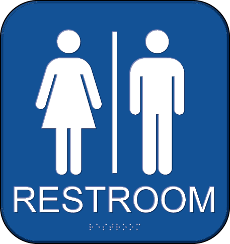
The classic pants/dress iconology is referenced in US government standards and is by far the most recognizable symbol for a bathroom.
https://www.access-board.gov/images/ada-aba/guides/chapter7/signs/restroom_-_tactile.png |

|
This is the AIGA symbol. It is certainly recognizable, although it’s optimized for a conventional configuration of men on one side and women on the other. These days it’s a bit simplistic. There’s nothing wrong with POI icons leaning into abstractions, but then we might as well go for metonymy, such as a toilet or toilet paper roll. This is not unlike how #1014 eschewed the classic library icon in favor of a book. More particular to this project, the AIGA symbol has the potential to mislead the user about what’s actually under the icon. All we get from the tiles is the location of an (As a side note, the AIGA symbol is not as universal as one might imagine. The standard, legally required signs in California are a triangle and a circle. Both of these symbols are heavily overloaded, including for rest areas: #443.) |

|
Updated PR based on feedback from Slack thread: New preview: |


| toilets: ["toilets"], | ||
| }, | ||
| sprite: "poi_toilet", | ||
| color: Color.poi.infrastructure, |

There was a problem hiding this comment.
I’m not sure this fits very well with other things in the infrastructure category, or the blue category. Much of the time, it’s actually part of some other POI.
Consider creating a different category for hyperlocal features that would also include street furniture. I’m assuming it would be less prominent than the infrastructure category: perhaps black, and appearing at a higher zoom level. Maybe a scaled-down icon and font.
The tradeoff would be in more remote settings where the amenity=toilet represents something significant in its own right. But I think that starts to get into a use case that OpenTrailMap would serve better anyways.
There was a problem hiding this comment.
Much of the time, it’s actually part of some other POI
I don't believe places with toilets=yes get mapped to the toilets class in the OpenMapTiles schema, so the only toilets that should show up are POIs where the toilets are the prominent "feature" of that object, right? So assuming things are mapped "correctly" (i.e. an amenity=toilets is a dedicated restroom) we shouldn't run into the scenario you're describing very frequently, right? I think I'm hesitant to decrease how quickly these bathrooms/restrooms/toilets appear because I haven't seen any conflicts with other POIs so far (at least in places I'm looking).
Otherwise, I think a new category is fine, but maybe that can be a separate PR (or Issue to track that change)?
There was a problem hiding this comment.
Even an amenity=toilet is usually conceptually part of some bigger facility. For example, in the screenshot you posted, it’s part of the school campus. We wouldn’t want a toilet POI to crowd out a school icon at a lower zoom level (for instance).

|
I think the side view of a toilet is an improvement over the front view; much more recognizable. Just a couple more things: Toilets in diagrams are more likely to face right in the United States. Can't say why, but it just feels like it fits in better with left-to-right text. The base of the toilet is too narrow—it looks as if the toilet seat is teetering on a small flower pot. The silhouette of the National Park Service standard icon has a decent base with more mass, that might serve as inspiration.
|

I'm fine swapping this if we want to do so. For the sake of comparison against previous icon attempts, let's save that decision until the end though.
The effect (specifically at the scale the icon gets displayed at) is pretty minor, in my opinion, but here is an attempt at more of an hourglass-shaped pedestal: I also tried swapping the colors (resulting in a mostly white icon): |


4 participants


Adds a POI for toilets 🚽 I just realized this POI was missing so I thought I'd take a swing at it:


I figured the infrastructure color made the most sense, but I'm certainly open to changing that. I first attempted a side-view of a toilet as the icon and then a 45° angle view (semi-3D) but neither turned out very well in my opinion.