Open
Conversation
Removed class first for the home button since it was messing up with the changed in the css
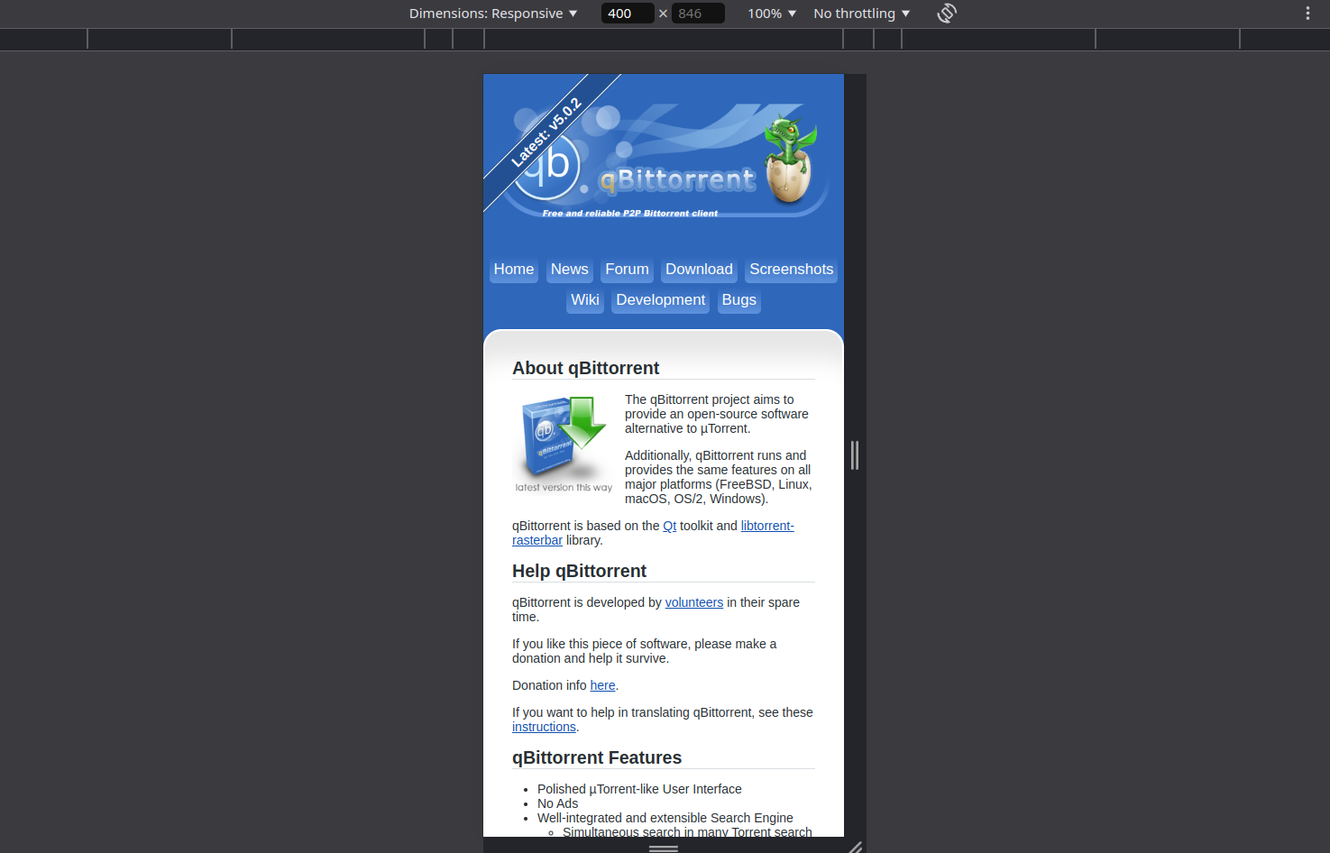
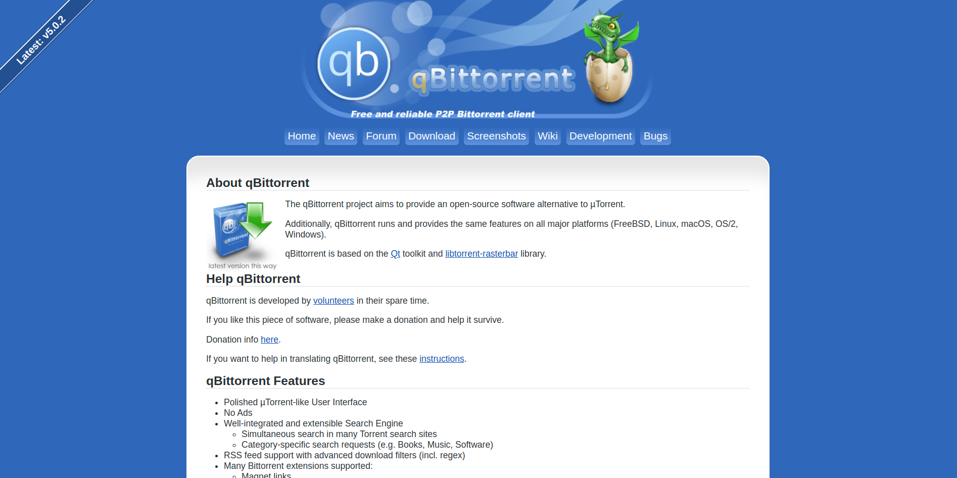
Added background gradient from blue to transparent and added rounded corners, makes the design more concise with the logo and i removed the gray separators. overall makes the site more modern.
remove white space
Added a div right bellow the "downloadNotesDiv" to add the flatpak badge that links directly to flathub.
Author
|
Also added the flatpak option in the linux section with the official flatpak badge. |

Added flatpak badge bellow "downloadNotesDiv"
|
why did you change the font? |
Author
|
Make it modern |
This file contains hidden or bidirectional Unicode text that may be interpreted or compiled differently than what appears below. To review, open the file in an editor that reveals hidden Unicode characters.
Learn more about bidirectional Unicode characters
Sign up for free
to join this conversation on GitHub.
Already have an account?
Sign in to comment
2 participants
Add this suggestion to a batch that can be applied as a single commit.This suggestion is invalid because no changes were made to the code.Suggestions cannot be applied while the pull request is closed.Suggestions cannot be applied while viewing a subset of changes.Only one suggestion per line can be applied in a batch.Add this suggestion to a batch that can be applied as a single commit.Applying suggestions on deleted lines is not supported.You must change the existing code in this line in order to create a valid suggestion.Outdated suggestions cannot be applied.This suggestion has been applied or marked resolved.Suggestions cannot be applied from pending reviews.Suggestions cannot be applied on multi-line comments.Suggestions cannot be applied while the pull request is queued to merge.Suggestion cannot be applied right now. Please check back later.
Modernized menu button with a background gradient that goes from blue to transparent, makes it way more concise with the logo above and removes the gray separators, Also removed the class "first" as it was messing with the Home button's new style.
Desktop:
Mobile: