Skip to content

feat(rn): add React Native support for Drawer - #3645

Merged
swapnil-kr1 merged 15 commits into
masterfrom
feat/blade-rn/Drawer
Jul 15, 2026
Merged

feat(rn): add React Native support for Drawer#3645
swapnil-kr1 merged 15 commits into
masterfrom
feat/blade-rn/Drawer

Conversation

@rohitr-raz

@rohitr-raz rohitr-raz commented Jul 3, 2026

Copy link
Copy Markdown
Contributor

Summary

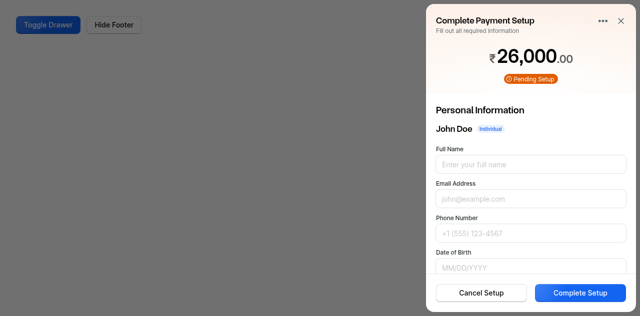
  • Adds native (.native.tsx) implementation for the Drawer component, replacing the previous throwBladeError stubs with real platform-specific rendering.
  • Uses styled-components/native + react-native-reanimated for the slide-in panel and dimmed overlay.
  • Mounts the drawer via @gorhom/portal using a conditional Portal mount (mirrors the working Popover/Tooltip native pattern), so the drawer mounts fresh on open and animates to the visible resting state.
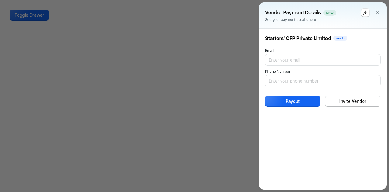
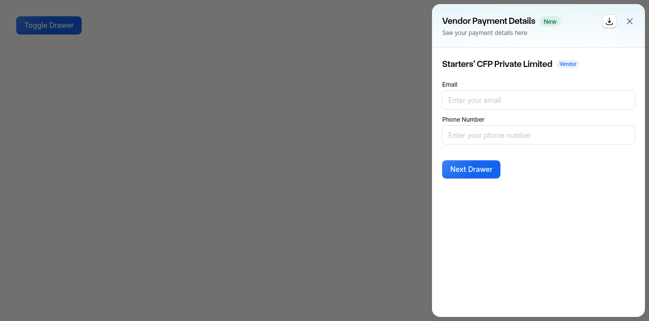
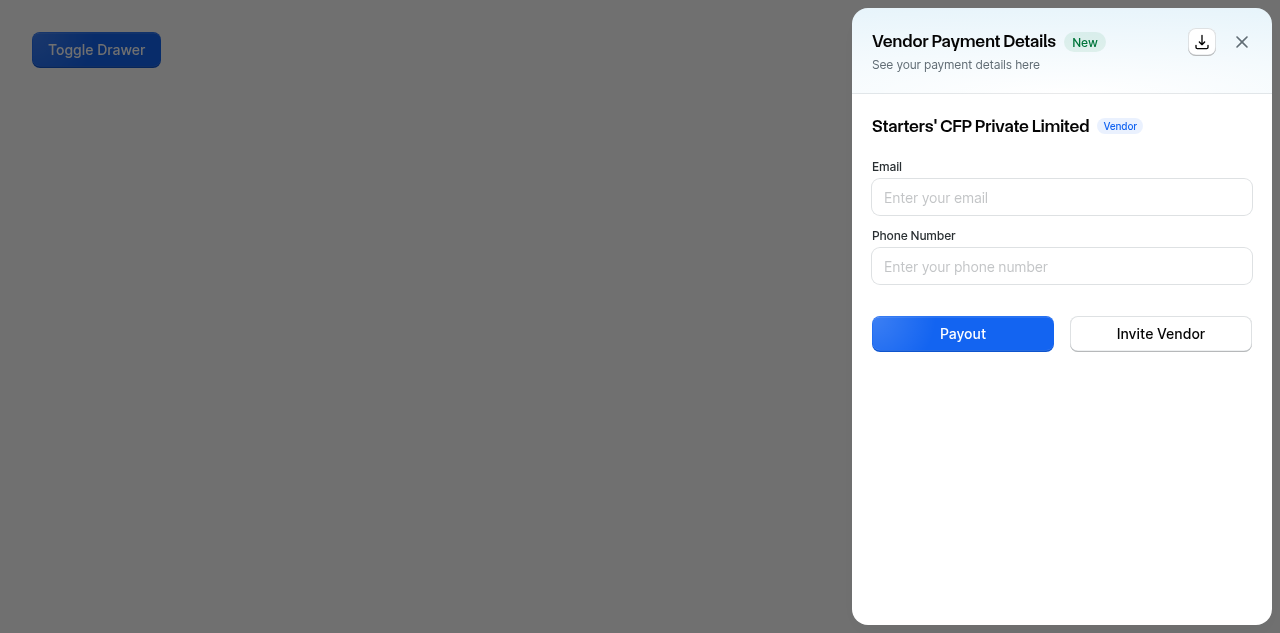
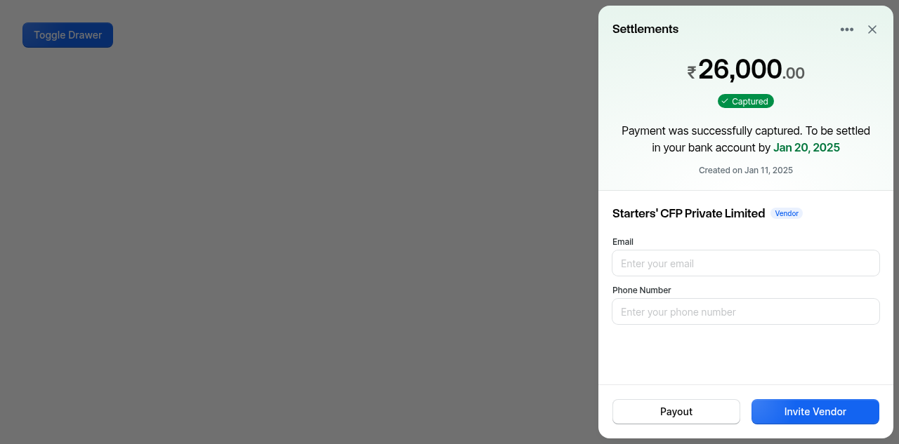
Screen.Recording.2026-07-09.at.12.53.02.PM.mov

Changes

  • Created: AnimatedDrawerContainer.native.tsx (reanimated slide-in + overlay), __tests__/Drawer.native.test.tsx (+ snapshot)
  • Implemented: Drawer.native.tsx, DrawerSubcomponents.native.tsx
  • Modified: StackProvider.tsx, BladeProvider.native.tsx
  • Storybook infra: .storybook/react-native/preview.tsx — registers a BladeBottomSheetPortal PortalHost in the story decorator (+ flex: 1) so portal-based components (Drawer/BottomSheet/Popover/Tooltip/Modal) render inside RN Storybook. Without this, @storybook/react-native-ui's own nested PortalProvider shadows Blade's host and portal content is silently dropped.
  • Story fix: docs/Drawer.stories.tsx — removed two invalid bare {' '} string children of a Box that crash on native ("Text strings must be rendered within a <Text>").
  • Changeset: minor bump for @razorpay/blade.

Verification

  • Native TypeScript compilation passes (yarn types:typecheck:native)
  • Native tests pass (566 suites / 1297 tests / 881 snapshots)
  • Visual verification on iOS simulator (iPhone 17 Pro): drawer opens as a right-anchored ~90% full-height panel with header, inputs, and dimmed overlay; overlay-press dismisses with exit animation; closed drawer does not block touches on the underlying screen
  • agent-browser web vs native side-by-side comparison — not performed (Step 4e skipped)
  • Android visual verification — not performed

Notes / Warnings (P2, non-blocking)

  • A non-fatal Node of type rule not supported as an inline style styled-components warning appears while the drawer is mounted; does not affect rendering.
  • The web-vs-native parity comparison (agent-browser) was skipped and can be done as a follow-up.

🤖 Generated with Claude Code

Made with Cursor

Implements .native.tsx files for the Drawer component, replacing the stub
implementations with real native rendering using styled-components/native
and react-native-reanimated.

- Add AnimatedDrawerContainer.native.tsx (reanimated slide-in/overlay)
- Implement Drawer.native.tsx via conditional @gorhom/portal mount
  (mirrors the working Popover/Tooltip native pattern)
- Implement DrawerSubcomponents.native.tsx (header/body)
- Register a BladeBottomSheetPortal PortalHost in the RN Storybook preview
  so portal-based components render in Storybook, and add flex:1 sizing
- Fix invalid bare string children in Drawer.stories.tsx (native crash)
- Add native tests + snapshot

Co-Authored-By: Claude <noreply@anthropic.com>
Co-authored-by: Cursor <cursoragent@cursor.com>
@changeset-bot

changeset-bot Bot commented Jul 3, 2026

Copy link
Copy Markdown

🦋 Changeset detected

Latest commit: 43f2425

The changes in this PR will be included in the next version bump.

This PR includes changesets to release 1 package
Name Type
@razorpay/blade Minor

Not sure what this means? Click here to learn what changesets are.

Click here if you're a maintainer who wants to add another changeset to this PR

@github-actions

github-actions Bot commented Jul 3, 2026

Copy link
Copy Markdown
Contributor

🤖 Slash AI Review has been triggered. View execution logs

@rzpcibot

rzpcibot commented Jul 3, 2026

Copy link
Copy Markdown
Collaborator

🛡️ Coverage Report

Summary


=============================== Coverage summary ===============================
Statements   : 81.73% ( 10736/13135 )
Branches     : 68.2% ( 6715/9846 )
Functions    : 81.01% ( 2470/3049 )
Lines        : 82.62% ( 10475/12677 )
================================================================================
Full Coverage Details
---------------------------------------|---------|----------|---------|---------|-------------------
File                                   | % Stmts | % Branch | % Funcs | % Lines | Uncovered Line #s 
---------------------------------------|---------|----------|---------|---------|-------------------
All files                              |   81.73 |     68.2 |   81.01 |   82.62 |                   
 blade                                 |     100 |      100 |     100 |     100 |                   
  jestStyledComponentsSerializer.js    |     100 |      100 |     100 |     100 |                   
 ...odemods/brand-refresh/transformers |    89.1 |     89.6 |   98.85 |   88.99 |                   
  index.ts                             |   88.23 |    84.37 |     100 |   88.23 | ...15,144,179,215 
  migrate-actionlist-and-table.ts      |      75 |      100 |     100 |      75 | 23                
  migrate-amount.ts                    |   86.48 |       75 |     100 |   86.48 | 27-31,101,133,164 
  migrate-badge.ts                     |      75 |      100 |     100 |      75 | 21                
  migrate-card.ts                      |    87.5 |      100 |     100 |    87.5 | 36                
  ...te-contrast-intent-color-props.ts |   89.83 |      100 |     100 |   89.65 | ...28,153,245,291 
  migrate-divider.ts                   |   83.33 |      100 |     100 |   83.33 | 31                
  migrate-dropdown.ts                  |   91.66 |      100 |     100 |   91.66 | 72                
  migrate-typography.ts                |    90.9 |    88.13 |   96.96 |   90.82 | ...34,245,325,355 
  utils.ts                             |     100 |      100 |     100 |     100 |                   
 ...migrate-motion-tokens/transformers |    87.5 |       50 |     100 |    87.5 |                   
  index.ts                             |       0 |        0 |       0 |       0 |                   
  migrate-motion.ts                    |    87.5 |       50 |     100 |    87.5 | 18                
 ...s/migrate-progressbar/transformers |   78.26 |       75 |     100 |   78.26 |                   
  index.ts                             |   78.26 |       75 |     100 |   78.26 | 9,39,64-68,78     
 blade/src/components/Accordion        |    87.5 |    69.29 |   95.83 |   89.83 |                   
  Accordion.tsx                        |     100 |      100 |     100 |     100 |                   
  AccordionButton.web.tsx              |   93.33 |    68.75 |     100 |    92.3 | 41                
  AccordionContext.tsx                 |   85.71 |       50 |     100 |   85.71 | 29,42             
  AccordionItem.tsx                    |   88.23 |       88 |     100 |   88.23 | 98,112            
  AccordionItemBody.tsx                |     100 |    58.33 |     100 |     100 | 58-61             
  AccordionItemHeader.tsx              |      68 |    45.45 |      75 |   80.95 | 21-22,63,70       
  AccordionSurface.web.tsx             |     100 |      100 |     100 |     100 |                   
  StyledAccordionButton.web.tsx        |   82.35 |    77.77 |     100 |   81.25 | 24-30             
  commonStyles.ts                      |     100 |      100 |     100 |     100 |                   
  componentIds.ts                      |     100 |      100 |     100 |     100 |                   
  index.ts                             |       0 |        0 |       0 |       0 |                   
  styles.web.ts                        |     100 |      100 |     100 |     100 |                   
 blade/src/components/ActionList       |   70.41 |    53.47 |   69.35 |   70.56 |                   
  ActionList.tsx                       |     100 |      100 |     100 |     100 |                   
  ActionListBox.web.tsx                |   67.08 |    40.47 |   73.68 |   67.08 | ...00,243,318-326 
  ActionListItem.tsx                   |   67.12 |    47.54 |      55 |   68.05 | ...19,361,392,414 
  ActionListItemAsset.web.tsx          |     100 |      100 |     100 |     100 |                   
  ActionListNoResults.tsx              |     100 |      100 |     100 |     100 |                   
  actionListUtils.ts                   |   63.63 |    50.94 |   69.23 |   63.07 | ...09,223,240,247 
  componentIds.ts                      |     100 |      100 |     100 |     100 |                   
  getA11yRoles.ts                      |   82.14 |    80.95 |      80 |   82.14 | 33,48-52,81       
  index.ts                             |       0 |        0 |       0 |       0 |                   
 ...e/src/components/ActionList/styles |     100 |      100 |     100 |     100 |                   
  StyledListBoxWrapper.web.tsx         |     100 |      100 |     100 |     100 |                   
  getBaseListBoxWrapperStyles.ts       |     100 |      100 |     100 |     100 |                   
 blade/src/components/Alert            |   80.55 |    75.96 |     100 |      80 |                   
  Alert.tsx                            |   77.04 |     73.5 |     100 |   76.27 | ...91,264-266,305 
  StyledAlert.tsx                      |     100 |      100 |     100 |     100 |                   
  index.ts                             |       0 |        0 |       0 |       0 |                   
  styles.ts                            |     100 |      100 |     100 |     100 |                   
 blade/src/components/Amount           |    87.8 |    70.43 |   81.81 |    88.6 |                   
  Amount.tsx                           |   87.17 |    70.43 |   81.81 |      88 | ...16,350,416-417 
  amountTokens.ts                      |     100 |      100 |     100 |     100 |                   
  index.tsx                            |       0 |        0 |       0 |       0 |                   
 ...src/components/AnimateInteractions |   76.92 |    28.57 |   55.55 |      80 |                   
  AnimateInteractions.web.tsx          |   71.42 |      100 |   33.33 |   71.42 | 43-46             
  AnimateInteractionsProvider.tsx      |     100 |      100 |     100 |     100 |                   
  index.ts                             |       0 |        0 |       0 |       0 |                   
  useFocusWithin.ts                    |   73.33 |    16.66 |      60 |   78.57 | 17,22-23          
 .../src/components/AnnouncementBanner |     100 |      100 |     100 |     100 |                   
  AnnouncementBanner.tsx               |     100 |      100 |     100 |     100 |                   
  StyledAnnouncementBanner.tsx         |     100 |      100 |     100 |     100 |                   
  index.ts                             |       0 |        0 |       0 |       0 |                   
  styles.ts                            |     100 |      100 |     100 |     100 |                   
 blade/src/components/AppBar           |   97.22 |     86.2 |     100 |   97.22 |                   
  AppBar.web.tsx                       |   96.15 |     86.2 |     100 |   96.15 | 253               
  AppBarContext.tsx                    |     100 |      100 |     100 |     100 |                   
  appBarTokens.ts                      |     100 |      100 |     100 |     100 |                   
 blade/src/components/Avatar           |   94.44 |    80.61 |    90.9 |   94.44 |                   
  Avatar.web.tsx                       |   95.83 |    76.31 |     100 |   95.83 | 74                
  AvatarButton.tsx                     |     100 |    88.88 |     100 |     100 | 19-21             
  AvatarGroup.web.tsx                  |   93.33 |    81.25 |     100 |   93.33 | 43                
  AvatarGroupContext.tsx               |     100 |      100 |     100 |     100 |                   
  StyledAvatar.tsx                     |     100 |      100 |     100 |     100 |                   
  StyledAvatarButton.tsx               |     100 |    69.23 |     100 |     100 | 11-13,25          
  StyledAvatarGroup.tsx                |     100 |      100 |     100 |     100 |                   
  TrustedBadgeIcon.web.tsx             |   33.33 |      100 |       0 |   33.33 | 6-7               
  avatarTokens.ts                      |     100 |      100 |     100 |     100 |                   
  index.ts                             |       0 |        0 |       0 |       0 |                   
 blade/src/components/Badge            |     100 |     91.3 |     100 |     100 |                   
  Badge.tsx                            |     100 |     91.3 |     100 |     100 | 112,152           
  StyledBadge.web.tsx                  |     100 |      100 |     100 |     100 |                   
  badgeTokens.ts                       |     100 |      100 |     100 |     100 |                   
  getStyledBadgeStyles.ts              |     100 |      100 |     100 |     100 |                   
  index.tsx                            |       0 |        0 |       0 |       0 |                   
 blade/src/components/BaseHeaderFooter |   94.11 |    79.31 |      90 |   94.11 |                   
  BaseFooter.tsx                       |     100 |    85.71 |     100 |     100 | 34                
  BaseHeader.tsx                       |   93.75 |    78.75 |   88.88 |   93.75 | 340,383,421       
 blade/src/components/BaseMenu         |     100 |      100 |     100 |     100 |                   
  BaseMenuContext.ts                   |     100 |      100 |     100 |     100 |                   
  index.ts                             |       0 |        0 |       0 |       0 |                   
  tokens.ts                            |     100 |      100 |     100 |     100 |                   
 ...c/components/BaseMenu/BaseMenuItem |     100 |    85.18 |     100 |     100 |                   
  BaseMenuItem.tsx                     |     100 |    84.21 |     100 |     100 | 69,109,121        
  StyledMenuItemContainer.web.tsx      |     100 |      100 |     100 |     100 |                   
  getBaseMenuItemStyles.ts             |     100 |       50 |     100 |     100 | 11                
  tokens.ts                            |     100 |      100 |     100 |     100 |                   
 blade/src/components/BaseMotion       |   97.43 |    91.42 |     100 |   97.43 |                   
  BaseMotion.tsx                       |     100 |     91.3 |     100 |     100 | 101,127           
  baseMotionUtils.ts                   |   94.44 |    91.66 |     100 |   94.44 | 33                
  index.ts                             |       0 |        0 |       0 |       0 |                   
  types.ts                             |       0 |        0 |       0 |       0 |                   
 blade/src/components/BladeProvider    |   91.17 |       75 |   83.33 |    90.9 |                   
  BladeProvider.web.tsx                |     100 |      100 |     100 |     100 |                   
  index.ts                             |       0 |        0 |       0 |       0 |                   
  stylisCSSHigherSpecificity.ts        |     100 |      100 |     100 |     100 |                   
  types.ts                             |       0 |        0 |       0 |       0 |                   
  useBladeProvider.ts                  |     100 |     87.5 |     100 |     100 | 32                
  useTheme.ts                          |      70 |       50 |      50 |      70 | 21,28,34          
 blade/src/components/BottomNav        |   94.44 |    78.26 |     100 |   94.44 |                   
  BottomNav.web.tsx                    |   94.44 |    78.26 |     100 |   94.44 | 76                
  index.ts                             |       0 |        0 |       0 |       0 |                   
 blade/src/components/BottomSheet      |   83.33 |    75.43 |   79.72 |   83.62 |                   
  BottomSheet.web.tsx                  |   81.21 |    68.04 |   89.65 |   81.25 | ...76-382,389-396 
  BottomSheetBackdrop.web.tsx          |     100 |      100 |     100 |     100 |                   
  BottomSheetBody.web.tsx              |   94.73 |    93.75 |     100 |     100 | 35                
  BottomSheetCommon.tsx                |    87.5 |    83.33 |     100 |    87.5 | 59                
  BottomSheetContext.ts                |     100 |      100 |      25 |     100 |                   
  BottomSheetFooter.web.tsx            |     100 |      100 |     100 |     100 |                   
  BottomSheetGrabHandle.web.tsx        |     100 |      100 |     100 |     100 |                   
  BottomSheetHeader.web.tsx            |   93.33 |    94.73 |     100 |     100 | 38                
  BottomSheetStack.tsx                 |   92.85 |      100 |   71.42 |   91.66 | 17-19             
  componentIds.ts                      |     100 |      100 |     100 |     100 |                   
  getBottomSheetGrabHandleStyles.ts    |     100 |       75 |     100 |     100 | 38                
  index.ts                             |       0 |        0 |       0 |       0 |                   
  types.ts                             |       0 |        0 |       0 |       0 |                   
  utils.ts                             |   16.66 |    14.28 |      50 |   16.66 | 11-25             
 blade/src/components/Box              |   96.42 |    78.57 |     100 |   96.42 |                   
  Box.tsx                              |   96.42 |    78.57 |     100 |   96.42 | 239               
  index.ts                             |       0 |        0 |       0 |       0 |                   
 blade/src/components/Box/BaseBox      |   94.38 |    94.31 |     100 |   94.31 |                   
  BaseBox.web.tsx                      |     100 |      100 |     100 |     100 |                   
  baseBoxStyles.ts                     |    98.3 |    96.96 |     100 |   98.27 | 308               
  getResponsiveValue.web.ts            |      90 |    92.85 |     100 |      90 | 67                
  index.ts                             |       0 |        0 |       0 |       0 |                   
  useMemoizedStyles.web.ts             |      80 |        0 |     100 |      80 | 22-30             
 ...e/src/components/Box/BaseBox/types |     100 |      100 |     100 |     100 |                   
  propsTypes.ts                        |     100 |      100 |     100 |     100 |                   
 blade/src/components/Box/styledProps  |     100 |      100 |     100 |     100 |                   
  getStyledProps.ts                    |     100 |      100 |     100 |     100 |                   
  index.ts                             |       0 |        0 |       0 |       0 |                   
  useStyledProps.ts                    |     100 |      100 |     100 |     100 |                   
 blade/src/components/Breadcrumb       |     100 |       72 |     100 |     100 |                   
  Breadcrumb.web.tsx                   |     100 |     92.3 |     100 |     100 | 20                
  BreadcrumbContext.tsx                |     100 |      100 |     100 |     100 |                   
  BreadcrumbItem.web.tsx               |     100 |       50 |     100 |     100 | 25-53             
  index.ts                             |       0 |        0 |       0 |       0 |                   
  types.ts                             |       0 |        0 |       0 |       0 |                   
 blade/src/components/Button           |       0 |        0 |       0 |       0 |                   
  index.ts                             |       0 |        0 |       0 |       0 |                   
 ...e/src/components/Button/BaseButton |   77.32 |    78.08 |      90 |   79.14 |                   
  AnimatedButtonContent.web.tsx        |     100 |      100 |     100 |     100 |                   
  BaseButton.tsx                       |    73.1 |    76.96 |   86.36 |      75 | ...05-329,616-621 
  StyledBaseButton.web.tsx             |     100 |    76.47 |     100 |     100 | 25,45-56,70       
  buttonTokens.ts                      |     100 |      100 |     100 |     100 |                   
  getStyledBaseButtonStyles.ts         |     100 |      100 |     100 |     100 |                   
  index.ts                             |       0 |        0 |       0 |       0 |                   
 blade/src/components/Button/Button    |     100 |      100 |     100 |     100 |                   
  Button.tsx                           |     100 |      100 |     100 |     100 |                   
  index.ts                             |       0 |        0 |       0 |       0 |                   
 ...e/src/components/Button/IconButton |    91.3 |    70.73 |     100 |    91.3 |                   
  IconButton.tsx                       |     100 |      100 |     100 |     100 |                   
  StyledIconButton.web.tsx             |    87.5 |    69.23 |     100 |    87.5 | 41-45             
  index.ts                             |       0 |        0 |       0 |       0 |                   
  tokens.ts                            |     100 |      100 |     100 |     100 |                   
 blade/src/components/ButtonGroup      |   88.46 |       72 |     100 |   88.46 |                   
  ButtonGroup.web.tsx                  |   81.25 |    66.66 |     100 |   81.25 | 31-39             
  ButtonGroupContext.tsx               |     100 |      100 |     100 |     100 |                   
  StyledButtonGroup.tsx                |     100 |       80 |     100 |     100 | 8                 
  index.ts                             |       0 |        0 |       0 |       0 |                   
 blade/src/components/Card             |   59.58 |    41.44 |   44.44 |   61.47 |                   
  Card.tsx                             |   92.59 |    80.85 |     100 |     100 | 278-288,324-337   
  CardContext.tsx                      |     100 |       75 |     100 |     100 | 9                 
  CardFooter.tsx                       |     100 |    63.82 |     100 |     100 | ...49-158,172-174 
  CardHeader.tsx                       |   82.97 |       80 |      60 |   82.97 | ...72,79-81,95-97 
  CardInfoSurface.tsx                  |      25 |        0 |       0 |      25 | 35-38             
  CardRoot.web.tsx                     |   81.81 |    77.27 |   71.42 |   89.47 | 96-97             
  CardSurface.web.tsx                  |     100 |    33.33 |     100 |     100 | 14-20             
  CardTicketSurface.web.tsx            |   14.58 |        0 |       0 |   15.21 | ...,84-86,125-181 
  InfoCard.tsx                         |      50 |        0 |       0 |      50 | 59-90             
  LinkOverlay.web.tsx                  |     100 |      100 |     100 |     100 |                   
  TicketCard.tsx                       |      50 |        0 |       0 |      50 | 59-90             
  constants.ts                         |     100 |      100 |     100 |     100 |                   
  createSectionedCardSlot.tsx          |      75 |      100 |      50 |      75 | 18                
  index.ts                             |       0 |        0 |       0 |       0 |                   
  sectionedCardConstants.ts            |     100 |      100 |     100 |     100 |                   
  splitSectionedCardChildren.ts        |    7.14 |        0 |       0 |    7.14 | 23-50             
  useSectionedCardState.ts             |    5.55 |        0 |       0 |    6.25 | 43-71             
 blade/src/components/Carousel         |    71.5 |    64.74 |   61.11 |   74.13 |                   
  Carousel.web.tsx                     |    67.7 |    66.15 |   56.25 |   70.46 | ...75,489,545-565 
  CarouselContext.tsx                  |   83.33 |       50 |     100 |   83.33 | 30                
  CarouselItem.web.tsx                 |     100 |    58.33 |     100 |     100 | 44-53,76-77       
  constants.ts                         |     100 |      100 |     100 |     100 |                   
  index.ts                             |       0 |        0 |       0 |       0 |                   
  types.ts                             |       0 |        0 |       0 |       0 |                   
  utils.ts                             |     100 |      100 |     100 |     100 |                   
 ...src/components/Carousel/Indicators |   74.35 |     40.9 |   55.55 |   76.31 |                   
  CircularIndicatorButton.web.tsx      |   57.89 |        0 |       0 |   61.11 | 29,64-76          
  IndicatorButton.tsx                  |     100 |      100 |     100 |     100 |                   
  Indicators.web.tsx                   |   81.81 |       50 |   66.66 |   81.81 | 26,40             
  StyledIndicatorButton.web.tsx        |     100 |      100 |     100 |     100 |                   
  getIndicatorButtonStyles.ts          |     100 |     87.5 |     100 |     100 | 32                
 ...mponents/Carousel/NavigationButton |   80.76 |    55.55 |      80 |   80.76 |                   
  NavigationButton.tsx                 |   61.53 |       60 |   66.66 |   61.53 | 23-28,34-37       
  StyledNavigationButton.web.tsx       |     100 |      100 |     100 |     100 |                   
  getNavigationButtonStyles.ts         |     100 |       50 |     100 |     100 | 11-70             
  index.ts                             |       0 |        0 |       0 |       0 |                   
 blade/src/components/Charts           |       0 |        0 |       0 |       0 |                   
  index.ts                             |       0 |        0 |       0 |       0 |                   
 blade/src/components/Charts/AreaChart |   91.48 |    72.97 |   88.88 |    91.3 |                   
  AreaChart.web.tsx                    |    91.3 |    72.97 |   88.88 |   91.11 | 193-197           
  componentIds.ts                      |     100 |      100 |     100 |     100 |                   
  index.ts                             |       0 |        0 |       0 |       0 |                   
 blade/src/components/Charts/BarChart  |   89.39 |    64.44 |   78.57 |   89.06 |                   
  BarChart.web.tsx                     |    87.5 |    64.44 |   76.92 |   87.27 | ...49-253,288-291 
  BarChartContext.ts                   |     100 |      100 |     100 |     100 |                   
  index.ts                             |       0 |        0 |       0 |       0 |                   
  tokens.ts                            |     100 |      100 |     100 |     100 |                   
 ...nents/Charts/CommonChartComponents |   74.45 |    61.72 |   82.22 |   74.42 |                   
  CommonChartComponents.web.tsx        |      80 |    64.18 |   85.36 |      80 | ...94-810,839-840 
  CommonChartComponentsContext.tsx     |      60 |      100 |   33.33 |      60 | 6-9               
  index.ts                             |       0 |        0 |       0 |       0 |                   
  tokens.ts                            |     100 |      100 |     100 |     100 |                   
  utils.ts                             |   36.11 |    35.71 |     100 |   35.29 | 45-82             
 ...e/src/components/Charts/DonutChart |   79.88 |    66.38 |   77.77 |    82.2 |                   
  DonutChart.web.tsx                   |   79.04 |    66.38 |   77.77 |   81.41 | ...75,513,562-565 
  index.ts                             |       0 |        0 |       0 |       0 |                   
  tokens.tsx                           |     100 |      100 |     100 |     100 |                   
 blade/src/components/Charts/LineChart |   83.33 |    80.43 |    61.9 |   82.35 |                   
  LineChart.web.tsx                    |   83.58 |    80.43 |   63.15 |   82.81 | ...07,235-239,270 
  LineChartContext.tsx                 |      75 |      100 |      50 |   66.66 | 10                
  componentIds.ts                      |     100 |      100 |     100 |     100 |                   
  index.ts                             |       0 |        0 |       0 |       0 |                   
 .../src/components/Charts/SankeyChart |   91.07 |    72.51 |   97.72 |   91.93 |                   
  SankeyChart.web.tsx                  |    90.5 |    72.51 |   97.72 |   91.32 | ...39,523-525,753 
  index.ts                             |       0 |        0 |       0 |       0 |                   
  tokens.ts                            |     100 |      100 |     100 |     100 |                   
 blade/src/components/Charts/utils     |   78.57 |    73.91 |     100 |   78.57 |                   
  getHighestColorInRange.ts            |   73.33 |    66.66 |     100 |   73.33 | 22-23,50-53       
  index.tsx                            |       0 |        0 |       0 |       0 |                   
  isSequentialColor.tsx                |      50 |       50 |     100 |      50 | 25-31             
  tokens.ts                            |     100 |      100 |     100 |     100 |                   
  useColorTheme.tsx                    |   93.75 |    83.33 |     100 |   93.75 | 47                
 ...harts/utils/assignDataColorMapping |     100 |      100 |     100 |     100 |                   
  assignDataColorMapping.ts            |     100 |      100 |     100 |     100 |                   
  index.ts                             |       0 |        0 |       0 |       0 |                   
 ...onents/Charts/utils/sanitizeString |     100 |      100 |     100 |     100 |                   
  index.ts                             |       0 |        0 |       0 |       0 |                   
  sanitizeString.ts                    |     100 |      100 |     100 |     100 |                   
 blade/src/components/ChatInput        |   69.17 |    63.04 |   66.66 |   73.27 |                   
  ChatInput.web.tsx                    |   82.75 |    71.42 |   66.66 |   82.14 | ...62,194-195,317 
  ChatInputActionBar.tsx               |     100 |    71.42 |     100 |     100 | 21-34             
  ChatInputGhostSuggestion.tsx         |      80 |       75 |     100 |     100 | 20                
  chatInputTokens.ts                   |     100 |      100 |     100 |     100 |                   
  index.ts                             |       0 |        0 |       0 |       0 |                   
  useChatInput.ts                      |   61.95 |     56.6 |   60.86 |   66.23 | ...96-198,205-219 
 blade/src/components/ChatMessage      |   39.42 |    32.57 |   23.33 |   41.83 |                   
  ChatMessage.web.tsx                  |     100 |    84.84 |     100 |     100 | 32,64,70,112      
  DefaultMessageBubble.web.tsx         |     100 |     40.9 |     100 |     100 | 30-71             
  ReasoningTraces.web.tsx              |    12.5 |        0 |       0 |      14 | ...79,114,163-273 
  Rotate.web.tsx                       |     100 |      100 |     100 |     100 |                   
  SelfMessageBubble.web.tsx            |     100 |       80 |     100 |     100 | 30                
  ThumbnailPreview.web.tsx             |   26.31 |        0 |       0 |   26.31 | 23,33-37,55-106   
  token.ts                             |     100 |      100 |     100 |     100 |                   
  utils.ts                             |     100 |      100 |     100 |     100 |                   
 blade/src/components/Checkbox         |   90.76 |    89.61 |     100 |   92.18 |                   
  Checkbox.tsx                         |     100 |    94.23 |     100 |     100 | 151,158,238       
  checkboxTokens.ts                    |     100 |      100 |     100 |     100 |                   
  index.ts                             |       0 |        0 |       0 |       0 |                   
  useCheckbox.ts                       |      80 |       80 |     100 |   82.75 | 58,72-74,112      
 .../components/Checkbox/CheckboxGroup |   85.36 |    77.14 |   86.66 |   86.48 |                   
  CheckboxGroup.tsx                    |     100 |    95.23 |     100 |     100 | 166               
  CheckboxGroupContext.ts              |     100 |      100 |     100 |     100 |                   
  index.ts                             |       0 |        0 |       0 |       0 |                   
  useCheckboxGroup.ts                  |   76.92 |       50 |   83.33 |   77.27 | 60-64,71,79       
 ...c/components/Checkbox/CheckboxIcon |     100 |    96.42 |     100 |     100 |                   
  CheckboxIcon.tsx                     |     100 |      100 |     100 |     100 |                   
  CheckboxIconWrapper.web.tsx          |     100 |      100 |     100 |     100 |                   
  CheckboxIconWrapperStyles.ts         |     100 |    91.66 |     100 |     100 | 31                
  Fade.web.tsx                         |     100 |      100 |     100 |     100 |                   
  index.ts                             |       0 |        0 |       0 |       0 |                   
 blade/src/components/Chip             |   91.24 |    82.94 |     100 |   94.53 |                   
  AnimatedChip.web.tsx                 |     100 |      100 |     100 |     100 |                   
  Chip.tsx                             |   91.37 |    81.48 |     100 |   98.14 | 74                
  ChipGroup.tsx                        |   83.33 |    91.17 |     100 |   83.33 | 59,65             
  ChipGroupContext.tsx                 |    87.5 |       50 |     100 |    87.5 | 12                
  StyledChipWrapper.web.tsx            |     100 |    88.88 |     100 |     100 | 10                
  chipTokens.ts                        |     100 |       50 |     100 |     100 | 163               
  getAnimatedChipStyles.ts             |     100 |    33.33 |     100 |     100 | 11-29             
  index.ts                             |       0 |        0 |       0 |       0 |                   
  useChipGroup.ts                      |    87.5 |    85.71 |     100 |   88.88 | 64,75,78          
 blade/src/components/Collapsible      |   88.18 |    75.67 |   86.66 |   87.61 |                   
  Collapsible.tsx                      |   94.44 |    92.85 |     100 |   94.44 | 130               
  CollapsibleBody.tsx                  |     100 |      100 |     100 |     100 |                   
  CollapsibleBodyContent.web.tsx       |   76.47 |       50 |      70 |   76.47 | 69,109-119        
  CollapsibleButton.tsx                |     100 |       50 |     100 |     100 | 51                
  CollapsibleChevronIcon.web.tsx       |     100 |      100 |     100 |     100 |                   
  CollapsibleContext.ts                |   85.71 |       50 |     100 |   85.71 | 19                
  CollapsibleLink.tsx                  |     100 |      100 |     100 |     100 |                   
  CollapsibleText.web.tsx              |   72.72 |    71.42 |   66.66 |   72.72 | 35-37             
  commonStyles.ts                      |     100 |       75 |     100 |     100 | 23-24             
  componentIds.ts                      |     100 |      100 |     100 |     100 |                   
  index.ts                             |       0 |        0 |       0 |       0 |                   
  styles.web.ts                        |     100 |      100 |     100 |     100 |                   
 blade/src/components/Counter          |     100 |    84.21 |     100 |     100 |                   
  Counter.tsx                          |     100 |    84.21 |     100 |     100 | 56-57,122         
  StyledCounter.web.tsx                |     100 |      100 |     100 |     100 |                   
  counterTokens.ts                     |     100 |      100 |     100 |     100 |                   
  getStyledCounterStyles.ts            |     100 |      100 |     100 |     100 |                   
  index.tsx                            |       0 |        0 |       0 |       0 |                   
 blade/src/components/CounterInput     |      90 |    77.63 |      96 |      95 |                   
  CounterInput.web.tsx                 |   88.75 |    77.63 |   95.65 |   94.28 | 149-154           
  CounterInputContext.tsx              |     100 |      100 |     100 |     100 |                   
  StyledCounterInput.tsx               |     100 |      100 |     100 |     100 |                   
  token.ts                             |     100 |      100 |     100 |     100 |                   
 blade/src/components/DatePicker       |   56.07 |    44.06 |   66.91 |   56.22 |                   
  BaseDatePicker.web.tsx               |      60 |    59.79 |   56.25 |   60.25 | ...11,449,530-564 
  Calendar.web.tsx                     |   61.01 |    78.57 |    37.5 |   61.81 | ...42-146,161-179 
  CalendarFooter.web.tsx               |    87.5 |       75 |     100 |     100 | 27,33,42-44       
  CalendarHeader.web.tsx               |   54.54 |    54.54 |      50 |   54.54 | ...09-120,172-181 
  CalendarStyles.web.tsx               |     100 |     77.5 |     100 |     100 | 171-306           
  DateInput.web.tsx                    |   69.76 |    45.63 |   84.61 |   70.58 | ...51,304,310,515 
  DatePicker.web.tsx                   |     100 |      100 |     100 |     100 |                   
  DatePickerContext.tsx                |     100 |      100 |     100 |     100 |                   
  constants.ts                         |     100 |      100 |     100 |     100 |                   
  index.ts                             |       0 |        0 |       0 |       0 |                   
  shiftTimezone.tsx                    |      65 |    64.28 |      75 |   63.15 | 10-13,29-33       
  useControlledDates.ts                |   34.78 |       16 |     100 |   34.78 | 42-73             
  useDatesState.ts                     |      50 |    52.94 |   78.57 |      50 | ...32-133,143,158 
  usePopup.ts                          |   94.73 |    58.33 |     100 |   94.73 | 46                
  utils.ts                             |   35.71 |    21.55 |   77.27 |   34.35 | ...81-421,484-710 
 ...ts/DatePicker/FilterChipDatePicker |   16.66 |        0 |       0 |   16.66 |                   
  DatePickerFilterChip.web.tsx         |   13.63 |        0 |       0 |   13.63 | 15-38,64-95       
  FilterChipDatePicker.web.tsx         |      50 |      100 |       0 |      50 | 5                 
  index.ts                             |       0 |        0 |       0 |       0 |                   
 ...mponents/DatePicker/QuickSelection |   41.66 |    20.75 |   17.64 |   44.44 |                   
  PresetSideBar.web.tsx                |   23.07 |    16.66 |   16.66 |   18.18 | 18-65             
  QuickSelectionItem.web.tsx           |      50 |        0 |       0 |      50 | 14                
  renderPresetDropdown.web.tsx         |   16.66 |        0 |       0 |   16.66 | 14-29             
  usePresetState.ts                    |   57.57 |    34.48 |   33.33 |   61.29 | ...36,57,69,86-96 
  utils.ts                             |   16.66 |        0 |       0 |      25 | 8-11              
 blade/src/components/Divider          |     100 |       90 |     100 |     100 |                   
  Divider.tsx                          |     100 |       90 |     100 |     100 | 80                
  index.ts                             |       0 |        0 |       0 |       0 |                   
 blade/src/components/Drawer           |    92.3 |       80 |   77.77 |    92.3 |                   
  Drawer.web.tsx                       |   88.23 |    76.74 |      80 |   88.23 | 135-136,217-218   
  DrawerContext.ts                     |     100 |      100 |       0 |     100 |                   
  DrawerSubcomponents.web.tsx          |   95.45 |      100 |   83.33 |   95.45 | 49                
  StackProvider.tsx                    |      95 |       50 |      80 |      95 | 37                
  drawerComponentIds.ts                |     100 |      100 |     100 |     100 |                   
  index.ts                             |       0 |        0 |       0 |       0 |                   
  types.ts                             |       0 |        0 |       0 |       0 |                   
 blade/src/components/Dropdown         |   65.53 |    57.29 |   55.33 |   67.33 |                   
  Dropdown.tsx                         |   96.72 |    78.26 |     100 |   96.66 | 136,158           
  DropdownButton.tsx                   |     100 |      100 |     100 |     100 |                   
  DropdownHeaderFooter.tsx             |   78.57 |       50 |      75 |   78.57 | 49-52             
  DropdownIconButton.tsx               |   22.22 |        0 |       0 |   22.22 | 38-70             
  DropdownLink.tsx                     |   77.77 |    83.33 |      75 |   77.77 | 79-81             
  DropdownOverlay.web.tsx              |     100 |    96.55 |     100 |     100 | 136               
  FilterChipGroup.web.tsx              |    9.09 |        0 |       0 |      10 | 17-28             
  FilterChipGroupContext.web.tsx       |     100 |      100 |   66.66 |     100 |                   
  FilterChipSelectInput.web.tsx        |   54.36 |    48.68 |      40 |    57.6 | ...89,196-207,231 
  InputDropdownButton.web.tsx          |   46.42 |     30.3 |   33.33 |      52 | 184,206-225       
  StyledDropdownOverlay.tsx            |     100 |       75 |     100 |     100 | 18                
  dropdownComponentIds.ts              |     100 |      100 |     100 |     100 |                   
  dropdownUtils.ts                     |   54.28 |    53.27 |   53.33 |   54.45 | ...73-276,292-307 
  index.ts                             |       0 |        0 |       0 |       0 |                   
  types.ts                             |       0 |        0 |       0 |       0 |                   
  useDropdown.ts                       |   69.56 |    66.66 |   58.82 |   70.78 | ...19-438,463,468 
 blade/src/components/Elevate          |     100 |      100 |     100 |     100 |                   
  Elevate.web.tsx                      |     100 |      100 |     100 |     100 |                   
  index.ts                             |       0 |        0 |       0 |       0 |                   
 blade/src/components/EmptyState       |     100 |      100 |     100 |     100 |                   
  EmptyState.web.tsx                   |     100 |      100 |     100 |     100 |                   
  emptyStateTokens.ts                  |     100 |      100 |     100 |     100 |                   
  index.ts                             |       0 |        0 |       0 |       0 |                   
 blade/src/components/Fade             |     100 |       60 |     100 |     100 |                   
  Fade.web.tsx                         |     100 |       60 |     100 |     100 | 41-61             
  index.ts                             |       0 |        0 |       0 |       0 |                   
 blade/src/components/FileUpload       |   51.42 |    55.65 |    37.5 |   54.87 |                   
  FileUpload.web.tsx                   |   43.28 |    51.67 |   25.71 |   47.89 | ...20-227,374-460 
  FileUploadItem.tsx                   |   69.23 |    68.75 |   42.85 |   69.23 | 110-122,150-156   
  FileUploadItemIcon.tsx               |   40.62 |    30.76 |     100 |   40.62 | 42-61,72-75       
  StyledFileUploadItemWrapper.tsx      |     100 |       75 |     100 |     100 | 18-32             
  StyledFileUploadWrapper.tsx          |     100 |      100 |     100 |     100 |                   
  fileUploadTokens.ts                  |     100 |      100 |     100 |     100 |                   
  isFileAccepted.tsx                   |   78.57 |    58.33 |     100 |   78.57 | 19,24-27          
 blade/src/components/FilterChip       |   85.71 |    63.63 |   77.77 |   85.71 |                   
  BaseFilterChip.web.tsx               |      85 |    63.63 |   77.77 |      85 | 92,145-177        
  tokens.ts                            |     100 |      100 |     100 |     100 |                   
 blade/src/components/Form             |   96.07 |    84.61 |     100 |   96.07 |                   
  FormHint.tsx                         |     100 |       88 |     100 |     100 | 30-35,114         
  FormHintWrapper.web.tsx              |     100 |      100 |     100 |     100 |                   
  FormLabel.tsx                        |   88.88 |     82.5 |     100 |   88.88 | 106,163           
  formTokens.ts                        |     100 |      100 |     100 |     100 |                   
  index.ts                             |       0 |        0 |       0 |       0 |                   
  useFormId.ts                         |     100 |      100 |     100 |     100 |                   
 ...c/components/Form/CharacterCounter |     100 |      100 |     100 |     100 |                   
  CharacterCounter.tsx                 |     100 |      100 |     100 |     100 |                   
  index.ts                             |       0 |        0 |       0 |       0 |                   
 blade/src/components/Form/Selector    |   96.87 |    71.87 |     100 |     100 |                   
  SelectorGroupField.tsx               |   88.88 |    66.66 |     100 |     100 | 33-45             
  SelectorInput.web.tsx                |     100 |      100 |     100 |     100 |                   
  SelectorLabel.web.tsx                |     100 |      100 |     100 |     100 |                   
  SelectorSupportText.tsx              |     100 |       50 |     100 |     100 | 24-29             
  SelectorTitle.tsx                    |     100 |    66.66 |     100 |     100 | 7                 
 blade/src/components/GenUI            |   82.18 |    73.77 |   88.64 |   82.22 |                   
  GenUIComponents.web.tsx              |      90 |    78.01 |   94.73 |   89.68 | ...1303,1332,1691 
  GenUIContext.web.tsx                 |     100 |      100 |     100 |     100 |                   
  GenUIProvider.web.tsx                |     100 |      100 |     100 |     100 |                   
  GenUISchemaRenderer.web.tsx          |   85.71 |    80.76 |   76.92 |   86.76 | ...17-218,226-233 
  GenUISpacing.ts                      |     100 |    91.66 |     100 |     100 | 33,52             
  rehypeAnimate.ts                     |   18.33 |    15.78 |    9.09 |   19.29 | ...0,44-63,89-119 
 blade/src/components/Icons            |       0 |        0 |       0 |       0 |                   
  index.ts                             |       0 |        0 |       0 |       0 |                   
  types.ts                             |       0 |        0 |       0 |       0 |                   
 ...nts/Icons/AcceptPaymentsFilledIcon |     100 |      100 |     100 |     100 |                   
  AcceptPaymentsFilledIcon.tsx         |     100 |      100 |     100 |     100 |                   
  index.ts                             |       0 |        0 |       0 |       0 |                   
 ...omponents/Icons/AcceptPaymentsIcon |     100 |      100 |     100 |     100 |                   
  AcceptPaymentsIcon.tsx               |     100 |      100 |     100 |     100 |                   
  index.ts                             |       0 |        0 |       0 |       0 |                   
 .../src/components/Icons/ActivityIcon |     100 |      100 |     100 |     100 |                   
  ActivityIcon.tsx                     |     100 |      100 |     100 |     100 |                   
  index.ts                             |       0 |        0 |       0 |       0 |                   
 ...c/components/Icons/AddressBookIcon |     100 |      100 |     100 |     100 |                   
  AddressBookIcon.tsx                  |     100 |      100 |     100 |     100 |                   
  index.ts                             |       0 |        0 |       0 |       0 |                   
 ...ents/Icons/AffordabilityFilledIcon |     100 |      100 |     100 |     100 |                   
  AffordabilityFilledIcon.tsx          |     100 |      100 |     100 |     100 |                   
  index.ts                             |       0 |        0 |       0 |       0 |                   
 ...components/Icons/AffordabilityIcon |     100 |      100 |     100 |     100 |                   
  AffordabilityIcon.tsx                |     100 |      100 |     100 |     100 |                   
  index.ts                             |       0 |        0 |       0 |       0 |                   
 ...c/components/Icons/AgentStudioIcon |     100 |      100 |     100 |     100 |                   
  AgentStudioIcon.tsx                  |     100 |      100 |     100 |     100 |                   
  index.ts                             |       0 |        0 |       0 |       0 |                   
 ...e/src/components/Icons/AirplayIcon |     100 |      100 |     100 |     100 |                   
  AirplayIcon.tsx                      |     100 |      100 |     100 |     100 |                   
  index.ts                             |       0 |        0 |       0 |       0 |                   
 ...c/components/Icons/AlertCircleIcon |     100 |      100 |     100 |     100 |                   
  AlertCircleIcon.tsx                  |     100 |      100 |     100 |     100 |                   
  index.ts                             |       0 |        0 |       0 |       0 |                   
 .../components/Icons/AlertOctagonIcon |     100 |      100 |     100 |     100 |                   
  AlertOctagonIcon.tsx                 |     100 |      100 |     100 |     100 |                   
  index.ts                             |       0 |        0 |       0 |       0 |                   
 ...src/components/Icons/AlertOnlyIcon |     100 |      100 |     100 |     100 |                   
  AlertOnlyIcon.tsx                    |     100 |      100 |     100 |     100 |                   
  index.ts                             |       0 |        0 |       0 |       0 |                   
 ...components/Icons/AlertTriangleIcon |     100 |      100 |     100 |     100 |                   
  AlertTriangleIcon.tsx                |     100 |      100 |     100 |     100 |                   
  index.ts                             |       0 |        0 |       0 |       0 |                   
 ...c/components/Icons/AlignCenterIcon |     100 |      100 |     100 |     100 |                   
  AlignCenterIcon.tsx                  |     100 |      100 |     100 |     100 |                   
  index.ts                             |       0 |        0 |       0 |       0 |                   
 .../components/Icons/AlignJustifyIcon |     100 |      100 |     100 |     100 |                   
  AlignJustifyIcon.tsx                 |     100 |      100 |     100 |     100 |                   
  index.ts                             |       0 |        0 |       0 |       0 |                   
 ...src/components/Icons/AlignLeftIcon |     100 |      100 |     100 |     100 |                   
  AlignLeftIcon.tsx                    |     100 |      100 |     100 |     100 |                   
  index.ts                             |       0 |        0 |       0 |       0 |                   
 ...rc/components/Icons/AlignRightIcon |     100 |      100 |     100 |     100 |                   
  AlignRightIcon.tsx                   |     100 |      100 |     100 |     100 |                   
  index.ts                             |       0 |        0 |       0 |       0 |                   
 blade/src/components/Icons/AnchorIcon |     100 |      100 |     100 |     100 |                   
  AnchorIcon.tsx                       |     100 |      100 |     100 |     100 |                   
  index.ts                             |       0 |        0 |       0 |       0 |                   
 ...e/src/components/Icons/AndroidIcon |     100 |      100 |     100 |     100 |                   
  AndroidIcon.tsx                      |     100 |      100 |     100 |     100 |                   
  index.ts                             |       0 |        0 |       0 |       0 |                   
 .../components/Icons/AnnouncementIcon |     100 |      100 |     100 |     100 |                   
  AnnouncementIcon.tsx                 |     100 |      100 |     100 |     100 |                   
  index.ts                             |       0 |        0 |       0 |       0 |                   
 .../src/components/Icons/ApertureIcon |     100 |      100 |     100 |     100 |                   
  ApertureIcon.tsx                     |     100 |      100 |     100 |     100 |                   
  index.ts                             |       0 |        0 |       0 |       0 |                   
 .../src/components/Icons/AppStoreIcon |     100 |      100 |     100 |     100 |                   
  AppStoreIcon.tsx                     |     100 |      100 |     100 |     100 |                   
  index.ts                             |       0 |        0 |       0 |       0 |                   
 blade/src/components/Icons/AppleIcon  |     100 |      100 |     100 |     100 |                   
  AppleIcon.tsx                        |     100 |      100 |     100 |     100 |                   
  index.ts                             |       0 |        0 |       0 |       0 |                   
 ...src/components/Icons/ArrowDownIcon |     100 |      100 |     100 |     100 |                   
  ArrowDownIcon.tsx                    |     100 |      100 |     100 |     100 |                   
  index.ts                             |       0 |        0 |       0 |       0 |                   
 ...components/Icons/ArrowDownLeftIcon |     100 |      100 |     100 |     100 |                   
  ArrowDownLeftIcon.tsx                |     100 |      100 |     100 |     100 |                   
  index.ts                             |       0 |        0 |       0 |       0 |                   
 ...omponents/Icons/ArrowDownRightIcon |     100 |      100 |     100 |     100 |                   
  ArrowDownRightIcon.tsx               |     100 |      100 |     100 |     100 |                   
  index.ts                             |       0 |        0 |       0 |       0 |                   
 ...src/components/Icons/ArrowLeftIcon |     100 |      100 |     100 |     100 |                   
  ArrowLeftIcon.tsx                    |     100 |      100 |     100 |     100 |                   
  index.ts                             |       0 |        0 |       0 |       0 |                   
 ...rc/components/Icons/ArrowRightIcon |     100 |      100 |     100 |     100 |                   
  ArrowRightIcon.tsx                   |     100 |      100 |     100 |     100 |                   
  index.ts                             |       0 |        0 |       0 |       0 |                   
 ...mponents/Icons/ArrowSquareDownIcon |     100 |      100 |     100 |     100 |                   
  ArrowSquareDownIcon.tsx              |     100 |      100 |     100 |     100 |                   
  index.ts                             |       0 |        0 |       0 |       0 |                   
 ...ents/Icons/ArrowSquareDownLeftIcon |     100 |      100 |     100 |     100 |                   
  ArrowSquareDownLeftIcon.tsx          |     100 |      100 |     100 |     100 |                   
  index.ts                             |       0 |        0 |       0 |       0 |                   
 ...nts/Icons/ArrowSquareDownRightIcon |     100 |      100 |     100 |     100 |                   
  ArrowSquareDownRightIcon.tsx         |     100 |      100 |     100 |     100 |                   
  index.ts                             |       0 |        0 |       0 |       0 |                   
 ...mponents/Icons/ArrowSquareLeftIcon |     100 |      100 |     100 |     100 |                   
  ArrowSquareLeftIcon.tsx              |     100 |      100 |     100 |     100 |                   
  index.ts                             |       0 |        0 |       0 |       0 |                   
 ...ponents/Icons/ArrowSquareRightIcon |     100 |      100 |     100 |     100 |                   
  ArrowSquareRightIcon.tsx             |     100 |      100 |     100 |     100 |                   
  index.ts                             |       0 |        0 |       0 |       0 |                   
 ...components/Icons/ArrowSquareUpIcon |     100 |      100 |     100 |     100 |                   
  ArrowSquareUpIcon.tsx                |     100 |      100 |     100 |     100 |                   
  index.ts                             |       0 |        0 |       0 |       0 |                   
 ...onents/Icons/ArrowSquareUpLeftIcon |     100 |      100 |     100 |     100 |                   
  ArrowSquareUpLeftIcon.tsx            |     100 |      100 |     100 |     100 |                   
  index.ts                             |       0 |        0 |       0 |       0 |                   
 ...nents/Icons/ArrowSquareUpRightIcon |     100 |      100 |     100 |     100 |                   
  ArrowSquareUpRightIcon.tsx           |     100 |      100 |     100 |     100 |                   
  index.ts                             |       0 |        0 |       0 |       0 |                   
 ...e/src/components/Icons/ArrowUpIcon |     100 |      100 |     100 |     100 |                   
  ArrowUpIcon.tsx                      |     100 |      100 |     100 |     100 |                   
  index.ts                             |       0 |        0 |       0 |       0 |                   
 ...c/components/Icons/ArrowUpLeftIcon |     100 |      100 |     100 |     100 |                   
  ArrowUpLeftIcon.tsx                  |     100 |      100 |     100 |     100 |                   
  index.ts                             |       0 |        0 |       0 |       0 |                   
 .../components/Icons/ArrowUpRightIcon |     100 |      100 |     100 |     100 |                   
  ArrowUpRightIcon.tsx                 |     100 |      100 |     100 |     100 |                   
  index.ts                             |       0 |        0 |       0 |       0 |                   
 blade/src/components/Icons/AtSignIcon |     100 |      100 |     100 |     100 |                   
  AtSignIcon.tsx                       |     100 |      100 |     100 |     100 |                   
  index.ts                             |       0 |        0 |       0 |       0 |                   
 ...rc/components/Icons/AttachmentIcon |     100 |      100 |     100 |     100 |                   
  AttachmentIcon.tsx                   |     100 |      100 |     100 |     100 |                   
  index.ts                             |       0 |        0 |       0 |       0 |                   
 ...nents/Icons/AutomateAccountingIcon |     100 |      100 |     100 |     100 |                   
  AutomateAccountingIcon.tsx           |     100 |      100 |     100 |     100 |                   
  index.ts                             |       0 |        0 |       0 |       0 |                   
 ...ts/Icons/AutomatePayrollFilledIcon |     100 |      100 |     100 |     100 |                   
  AutomatePayrollFilledIcon.tsx        |     100 |      100 |     100 |     100 |                   
  index.ts                             |       0 |        0 |       0 |       0 |                   
 ...mponents/Icons/AutomatePayrollIcon |     100 |      100 |     100 |     100 |                   
  AutomatePayrollIcon.tsx              |     100 |      100 |     100 |     100 |                   
  index.ts                             |       0 |        0 |       0 |       0 |                   
 blade/src/components/Icons/AwardIcon  |     100 |      100 |     100 |     100 |                   
  AwardIcon.tsx                        |     100 |      100 |     100 |     100 |                   
  index.ts                             |       0 |        0 |       0 |       0 |                   
 .../BankAccountVerificationFilledIcon |     100 |      100 |     100 |     100 |                   
  ...AccountVerificationFilledIcon.tsx |     100 |      100 |     100 |     100 |                   
  index.ts                             |       0 |        0 |       0 |       0 |                   
 .../Icons/BankAccountVerificationIcon |     100 |      100 |     100 |     100 |                   
  BankAccountVerificationIcon.tsx      |     100 |      100 |     100 |     100 |                   
  index.ts                             |       0 |        0 |       0 |       0 |                   
 blade/src/components/Icons/BankIcon   |     100 |      100 |     100 |     100 |                   
  BankIcon.tsx                         |     100 |      100 |     100 |     100 |                   
  index.ts                             |       0 |        0 |       0 |       0 |                   
 ...c/components/Icons/BarChartAltIcon |     100 |      100 |     100 |     100 |                   
  BarChartAltIcon.tsx                  |     100 |      100 |     100 |     100 |                   
  index.ts                             |       0 |        0 |       0 |       0 |                   
 .../src/components/Icons/BarChartIcon |     100 |      100 |     100 |     100 |                   
  BarChartIcon.tsx                     |     100 |      100 |     100 |     100 |                   
  index.ts                             |       0 |        0 |       0 |       0 |                   
 ...e/src/components/Icons/BarCodeIcon |     100 |      100 |     100 |     100 |                   
  BarCodeIcon.tsx                      |     100 |      100 |     100 |     100 |                   
  index.ts                             |       0 |        0 |       0 |       0 |                   
 ...onents/Icons/Battery100PercentIcon |     100 |      100 |     100 |     100 |                   
  Battery100PercentIcon.tsx            |     100 |      100 |     100 |     100 |                   
  index.ts                             |       0 |        0 |       0 |       0 |                   
 ...ponents/Icons/Battery20PercentIcon |     100 |      100 |     100 |     100 |                   
  Battery20PercentIcon.tsx             |     100 |      100 |     100 |     100 |                   
  index.ts                             |       0 |        0 |       0 |       0 |                   
 ...ponents/Icons/Battery40PercentIcon |     100 |      100 |     100 |     100 |                   
  Battery40PercentIcon.tsx             |     100 |      100 |     100 |     100 |                   
  index.ts                             |       0 |        0 |       0 |       0 |                   
 ...ponents/Icons/Battery60PercentIcon |     100 |      100 |     100 |     100 |                   
  Battery60PercentIcon.tsx             |     100 |      100 |     100 |     100 |                   
  index.ts                             |       0 |        0 |       0 |       0 |                   
 ...ponents/Icons/Battery80PercentIcon |     100 |      100 |     100 |     100 |                   
  Battery80PercentIcon.tsx             |     100 |      100 |     100 |     100 |                   
  index.ts                             |       0 |        0 |       0 |       0 |                   
 ...mponents/Icons/BatteryChargingIcon |     100 |      100 |     100 |     100 |                   
  BatteryChargingIcon.tsx              |     100 |      100 |     100 |     100 |                   
  index.ts                             |       0 |        0 |       0 |       0 |                   
 ...e/src/components/Icons/BatteryIcon |     100 |      100 |     100 |     100 |                   
  BatteryIcon.tsx                      |     100 |      100 |     100 |     100 |                   
  index.ts                             |       0 |        0 |       0 |       0 |                   
 blade/src/components/Icons/BellIcon   |     100 |      100 |     100 |     100 |                   
  BellIcon.tsx                         |     100 |      100 |     100 |     100 |                   
  index.ts                             |       0 |        0 |       0 |       0 |                   
 ...e/src/components/Icons/BellOffIcon |     100 |      100 |     100 |     100 |                   
  BellOffIcon.tsx                      |     100 |      100 |     100 |     100 |                   
  index.ts                             |       0 |        0 |       0 |       0 |                   
 ...rc/components/Icons/BfsiFilledIcon |     100 |      100 |     100 |     100 |                   
  BfsiFilledIcon.tsx                   |     100 |      100 |     100 |     100 |                   
  index.ts                             |       0 |        0 |       0 |       0 |                   
 blade/src/components/Icons/BfsiIcon   |     100 |      100 |     100 |     100 |                   
  BfsiIcon.tsx                         |     100 |      100 |     100 |     100 |                   
  index.ts                             |       0 |        0 |       0 |       0 |                   
 blade/src/components/Icons/BillIcon   |     100 |      100 |     100 |     100 |                   
  BillIcon.tsx                         |     100 |      100 |     100 |     100 |                   
  index.ts                             |       0 |        0 |       0 |       0 |                   
 .../components/Icons/BillMeFilledIcon |     100 |      100 |     100 |     100 |                   
  BillMeFilledIcon.tsx                 |     100 |      100 |     100 |     100 |                   
  index.ts                             |       0 |        0 |       0 |       0 |                   
 blade/src/components/Icons/BillMeIcon |     100 |      100 |     100 |     100 |                   
  BillMeIcon.tsx                       |     100 |      100 |     100 |     100 |                   
  index.ts                             |       0 |        0 |       0 |       0 |                   
 ...src/components/Icons/BluetoothIcon |     100 |      100 |     100 |     100 |                   
  BluetoothIcon.tsx                    |     100 |      100 |     100 |     100 |                   
  index.ts                             |       0 |        0 |       0 |       0 |                   
 blade/src/components/Icons/BoldIcon   |     100 |      100 |     100 |     100 |                   
  BoldIcon.tsx                         |     100 |      100 |     100 |     100 |                   
  index.ts                             |       0 |        0 |       0 |       0 |                   
 blade/src/components/Icons/BookIcon   |     100 |      100 |     100 |     100 |                   
  BookIcon.tsx                         |     100 |      100 |     100 |     100 |                   
  index.ts                             |       0 |        0 |       0 |       0 |                   
 .../src/components/Icons/BookmarkIcon |     100 |      100 |     100 |     100 |                   
  BookmarkIcon.tsx                     |     100 |      100 |     100 |     100 |                   
  index.ts                             |       0 |        0 |       0 |       0 |                   
 blade/src/components/Icons/BoxIcon    |     100 |      100 |     100 |     100 |                   
  BoxIcon.tsx                          |     100 |      100 |     100 |     100 |                   
  index.ts                             |       0 |        0 |       0 |       0 |                   
 ...src/components/Icons/BriefcaseIcon |     100 |      100 |     100 |     100 |                   
  BriefcaseIcon.tsx                    |     100 |      100 |     100 |     100 |                   
  index.ts                             |       0 |        0 |       0 |       0 |                   
 blade/src/components/Icons/BugIcon    |     100 |      100 |     100 |     100 |                   
  BugIcon.tsx                          |     100 |      100 |     100 |     100 |                   
  index.ts                             |       0 |        0 |       0 |       0 |                   
 .../src/components/Icons/BuildingIcon |     100 |      100 |     100 |     100 |                   
  BuildingIcon.tsx                     |     100 |      100 |     100 |     100 |                   
  index.ts                             |       0 |        0 |       0 |       0 |                   
 ...onents/Icons/BulkPayoutsFilledIcon |     100 |      100 |     100 |     100 |                   
  BulkPayoutsFilledIcon.tsx            |     100 |      100 |     100 |     100 |                   
  index.ts                             |       0 |        0 |       0 |       0 |                   
 ...c/components/Icons/BulkPayoutsIcon |     100 |      100 |     100 |     100 |                   
  BulkPayoutsIcon.tsx                  |     100 |      100 |     100 |     100 |                   
  index.ts                             |       0 |        0 |       0 |       0 |                   
 ...mponents/Icons/BusinessBankingIcon |     100 |      100 |     100 |     100 |                   
  BusinessBankingIcon.tsx              |     100 |      100 |     100 |     100 |                   
  index.ts                             |       0 |        0 |       0 |       0 |                   
 .../BusinessSpendM...*[Comment body truncated]*

@github-actions

github-actions Bot commented Jul 3, 2026

Copy link
Copy Markdown
Contributor

🤖 Slash PR Healer has been triggered. View execution logs

(Review Cancelled - Superseded by a new run)

- Remove empty noop arrow function, guard onExitComplete call directly
- Rename unused isLazy to ignoredIsLazy to satisfy no-unused-vars rule

Co-authored-by: admin <admin>
@github-actions

github-actions Bot commented Jul 3, 2026

Copy link
Copy Markdown
Contributor

🤖 Slash AI Review has been triggered. View execution logs

@github-actions

github-actions Bot commented Jul 3, 2026

Copy link
Copy Markdown
Contributor

🤖 Slash PR Healer has been triggered. View execution logs

(Review Cancelled - Superseded by a new run)

@rzp-slash-public rzp-slash-public Bot left a comment

Copy link
Copy Markdown
Contributor

Choose a reason for hiding this comment

The reason will be displayed to describe this comment to others. Learn more.

✨ Agentic PR Review ✨

UI Review

❌ 2 failed

Check Problem
iOS Drawer visual verification No screenshots or videos are embedded in the PR body to visually verify the iOS Drawer implementation. Only a textual description of manual testing is provided, which is insufficient for ui-critique verification of React Native components.
Android Drawer visual verification Android visual verification was not performed. No screenshots or videos demonstrating Drawer behavior on Android are provided.

Usage

import { Drawer, DrawerHeader, DrawerBody, DrawerFooter } from '@razorpay/blade/components';

const MyDrawer = () => {
  const [showDrawer, setShowDrawer] = React.useState(false);
  return (
    <Box>
      <Button onClick={() => setShowDrawer(true)}>Open Drawer</Button>
      <Drawer
        isOpen={showDrawer}
        onDismiss={() => setShowDrawer(false)}
      >
        <DrawerHeader title="Announcements" />
        <DrawerBody>
          <Text>Content</Text>
        </DrawerBody>
      </Drawer>
    </Box>
  );
};

@github-actions

github-actions Bot commented Jul 3, 2026

Copy link
Copy Markdown
Contributor

🤖 Slash AI Review has been triggered. View execution logs

(Review Cancelled - Superseded by a new run)

@rzp-slash-public rzp-slash-public Bot left a comment

Copy link
Copy Markdown
Contributor

Choose a reason for hiding this comment

The reason will be displayed to describe this comment to others. Learn more.

✨ Agentic PR Review ✨

UI Review

❌ 1 failed

Check Problem
React Native Drawer - visual verification No screenshots / videos found in PR_BODY (required for react native components)

Usage

import { Drawer, DrawerHeader, DrawerBody, DrawerFooter } from '@razorpay/blade/components';

const MyDrawer = () => {
  const [isOpen, setIsOpen] = React.useState(false);
  return (
    <Box>
      <Button onClick={() => setIsOpen(true)}>Open Drawer</Button>
      <Drawer
        isOpen={isOpen}
        onDismiss={() => setIsOpen(false)}
      >
        <DrawerHeader title="Announcements" />
        <DrawerBody>
          <Text>Content</Text>
        </DrawerBody>
      </Drawer>
    </Box>
  );
};

accessibilityLabel,
showOverlay = true,
initialFocusRef,
isLazy: _isLazy = true,

Copy link
Copy Markdown
Contributor

Choose a reason for hiding this comment

The reason will be displayed to describe this comment to others. Learn more.

🟠 [MAJOR] · code-quality-critique · confidence: 7/10

Problem: isLazy prop is silently ignored on native

Suggestion: The prop is destructured as _isLazy and never used, so isLazy={false} (keep drawer mounted when closed, a documented API contract) has no effect on native. Either implement the behaviour — keep isMounted true when isLazy=false even after close — or throw/warn so callers are not silently misled.

Copy link
Copy Markdown
Contributor Author

Choose a reason for hiding this comment

The reason will be displayed to describe this comment to others. Learn more.

done


React.useEffect(() => {
if (isOpen) {
addToDrawerStack({ elementId: drawerId, onDismiss });

Copy link
Copy Markdown
Contributor

Choose a reason for hiding this comment

The reason will be displayed to describe this comment to others. Learn more.

🔵 [MINOR] · code-quality-critique · confidence: 6/10

Problem: closeButtonRef not provided in native DrawerContext value

Suggestion: DrawerSubcomponents.native.tsx reads closeButtonRef from DrawerContext and forwards it to BaseHeader, but Drawer.native.tsx never populates it. Create a local const closeButtonRef = React.useRef(null) in _Drawer and include it in contextValue, mirroring the web implementation, so BaseHeader can attach the ref to its close button.

Copy link
Copy Markdown
Contributor Author

Choose a reason for hiding this comment

The reason will be displayed to describe this comment to others. Learn more.

done

…een width [resolved by agent]

Co-authored-by: admin <admin>
@github-actions

github-actions Bot commented Jul 3, 2026

Copy link
Copy Markdown
Contributor

🤖 Slash AI Review has been triggered. View execution logs

(Review Cancelled - Superseded by a new run)

@rzp-slash-public rzp-slash-public Bot left a comment

Copy link
Copy Markdown
Contributor

Choose a reason for hiding this comment

The reason will be displayed to describe this comment to others. Learn more.

✨ Agentic PR Review ✨

UI Review

✅ 1 passed · ❌ 1 failed

Check Problem
React Native Drawer - Visual Verification No screenshots / videos found in PR_BODY (required for react native components)
Passing checks (1)
Check
Web Storybook - Drawer Story Fix

Usage

import { Drawer, DrawerHeader, DrawerBody, DrawerFooter } from '@razorpay/blade/components';

const MyDrawer = () => {
  const [isOpen, setIsOpen] = React.useState(false);
  return (
    <>
      <Button onClick={() => setIsOpen(true)}>Open Drawer</Button>
      <Drawer
        isOpen={isOpen}
        onDismiss={() => setIsOpen(false)}
        showOverlay={true}
        accessibilityLabel="My Drawer"
        isLazy={true}
        testID="my-drawer"
      >
        <DrawerHeader
          title="Announcements"
          subtitle="What's new"
          leading={<AnnouncementIcon size="large" />}
          trailing={<Button icon={DownloadIcon} />}
          titleSuffix={<Badge color="positive">NEW</Badge>}
          showDivider={true}
        />
        <DrawerBody>
          <Text>Drawer content here</Text>
        </DrawerBody>
        <DrawerFooter showDivider={true}>
          <Button variant="primary" isFullWidth>Continue</Button>
        </DrawerFooter>
      </Drawer>
    </>
  );
};

- Initialize the surface shared values at the closed/off-screen state so the
  slide-in has a frame to animate from (enter was snapping into place)
- Mirror web's Drawer transition timings (xmoderate/entrance, moderate/exit)
- Use Dimensions.get for screen width and a noop exit callback fallback
- Refine DrawerSubcomponents native layout and update the Drawer stories
- Regenerate Drawer native snapshots

Co-authored-by: Cursor <cursoragent@cursor.com>
@github-actions

github-actions Bot commented Jul 8, 2026

Copy link
Copy Markdown
Contributor

🤖 Slash AI Review has been triggered. View execution logs

@github-actions

github-actions Bot commented Jul 8, 2026

Copy link
Copy Markdown
Contributor

🤖 Slash PR Healer has been triggered. View execution logs

(Review Cancelled - Superseded by a new run)

Co-authored-by: admin <admin>
@github-actions

github-actions Bot commented Jul 8, 2026

Copy link
Copy Markdown
Contributor

🤖 Slash AI Review has been triggered. View execution logs

(Review Cancelled - Superseded by a new run)

@rzp-slash-public rzp-slash-public Bot left a comment

Copy link
Copy Markdown
Contributor

Choose a reason for hiding this comment

The reason will be displayed to describe this comment to others. Learn more.

✨ Agentic PR Review ✨

UI Review

❌ 1 failed

Check Problem
Visual Verification No screenshots / videos found in PR_BODY (required for react native components)

Usage

import { Drawer, DrawerHeader, DrawerBody, DrawerFooter } from '@razorpay/blade/components';

const MyDrawer = () => {
  const [showDrawer, setShowDrawer] = React.useState(false);
  return (
    <Box>
      <Button onPress={() => setShowDrawer(true)}>Open Drawer</Button>
      <Drawer
        isOpen={showDrawer}
        onDismiss={() => setShowDrawer(false)}
        accessibilityLabel="Announcements drawer"
        showOverlay={true}
        isLazy={true}
        testID="my-drawer"
      >
        <DrawerHeader
          title="Announcements"
          subtitle="What's new"
          leading={<DrawerHeaderIcon icon={AnnouncementIcon} />}
          trailing={<Button icon={DownloadIcon} />}
          titleSuffix={<DrawerHeaderBadge>New</DrawerHeaderBadge>}
          color="information"
          showDivider={true}
        />
        <DrawerBody>
          <Text>Content here</Text>
        </DrawerBody>
        <DrawerFooter showDivider={true}>
          <Button isFullWidth>Continue</Button>
        </DrawerFooter>
      </Drawer>
    </Box>
  );
};

@rzp-slash-public rzp-slash-public Bot left a comment

Copy link
Copy Markdown
Contributor

Choose a reason for hiding this comment

The reason will be displayed to describe this comment to others. Learn more.

✨ Agentic PR Review ✨

UI Review

✅ 2 passed · ❌ 1 failed

Check Problem Screenshot
React Native Drawer - Visual Verification
Passing checks (2)
Check Screenshot
Web Drawer Stories - Simple Drawer (flexDirection fix)
Web Drawer Stories - Drawer Stacking (flexDirection fix)

Usage

import { Drawer, DrawerHeader, DrawerBody, DrawerFooter } from '@razorpay/blade/components';

const MyDrawer = () => {
  const [showDrawer, setShowDrawer] = React.useState(false);
  return (
    <Box>
      <Button onClick={() => setShowDrawer(true)}>Open Drawer</Button>
      <Drawer
        isOpen={showDrawer}
        onDismiss={() => setShowDrawer(false)}
      >
        <DrawerHeader title="Announcements" />
        <DrawerBody>
          <Text>Content</Text>
        </DrawerBody>
        <DrawerFooter>
          <Button isFullWidth>Continue</Button>
        </DrawerFooter>
      </Drawer>
    </Box>
  );
}

- Add closeButtonRef useRef and include it in DrawerContext
- Fall back to closeButtonRef when focusing on open
- Honor isLazy: initialize isMounted with isOpen || !isLazy
- Guard onUnmount behind hasEverOpenedRef
- Update isLazy test for web parity

@rzp-slash-public rzp-slash-public Bot left a comment

Copy link
Copy Markdown
Contributor

Choose a reason for hiding this comment

The reason will be displayed to describe this comment to others. Learn more.

✨ Agentic PR Review ✨

UI Review

🔗 Storybook: Preview

✅ 7 passed · ❌ 5 failed · ⏭️ 1 skipped

Check Problem
Stacking Offset Visual Parity Missing isFirstDrawerInStack translateX offset in native AnimatedDrawerContainer — stacked drawers will look visually different from web

Suggestion: Pass stackingLevel/isFirstDrawerInStack from Drawer.native.tsx into AnimatedDrawerContainer and apply a translateX offset when a drawer is the first in a stack of 2+.
Overlay Animation Timing Parity Overlay animation durations differ between web and native

Suggestion: Use separate timing configs for overlay vs surface to match web's DrawerOverlay styled component.
DrawerHeaderGradient hsla Color Parsing Fragile regex-based hsla color parsing in DrawerHeaderGradient — silently degrades to full opacity if token format changes

Suggestion: Add a DEV warning when the regex doesn't match, or use a structured color parser.
Screen Dimension Change Handling No Dimensions change listener — screenWidth is captured once at mount and never updated for rotation/resize

Suggestion: Use useWindowDimensions() hook from 'react-native' which re-renders on dimension changes.
Scroll Lock Parity No scroll lock on native — background content can scroll while drawer is open

Suggestion: Consider intercepting touch events on the overlay or using a modal-level interaction lock.
Passing checks (7)
Check
Storybook Publish
Chromatic Deployment
✅ DrawerFooter Sticky Position Parity
✅ Surface Animation Duration Parity
✅ Shadow/Elevation Handling
✅ Portal and Context Re-provision
✅ Accessibility Parity

CI / Sanity

✅ 12 passed

Passing checks (12)
Check
Chromatic Deployment
Generate Coverage Report
Knowledgebase Lint
PR Title Check
Run Tests (1)
Run Tests (2)
Run Tests (3)
Run Tests (4)
Validate Source Code
Storybook Publish: blade
ci/codesandbox
semgrep-cloud-platform/scan

Usage

import { Drawer, DrawerHeader, DrawerBody, DrawerFooter } from '@razorpay/blade';

const MyDrawer = () => {
  const [showDrawer, setShowDrawer] = React.useState(false);
  return (
    <>
      <Button onClick={() => setShowDrawer(true)}>Open Drawer</Button>
      <Drawer
        isOpen={showDrawer}
        onDismiss={() => setShowDrawer(false)}
        onUnmount={() => console.log('Drawer closed and unmounted')}
        showOverlay={true}
        accessibilityLabel="Announcements drawer"
      >
        <DrawerHeader title="Announcements" subtitle="What's new" />
        <DrawerBody>
          <Text>Drawer content goes here</Text>
        </DrawerBody>
        <DrawerFooter>
          <Button variant="primary" isFullWidth>Continue</Button>
        </DrawerFooter>
      </Drawer>
    </>
  );
};


const shadow = (getElevationValue('highRaised', theme) as unknown) as ElevationStyles;

React.useEffect(() => {

Copy link
Copy Markdown
Contributor

Choose a reason for hiding this comment

The reason will be displayed to describe this comment to others. Learn more.

🟠 [MAJOR] · code-quality-critique · confidence: 9/10

Problem: The useEffect that drives withTiming animations has no cleanup function. Every other reanimated component in the codebase (Spinner, ProgressBar, Skeleton) calls cancelAnimation on each shared value in the useEffect cleanup to prevent the UI-thread worklet from continuing to animate after unmount. If AnimatedDrawerContainer unmounts mid-animation (e.g. rapid open/close toggle), the withTiming worklets on translateX, surfaceOpacity, and overlayOpacity continue running on the UI thread with no component to update, risking memory leaks or native crashes.

Suggestion: Add a cleanup return to the useEffect that cancels all three shared values: cancelAnimation(translateX); cancelAnimation(surfaceOpacity); cancelAnimation(overlayOpacity); Also add cancelAnimation to the import from 'react-native-reanimated'.

Copy link
Copy Markdown
Contributor

Choose a reason for hiding this comment

The reason will be displayed to describe this comment to others. Learn more.

✨ Agentic Resolution ✨: Auto Comment Resolution Triggered (View Logs)

Copy link
Copy Markdown
Contributor

Choose a reason for hiding this comment

The reason will be displayed to describe this comment to others. Learn more.

Fixed: Added cancelAnimation to the reanimated import and a cleanup useEffect that cancels all three shared values (translateX, surfaceOpacity, overlayOpacity) on unmount, matching the pattern used by other reanimated components (Spinner, ProgressBar, Skeleton).

React.useEffect(() => {
  return () => {
    cancelAnimation(translateX);
    cancelAnimation(surfaceOpacity);
    cancelAnimation(overlayOpacity);
  };
}, [translateX, surfaceOpacity, overlayOpacity]);

[resolved by agent]

// the `onUnmount` side-effect behind the previous-mounted flag so it only fires
// when the drawer had actually been opened and is now finishing its exit — never
// on the initial closed render.
setIsMounted((prevIsMounted) => {

Copy link
Copy Markdown
Contributor

Choose a reason for hiding this comment

The reason will be displayed to describe this comment to others. Learn more.

🟠 [MAJOR] · code-quality-critique · confidence: 8/10

Problem: handleExitComplete calls onUnmount?.() inside the setIsMounted state updater function. React state updater functions should be pure — in StrictMode (development), React intentionally double-invokes updaters to detect side effects, which would cause onUnmount to fire twice.

Suggestion: Move the onUnmount call outside the updater. Use a ref to track the previous mounted state, then call onUnmount and setIsMounted separately.

Copy link
Copy Markdown
Contributor

Choose a reason for hiding this comment

The reason will be displayed to describe this comment to others. Learn more.

✨ Agentic Resolution ✨: Auto Comment Resolution Triggered (View Logs)

Copy link
Copy Markdown
Contributor

Choose a reason for hiding this comment

The reason will be displayed to describe this comment to others. Learn more.

Fixed: Moved the onUnmount?.() call outside the setIsMounted state updater. Now uses a wasMountedRef (synced via a useEffect) to track the previous mounted state, and calls onUnmount and setIsMounted(false) as separate statements. The state updater is now pure, avoiding the StrictMode double-invocation issue.

const wasMountedRef = React.useRef(false);

React.useEffect(() => {
  wasMountedRef.current = isMounted;
}, [isMounted]);

const handleExitComplete = React.useCallback(() => {
  if (wasMountedRef.current && hasEverOpenedRef.current) {
    onUnmount?.();
  }
  setIsMounted(false);
}, [onUnmount]);

[resolved by agent]

};
}, [drawerId, drawerStack]);

React.useEffect(() => {

Copy link
Copy Markdown
Contributor

Choose a reason for hiding this comment

The reason will be displayed to describe this comment to others. Learn more.

🟠 [MAJOR] · code-quality-critique · confidence: 7/10

Problem: There is no hardware back button (Android BackHandler) handling. The web version handles Escape key to dismiss the drawer. On Android, users expect the hardware back button to close an open drawer. Without a BackHandler subscription, pressing back while a drawer is open will navigate away from the screen instead of closing the drawer.

Suggestion: Add a BackHandler subscription inside the isOpen effect: const backHandler = BackHandler.addEventListener('hardwareBackPress', () => { onDismiss(); return true; }); return () => backHandler.remove();

});
}, [onUnmount]);

const { stackingLevel } = React.useMemo(() => {

Copy link
Copy Markdown
Contributor

Choose a reason for hiding this comment

The reason will be displayed to describe this comment to others. Learn more.

🔵 [MINOR] · api-decision-critique · confidence: 8/10

Problem: Missing isFirstDrawerInStack computation. Web computes this and passes it to AnimatedDrawerContainer to apply different translateX offsets for stacked drawers. Native omits it entirely, so stacked drawers will have identical positioning to single drawers — losing the visual offset that distinguishes stacked drawers on web.

Suggestion: Compute isFirstDrawerInStack the same way as web and pass it to AnimatedDrawerContainer to adjust translateX target for stacked drawer positioning parity.

Copy link
Copy Markdown
Contributor

Choose a reason for hiding this comment

The reason will be displayed to describe this comment to others. Learn more.

✨ Agentic Resolution ✨: Auto Comment Resolution Triggered (View Logs)

Copy link
Copy Markdown
Contributor

Choose a reason for hiding this comment

The reason will be displayed to describe this comment to others. Learn more.

Fixed: Added isFirstDrawerInStack computation in Drawer.native.tsx (matching web's logic exactly: level === 1 && Object.keys(drawerStack).length > 1) and passed it as a new prop to AnimatedDrawerContainer. In the animated container, when isFirstDrawerInStack is true and the drawer is visible, the resting translateX target is offset by -theme.spacing[5] (16px, matching web's base breakpoint offset) so the first drawer peeks out behind the stacked drawer.

// Drawer.native.tsx
const { stackingLevel, isFirstDrawerInStack } = React.useMemo(() => {
  const level = Object.keys(drawerStack).indexOf(drawerId) + 1;
  return {
    stackingLevel: level,
    isFirstDrawerInStack: level === 1 && Object.keys(drawerStack).length > 1,
  };
}, [drawerId, drawerStack]);

// AnimatedDrawerContainer.native.tsx
const stackOffset = isFirstDrawerInStack ? -theme.spacing[5] : 0;
translateX.value = withTiming(isVisible ? stackOffset : screenWidth, config);

[resolved by agent]

bottom: 0,
right: 0,
width: '90%',
flexDirection: 'column' as const,

Copy link
Copy Markdown
Contributor

Choose a reason for hiding this comment

The reason will be displayed to describe this comment to others. Learn more.

🔵 [MINOR] · api-decision-critique · confidence: 7/10

Problem: Drawer width is hardcoded to '90%' with no responsive breakpoints. Web uses width={{ base: '90%', s: '375px', m: '420px' }} to cap the drawer width on larger screens. On RN tablet or wide-window contexts, the native drawer will be significantly wider than its web counterpart.

Suggestion: Use the theme's breakpoint system or Dimensions-based logic to apply responsive width matching web's responsive width tokens.

children,
}: AnimatedDrawerContainerProps): React.ReactElement => {
const { theme } = useTheme();
const screenWidth = Dimensions.get('window').width;

Copy link
Copy Markdown
Contributor

Choose a reason for hiding this comment

The reason will be displayed to describe this comment to others. Learn more.

🔵 [MINOR] · code-quality-critique · confidence: 7/10

Problem: Dimensions.get('window').width is captured once at mount and stored in screenWidth. If the device orientation changes (portrait↔landscape) or the window is resized, the drawer will use a stale screen width for its slide animation distance.

Suggestion: Replace with useWindowDimensions() hook from 'react-native' which re-renders on dimension changes.

// does not honor the alpha channel embedded in a color string, so we split the token into its
// opaque hue + explicit `stopOpacity` to reproduce web's light tint exactly (no magic values).
const subtleColor = theme.colors.feedback.background[color].subtle;
const alphaMatch = subtleColor.match(/hsla?\([^)]*,\s*([\d.]+)\s*\)$/);

Copy link
Copy Markdown
Contributor

Choose a reason for hiding this comment

The reason will be displayed to describe this comment to others. Learn more.

🔵 [MINOR] · code-quality-critique · confidence: 7/10

Problem: The hsla color parsing uses regex to extract the alpha channel from the theme token string. This is fragile — if the theme format ever changes, the regex silently fails and subtleAlpha defaults to 1, producing a fully opaque gradient instead of the intended subtle tint.

Suggestion: Add a __DEV__ warning when the regex doesn't match, so theme format changes are caught early.

return <Text>Drawer Component is not available for Native mobile apps.</Text>;
const drawerPadding = 'spacing.6';

const _DrawerBody = ({ children }: { children: React.ReactNode }): React.ReactElement => {

Copy link
Copy Markdown
Contributor

Choose a reason for hiding this comment

The reason will be displayed to describe this comment to others. Learn more.

🔵 [MINOR] · code-quality-critique · confidence: 6/10

Problem: DrawerBody uses a plain ScrollView without keyboardDismissMode. When a user has focused a TextInput inside the drawer body and then scrolls, the keyboard remains open on iOS, covering the content below.

Suggestion: Add keyboardDismissMode="interactive" and keyboardShouldPersistTaps="handled" to the ScrollView.


const isStackedDrawer = stackingLevel && stackingLevel > 1;

const isAtleastOneDrawerOpen = Object.keys(drawerStack).length > 0;

Copy link
Copy Markdown
Contributor

Choose a reason for hiding this comment

The reason will be displayed to describe this comment to others. Learn more.

🔵 [MINOR] · code-quality-critique · confidence: 9/10

Problem: Variable name isAtleastOneDrawerOpen has a capitalization typo — should be isAtLeastOneDrawerOpen (capitalize the 'L' in 'Least').

Suggestion: Rename to isAtLeastOneDrawerOpen.

Copy link
Copy Markdown
Contributor

Choose a reason for hiding this comment

The reason will be displayed to describe this comment to others. Learn more.

✨ Agentic Resolution ✨: Auto Comment Resolution Triggered (View Logs)

Copy link
Copy Markdown
Contributor

Choose a reason for hiding this comment

The reason will be displayed to describe this comment to others. Learn more.

Fixed: Renamed isAtleastOneDrawerOpen to isAtLeastOneDrawerOpen (capitalized the 'L' in 'Least').

[resolved by agent]

removeFromDrawerStack({ elementId: drawerId });
}
// eslint-disable-next-line react-hooks/exhaustive-deps
}, [isOpen]);

Copy link
Copy Markdown
Contributor

Choose a reason for hiding this comment

The reason will be displayed to describe this comment to others. Learn more.

🔵 [MINOR] · code-quality-critique · confidence: 6/10

Problem: The effect that adds/removes the drawer from the stack has no cleanup function. If the Drawer component unmounts while isOpen is true (e.g. parent conditionally renders), removeFromDrawerStack is never called, leaving a stale entry in drawerStack.

Suggestion: Add a cleanup return to the effect: return () => { removeFromDrawerStack({ elementId: drawerId }); };

@github-actions

github-actions Bot commented Jul 10, 2026

Copy link
Copy Markdown
Contributor

🤖 Slash AI Review has been triggered. View execution logs

(Review Cancelled - Superseded by a new run)

@rzp-slash-public rzp-slash-public Bot left a comment

Copy link
Copy Markdown
Contributor

Choose a reason for hiding this comment

The reason will be displayed to describe this comment to others. Learn more.

✨ Agentic PR Review ✨

UI Review

🔗 Storybook: Preview

✅ 5 passed

Passing checks (5)
Check
Drawer Default story (Simple Drawer)
Drawer Stacking story
Initial Focus story
With Custom Header story
With Footer story

CI / Sanity

✅ 6 passed · ❌ 4 failed · ⏭️ 1 skipped

Check Problem
Run Tests (1) Test shard 1 failed. Logs not yet available (run still in progress).

Suggestion: Re-run the failed job or check logs once the run completes.
Validate Source Code
Knowledgebase Lint
Chromatic Deployment
Passing checks (6)
Check
Run Tests (2)
Run Tests (3)
Run Tests (4)
Storybook Publish: blade
PR Title Check
semgrep-cloud-platform/scan

Usage

import { Drawer, DrawerHeader, DrawerBody, DrawerFooter } from '@razorpay/blade/components';

<Drawer isOpen={true} onDismiss={() => {}}>
  <DrawerHeader title="Title" />
  <DrawerBody>Content</DrawerBody>
</Drawer>

children,
}: AnimatedDrawerContainerProps): React.ReactElement => {
const { theme } = useTheme();
const screenWidth = Dimensions.get('window').width;

Copy link
Copy Markdown
Contributor

Choose a reason for hiding this comment

The reason will be displayed to describe this comment to others. Learn more.

🔵 [MINOR] · code-quality-critique · confidence: 7/10

Problem: Dimensions.get('window').width is not reactive to screen dimension changes (rotation, fold/unfold, split-screen). If the screen rotates while the drawer is open, the exit animation translates to the stale portrait width.

Suggestion: Replace with useWindowDimensions() for reactivity.

// does not honor the alpha channel embedded in a color string, so we split the token into its
// opaque hue + explicit `stopOpacity` to reproduce web's light tint exactly (no magic values).
const subtleColor = theme.colors.feedback.background[color].subtle;
const alphaMatch = subtleColor.match(/hsla?\([^)]*,\s*([\d.]+)\s*\)$/);

Copy link
Copy Markdown
Contributor

Choose a reason for hiding this comment

The reason will be displayed to describe this comment to others. Learn more.

🔵 [MINOR] · code-quality-critique · confidence: 6/10

Problem: The hsla regex matches both hsl() and hsla() formats. For an hsl() color without alpha, the regex captures lightness as alpha. Currently safe because feedback.background tokens are always hsla().

Suggestion: Require the 'a' in the regex: /hsla([^)],\s([\d.]+)\s*)$/

rzp-slash-public[bot]
rzp-slash-public Bot previously approved these changes Jul 10, 2026

@rzp-slash-public rzp-slash-public Bot left a comment

Copy link
Copy Markdown
Contributor

Choose a reason for hiding this comment

The reason will be displayed to describe this comment to others. Learn more.

✨ Agentic PR Review ✨

Status: Approved ✅

UI Review

✅ 1 passed

Passing checks (1)
Check
Drawer native - basic open/close (from PR video)

Usage

import { Drawer, DrawerHeader, DrawerBody, DrawerFooter } from '@razorpay/blade/components';

<Drawer isOpen={showDrawer} onDismiss={() => setShowDrawer(false)}>
  <DrawerHeader title="Title" />
  <DrawerBody>Content</DrawerBody>
  <DrawerFooter>Footer</DrawerFooter>
</Drawer>

@rzp-slash-public rzp-slash-public Bot added the rcore:eligible-for-auto-approval PR is approved by slash label Jul 10, 2026
@saurabhdaware

Copy link
Copy Markdown
Member

In stacked drawer, the first drawer is slightly visible from behind like this in web

image

But in RN video it seems like that peek behaviour from behind is not there 🤔

@rohitr-raz

Copy link
Copy Markdown
Contributor Author

In stacked drawer, the first drawer is slightly visible from behind like this in web

image But in RN video it seems like that peek behaviour from behind is not there 🤔

it was intentional as there is not enough space in mobile for giving slight visibility to the first drawer , had this discussion with @rkdotxyz as well

saurabhdaware
saurabhdaware previously approved these changes Jul 14, 2026
Resolve comment conflict in RN Storybook preview to mention both Drawer and BottomSheet portal content.

Co-authored-by: Cursor <cursoragent@cursor.com>
@github-actions

github-actions Bot commented Jul 14, 2026

Copy link
Copy Markdown
Contributor

🤖 Slash AI Review has been triggered. View execution logs

(Review Cancelled - Superseded by a new run)

rzp-slash-public[bot]
rzp-slash-public Bot previously approved these changes Jul 14, 2026

@rzp-slash-public rzp-slash-public Bot left a comment

Copy link
Copy Markdown
Contributor

Choose a reason for hiding this comment

The reason will be displayed to describe this comment to others. Learn more.

✨ Agentic PR Review ✨

Status: Approved ✅

Usage

import { Drawer, DrawerHeader, DrawerBody, DrawerFooter } from '@razorpay/blade/components';

<Drawer isOpen={true} onDismiss={() => {}} accessibilityLabel="My Drawer">
  <DrawerHeader title="Title" subtitle="Subtitle" />
  <DrawerBody>Content</DrawerBody>
  <DrawerFooter>
    <Button variant="primary" isFullWidth>Continue</Button>
  </DrawerFooter>
</Drawer>

@github-actions

github-actions Bot commented Jul 15, 2026

Copy link
Copy Markdown
Contributor

🤖 Slash AI Review has been triggered. View execution logs

(Review Cancelled - Superseded by a new run)

@rzp-slash-public rzp-slash-public Bot left a comment

Copy link
Copy Markdown
Contributor

Choose a reason for hiding this comment

The reason will be displayed to describe this comment to others. Learn more.

✨ Agentic PR Review ✨

UI Review

⏭️ 5 skipped

Usage

import { Drawer, DrawerHeader, DrawerBody, DrawerFooter } from '@razorpay/blade/components';

<Drawer isOpen={true} onDismiss={() => {}} accessibilityLabel="My Drawer">
  <DrawerHeader title="Title" leading={<Icon />} />
  <DrawerBody>Content</DrawerBody>
  <DrawerFooter><Button>Save</Button></DrawerFooter>
</Drawer>

@github-actions

github-actions Bot commented Jul 15, 2026

Copy link
Copy Markdown
Contributor

🤖 Slash AI Review has been triggered. View execution logs

(Review Cancelled - Superseded by a new run)

@rzp-slash-public rzp-slash-public Bot left a comment

Copy link
Copy Markdown
Contributor

Choose a reason for hiding this comment

The reason will be displayed to describe this comment to others. Learn more.

✨ Agentic PR Review ✨

UI Review

❌ 5 failed

Check Problem
DrawerTemplate (default Drawer story) agent-browser could not launch Chrome (exit code 127: posix_fallocate64 symbol not found). Unable to visually verify the Drawer default story renders correctly after the flexDirection and flex-button layout changes.
DrawerStacking agent-browser could not launch Chrome (exit code 127: posix_fallocate64 symbol not found). Unable to visually verify the DrawerStacking story.
InitialFocus agent-browser could not launch Chrome (exit code 127: posix_fallocate64 symbol not found). Unable to visually verify the InitialFocus story.
WithCustomHeader agent-browser could not launch Chrome (exit code 127: posix_fallocate64 symbol not found). Unable to visually verify the WithCustomHeader story.
WithFooter agent-browser could not launch Chrome (exit code 127: posix_fallocate64 symbol not found). Unable to visually verify the WithFooter story.

Usage

import { Drawer, DrawerHeader, DrawerBody, DrawerFooter } from '@razorpay/blade/components';

<Drawer isOpen={true} onDismiss={() => {}} accessibilityLabel="My Drawer">
  <DrawerHeader title="Title" />
  <DrawerBody>Content</DrawerBody>
  <DrawerFooter>Footer</DrawerFooter>
</Drawer>

Resolve Storybook preview comment conflict keeping Drawer, BottomSheet, and DatePicker mentions.

Co-authored-by: Cursor <cursoragent@cursor.com>
@github-actions

github-actions Bot commented Jul 15, 2026

Copy link
Copy Markdown
Contributor

🤖 Slash AI Review has been triggered. View execution logs

(Review Cancelled - Superseded by a new run)

Co-authored-by: Cursor <cursoragent@cursor.com>

# Conflicts:
#	packages/blade/.storybook/react-native/preview.tsx
@github-actions

Copy link
Copy Markdown
Contributor

🤖 Slash AI Review has been triggered. View execution logs

@swapnil-kr1
swapnil-kr1 merged commit e8471c1 into master Jul 15, 2026
21 checks passed
@swapnil-kr1
swapnil-kr1 deleted the feat/blade-rn/Drawer branch July 15, 2026 13:31

@rzp-slash-public rzp-slash-public Bot left a comment

Copy link
Copy Markdown
Contributor

Choose a reason for hiding this comment

The reason will be displayed to describe this comment to others. Learn more.

✨ Agentic PR Review ✨

UI Review

✅ 5 passed

Passing checks (5)
Check Screenshot
DrawerTemplate (Simple Drawer / Default)
DrawerStacking
InitialFocus
WithCustomHeader
WithFooter

Usage

import { Drawer, DrawerHeader, DrawerBody, DrawerFooter } from '@razorpay/blade/components';

<Drawer isOpen={showDrawer} onDismiss={() => setShowDrawer(false)}>
  <DrawerHeader title="Announcements" />
  <DrawerBody>Content</DrawerBody>
  <DrawerFooter>
    <Button variant="primary" isFullWidth>Continue</Button>
  </DrawerFooter>
</Drawer>

* Encapsulates the reanimated slide-in surface + fading overlay for the native
* Drawer. Mirrors the web `AnimatedDrawerContainer` styled component but drives
* `translateX`/`opacity` via reanimated shared values instead of CSS transitions.
*/

Copy link
Copy Markdown
Contributor

Choose a reason for hiding this comment

The reason will be displayed to describe this comment to others. Learn more.

🟠 [MAJOR] · code-quality-critique · confidence: 8/10

Problem: The animation useEffect captures onExitComplete in the withTiming callback but excludes it from the dependency array [isVisible, screenWidth]. If onExitComplete (which wraps handleExitComplete → onUnmount) changes identity between renders, the animation's completion callback will invoke a stale closure. This can result in onUnmount never being called or being called with outdated state after the exit animation finishes.

Suggestion: Store onExitComplete in a ref to avoid re-triggering the animation on every identity change, or add it to the dependency array. The ref approach is preferable to avoid restarting the animation mid-flight.

Copy link
Copy Markdown
Contributor

Choose a reason for hiding this comment

The reason will be displayed to describe this comment to others. Learn more.

✨ Agentic Resolution ✨: Auto Comment Resolution Triggered (View Logs)

Copy link
Copy Markdown
Contributor

Choose a reason for hiding this comment

The reason will be displayed to describe this comment to others. Learn more.

Fixed: stored onExitComplete in a ref (onExitCompleteRef) that is kept in sync via a separate useEffect. The reanimated withTiming callback now reads onExitCompleteRef.current instead of the captured closure, so it always invokes the latest identity without re-triggering the animation. See PR #3754. [resolved by agent]

*/
showOverlay: boolean;
/**
* Called when the user presses the overlay to dismiss the drawer.

Copy link
Copy Markdown
Contributor

Choose a reason for hiding this comment

The reason will be displayed to describe this comment to others. Learn more.

🔵 [MINOR] · code-quality-critique · confidence: 7/10

Problem: Dimensions.get('window').width is called during render but never updated. If the device rotates or the window resizes (e.g., multitasking on iPad), screenWidth becomes stale and the slide-in/slide-out animation will use the wrong off-screen position.

Suggestion: Subscribe to dimension changes via Dimensions.addEventListener('change', ...) and update screenWidth in state, or use the useWindowDimensions hook from react-native which is reactive.

Copy link
Copy Markdown
Contributor

Choose a reason for hiding this comment

The reason will be displayed to describe this comment to others. Learn more.

✨ Agentic Resolution ✨: Auto Comment Resolution Triggered (View Logs)

Copy link
Copy Markdown
Contributor

Choose a reason for hiding this comment

The reason will be displayed to describe this comment to others. Learn more.

Fixed: replaced Dimensions.get('window').width with the reactive useWindowDimensions() hook from react-native. Now screenWidth updates automatically on device rotation or multitasking resize, and the animation effect re-runs with the correct off-screen position. See PR #3754. [resolved by agent]

return {
stackingLevel: level,
isFirstDrawerInStack: level === 1 && Object.keys(drawerStack).length > 1,
};

Copy link
Copy Markdown
Contributor

Choose a reason for hiding this comment

The reason will be displayed to describe this comment to others. Learn more.

🔵 [MINOR] · code-quality-critique · confidence: 6/10

Problem: The z-index useEffect depends only on [isMounted] but reads stackingLevel. If stackingLevel changes while isMounted stays the same (e.g., another drawer is added/removed from the stack changing this drawer's index), the z-index won't update.

Suggestion: Add stackingLevel to the dependency array: }, [isMounted, stackingLevel]);

Copy link
Copy Markdown
Contributor

Choose a reason for hiding this comment

The reason will be displayed to describe this comment to others. Learn more.

✨ Agentic Resolution ✨: Auto Comment Resolution Triggered (View Logs)

Copy link
Copy Markdown
Contributor

Choose a reason for hiding this comment

The reason will be displayed to describe this comment to others. Learn more.

Fixed: added stackingLevel to the dependency array of the z-index useEffect so it re-runs when the drawer stack changes (e.g. another drawer is added/removed changing this drawer's index). See PR #3754. [resolved by agent]

* equivalent gradient with react-native-svg using the same status-driven feedback token.
*/
const DrawerHeaderGradient = ({
color,

Copy link
Copy Markdown
Contributor

Choose a reason for hiding this comment

The reason will be displayed to describe this comment to others. Learn more.

🔵 [MINOR] · code-quality-critique · confidence: 6/10

Problem: The HSL color parsing in DrawerHeaderGradient uses regex to extract the alpha channel and strip it. If theme.colors.feedback.background[color].subtle is not in hsla(...) format (e.g., hsl(...) without alpha, or hex), the opaqueColor transform will produce an invalid color string.

Suggestion: Guard the alpha-stripping logic: only apply the hsla→hsl + alpha removal when the regex match succeeds. If no alpha is found, use subtleColor as-is for opaqueColor.

Copy link
Copy Markdown
Contributor

Choose a reason for hiding this comment

The reason will be displayed to describe this comment to others. Learn more.

✨ Agentic Resolution ✨: Auto Comment Resolution Triggered (View Logs)

Copy link
Copy Markdown
Contributor

Choose a reason for hiding this comment

The reason will be displayed to describe this comment to others. Learn more.

Fixed: guarded the opaqueColor transform so the hsla-to-hsl + alpha removal only applies when the regex match succeeds (alphaMatch is truthy). If no alpha is found, subtleColor is used as-is for opaqueColor, preventing invalid color strings for non-hsla formats. See PR #3754. [resolved by agent]

onDismiss={() => setShowDrawer(false)}
>
<DrawerHeader title="Announcements" />
<DrawerBody>

Copy link
Copy Markdown
Contributor

Choose a reason for hiding this comment

The reason will be displayed to describe this comment to others. Learn more.

🔵 [MINOR] · api-decision-critique · confidence: 7/10

Problem: The web Drawer uses React.forwardRef (typed as React.ForwardRefRenderFunction) and exports a forwardRef component, but the native Drawer does not. This means ref is a valid prop on web but silently ignored on native. BladeElementRef is defined as a Platform.Select type specifically to support cross-platform ref forwarding.

Suggestion: Wrap the native _Drawer in React.forwardRef and attach the ref to the AnimatedDrawerContainer's StyledDrawerWrapper, matching the web component's ref attachment point.

Copy link
Copy Markdown
Contributor

Choose a reason for hiding this comment

The reason will be displayed to describe this comment to others. Learn more.

✨ Agentic Resolution ✨: Auto Comment Resolution Triggered (View Logs)

Copy link
Copy Markdown
Contributor

Choose a reason for hiding this comment

The reason will be displayed to describe this comment to others. Learn more.

Fixed: wrapped the native _Drawer in React.forwardRef (typed as React.ForwardRefRenderFunction<BladeElementRef, DrawerProps>) and attached the ref to AnimatedDrawerContainer's StyledDrawerWrapper via a React.forwardRef on AnimatedDrawerContainer itself. This matches the web component's ref forwarding pattern. The assignWithoutSideEffects call now wraps React.forwardRef(_Drawer). See PR #3754. [resolved by agent]

Sign up for free to join this conversation on GitHub. Already have an account? Sign in to comment

Labels

Human Help Needed 🧑🏻‍💻 Poor AI needs help from human for something rcore:eligible-for-auto-approval PR is approved by slash Run Slash Review Runs slash review on deman

Projects

None yet

Development

Successfully merging this pull request may close these issues.

4 participants