feat(ChatInput): add feedback, an attached rating prompt on the composer - #3886
feat(ChatInput): add feedback, an attached rating prompt on the composer#3886annamalailakshmann wants to merge 7 commits into
Conversation


🦋 Changeset detectedLatest commit: ad7a421 The changes in this PR will be included in the next version bump. This PR includes changesets to release 1 package
Not sure what this means? Click here to learn what changesets are. Click here if you're a maintainer who wants to add another changeset to this PR |


|
🤖 Slash AI Review has been triggered. View execution logs |
|
(Review Cancelled - Superseded by a new run) |
ecd652a to
fe456d3
Compare
19d1943 to
26dfd90
Compare
|
(Review Cancelled - Superseded by a new run) |

🛡️ Coverage ReportSummaryFull Coverage Details |
![rzp-slash[bot]](https://avatars.githubusercontent.com/u/7713209?s=60&v=4)

There was a problem hiding this comment.
✨ Agentic PR Review ✨
UI Review
✅ 6 passed
Passing checks (6)




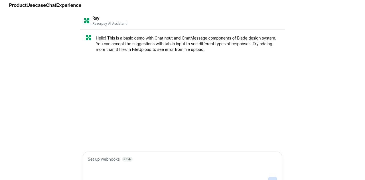
Usage
import { ChatInput } from '@razorpay/blade/components';

<ChatInput
  placeholder="Ask anything..."
  feedback={{
    moodIcons,
    isVisible: showFeedback,
    question: "How's this assistant doing so far?",
    onMoodSelect: ({ mood }) => setPicked(mood),
    onSubmit: ({ mood, tags }) => setShowFeedback(false),
    onDismiss: () => setShowFeedback(false),
  }}
/>| * change that shows up as unexplained diff noise in every snapshot downstream. | ||
| */ | ||
| const isFeedbackVisible = Boolean(feedback) && feedback?.isVisible !== false; | ||
| const frameProps = feedback |
There was a problem hiding this comment.
🟠 [MAJOR] · code-quality-critique · confidence: 8/10
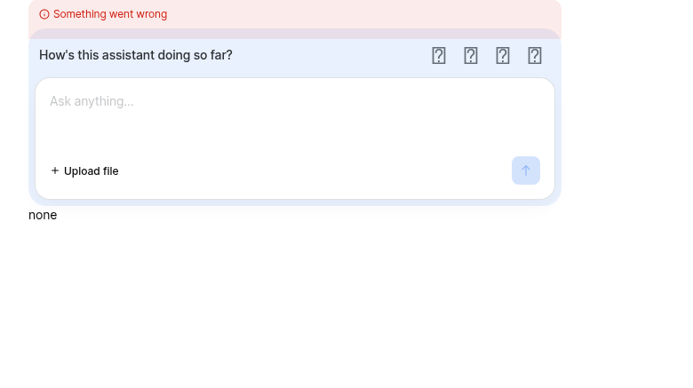
Problem: Error popup mispositioned when feedback is visible. The error popup uses bottom="calc(100% - 12px)" (line 328) relative to the outer BaseBox, whose height now includes the feedback strip + padding + gap when frameProps is applied. The popup lands at the top of the feedback strip instead of sliding out from behind the input card's top edge.
Suggestion: Move the error popup inside the input card's positioned wrapper (<BaseBox position="relative" zIndex={1}> at line 278) so bottom: calc(100% - 12px) resolves against the input card height, not the full frame.
|
(Review Cancelled - Superseded by a new run) |
There was a problem hiding this comment.
✨ Agentic PR Review ✨
UI Review
✅ 8 passed
Passing checks (8)


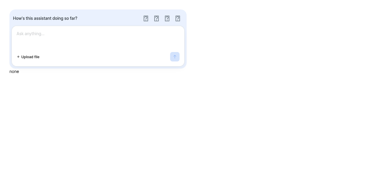
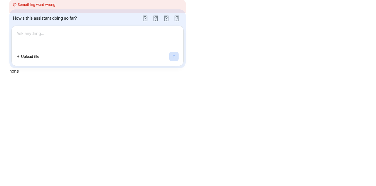



Usage
import { ChatInput } from '@razorpay/blade/components';

<ChatInput
  placeholder="Ask anything..."
  feedback={{
    moodIcons,
    question: "How's this assistant doing so far?",
    onMoodSelect: ({ mood }) => {},
    onSubmit: ({ mood, tags }) => {},
    onDismiss: () => {},
  }}
/>| return ( | ||
| <BaseBox | ||
| position="relative" | ||
| {...frameProps} |
There was a problem hiding this comment.
🟠 [MAJOR] · code-quality-critique · confidence: 8/10
Problem: Error popup is misaligned when the feedback surface is showing: frameProps adds 8px padding and the feedback strip to the container, but the error popup's bottom/left/right were calibrated for the no-frame case — it overhangs the card by 8px on each side and sits above the strip instead of behind the card's top edge
Suggestion: Move the error popup inside the card wrapper BaseBox (which already has position:relative), or adjust bottom/left/right to account for the frame padding when isFeedbackVisible is true
 kamaleshs-bridge4
left a comment
kamaleshs-bridge4
left a comment
kamaleshs-bridge4
left a comment
There was a problem hiding this comment.
✨ Agentic PR Review ✨
UI Review
✅ 2 passed · ❌ 1 failed
| Check | Problem |
|---|---|
| With feedback prompt (attached) |
Passing checks (2)
| Check |
|---|
| ✅ With custom mood icons |
| ✅ KitchenSink ChatInput |
Usage
import { ChatInput } from '@razorpay/blade/components';

const moodIcons = {
  'very-dissatisfied': <SadFaceIcon />,
  'dissatisfied': <FrownIcon />,
  'satisfied': <SmileIcon />,
  'very-satisfied': <GrinIcon />,
};

<ChatInput
  feedback={{
    moodIcons,
    question: 'How is it going?',
    onMoodSelect: ({ mood }) => trackMood(mood),
    onSubmit: ({ mood, tags, comment }) => submitFeedback({ mood, tags, comment }),
    onDismiss: () => setShowFeedback(false),
  }}
/>| * the page chrome. No border — the tint alone separates it from the page, and an outline | ||
| * around an outline (the card carries its own) reads as two boxes rather than one. | ||
| */ | ||
| backgroundColor: isFeedbackVisible ? 'surface.background.primary.subtle' : 'transparent', |
There was a problem hiding this comment.
🟠 [MAJOR] · code-quality-critique · confidence: 7/10
Problem: When isVisible transitions from true to false, backgroundColor and padding in frameProps change instantly (tinted to transparent, spacing.3 to spacing.0), while the Move exit animation is still playing. This causes two visible glitches: (1) the feedback content appears to float without its tinted background during the exit animation, and (2) the input card jumps up by ~12px because the padding change is immediate rather than animated. The ComposerHoldsStillAcrossSteps test only covers step changes (mood to tags), not the dismissal transition, so this is untested.
Suggestion: Delay the frame's background/padding removal until the Move exit animation completes. One approach: track a local isAnimatingOut state and keep the visible frame props until the animation finishes, or animate the container's padding and background alongside the content exit.
| const isFeedbackVisible = Boolean(feedback) && feedback?.isVisible !== false; | ||
| const frameProps = feedback | ||
| ? ({ | ||
| display: 'flex', |
There was a problem hiding this comment.
🔵 [MINOR] · code-quality-critique · confidence: 8/10
Problem: frameProps sets display: 'flex', but {...getStyledProps(rest)} is spread after it on line 262. Since display is part of StyledPropsBlade, a consumer passing display (e.g. display="block") to ChatInput would override the frame's display: 'flex', silently breaking the flex column layout — flexDirection and gap become no-ops without flex, removing the 4px spacing between the prompt and the card.
Suggestion: Apply display: 'flex' via a styled component or inline style that cannot be overridden by consumer styled props, or spread frameProps after getStyledProps(rest) for layout-critical props only.
| */ | ||
| type ChatInputFeedbackProps = Pick< | ||
| ChatFeedbackProps, | ||
| 'question' | 'moodConfig' | 'moodIcons' | 'isDisabled' | 'onMoodSelect' | 'onSubmit' | 'onDismiss' |
There was a problem hiding this comment.
🙏🏻 [NEEDS CLARIFICATION] · api-decision-critique · confidence: 4/10
ChatInputFeedbackProps picks 'moodIcons' from ChatFeedbackProps, where it is a required prop of type ChatFeedbackMoodIcons. However, ChatFeedbackMoodIcons is not re-exported from ChatFeedback/index.ts (only 5 of 6 types are exported). Consumers who want to pre-declare a typed mood-icons object — rather than relying on inference from an inline literal — cannot import the type from the public API. Should ChatFeedback/index.ts add ChatFeedbackMoodIcons to its export list, or is the expectation that consumers construct Record<ChatFeedbackMood, React.ReactNode> manually?
 kamaleshs-bridge4
added
the
Human Help Needed 🧑🏻💻
kamaleshs-bridge4
added
the
Human Help Needed 🧑🏻💻
95b0238 to
85b640c
Compare
|
(Review Cancelled - Superseded by a new run) |
There was a problem hiding this comment.
✨ Agentic PR Review ✨
Status: Approved ✅
UI Review
✅ 11 passed
Passing checks (11)
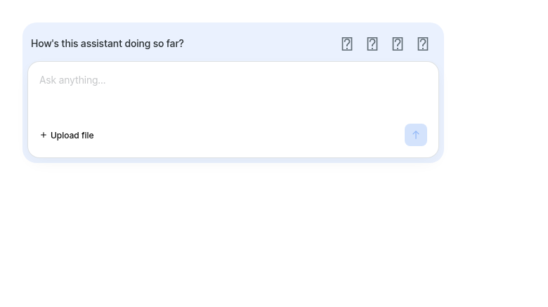
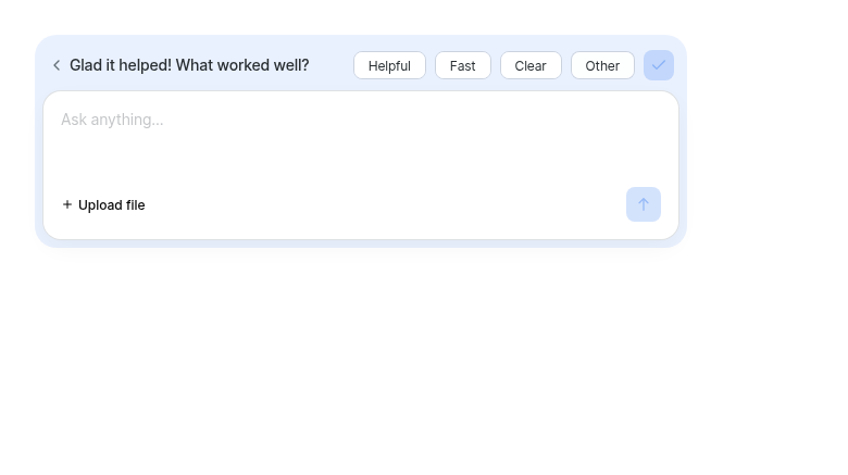
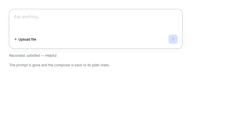
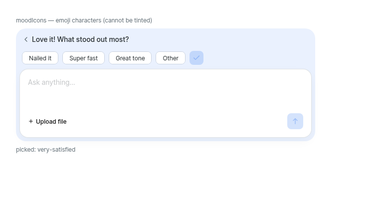
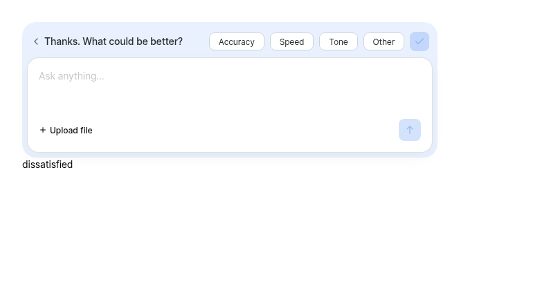
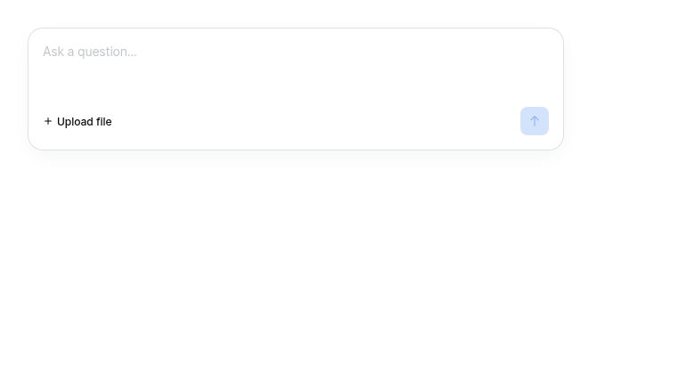
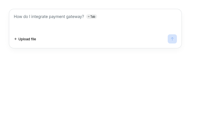
Usage
import { ChatInput } from '@razorpay/blade/components';

<ChatInput
  placeholder="Ask anything..."
  feedback={{
    moodIcons,
    isVisible,
    question: "How's this assistant doing so far?",
    onMoodSelect: ({ mood }) => setPicked(mood),
    onSubmit: ({ mood, tags }) => recordAnswer(mood, tags),
    onDismiss: () => setShowFeedback(false),
  }}
/> rzp-slash-public
Bot
added
the
rcore:eligible-for-auto-approval
rzp-slash-public
Bot
added
the
rcore:eligible-for-auto-approval
85b640c to
0930cbe
Compare
|
(Review Cancelled - Superseded by a new run) |

kamaleshs-bridge4
left a comment
kamaleshs-bridge4
left a comment
There was a problem hiding this comment.
✨ Agentic PR Review ✨
Status: Approved ✅
UI Review
✅ 7 passed
Passing checks (7)



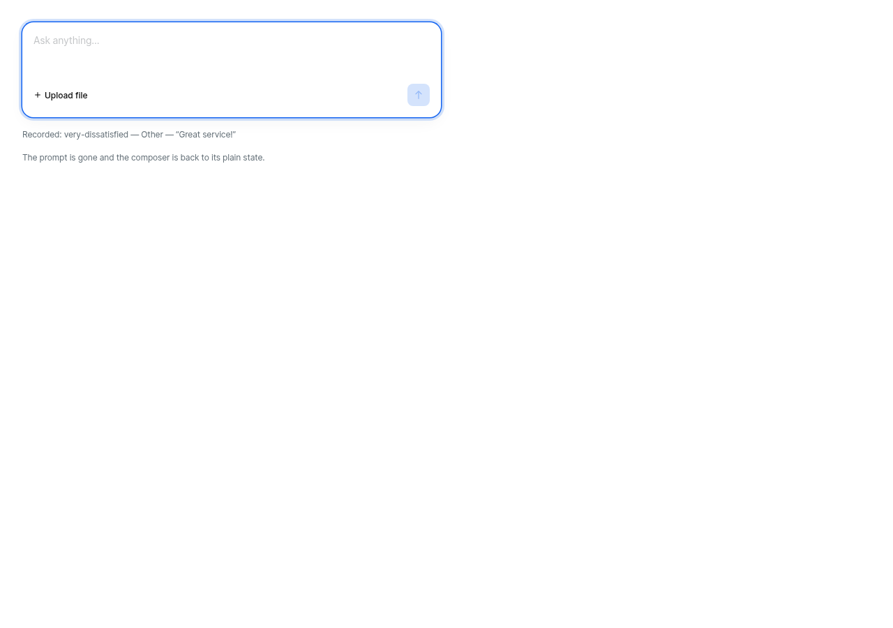
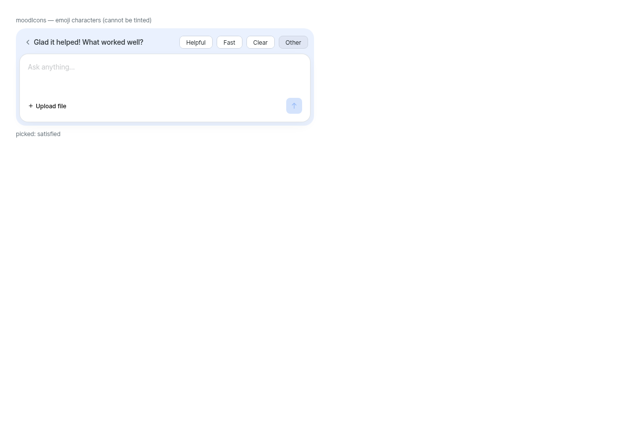
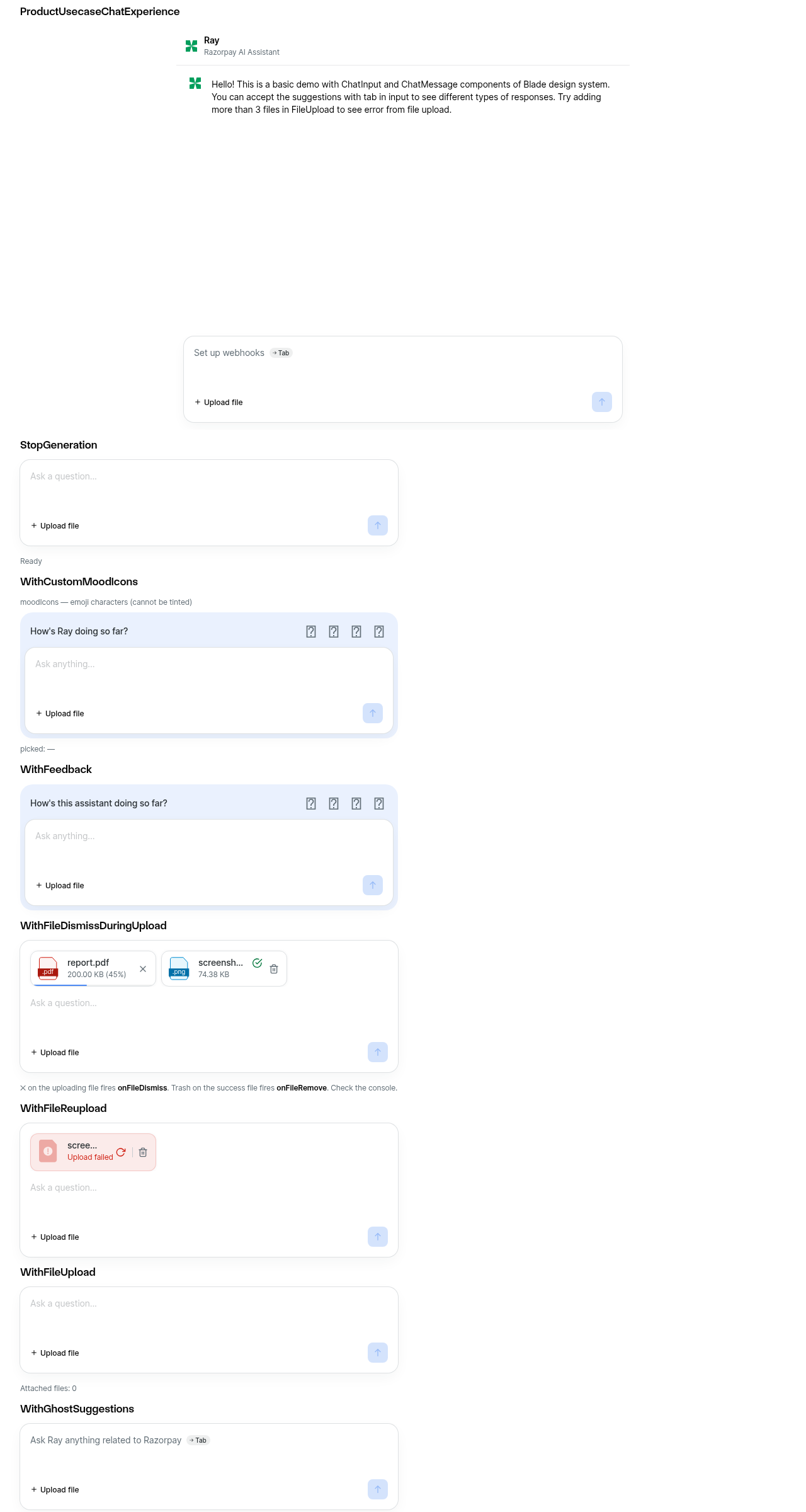
Usage
import { ChatInput } from '@razorpay/blade/components';

<ChatInput
  placeholder="Ask anything..."
  feedback={{
    question: "How's this going?",
    moodIcons,
    moodConfig,
    isVisible,
    freeTextTag: 'Other',
    commentPlaceholder: 'Anything else? (optional)',
    onMoodSelect,
    onSubmit,
    onDismiss,
  }}
/>| * collects the free-text comment needs to submit the flow from its own send button, and to | ||
| * release the tag again when the user backs out of typing. | ||
| */ | ||
| controlsRef?: React.MutableRefObject<ChatFeedbackControls | null>; |
There was a problem hiding this comment.
🔵 [MINOR] · code-quality-critique · confidence: 9/10
Problem: Stale JSDoc: says onSubmit 'Fires once when tags are submitted, and again with comment populated if the user goes on to add a free-text follow-up', but the comment step was removed in this PR — onSubmit now fires only once. The 'and again with comment' phrase describes the removed submitComment/openComment flow.
Suggestion: Update JSDoc to reflect that onSubmit fires once on submit, with comment populated by the host (e.g. composer) if free text was collected
|
(Review Cancelled - Superseded by a new run) |
There was a problem hiding this comment.
✨ Agentic PR Review ✨
UI Review
✅ 4 passed
Passing checks (4)
| Check | Screenshot |
|---|---|
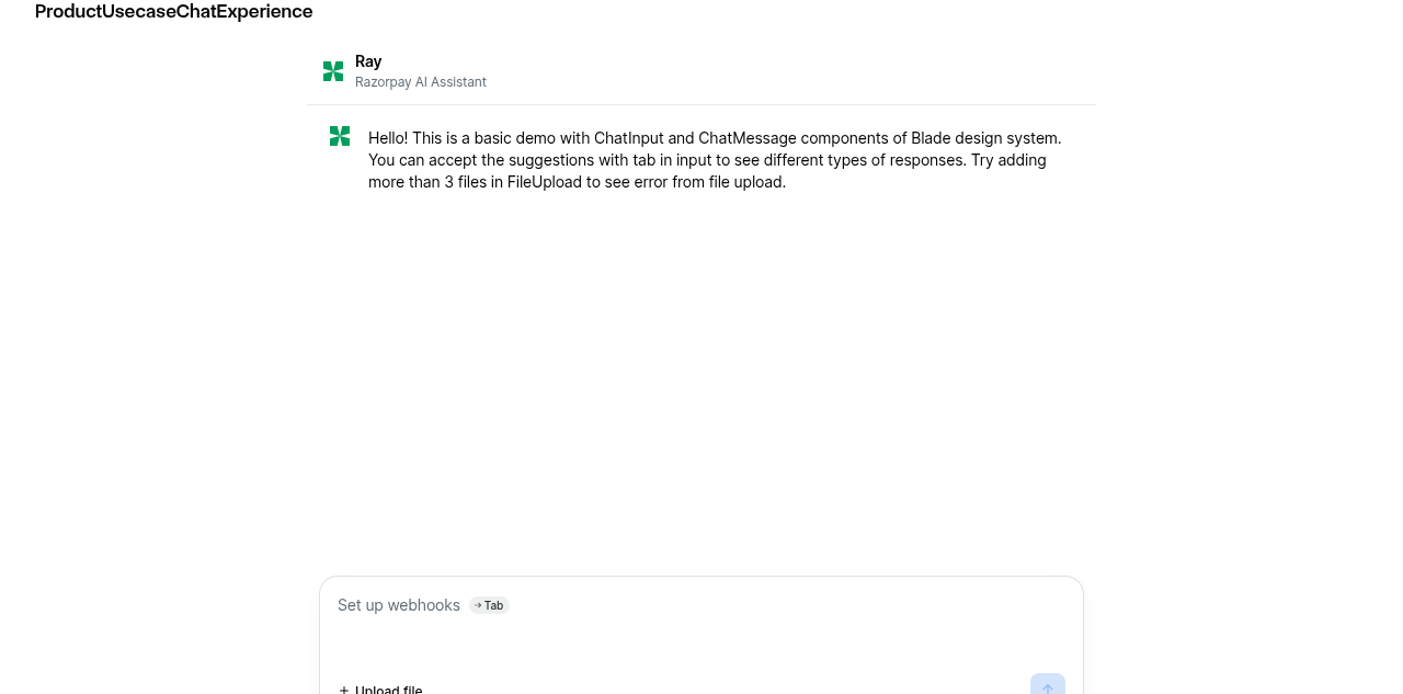
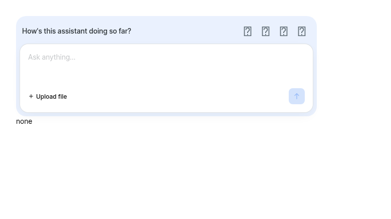
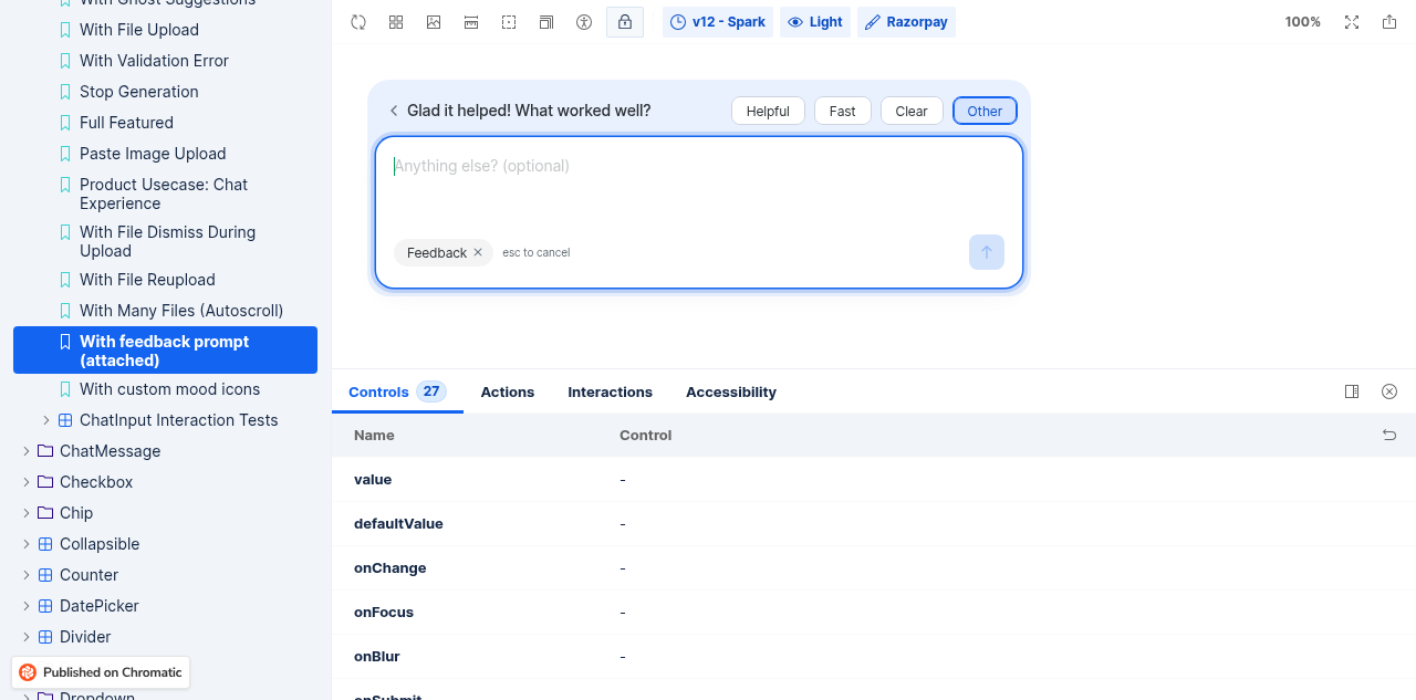
| ✅ With feedback prompt (attached) | 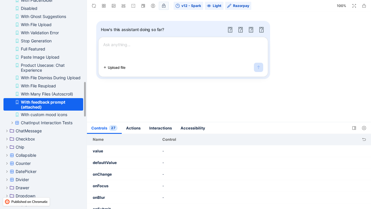 |
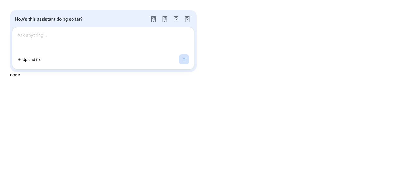
| ✅ With custom mood icons | 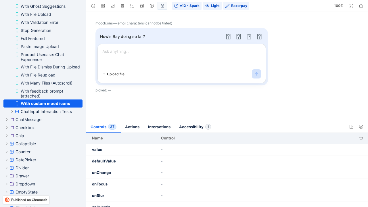 |
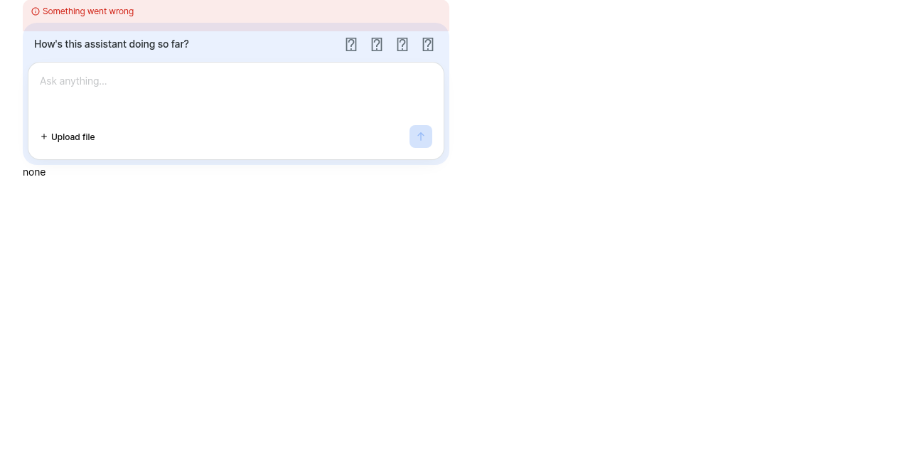
| ✅ ChatFeedback Default | 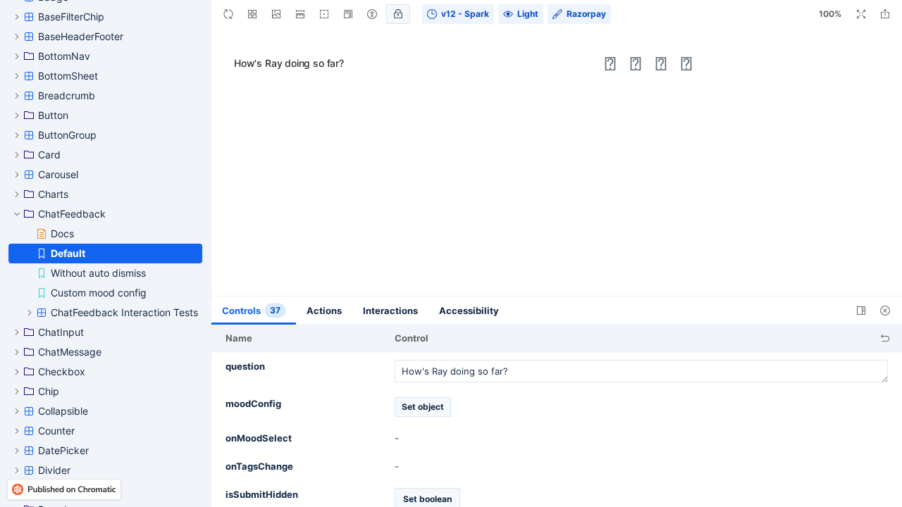 |
| ✅ KitchenSink ChatInput |  |
Usage
import { ChatInput } from '@razorpay/blade/components';

<ChatInput
  placeholder="Ask anything..."
  feedback={{
    question: "How's this going?",
    moodIcons,
    onSubmit: ({ mood, tags, comment }) => record(mood, tags, comment),
    onDismiss: () => setShowFeedback(false),
  }}
/>| hideLabelText | ||
| hideFormHint | ||
| placeholder={showGhostSuggestion ? '' : placeholder} | ||
| placeholder={ |
There was a problem hiding this comment.
🟠 [MAJOR] · code-quality-critique · confidence: 8/10
Problem: The placeholder prop was updated to account for isFeedbackInput, but the inputRowOverlay prop (unchanged, ~line 499) was not. When entering feedback mode, the chat draft is cleared, making showGhostSuggestion true if suggestions are provided. The ghost suggestion overlay then renders on top of the feedback placeholder, showing chat suggestions to a user who is supposed to be typing feedback. Additionally, handleComposerKeyDown only handles Escape and Enter in feedback mode — Tab is silently dropped, so the visible ghost suggestion cannot even be accepted.
Suggestion: Guard the inputRowOverlay with !isFeedbackInput, e.g. inputRowOverlay={!isFeedbackInput && showGhostSuggestion && suggestions ? (...) : null}. This ensures ghost suggestions are suppressed while the composer is collecting feedback.
| [clearTimers, onMoodSelect, schedule, setSelectedTags, theme.motion.duration.quick], | ||
| ); | ||
|
|
||
| const submitTags = React.useCallback(() => { |
There was a problem hiding this comment.
🟠 [MAJOR] · api-decision-critique · confidence: 8/10
Problem: The comment prop is declared on ChatFeedbackProps (per the decisions doc and ChatFeedbackSubmitPayload) but is never wired through. submitTags calls onSubmit?.({ mood: selectedMood, tags: selectedTags }) with no comment field, and UseChatFeedbackProps does not Pick comment. A consumer using ChatFeedback directly and passing comment will have it silently ignored — onSubmit receives { mood, tags } only. The ChatInputFeedback wrapper works around this by intercepting onSubmit and injecting comment manually, confirming the author knows ChatFeedback itself doesn't handle it.
Suggestion: Pass comment from ChatFeedbackProps into useChatFeedback and include it in the submitTags payload: onSubmit?.({ mood: selectedMood, tags: selectedTags, comment }). Then ChatInputFeedback can pass comment directly to ChatFeedback instead of intercepting onSubmit.
| <ChatInputActionBar | ||
| isDisabled={isDisabled} | ||
| isGenerating={isGenerating} | ||
| isSubmitDisabled={isSubmitDisabled} |
There was a problem hiding this comment.
🔵 [MINOR] · code-quality-critique · confidence: 6/10
Problem: The onSubmit prop on ChatInputActionBar was changed to route to submitFeedbackInput in feedback mode, but isSubmitDisabled (passed unchanged) still reflects the chat submit's empty-text check. In feedback mode with no typed comment, the send button is disabled — yet Enter in handleComposerKeyDown calls submitFeedbackInput unconditionally. This creates an inconsistency: the user can submit empty feedback via Enter but not via the send button.
Suggestion: Override isSubmitDisabled in feedback mode (e.g. pass isSubmitDisabled={isFeedbackInput ? false : isSubmitDisabled}), or add an empty-text guard to the Enter handler in handleComposerKeyDown to match the button's behavior.
| which is why that state had to move off the glyph. | ||
| */} | ||
| <MoodIconSlot aria-hidden="true">{moodIcons[mood]}</MoodIconSlot> | ||
| <MoodIconSlot aria-hidden="true">{moodIcons?.[mood]}</MoodIconSlot> |
There was a problem hiding this comment.
🔵 [MINOR] · code-quality-critique · confidence: 6/10
Problem: The expression changed from moodIcons[mood] to moodIcons?.[mood], adding optional chaining. But moodIcons is typed as ChatFeedbackMoodIcons = Record<ChatFeedbackMood, React.ReactNode> — a required prop. The optional chaining is inconsistent with the type contract and could mask a bug where moodIcons is accidentally omitted.
Suggestion: Revert to moodIcons[mood] to match the required type. If there is a real scenario where moodIcons can be undefined, make the type optional instead of silently weakening the runtime check.
3805480 to
bf8d78d
Compare
|
(Review Cancelled - Superseded by a new run) |
bf8d78d to
baf5963
Compare
kamaleshs-bridge4
left a comment
kamaleshs-bridge4
left a comment
There was a problem hiding this comment.
✨ Agentic PR Review ✨
Status: Approved ✅
UI Review
✅ 10 passed
Passing checks (10)
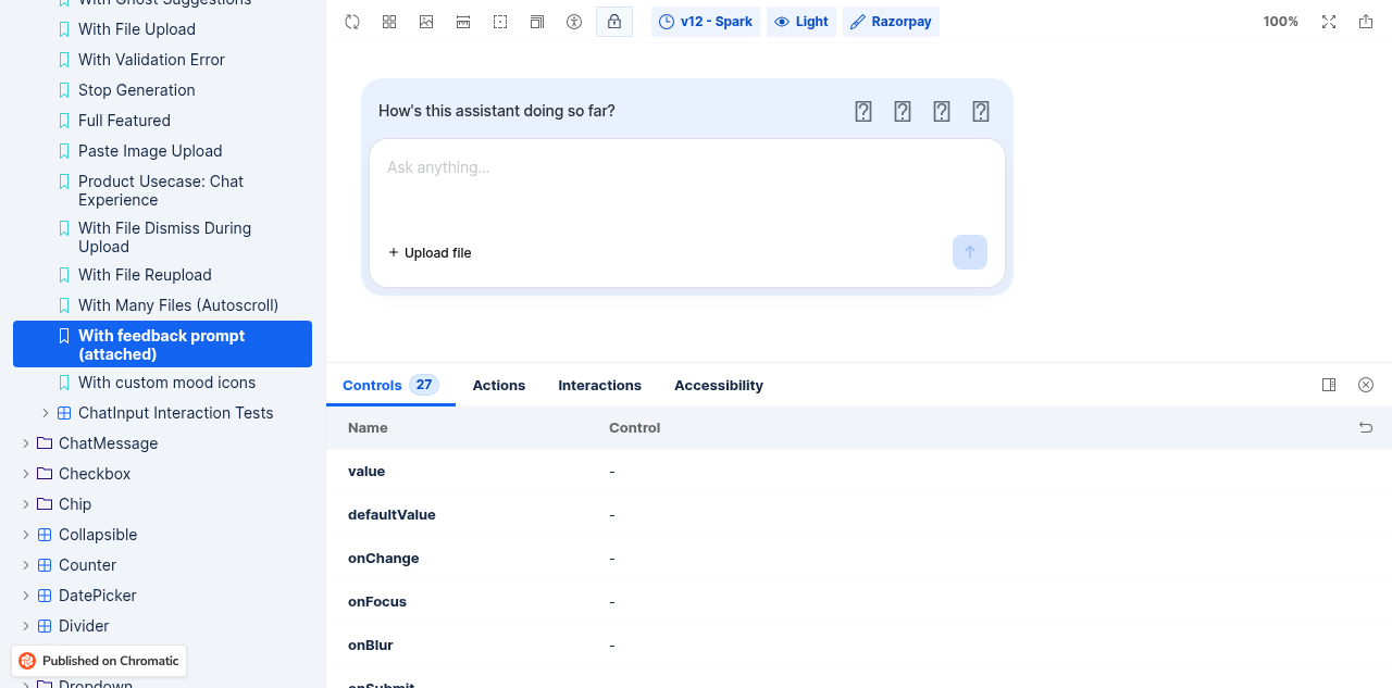





Usage
import { ChatInput } from '@razorpay/blade/components';

<ChatInput
  placeholder="Ask anything..."
  feedback={{
    feedbackIcons: emojiMoodIcons,
    isVisible: showFeedback,
    question: "How's this assistant doing so far?",
    onMoodSelect: ({ mood }) => setAnswer(mood),
    onSubmit: ({ mood, tags, comment }) => record({ mood, tags, comment }),
    onDismiss: () => setShowFeedback(false),
    freeTextTag: 'Other',
    commentPlaceholder: 'Anything else? (optional)',
  }}
/>
|
(Review Cancelled - Superseded by a new run) |
There was a problem hiding this comment.
✨ Agentic PR Review ✨
UI Review
✅ 6 passed
Passing checks (6)
Usage
import { ChatInput } from '@razorpay/blade/components';

<ChatInput
  placeholder="Ask anything..."
  feedback={{
    question: "How's this going?",
    feedbackIcons,
    onSubmit: ({ mood, tags, comment }) => { ... },
    onDismiss: () => { ... },
  }}
/>
|
🤖 Slash AI Review has been triggered. View execution logs |
|
(Review Cancelled - Superseded by a new run) |
5082b5f to
6f543ef
Compare
|
(Review Cancelled - Superseded by a new run) |
|
🤖 Slash AI Review has been triggered. View execution logs |
There was a problem hiding this comment.
✨ Agentic PR Review ✨
Status: Approved ✅
UI Review
✅ 9 passed
Passing checks (9)
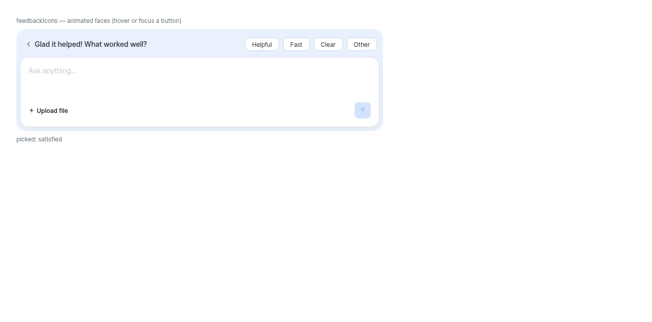
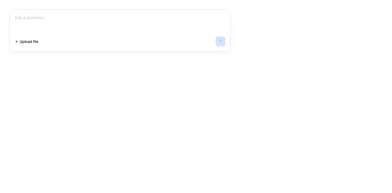
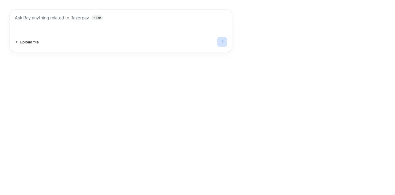
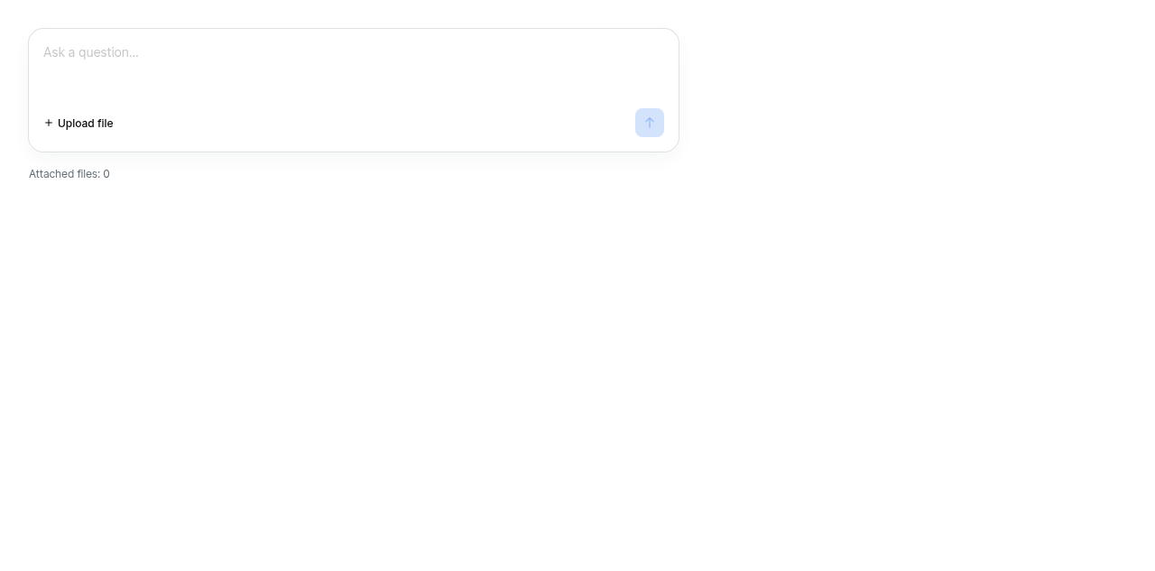
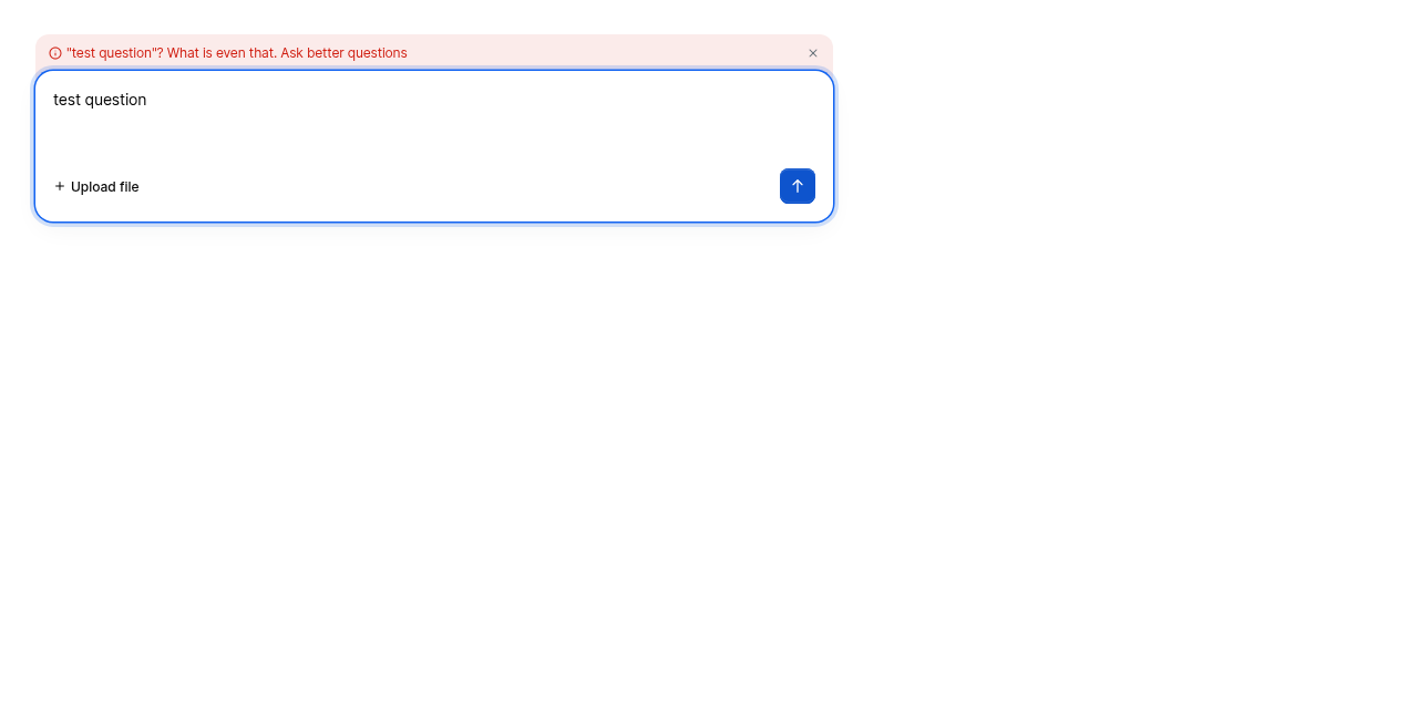
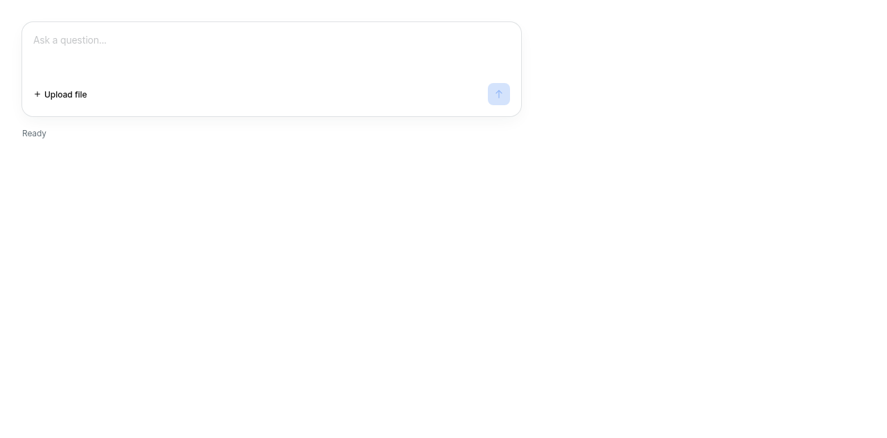
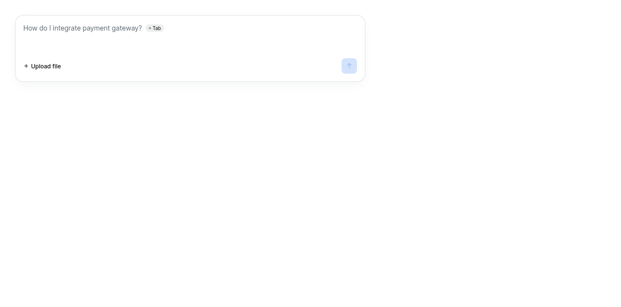
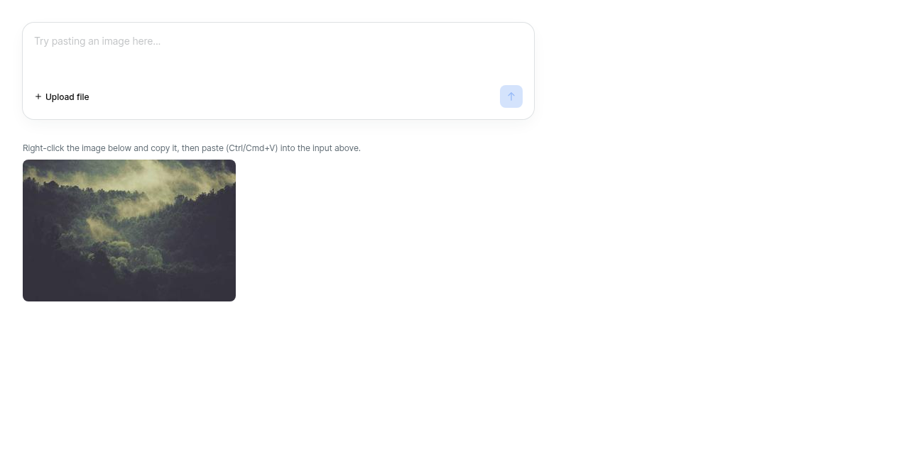
Usage
import { ChatInput } from '@razorpay/blade/components';

<ChatInput
  placeholder="Ask anything..."
  feedback={{
    feedbackIcons,
    isVisible: showFeedback,
    question: "How's Ray doing so far?",
    freeTextTag: 'Other',
    commentPlaceholder: 'Anything else? (optional)',
    onMoodSelect: ({ mood }) => setPicked(mood),
    onSubmit: ({ mood, tags, comment }) => record(mood, tags, comment),
    onDismiss: () => setShowFeedback(false),
  }}
/>
kamaleshs-bridge4
left a comment
kamaleshs-bridge4
left a comment
There was a problem hiding this comment.
✨ Agentic PR Review ✨
UI Review
✅ 11 passed
Passing checks (11)
Usage
import { ChatInput } from '@razorpay/blade/components';

<ChatInput
  placeholder="Ask anything..."
  feedback={{
    question: "How's this going?",
    feedbackIcons,
    onSubmit,
    onDismiss,
  }}
/>3 participants


Description
One new prop on the existing component:
Pass it and a
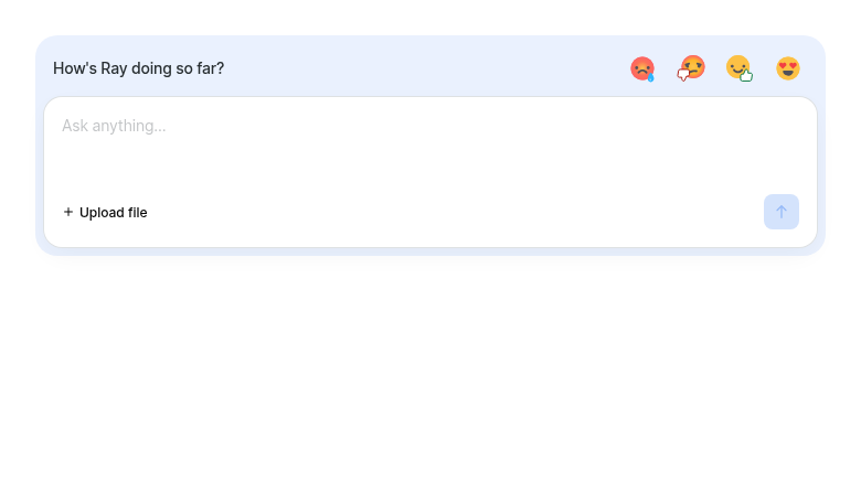
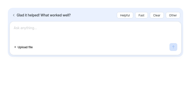
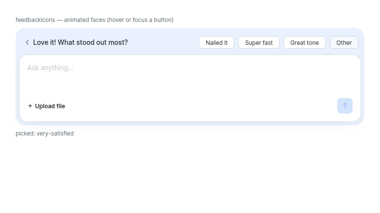
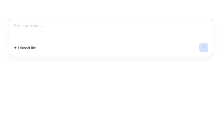
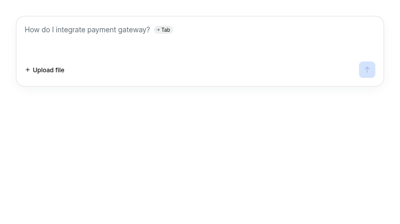
ChatFeedbackprompt attaches to the composer's top edge, the two sharing one tinted surface so they read as a single object. Omit it and the composer renders exactly as it does today — verified: the flag-off snapshot contains no frame CSS at all, because those properties are only emitted when the prop is present.The composer takeover
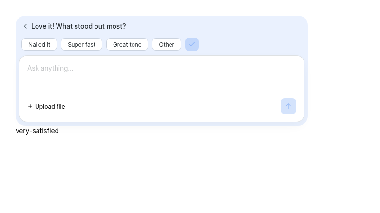
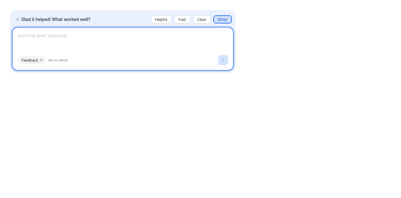
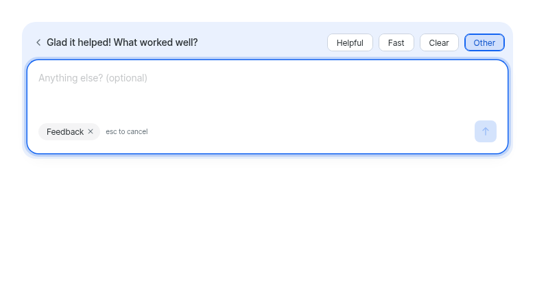
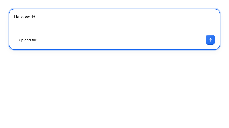
Picking the prompt's free-text tag (
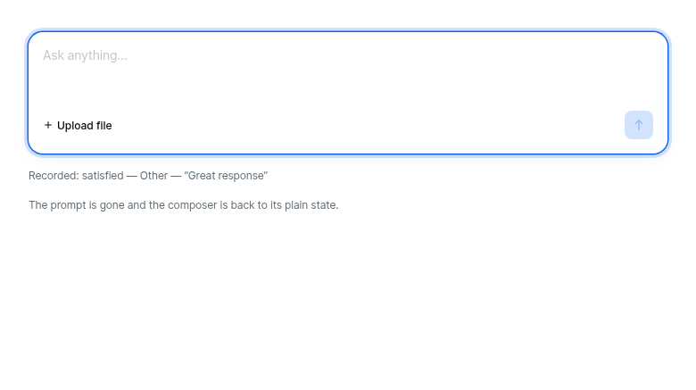
feedback.freeTextTag, default'Other') hands the composer over: placeholder swaps, a dismissableFeedbacktag replaces the upload link, focus moves to the field, and Enter submits the comment.Every exit also releases the tag. Leaving it selected strands the user: the tick stays hidden because the only tag picked is the free-text one, and the composer has gone back to chatting — a choice made with no way left to send it.
Enter is blocked rather than rerouted because sending someone's candid feedback to the assistant as a prompt is not a recoverable mistake.
Why the prompt lives inside
ChatInputThe obvious composition — render
ChatFeedbackabove aChatInput— is silently broken. The composer keeps its validation region mounted directly above the card even with no error, and it swallows clicks aimed at anything stacked there (fixed in #3883). Owning the prompt here means the layer it sits on is decided in the same file as the layer the error region sits on.Changes
feedbackprop +ChatInputFeedbackProps;ChatInputFeedbackowns surface, spacing, layering and entry/exitleadingSloton the action bar, for the mode indicatoracceptis handledOn the tests
The important interaction test asserts by hit-testing, not clicking: