@rcaferati/vue-awesome-button provides three related Vue 3 button components:
AwesomeButton- animated base buttonAwesomeButtonProgress- progress flow wrapper on top ofAwesomeButtonAwesomeButtonSocial- social/share wrapper on top ofAwesomeButton
This README is updated for the current 1.0.1 release outputs, including base CSS, bundled theme CSS files, Vue slots, emits, and plugin registration.
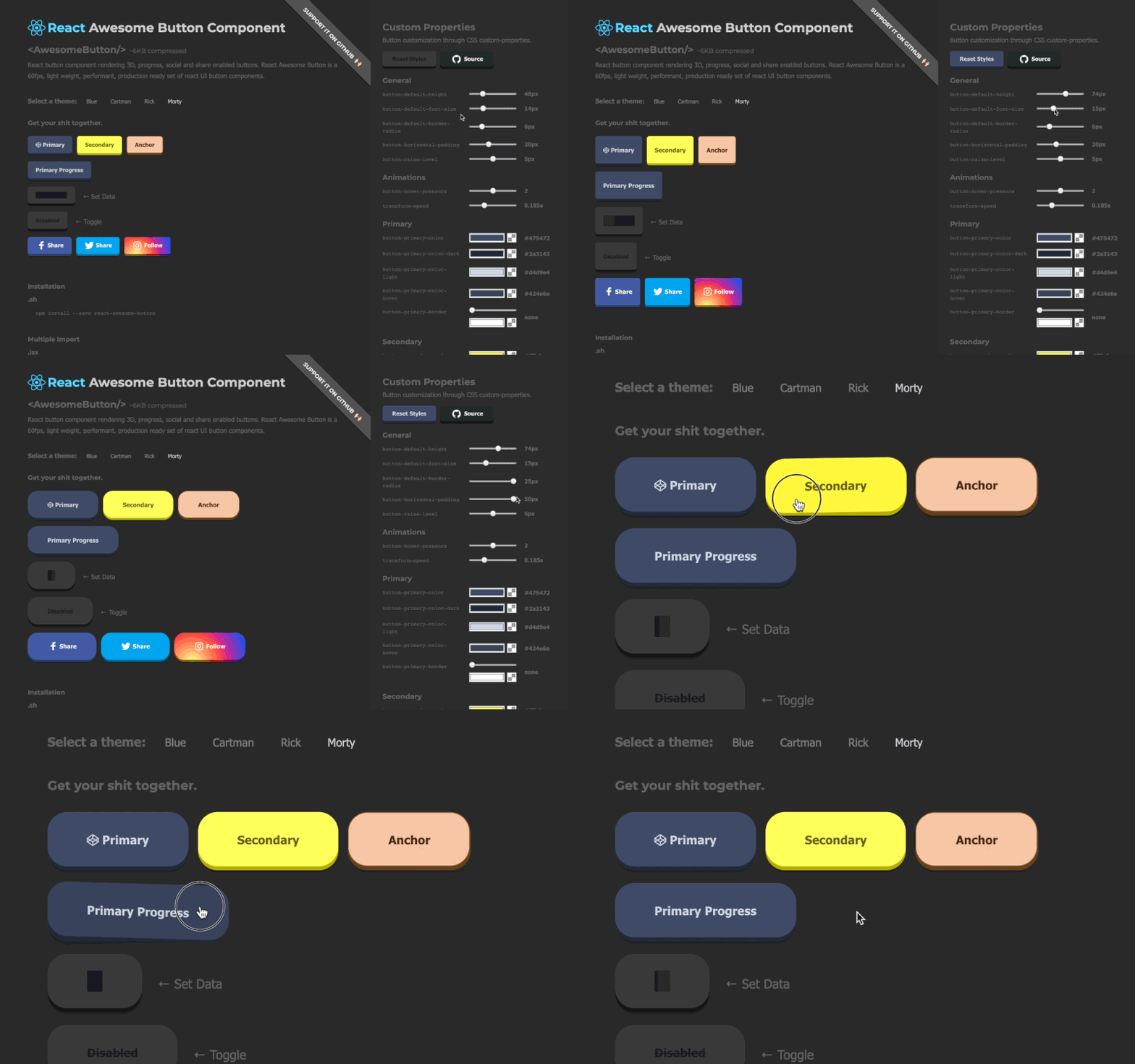
npm install @rcaferati/vue-awesome-buttonImport the base stylesheet once, import any theme CSS files you want to use, then render a button with the matching theme prop.
<script setup lang="ts">
import { AwesomeButton } from '@rcaferati/vue-awesome-button';
import '@rcaferati/vue-awesome-button/styles.css';
import '@rcaferati/vue-awesome-button/themes/theme-blue.css';
</script>

<template>
  <AwesomeButton theme="blue" type="primary">
    Button
  </AwesomeButton>
</template>The Vue package does not use theme mapping objects. Themes are plain CSS files scoped by the theme prop.
import '@rcaferati/vue-awesome-button/styles.css';
import '@rcaferati/vue-awesome-button/themes/theme-blue.css';<AwesomeButton theme="blue" type="primary">
Button
</AwesomeButton>Import each theme CSS file once, then switch themes per button instance.
import '@rcaferati/vue-awesome-button/styles.css';
import '@rcaferati/vue-awesome-button/themes/theme-blue.css';
import '@rcaferati/vue-awesome-button/themes/theme-rickiest.css';<template>
<AwesomeButton theme="blue" type="primary">
Blue
</AwesomeButton>
<AwesomeButton theme="rickiest" type="secondary">
Rickiest
</AwesomeButton>
</template>theme-amber.csstheme-blue.csstheme-bojack.csstheme-bruce.csstheme-c137.csstheme-eric.csstheme-flat.csstheme-indigo.csstheme-red.csstheme-rickiest.css
Use the plugin if you want global component registration.
import { createApp } from 'vue';
import App from './App.vue';
import { AwesomeButtonPlugin } from '@rcaferati/vue-awesome-button';
import '@rcaferati/vue-awesome-button/styles.css';
import '@rcaferati/vue-awesome-button/themes/theme-blue.css';

createApp(App).use(AwesomeButtonPlugin).mount('#app');
After registration, AwesomeButton, AwesomeButtonProgress, and AwesomeButtonSocial are available in templates without local imports.
If href is not provided, AwesomeButton renders button-like behavior and emits press on successful activation.
<script setup lang="ts">
import { AwesomeButton } from '@rcaferati/vue-awesome-button';
import '@rcaferati/vue-awesome-button/styles.css';
import '@rcaferati/vue-awesome-button/themes/theme-blue.css';

function handleSave() {
  // do something
}
</script>

<template>
  <AwesomeButton theme="blue" type="primary" @press="handleSave">
    Save changes
  </AwesomeButton>
</template>If href is provided, the component renders anchor-like behavior and lets native navigation happen. Normal Vue attrs are forwarded to the root element.
<script setup lang="ts">
import { AwesomeButton } from '@rcaferati/vue-awesome-button';
import '@rcaferati/vue-awesome-button/styles.css';
import '@rcaferati/vue-awesome-button/themes/theme-blue.css';
</script>

<template>
  <AwesomeButton
    theme="blue"
    type="link"
    href="https://github.com/rcaferati"
    target="_blank"
    rel="noreferrer noopener"
  >
    Open website
  </AwesomeButton>
</template>Use before and after slots to render icons. For icon-only buttons, pass the icon with a named slot and omit default slot text.
<script setup lang="ts">
import { AwesomeButton } from '@rcaferati/vue-awesome-button';
import '@rcaferati/vue-awesome-button/styles.css';
import '@rcaferati/vue-awesome-button/themes/theme-blue.css';
</script>

<template>
  <div style="display: grid; gap: 12px;">
    <AwesomeButton theme="blue" type="primary" size="medium">
      <template #before>
        <svg aria-hidden="true" viewBox="0 0 24 24" width="16" height="16">
          <path d="M12 3l1.9 4.8L19 9.2l-4 3.4 1.3 5.2L12 15l-4.3 2.8L9 12.6 5 9.2l5.1-1.4L12 3z" />
        </svg>
      </template>

      Continue

      <template #after>
        <svg aria-hidden="true" viewBox="0 0 24 24" width="16" height="16">
          <path d="M5 12h14" />
          <path d="m13 5 7 7-7 7" />
        </svg>
      </template>
    </AwesomeButton>

    <AwesomeButton theme="blue" type="primary" size="medium" aria-label="Play">
      <template #before>
        <svg aria-hidden="true" viewBox="0 0 24 24" width="16" height="16">
          <path d="M8 5v14l11-7z" />
        </svg>
      </template>
    </AwesomeButton>
  </div>
</template>size="small" | "medium" | "large"uses fixed button dimensions.:size="null"uses content-driven auto width.- Fixed-size changes and measured auto-width changes animate by default. Use
:animate-size="false"to opt out. - Switching between fixed size and auto width is intentionally instant in this release.
<script setup lang="ts">
import { AwesomeButton } from '@rcaferati/vue-awesome-button';
import '@rcaferati/vue-awesome-button/styles.css';
import '@rcaferati/vue-awesome-button/themes/theme-blue.css';
</script>

<template>
  <div style="display: grid; gap: 12px;">
    <AwesomeButton theme="blue" size="small" type="primary">
      Small
    </AwesomeButton>
    <AwesomeButton theme="blue" size="medium" type="primary">
      Medium
    </AwesomeButton>
    <AwesomeButton theme="blue" size="large" type="primary">
      Large
    </AwesomeButton>
    <AwesomeButton theme="blue" :size="null" type="primary">
      Auto width grows with content
    </AwesomeButton>
    <AwesomeButton theme="blue" size="large" type="primary" :animate-size="false">
      Instant fixed-size change
    </AwesomeButton>
  </div>
</template>Use text-transition when the default slot resolves to a plain string and you want label changes to animate.
<script setup lang="ts">
import { ref } from 'vue';
import { AwesomeButton } from '@rcaferati/vue-awesome-button';
import '@rcaferati/vue-awesome-button/styles.css';

const expanded = ref(false);
</script>

<template>
  <AwesomeButton
    type="primary"
    :size="null"
    text-transition
    @press="expanded = !expanded"
  >
    {{ expanded ? 'Processing settlement report' : 'Generate report' }}
  </AwesomeButton>
</template>| Slot | Description |
|---|---|
before |
Content rendered before the main label, commonly an icon |
| default | Main label/content |
after |
Content rendered after the main label, commonly an icon |
extra |
Extra wrapper content used by wrappers such as progress |
| Emit | Payload | Description |
|---|---|---|
press |
MouseEvent | KeyboardEvent | PointerEvent |
Successful activation/release |
pressed |
MouseEvent | KeyboardEvent | PointerEvent |
Press-in interaction started |
released |
HTMLElement | null |
Release cycle cleared |
| Prop | Type | Default | Description |
|---|---|---|---|
type |
string |
"primary" |
Visual variant key, such as primary, secondary, danger, link, or a social visual variant |
size |
"small" | "medium" | "large" | null |
"medium" |
Size key or null for auto width |
active |
boolean |
false |
Controlled pressed/active visual state |
disabled |
boolean |
false |
Disables interactions |
visible |
boolean |
true |
Toggles visible state class |
placeholder |
boolean |
false |
Renders placeholder/skeleton state |
lockedHover |
boolean |
false |
Locks the visual middle-hover position without changing interactivity |
animateSize |
boolean |
true |
Animates fixed-size and measured auto-width changes |
textTransition |
boolean |
false |
Animates string-only label changes |
between |
boolean |
false |
Uses space-between layout for content |
ripple |
boolean |
false |
Enables ripple effect on successful activation |
moveEvents |
boolean |
true |
Enables pointer move position classes |
href |
string | null |
null |
Enables anchor-like mode |
as |
string | Component |
"button" |
Root element/component when href is not set |
theme |
ThemeName | null |
null |
Applies a bundled theme marker class, such as blue |
Normal Vue attrs such as class, style, aria-*, target, and rel are forwarded to the rendered root element.
<AwesomeButton disabled locked-hover>
  Locked hover
</AwesomeButton>
AwesomeButtonProgress wraps AwesomeButton and manages a guarded progress lifecycle. Its press emit receives a second callback argument:
next(true)starts the success flownext(false, 'Failed')starts the error flow with an optional label override
<script setup lang="ts">
import { AwesomeButtonProgress } from '@rcaferati/vue-awesome-button';
import '@rcaferati/vue-awesome-button/styles.css';
import '@rcaferati/vue-awesome-button/themes/theme-blue.css';

const sleep = (ms: number) => new Promise((resolve) => window.setTimeout(resolve, ms));

async function handleVerify(
  _event: MouseEvent | KeyboardEvent | PointerEvent,
  next: (endState?: boolean, errorLabel?: string | null) => void
) {
  await sleep(900);
  next(true);
}
</script>

<template>
  <AwesomeButtonProgress
    theme="blue"
    type="primary"
    loading-label="Verifying..."
    result-label="Verified!"
    :release-delay="500"
    @press="handleVerify"
  >
    Verify
  </AwesomeButtonProgress>
</template><script setup lang="ts">
import { AwesomeButtonProgress } from '@rcaferati/vue-awesome-button';
import '@rcaferati/vue-awesome-button/styles.css';
const sleep = (ms: number) => new Promise((resolve) => window.setTimeout(resolve, ms));
async function handlePublish(
_event: MouseEvent | KeyboardEvent | PointerEvent,
next: (endState?: boolean, errorLabel?: string | null) => void
) {
await sleep(900);
next(false, 'Failed');
}
</script>
<template>
<AwesomeButtonProgress
type="danger"
loading-label="Publishing..."
result-label="Done!"
@press="handlePublish"
>
Publish
</AwesomeButtonProgress>
</template>Use :show-progress-bar="false" to keep the loading/result text flow while hiding the dark loading bar. Use progress-loading-time to control how long the progress bar takes to advance during the loading phase.
<script setup lang="ts">
import { AwesomeButtonProgress } from '@rcaferati/vue-awesome-button';
import '@rcaferati/vue-awesome-button/styles.css';

const sleep = (ms: number) => new Promise((resolve) => window.setTimeout(resolve, ms));

async function handleSync(
  _event: MouseEvent | KeyboardEvent | PointerEvent,
  next: (endState?: boolean, errorLabel?: string | null) => void
) {
  await sleep(900);
  next(true);
}
</script>

<template>
  <AwesomeButtonProgress
    type="primary"
    loading-label="Syncing..."
    result-label="Synced!"
    :show-progress-bar="false"
    :progress-loading-time="1500"
    @press="handleSync"
  >
    Sync account
  </AwesomeButtonProgress>
</template><script setup lang="ts">
import { AwesomeButtonProgress } from '@rcaferati/vue-awesome-button';
import '@rcaferati/vue-awesome-button/styles.css';
import '@rcaferati/vue-awesome-button/themes/theme-blue.css';
const sleep = (ms: number) => new Promise((resolve) => window.setTimeout(resolve, ms));
async function handleVerify(
_event: MouseEvent | KeyboardEvent | PointerEvent,
next: (endState?: boolean, errorLabel?: string | null) => void
) {
await sleep(900);
next(true);
}
</script>
<template>
<AwesomeButtonProgress
theme="blue"
type="primary"
size="medium"
loading-label="Verifying..."
result-label="Verified!"
@press="handleVerify"
>
<template #before>
<svg aria-hidden="true" viewBox="0 0 24 24" width="16" height="16">
<path d="M12 2l8 4v6c0 5-3.4 8.7-8 10-4.6-1.3-8-5-8-10V6l8-4z" />
</svg>
</template>
Verify signature
</AwesomeButtonProgress>
</template>AwesomeButtonProgress accepts all AwesomeButton props except public active, and replaces the base press payload with the progress version below.
| Prop | Type | Default | Description |
|---|---|---|---|
loadingLabel |
string |
"Wait.." |
Loading phase label |
resultLabel |
string |
"Success!" |
Success label |
releaseDelay |
number |
500 |
Delay before reset after progress end |
showProgressBar |
boolean |
true |
Hides the dark loading bar when false, while keeping the progress flow |
progressLoadingTime |
number |
6000 |
Loading-phase progress bar duration in milliseconds |
@press |
(event, next) => void |
- | Progress handler. Call next(true) or next(false, label?) |
AwesomeButtonSocial wraps AwesomeButton and builds a share action when no custom press listener is provided.
On activation, the component behaves like this:
- If you listen to
@press, your handler is called and the built-in sharer logic is skipped - If
hrefis provided, the forwarded base anchor still navigates normally - If there is no
hrefand no custom sharer override, mobile-capable environments attemptnavigator.share(...) - Otherwise, the built-in sharer uses a type-specific web share URL, direct URL, or centered popup where supported
If you want a pure custom action with no native navigation, avoid combining @press with href.
<script setup lang="ts">
import { AwesomeButtonSocial } from '@rcaferati/vue-awesome-button';
import '@rcaferati/vue-awesome-button/styles.css';
import '@rcaferati/vue-awesome-button/themes/theme-blue.css';
</script>

<template>
  <AwesomeButtonSocial
    theme="blue"
    type="linkedin"
    :size="null"
    :sharer="{
      url: 'https://example.com',
      message: 'Check this out'
    }"
  >
    <template #before>
      <svg aria-hidden="true" viewBox="0 0 24 24" width="16" height="16">
        <path d="M4 3.5A2.5 2.5 0 1 1 4 8.5a2.5 2.5 0 0 1 0-5zM2 10h4v11H2V10zm7 0h4v1.6c.6-1 1.9-1.9 3.9-1.9 4.2 0 5 2.8 5 6.4V21h-4v-4.4c0-2.1 0-3.8-2.3-3.8-2.3 0-2.6 1.8-2.6 3.7V21H9V10z" />
      </svg>
    </template>

    LinkedIn
  </AwesomeButtonSocial>
</template>github is a visual style in the bundled themes. If you want a GitHub-looking button that opens a profile or repo, use href.
<script setup lang="ts">
import { AwesomeButtonSocial } from '@rcaferati/vue-awesome-button';
import '@rcaferati/vue-awesome-button/styles.css';
import '@rcaferati/vue-awesome-button/themes/theme-blue.css';
</script>

<template>
  <AwesomeButtonSocial
    theme="blue"
    type="github"
    href="https://github.com/rcaferati"
    target="_blank"
    rel="noreferrer noopener"
  >
    <template #before>
      <svg aria-hidden="true" viewBox="0 0 24 24" width="16" height="16">
        <path d="M12 .5a12 12 0 0 0-3.8 23.4c.6.1.8-.3.8-.6v-2c-3.3.7-4-1.4-4-1.4-.6-1.4-1.3-1.8-1.3-1.8-1.1-.7.1-.7.1-.7 1.2.1 1.8 1.2 1.8 1.2 1.1 1.8 2.8 1.3 3.5 1 .1-.8.4-1.3.8-1.6-2.7-.3-5.5-1.3-5.5-5.9 0-1.3.5-2.4 1.2-3.2-.1-.3-.5-1.5.1-3.2 0 0 1-.3 3.3 1.2a11.5 11.5 0 0 1 6 0c2.3-1.5 3.3-1.2 3.3-1.2.7 1.7.2 2.9.1 3.2.8.8 1.2 1.9 1.2 3.2 0 4.6-2.8 5.6-5.5 5.9.4.4.8 1.1.8 2.2v3.3c0 .3.2.7.8.6A12 12 0 0 0 12 .5z" />
      </svg>
    </template>

    Open GitHub
  </AwesomeButtonSocial>
</template><script setup lang="ts">
import { AwesomeButtonSocial } from '@rcaferati/vue-awesome-button';
import '@rcaferati/vue-awesome-button/styles.css';
</script>
<template>
<AwesomeButtonSocial
type="whatsapp"
:sharer="{
phone: '5511999999999',
message: 'Hello from AwesomeButton',
url: 'https://example.com'
}"
>
WhatsApp
</AwesomeButtonSocial>
</template>instagram is treated as a direct URL fallback. It does not use a dedicated web popup sharer endpoint.
<script setup lang="ts">
import { AwesomeButtonSocial } from '@rcaferati/vue-awesome-button';
import '@rcaferati/vue-awesome-button/styles.css';
</script>

<template>
  <AwesomeButtonSocial
    type="instagram"
    :sharer="{
      url: 'https://example.com',
      message: 'Open this link'
    }"
  >
    Instagram
  </AwesomeButtonSocial>
</template>If href is present, the component behaves like an anchor and does not execute the built-in share flow.
<script setup lang="ts">
import { AwesomeButtonSocial } from '@rcaferati/vue-awesome-button';
import '@rcaferati/vue-awesome-button/styles.css';
</script>

<template>
  <AwesomeButtonSocial
    type="github"
    href="https://github.com/rcaferati"
    target="_blank"
    rel="noreferrer noopener"
  >
    Open GitHub
  </AwesomeButtonSocial>
</template>
AwesomeButtonSocial accepts all AwesomeButton props and adds the props below.
| Prop | Type | Default | Description |
|---|---|---|---|
sharer |
SharerConfig |
{} |
Share payload source, with page metadata fallbacks where available |
dimensions |
{ width: number; height: number } |
{ width: 640, height: 480 } |
Popup window dimensions for share flows |
sharer.url |
string |
current page URL | URL to share, falling back to window.location.href |
sharer.message |
string |
page title | Share message/text, falling back to document.title |
sharer.image |
string |
og:image meta |
Image URL used by supported sharers, such as Pinterest |
sharer.phone |
string |
null |
Phone for WhatsApp |
sharer.user |
string |
null |
Username for Messenger direct flow |
The built-in sharer recognizes:
facebooktwitterpinterestlinkedinredditwhatsappmessengermailinstagram
You can use other type values as visual styles if the CSS includes them. The bundled visual-only social styles include github, gplus, and youtube.
Use a named icon slot and omit default slot text. Add an accessible label through normal Vue attrs.
<AwesomeButton type="primary" aria-label="Play">
  <template #before>
    <svg aria-hidden="true" viewBox="0 0 24 24" width="16" height="16">
      <path d="M8 5v14l11-7z" />
    </svg>
  </template>
</AwesomeButton>Use the progress @press contract and call next(true) or next(false, label?) when the work completes.
import type { ProgressNext } from '@rcaferati/vue-awesome-button';

async function save(_event: MouseEvent | KeyboardEvent | PointerEvent, next: ProgressNext) {
  try {
    await saveRecord();
    next(true);
  } catch {
    next(false, 'Failed');
  }
}Use slots for icons. The social component does not require bundled icons to work.
@rcaferati/vue-awesome-button@rcaferati/vue-awesome-button/AwesomeButton@rcaferati/vue-awesome-button/AwesomeButtonProgress@rcaferati/vue-awesome-button/AwesomeButtonSocial@rcaferati/vue-awesome-button/plugin@rcaferati/vue-awesome-button/styles.css@rcaferati/vue-awesome-button/themes/theme-amber.css@rcaferati/vue-awesome-button/themes/theme-blue.css@rcaferati/vue-awesome-button/themes/theme-bojack.css@rcaferati/vue-awesome-button/themes/theme-bruce.css@rcaferati/vue-awesome-button/themes/theme-c137.css@rcaferati/vue-awesome-button/themes/theme-eric.css@rcaferati/vue-awesome-button/themes/theme-flat.css@rcaferati/vue-awesome-button/themes/theme-indigo.css@rcaferati/vue-awesome-button/themes/theme-red.css@rcaferati/vue-awesome-button/themes/theme-rickiest.css
Rafael Caferati
Website: https://caferati.dev
LinkedIn: https://linkedin.com/in/rcaferati
Instagram: https://instagram.com/rcaferati
MIT