it is weird when visualizing DEGs using dotplot #5910
xiaowenchenjax
started this conversation in
General
Replies: 2 comments 1 reply
-
|
Please see #5742 |
Beta Was this translation helpful? Give feedback.
0 replies
-
|
Hi @timoast |
Beta Was this translation helpful? Give feedback.
1 reply
-
|
sure |
Beta Was this translation helpful? Give feedback.
Sign up for free
to join this conversation on GitHub.
Already have an account?
Sign in to comment
Uh oh!
There was an error while loading. Please reload this page.
-
Dear Author,
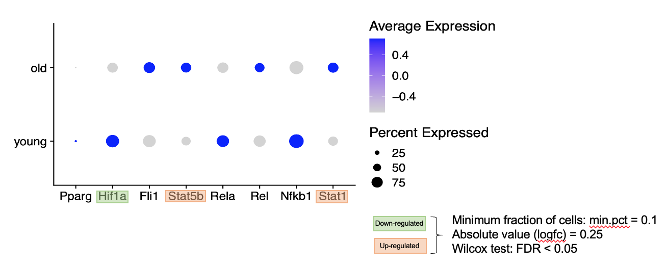
I used function "FindMarkers()" to identify DEGs in Old sample vs Young sample. I used the dot plot to visualize some interested genes, labeled DEGs in green and orange color. please see the following figure.
gene 'Fli1' is not DEG, but its average expression value distribution in old and young is similar with DEG 'Stat5b'. It looks weird. Could you help me to explain that?
Thanks
Beta Was this translation helpful? Give feedback.
All reactions