
LittleLink Extended is an add-on repository for LittleLink. It welcomes more niche or region-specific services that aren’t quite popular enough for the core LittleLink repo. By importing this extension, you can expand your LittleLink setup with additional brands and icons. You can either import everything or selectively copy only the pieces you need.
To use LittleLink Extended, you’ll need a copy of the original LittleLink project. Fork or download that repository first.
Then:
- Clone or download this LittleLink Extended repo.
- Copy the necessary files (CSS and icons) into your LittleLink project.
- Reference the new CSS in your
index.html.
In this repo’s css folder, you’ll find brands-extended.css. Copy that file into the css folder of your LittleLink project. Your folder structure should look something like this afterward:
littlelink
│
├── css
│   ├── reset.css
│   ├── style.css
│   ├── brands.css
│   └── brands-extended.css ← (new)
│
└── images
    └── icons
In this repo’s images folder, you’ll find a folder named icons-extended. Copy that entire folder into the images folder of your LittleLink project. Your structure might then look like:
littlelink
│
├── css
│   ├── ...
├── images
│   ├── avatar.png
│   ├── icons
│   └── icons-extended ← (new)
└── ...
When you need to reference an extended icon, you’ll do so via images/icons-extended/....
Open your LittleLink project’s index.html. In the <head> section, find the line that references brands.css:
<link rel="stylesheet" href="css/brands.css">Beneath it, add a line for the extended CSS:
<link rel="stylesheet" href="css/brands-extended.css">It should look something like:
<link rel="stylesheet" href="css/reset.css">
<link rel="stylesheet" href="css/style.css">
<link rel="stylesheet" href="css/brands.css">
<link rel="stylesheet" href="css/brands-extended.css">
That’s all you need to pull in the extended brand styles.
At this point, you’ve successfully imported LittleLink Extended. To see how to use the newly added buttons, simply reference them in your index.html or preview.html by using their associated classes (e.g., button-anilist, button-bereal, etc.).
For more information on the original LittleLink project, check out the LittleLink repo.
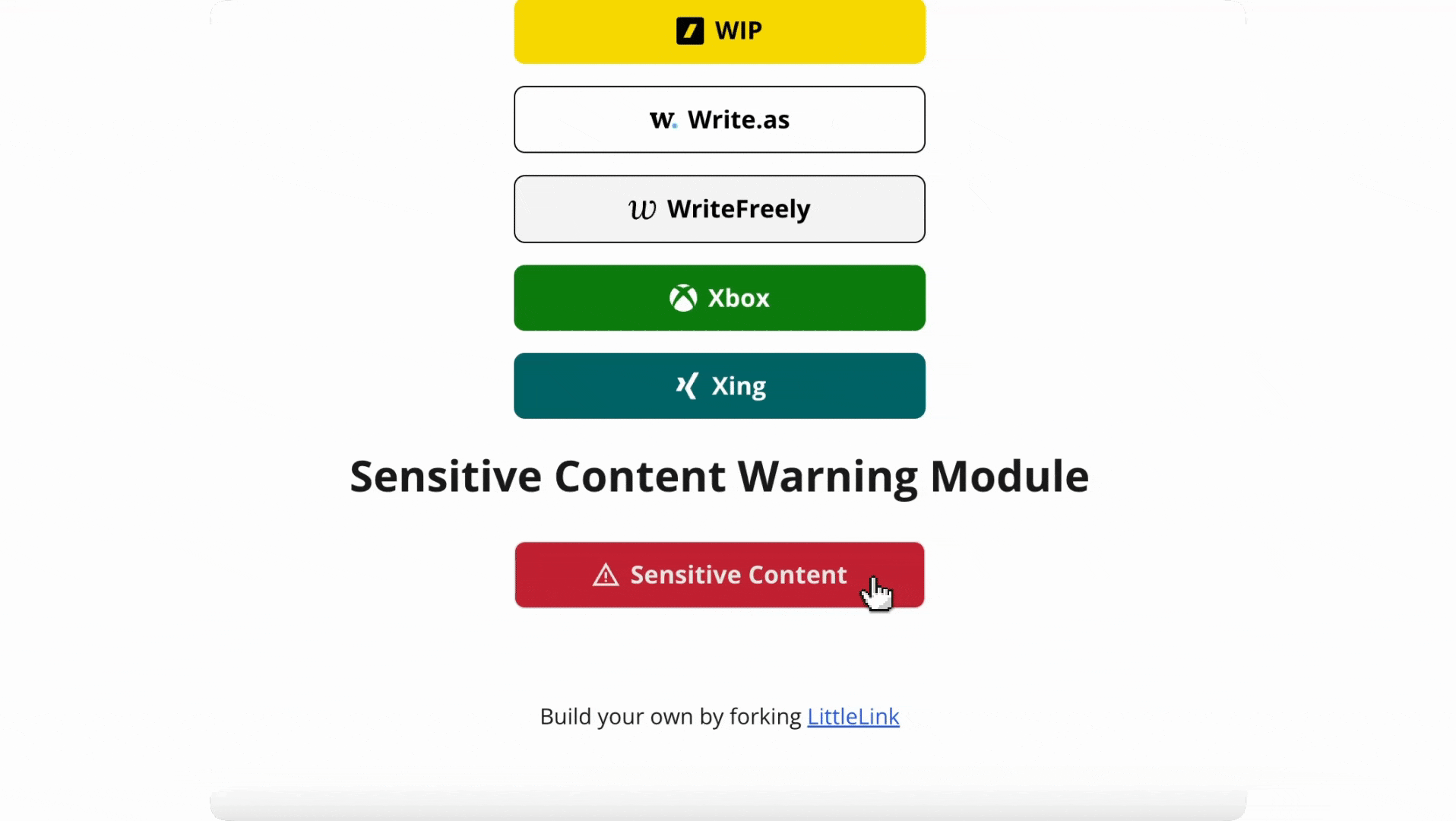
In addition to extended brands, this repository includes an optional module for adding “Sensitive Content” warnings. This module lets you display a slide-down panel warning users about potentially sensitive or age-restricted content. Each panel can include a “Continue” button that opens a custom link, set entirely in your HTML.
-
Copy the CSS
Downloadsensitive-content.cssfrom this repo (in thecssfolder) and place it in your LittleLink project’scssfolder. You can adjust the button color that is declared insensitive-content.cssor use a button color style frombrands.cssorbrands-extended.cssto adjust the button to any styling of your choice. -
Copy the JS
Downloadjsfolder which containssensitive-content.jsfrom this repo and place it in your LittleLink project. By default LittleLink doesn't use any JS. -
Reference Them
In yourindex.html(orpreview.htmlin LittleLink Extended), add the CSS after your main styles:<link rel="stylesheet" href="css/style.css"> <link rel="stylesheet" href="css/brands-extended.css"> <link rel="stylesheet" href="css/sensitive-content.css"> <!-- new -->
Then load the JS near the bottom of
<body>:<script src="js/sensitive-content.js"></script>
-
Add the HTML Snippet
Wherever you want a “Sensitive Content” button, insert:<div class="slide-container" data-continue-url="https://example.com"> <a class="button button-default sensitive-trigger" href="javascript:void(0)"> <img class="icon" aria-hidden="true" src="images/icons/generic-warning.svg" alt="Warning Icon"> Sensitive Content </a> <div class="sensitive-panel"> <div class="sensitive-panel__content"> <p>This link may contain content that is not appropriate for all audiences.</p> <button class="button button-default sensitive-continue">Continue</button> </div> </div> </div>
data-continue-url="..."sets the external link for the “Continue” button..sensitive-triggertoggles the panel open/close..sensitive-panelis the collapsible container..sensitive-continuetriggers navigation to thedata-continue-url.
You can add multiple sensitive content panels by repeating the snippet above with different data-continue-url values. The JS automatically handles each one independently, so each panel can open a different link.