A powerful, interactive tool for creating and fine-tuning fluid CSS properties using CSS clamp() function. Built with Vue.js 3 and modern web technologies.
- Interactive Editor: Adjust min/max values, change rates, and relative sizing with intuitive controls
- Multi-Property Support: Generate fluid values for typography, spacing, sizing, positioning, and layout properties
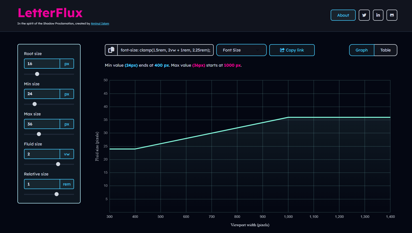
- Live Preview: Real-time graph visualization of fluid CSS behavior
- Table View: Detailed breakdown of property values across different viewport widths
- Code Generation: Automatic CSS
clamp()code generation with copy functionality - Responsive Design: Fully responsive interface that works on all devices
- Share & Export: Easy sharing and exporting of configurations
- Vue.js 3 with Composition API
- Vue Router for navigation
- Chart.js for interactive graphs
- SCSS with CSS variables
- Vite for build tooling
- ESLint + Prettier for code quality
# Clone the repository
git clone https://github.com/theaminulai/letter-flux.git

# Navigate to project directory
cd letter-flux

# Install dependencies
npm install

# Start development server
npm run dev# Development
npm run dev # Start development server
# Build
npm run build # Build for production
npm run preview # Preview production build
# Code Quality
npm run format # Format code with Prettier
npm run lint # Lint code with ESLint
npm run lint:fix # Auto-fix linting issues
npm run format:all # Format and fix all issues- Select Property: Choose from various CSS properties (typography, spacing, sizing, positioning, etc.)
- Adjust Settings: Use the form controls to set minimum and maximum values
- Fine-tune: Use range sliders for precise adjustments
- Visualize: View the fluid behavior on the interactive graph
- Inspect: Check specific viewport sizes in the table view
- Copy Code: Generate and copy the CSS clamp() function
- Share: Share your configuration with others
Fluid CSS is a modern approach to responsive design that allows CSS property values to scale smoothly between minimum and maximum values based on viewport width.
It uses the CSS clamp() function to define values that adapt automatically across screen sizes.
This tool supports generating fluid values for various CSS properties:
Typography: Font Size, Line Height, Letter Spacing, Word Spacing
Spacing: Margin, Padding, Gap
Sizing: Width, Max Width, Flex Basis
Layout & Styling: Border Radius, Border Width, Position (Top, Left), Transition Duration
For example:
/* Fluid typography */
.title {
    font-size: clamp(1rem, 2vw + 1rem, 2.5rem);
}

/* Fluid spacing */
.container {
    padding: clamp(1rem, 3vw, 3rem);
}

/* Fluid positioning */
.element {
    top: clamp(10px, 2vw + 5px, 50px);
}- Addresses common pain points in configuring and visualizing fluid CSS values
- Built with a modern tech stack (Vue 3, ES6+, SCSS)
- Includes production-oriented features such as PWA support and accessibility considerations
- Fully open source and open to community contributions
- Emphasizes clear structure and documented code
- Designed with responsive layout principles for a consistent experience across devices
- Targets WCAG 2.1 AA accessibility guidelines
- Mobile-first, responsive user interface
- Zero runtime dependencies for core functionality
- Fast development and build tooling provided by Vite
- Includes basic SEO meta tags for improved sharing and search indexing
Contributions are welcome! Please feel free to submit a Pull Request.
This project is open source and available under the GPL License.
Aminul Islam
- GitHub: @theaminulai
- Twitter: @theaminulai
- LinkedIn: theaminulai
This project was inspired by comprehensive research and learning from these excellent resources:
- MDN CSS clamp Documentation - Official CSS clamp() reference
- CSS-Tricks clamp Guide - Comprehensive clamp() function guide
- Web.dev Responsive Design - Modern responsive design techniques
- CSS-Tricks Fluid Typography - Viewport-based font scaling
⭐ If you find this project useful, please consider giving it a star!