fix: blade theme and neutral button - #3910
Conversation


🦋 Changeset detectedLatest commit: 895b626 The changes in this PR will be included in the next version bump. This PR includes changesets to release 2 packages
Not sure what this means? Click here to learn what changesets are. Click here if you're a maintainer who wants to add another changeset to this PR |


|
(Review Cancelled - Superseded by a new run) |
|
(Review Cancelled - Superseded by a new run) |

🛡️ Coverage ReportSummaryFull Coverage Details |

 kamaleshs-bridge4
left a comment
kamaleshs-bridge4
left a comment
kamaleshs-bridge4
left a comment
There was a problem hiding this comment.
✨ Agentic PR Review ✨
UI Review
✅ 4 passed
Passing checks (4)
| Check |
|---|
| ✅ Button - Playground |
| ✅ Button - Primary |
| ✅ InteractiveTokensPlayground - Playground |
| ✅ TextInput - Default |
Usage
import { Button } from '@razorpay/blade-svelte/components';

<Button color="black" variant="primary">Click me</Button>| * @default 'primary' | ||
| */ | ||
| color?: 'primary' | 'white' | 'positive' | 'negative'; | ||
| color?: 'primary' | 'white' | 'black' | 'positive' | 'negative'; |
There was a problem hiding this comment.
🟠 [MAJOR] · api-decision-critique · confidence: 9/10
Problem: 'black' is exposed on the public Button API in blade-svelte, but in React Blade the public Button color prop is deliberately restricted to 'primary' | 'white' | 'positive' | 'negative' — 'black' is excluded. The React BaseButton documents 'black' as: "Only supported with variant='primary'. Consumed by FloatingActionButton and intentionally not exposed on Button." There is no FloatingActionButton in blade-svelte to justify exposing 'black' on Button. This creates a cross-framework API inconsistency.
Suggestion: Either (a) remove 'black' from blade-svelte Button/types.ts to match React Blade's public API (keep it only on BaseButton for internal use), or (b) if the intent is to diverge, add a JSDoc comment explaining why blade-svelte exposes 'black' on Button while React does not.
| * @default 'primary' | ||
| */ | ||
| color?: 'primary' | 'white' | 'positive' | 'negative'; | ||
| color?: 'primary' | 'white' | 'black' | 'positive' | 'negative'; |
There was a problem hiding this comment.
🟠 [MAJOR] · api-decision-critique · confidence: 8/10
Problem: 'black' only produces a visually distinct button when combined with variant="primary". With variant="secondary" or "tertiary", it silently falls back to default gray rendering. The type definition lacks any JSDoc documenting this constraint. Consumers who set color="black" with variant="secondary" will get a standard gray button with no warning.
Suggestion: Add a JSDoc comment to the color prop in Button/types.ts documenting that 'black' is only visually distinct with variant="primary".
|
(Review Cancelled - Superseded by a new run) |
![rzp-slash-public[bot]](https://avatars.githubusercontent.com/u/7713209?s=60&v=4)

There was a problem hiding this comment.
✨ Agentic PR Review ✨
Status: Approved ✅
UI Review
✅ 7 passed
Passing checks (7)
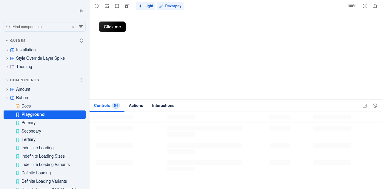
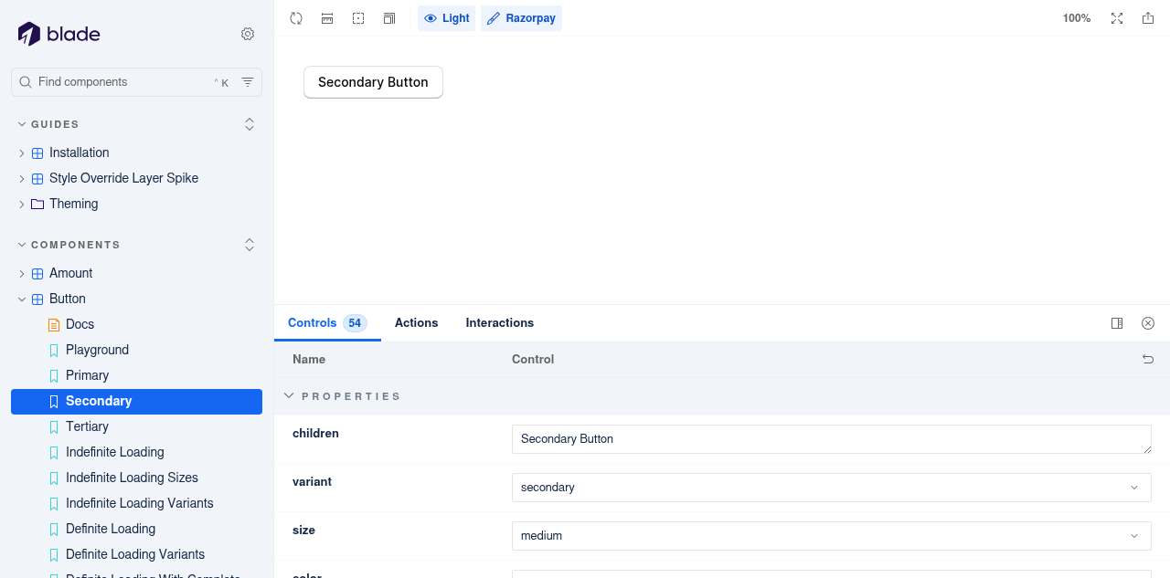
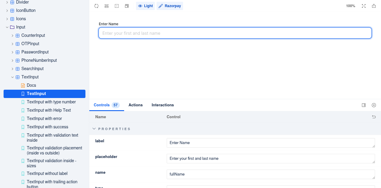
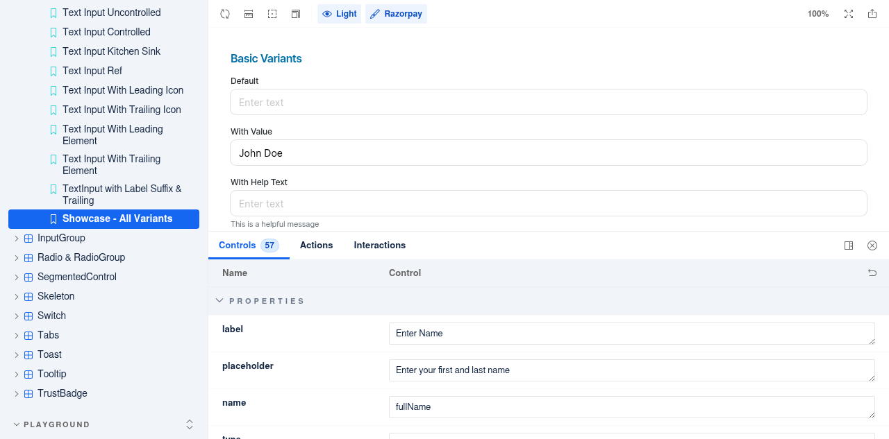
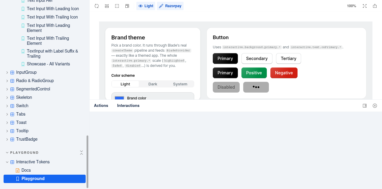
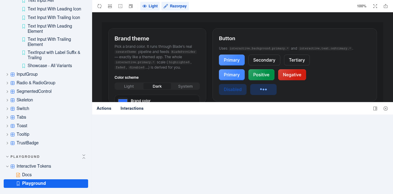
Usage
import { Button } from '@razorpay/blade-svelte/components';

<Button color="neutral" variant="primary">Neutral Button</Button> rzp-slash-public
Bot
added
the
rcore:eligible-for-auto-approval
rzp-slash-public
Bot
added
the
rcore:eligible-for-auto-approval
 rohankokane-dev
changed the title
rohankokane-dev
changed the title
|
(Review Cancelled - Superseded by a new run) |
|
There was a problem hiding this comment.
✨ Agentic PR Review ✨
UI Review
✅ 8 passed
Passing checks (8)




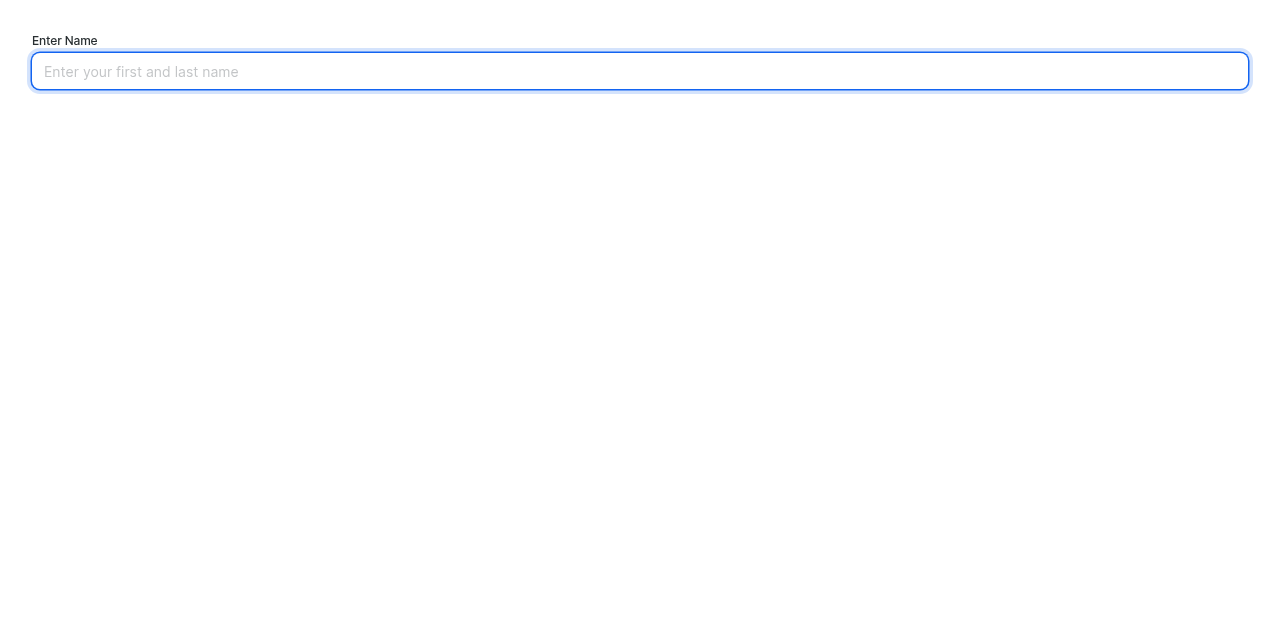
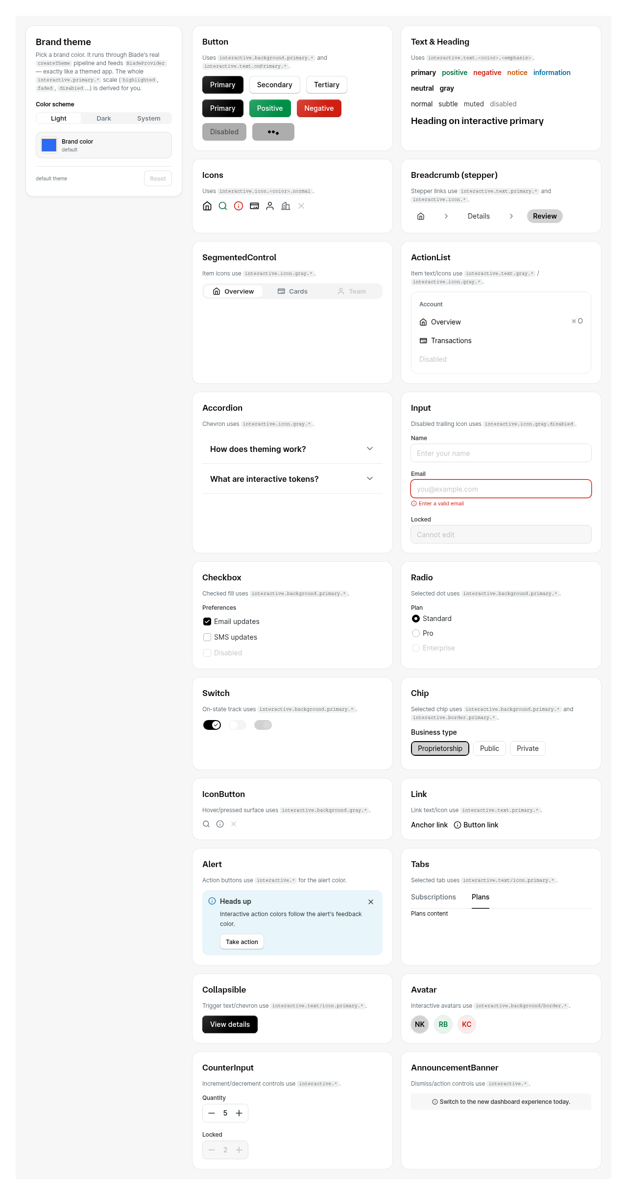
Usage
import { Button } from '@razorpay/blade-svelte/components';

<Button color="neutral">Click me</Button>|
|
||
| if (color === 'neutral') { | ||
| if (variant === 'primary') { | ||
| return `interactive.${property}.staticBlack.${_state}`; |
There was a problem hiding this comment.
🟠 [MAJOR] · code-quality-critique · confidence: 8/10
Problem: Neutral primary background token mismatch: getButtonBackgroundColorToken returns interactive.${property}.staticBlack.${_state} but the CSS .color-neutral class uses --interactive-background-neutral-* tokens. The disabled state values differ — staticBlack.disabled is hsla(0,0%,0%,0.56) while neutral.disabled is hsla(0,0%,0%,0.18). Since getButtonProgressRestColorToken calls this function with state:'disabled', the definite-loading rest cover paints at 0.56 opacity black instead of matching the actual disabled appearance at 0.18 opacity.
Suggestion: Change staticBlack to neutral in the neutral primary return: return interactive.${property}.neutral.${_state}; — this aligns the token with the CSS .color-neutral variables and fixes the loading rest color.
![rzp-slash[bot]](https://github.githubassets.com/images/gravatars/gravatar-user-420.png)
Co-authored-by: admin <admin>
|
|
|
|

5 participants


Description
Changes
Additional Information
Component Checklist