Visualization by Subgroup
An example of a subgroup profile plot is given below.
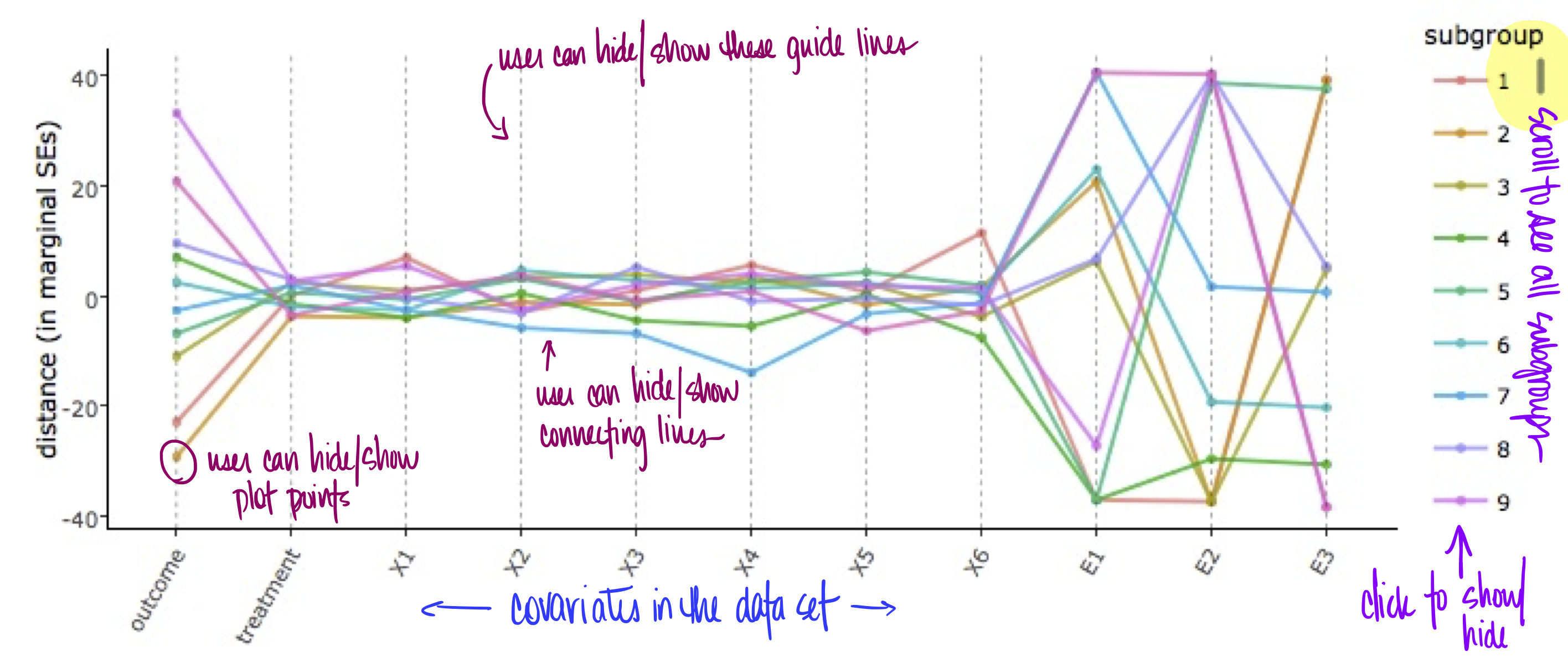
Each line corresponds to a subgroup -- each line is a subgroup profile. Plotting these profiles together allows the user to visually compare the subgroups for distinguishing features. The user is also able to hover their mouse pointer over any point in the graph to see what subgroup the datum corresponds to [#4 in future update].
When an extreme covariate value has been identified, as well as the associated subgroup, the user is able to use the Viz by Subgroup visualization to isolate that subgroup and look at the entire subgroup-specific distribution (rather than just the mean) of each covariate in that subgroup.
The user is able to select which profiles appear in the plot by clicking the corresponding color on the right [show/hide all: #15 in future update]. The user can also further customize the plot by
- hiding/showing the covariate guide lines
- hiding/showing the connecting lines
- hiding/showing the plot points
After the user has identified specific subgroups for further investigation, they can investigate using the "Viz by Subgroup" feature. The user is able to select a subgroup and view entire covariate distributions (rather than just the mean) for data generated by that subgroup.
