Javascript API Reference
The Exhibitor Javascript API allows you to describe how your React components are exposed to Exhibitor.
The most important part of the API. This is a function accepting your React component and provides an API to describe how it is exposed to Exhibitor.
Important Note: Be sure to end your component exhibit with a call to .build().
Examples:
// button.exh.ts

import exhibit from 'exhibitor'

import Button from './button' // I.e. ./button.[t|j]sx

exhibit(Button, 'Button')
// button.exh.tsx
import exhibit from 'exhibitor'
exhibit(() => <div>Hello World!</div>, 'Button') // Inline component (not advised).exhibit returns an API that you use to build-up your component's exhibit:
Specifies the default props for any proceeding component variants.
Example:
exhibit(Button, 'Button')
  .defaults({
    onClick: () => undefined,
    color: 'default',
    iconPosition: 'left',
    text: 'Button Text',
    size: 'normal',
    disabled: false,
})Miscellaneous options for the exhibit.
Example:
exhibit(Button, 'Button')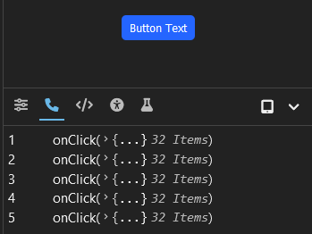
.options({ group: 'Final Review' })Specifies what props of the component correspond to event handlers. For example, this will most likely be functions like onClick, onKeyPress, onValueChange, etc.
When these events occur while the component is being interacted with in the Exhibitor Site, the calls to these event handler functions will be logged in the Event Log bottom-bar panel.
Example:
exhibit(Button, 'Button')
  .events({
    onClick: true,
    onValueChange: true,
})Specifies a variant of the component. This enables you to show the component with varying props.
Example (if default props are defined):
exhibit(Button, 'Button')
  .defaults({ color: 'blue' })
  .variant('green', defaultProps => ({
    ...defaultProps,
    color: ButtonColor.GREEN,
  }))
Example (if default props are not defined):
exhibit(Button, 'Button')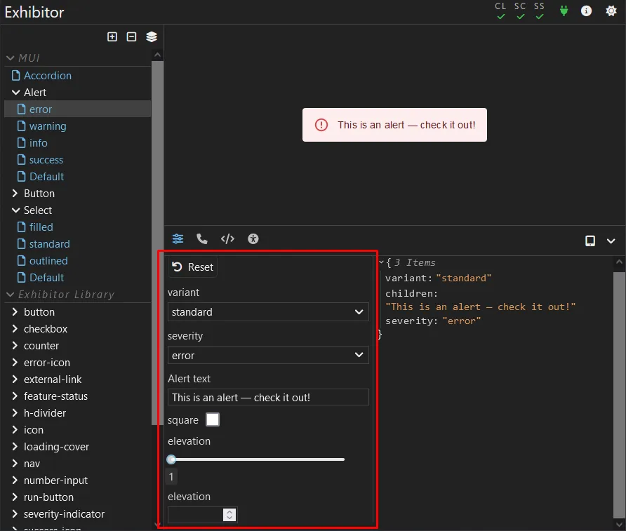
.variant('green', ({ ... }))Prop Modifiers allow you to render inputs in the Exhibitor Site that allow the props of a component Variant to be dynamically changed.
How they look:
Example (explicitly):
import { PropModifierType} from 'exhibitor'

exhibit(Button, 'Button')
  .defaults({ ... })
  .propModifiers([
    {
      label: 'Color',
      type: PropModifierType.SELECT,
      options: ['blue', 'green', 'red', 'yellow'],
      // Tells Exhibitor how this prop is retrieved from props
      init: props => props.variant,
      // Tells Exhibitor how this prop's value is set to props
      apply: (newColor, currentProps) => ({ ...currentProps, color: newColor }),
    },
  ])
Example (helper function):
import { simpleSelectModifier } from 'exhibitor'

exhibit(Button, 'Button')
  .defaults({ ... })
  .propModifiers([
    simpleSelectModifier('color', ['blue', 'green', 'red', 'yellow']),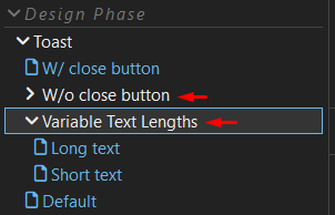
])Specify a group of variants. This is useful for grouping variant together that share common base props. For example, if your component has a "darkMode" prop, a "dark" and "light" variant group can be defined.
Groups are represented accordingly in the Exhibitor Site:
Example:
exhibit(Button, 'Button')
  .group('large', ex => ex
    .variant('w/o icon', defaultProps => {
      ...defaultProps,
      size: 'large',
    })
    .variant('w/o icon', defaultProps => {
      ...defaultProps,
      size: 'large',
      iconName: 'paper-plane',
}))A call to .build() must be the last call after all desired calls to functions off of exhibit(...) are done.
Example:
exhibit(Button, 'Button')
  ...
.build()import exhibit from 'exhibitor'
import Button from './button'
exhibit(Button, 'Button')
.events({
onClick: true,
})
.defaults({
onClick: () => undefined,
color: 'default',
iconPosition: 'left',
text: 'Button Text',
size: 'normal',
disabled: false,
})
.options({ group: 'Final Review' })
.propModifiers([
{
label: 'Color',
type: PropModifierType.SELECT,
options: ['default', 'blue', 'green', 'red', 'yellow'],
init: props => props.variant,
apply: (newColor, currentProps) => ({ ...currentProps, color: newColor }),
},
])
.variant('green', p => ({
...p,
color: 'green',
}))
.variant('large', p => ({
...p,
size: 'large',
}))
.variant('with icon', p => ({
...p,
iconName: 'paper-plane',
text: 'Send',
}))
.build()